Ugliest Colors in the World – Universally Unappealing Shades
What is the ugliest color? Are there colors that people find repulsive and what are these ugly colors? In most cases, an unappealing color is a matter of opinion as one person hates it, while another will love it. However, some colors tend to have a large percentage of dislikes. So, let us have a look at one of the ugliest colors in the world, along with a few more and you can make up your own mind.
What Are Ugly Colors?
Pantone will disagree with you if you think there are ugly colors, as they see all colors equally. Ugly colors are usually created because of associations and can be formed by different experiences. So, some colors may seem ugly to some, while the same color is well-liked by others. In the art and design world, there are no ugly colors, it is all about how you use the colors that matter.
Choosing appropriate colors can help create a specific atmosphere and you can do it by using unusual color combinations. What qualifies as the ugliest colors in the world? Most of these colors are your muddy and earthy shades with names like pickle, ox-blood, or rust.
The colors appear to be a little off-putting, making you think twice about using them for anything.
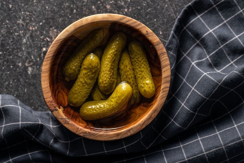
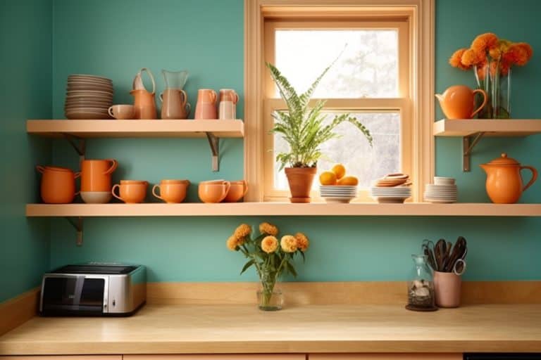
You can create an appealing color palette with so-called “ugly colors” if used correctly. This is where a little bit of color knowledge comes into play. Knowing when to use colors as your main theme and when to use it as an accent color. Find out what colors work well together, for example, mustard and teal, olive and peach, or a pickle color with rose pink. Remember, there are also various shades and tones of the same colors, so you do not have to stick to using a single dark brown color, for example.
There are many colors and color palettes to consider, so you do not have to choose any of the so-called “ugly colors”. However, do not rule them out simply because they have a negative association, as they can add some character to your design of choice. It is all about creating a balance of colors, no matter what they are. Of course, all colors have both positive and negative associations and meanings, and various cultures also have their own associations.
So, when it comes to color meanings, it is not universal and can differ from person to person and even from one country to another.
A List of the Ugliest Colors in the World
Everybody has their favorite color or colors, and these usually range across various shades of all the primary and secondary colors. The most popular are the blue, green, and purple colors. So, let us look at some of the less popular colors and how a color can get voted the ugliest color in the world.
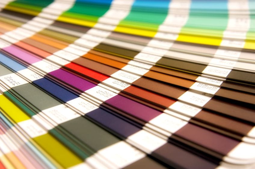
Pantone 448 C
This is the one particular color that earned its title as the ugliest color in the world. This all happened in Australia, where researchers wanted to find a color that repulsed most people. A research agency was commissioned to find a color they could use on packaging for smoking. The idea was to reduce the number of tobacco products used, which could then help save lives. Each cigarette carton had to look unappealing, thus reducing the urge to purchase the cigarettes.
The study took about three months, over a few tests, with over 1000 participants who were regular smokers. In 2012, a particular color was chosen, which was first referred to as “olive green”. However, the Australian Olive Association was not too impressed with this, and the name was then changed to “drab dark brown”.
Once the color was adopted and used in Australia, there was a noticeable decline in smoking afterward.
So, the ugliest color in the world is actually helping people to stop smoking. Other governments also hopped onto the bandwagon and began implementing the color to discourage smoking. Since 2016, countries including France, the United Kingdom, Israel, New Zealand, Thailand, and Belgium amongst others have passed the “plain packaging law” and used the exact hue on their packaging.
The color is also known as Pantone 448 C and Opaque Couché. The latter name simply means “layered opaque” in French and seems to be incorrectly used in correlation with the actual color. This is because there is a swatch library or palette in Adobe Illustrator known as “Pantone solid Color” in English, also known as “Pantone Opaque Couché” in French, which contains the drab dark brown color.
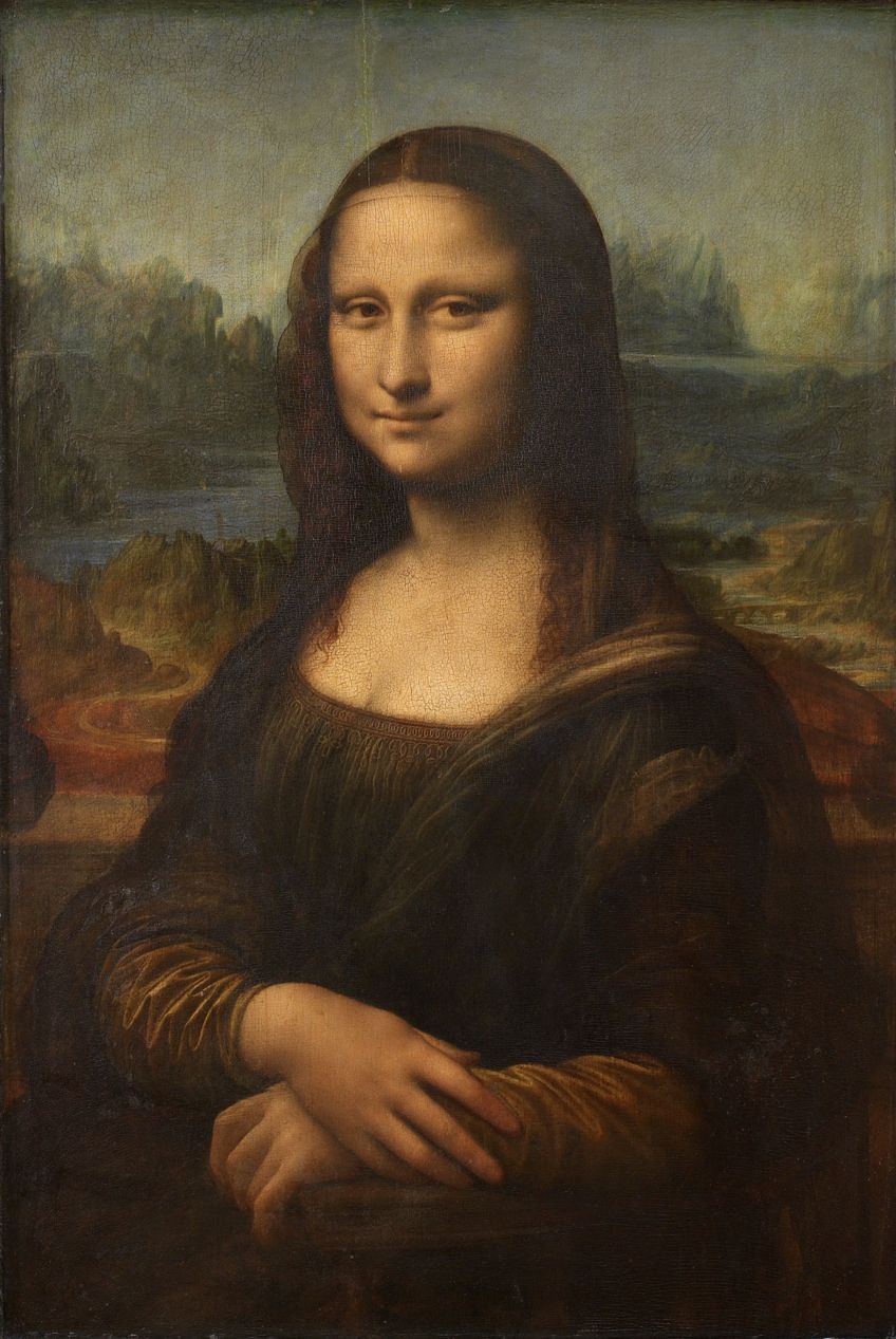
Even if a single survey labeled the Pantone 448 C as the ugliest color in the world, this is still open to interpretation. The color can be used in many other contexts besides plain and unappealing packaging. For example, the painting of The Mona Lisa (1503-1506) by Leonardo da Vinci has darkened due to changes in the intensity of the pigments and varnish he used to a drab dark brown.
Others might see the color working in various interior design color palettes, or even in fashion.
Ultimately, how you see color depends on how you use it. However, below are a few of the more negative associations the drab dark brown color elicits.
- Dirtiness
- Muddiness
- Feces
- Dullness
- Sadness
- Boredom
- Negativity
| Shade | Hex Code | CMYK Color Code (%) | RGB Color Code | Color |
| Pantone 448 C | #4a412a | 0, 12, 43, 71 | 74, 65, 42 |
Having seen the color, and you agree with this being one of the ugliest colors in the world, can you imagine this color being used in a color palette? Is there a way to create an appealing look if you combine this color with other color combinations? Below is a good example of a color palette, using the drab dark brown. You can then decide if it has any redeeming qualities.
| Shade | Hex Code | CMYK Color Code (%) | RGB Color Code | Color |
| Pantone 448 C | #4a412a | 0, 12, 43, 71 | 74, 65, 42 | |
| Dark Teal | #008080 | 100, 0, 0, 50 | 0, 128, 128 | |
| Strong Cyan | #00cdcd | 100, 0, 0, 20 | 0, 205, 205 | |
| Soft Pink | #e4b6ce | 0, 20, 10, 11 | 228, 182, 206 | |
| Pink Lemonade | #f2dbe7 | 0, 10, 5, 5 | 242, 219, 231 |
Mustard Yellow
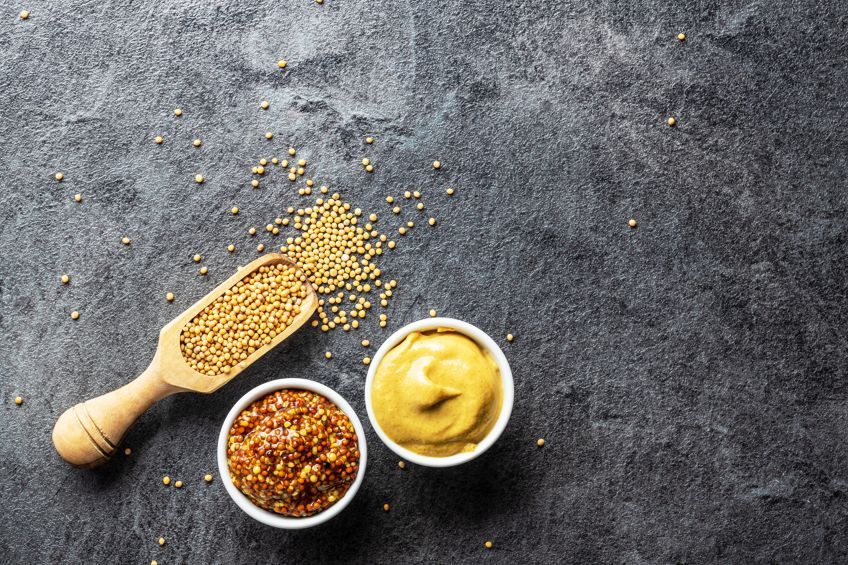
This color can be seen as a dull and dark shade of yellow and is quite a popular color used in fashion as well as interior design. Said to be a cheerful color, it can also be a tiring color that is hard on the eyes. Some have tested the color and found that if you are in a room that has entirely too much mustard yellow, you are more likely to lose your temper more readily.
For those of you who do not like mustard, the condiment, mustard yellow might provoke unpleasant memories. The color is also quite close to representing a few unpleasant things like certain bodily fluids or discharges or bile.
So, it is sometimes hard to like a color that has these kinds of associations.
| Shade | Hex Code | CMYK Color Code (%) | RGB Color Code | Color |
| Mustard Yellow | #e1ad01 | 0, 23, 100, 12 | 225, 173, 1 |
Pickle Green
If you like pickles, then you might not consider this an ugly color. The color, which is similar to the light olive can have associations with a few unpleasant things like infections or diarrhea.
Both are shades of green, with a distinct yellow undertone.
| Shade | Hex Code | CMYK Color Code (%) | RGB Color Code | Color |
| Pickle Green | #93934a | 0, 0, 50, 42 | 147, 147, 74 | |
| Light Olive | #b8bc86 | 2, 0, 29, 26 | 184, 188, 134 |
Dark Brown
During the study we mentioned when Pantone 448 C was selected as the ugliest color, dark brown came in second. However, the color was more chocolatey brown and is more a pleasing color when compared to the drab dark brown color.
There are also many other associations with dark brown, including people with dark brown eyes and hair. Dark brown is also quite popular in interior design and fashion. Think wooden floors or winter boots. It is a warm color that is sturdy, and warm and is closely linked to the earth and healing. However, it can also be associated with things like rotting food or mud and dirt. Some people may also simply prefer brighter and more colorful hues.
| Shade | Hex Code | CMYK Color Code (%) | RGB Color Code | Color |
| Dark Brown | #654321 | 0, 34, 67, 60 | 101, 67, 33 |
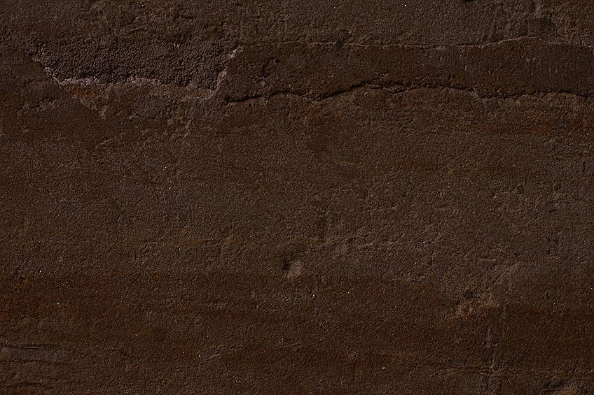
Lime Green
This is a bright and intense color that can be quite tiring to look at. The color is also not restful or calming but is more full of energy and is a stimulating color. The color is also more difficult to use, for example, a lime green car, jersey, or couch might not be one of your first choices.
Not that it is an ugly color, but used too excessively, it can become irritating and overpowering.
| Shade | Hex Code | CMYK Color Code (%) | RGB Color Code | Color |
| Lime Green | #32cd32 | 76, 0, 76, 20 | 50, 205, 50 |
Beige
Beige is a color extremely conservative and seen as monotonous and dull. Maybe it is not such a well-liked color for many, because it represents the working world. The color is used in schools and hospitals, and even the first computer was made in a beige color. Even though there are many positive associations, too much of this color can leave you feeling sad and lonely. It can also create feelings of lethargy and depression if used incorrectly.
| Shade | Hex Code | CMYK Color Code (%) | RGB Color Code | Color |
| Beige | #f5f5dc | 0, 0, 10, 4 | 245, 245, 220 |
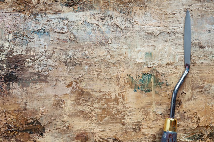
Dark Gray
In many cases, dark gray can easily be associated with negative feelings like depression and sadness or loss. The color can seem indifferent and can be linked to unpleasant things like decay. The color has an overall dampening effect on the mood. Since it has no real color to it, it can also seem boring and too serious. The color can invoke images of gray buildings and parking lots.
The color does not inspire and catch your attention unless used correctly in combination with other colors.
| Shade | Hex Code | CMYK Color Code (%) | RGB Color Code | Color |
| Dark Gray | #838383 | 0, 0, 0, 49 | 131, 131, 131 |
Rust
The most obvious association with this color is rust, which is not something pleasant. This can be described as a strong orange or reddish-brown color that resembles iron-oxide, and some may see this as an ugly color. Rusty old cars, fences, and other metal objects can have unpleasant associations.
| Shade | Hex Code | CMYK Color Code (%) | RGB Color Code | Color |
| Rust | #b7410e | 0, 64, 92, 28 | 183, 65, 14 |

White
White is clinical, cold, boring, empty, and may remind you of hospitals. Used excessively, it becomes bland and impersonal, and it can be quite blinding. In some cultures, the color white is linked to sadness and death.
| Shade | Hex Code | CMYK Color Code (%) | RGB Color Code | Color |
| White | #ffffff | 0, 0, 0, 0 | 255, 255, 255 |
Some Unusual and Amusing Ugly Color Names
So, we have considered some of the colors that can be deemed as ugly. However, this is also a matter of opinion. Today, there are so many colors available and most of these colors have names.
Below are a few colors with weird and unusual names, which might or might not be considered ugly, you can decide.
Arsenic
This dark grayish-blue cool color is named after the natural chemical element that is associated mostly with poison and death. This cool gray color might even go well with the drab dark brown color mentioned above.
| Shade | Hex Code | CMYK Color Code (%) | RGB Color Code | Color |
| Arsenic | #3b444b | 21, 9, 0, 71 | 59, 68, 75 |
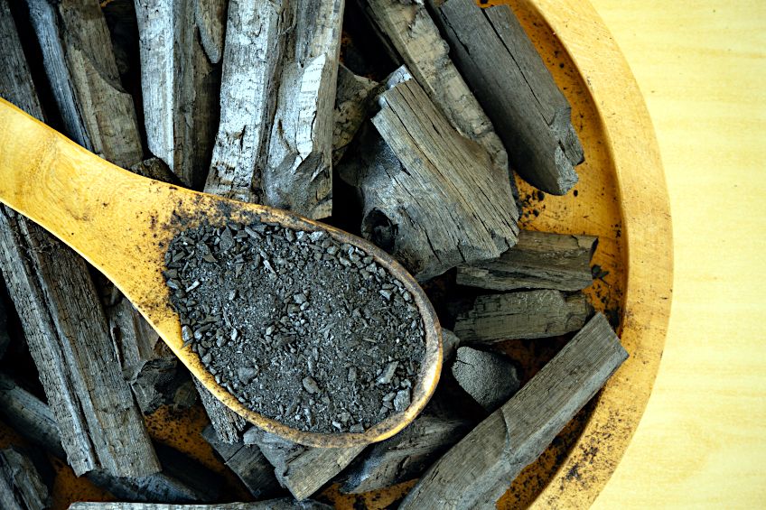
Humorous Green
This is a Sherwin Williams (SW 6918) color, and it seems somebody found something funny about the color. A moderate yellow that is leaning close to mustard, might be the color you are looking for.
Alternatively, you might consider placing it on the list of ugly colors.
| Shade | Hex Code | CMYK Color Code (%) | RGB Color Code | Color |
| Humorous green | #c6b836 | 0, 7, 73, 22 | 198, 184, 54 |
Goose Turd Green
The name itself says it all. This color name originated during the Elizabethan era in England. Dressmakers in those days wanted to attract more people and gain more business. So, they began giving weird and unusual names to the various color fabrics they used, and this made it more exciting and adventurous for buyers. This particular color was one of the more interesting names and it is unknown whether the naming of the colors worked to bring in more customers, but the name did stick and is still used today.
| Shade | Hex Code | CMYK Color Code (%) | RGB Color Code | Color |
| Goose Turd Green | #4ea809 | 54, 0, 95, 34 | 78, 168, 9 |
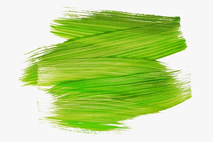
Puke
This name will assuredly put you off this color as it is a shade close to what it represents. The color is a shade of olive-brown and was first mentioned in the Shakespearean play As You Like It (1599), where a puke stocking is mentioned. This term was used to describe the woolen stockings worn in those days.
The name has remained all these years and is still in use today.
| Shade | Hex Code | CMYK Color Code (%) | RGB Color Code | Color |
| Puke | #947706 | 0, 20, 96, 42 | 148, 119, 6 |
Ox Blood
Also known as Sang-De-Boeuf, this color is supposed to be similar to the red originally used as a blood-colored pottery glaze. The name Sang-De-Boeuf can be traced to the late 19th century. However, the method of creating the red glaze can be traced back to the 13th century in China. The name “ox blood” itself can be a bit off-putting, which is why we decided to include it here.
| Shade | Hex Code | CMYK Color Code (%) | RGB Color Code | Color |
| Ox Blood | #4a0404 | 0, 95, 95, 71 | 74, 4, 4 |
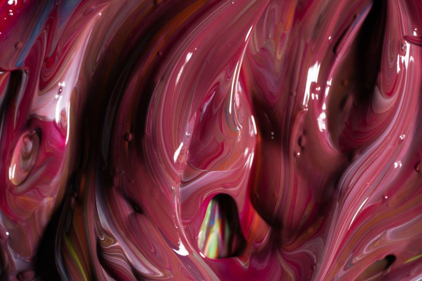
Some might say that there is no such thing as an ugly color, as colors can appear to be ugly in one scenario but can work wonderfully in another. As with many other things, beauty is in the eye of the beholder, but in the case of Pantone 448 C, majority vote rules and so it remains one of the ugliest colors in the world.
Frequently Asked Question
What Is the Ugliest Color?
The color that was voted as the ugliest color in the world is known as Pantone 448 C. This color has also been labeled a drab dark brown and was chosen as the color for the packaging of tobacco. The color was chosen because it was so off-putting, so people are less likely to purchase tobacco products, thus helping to reduce smoking.
What Is the Least Popular Color?
To discover the least liked color, there have been random surveys done online, and the conclusion from these surveys is that yellow seems to be the least liked color. Only five percent of participants preferred yellow. Another survey also indicated that orange loses favor as both women and men age.
What Are Some Well-Liked Colors?
Some of the more popular colors include shades of blue and green, with purple coming in at a close third. Red is also up there in the top five popular colors.
In 2005, Charlene completed her Wellness Diplomas in Therapeutic Aromatherapy and Reflexology from the International School of Reflexology and Meridian Therapy. She worked for a company offering corporate wellness programs for a couple of years, before opening up her own therapy practice. It was in 2015 that a friend, who was a digital marketer, asked her to join her company as a content creator, and this is where she found her excitement for writing.
Since joining the content writing world, she has gained a lot of experience over the years writing on a diverse selection of topics, from beauty, health, wellness, travel, and more. Due to various circumstances, she had to close her therapy practice and is now a full-time freelance writer. Being a creative person, she could not pass up the opportunity to contribute to the Art in Context team, where is was in her element, writing about a variety of art and craft topics. Contributing articles for over three years now, her knowledge in this area has grown, and she has gotten to explore her creativity and improve her research and writing skills.
Charlene Lewis has been working for artincontext.org since the relaunch in 2020. She is an experienced writer and mainly focuses on the topics of color theory, painting and drawing.
Learn more about Charlene Lewis and the Art in Context Team.
Cite this Article
Charlene, Lewis, “Ugliest Colors in the World – Universally Unappealing Shades.” Art in Context. July 14, 2022. URL: https://artincontext.org/ugliest-colors-in-the-world/
Lewis, C. (2022, 14 July). Ugliest Colors in the World – Universally Unappealing Shades. Art in Context. https://artincontext.org/ugliest-colors-in-the-world/
Lewis, Charlene. “Ugliest Colors in the World – Universally Unappealing Shades.” Art in Context, July 14, 2022. https://artincontext.org/ugliest-colors-in-the-world/.



Very interesting insights – helped me with my studies!
how are these colors ugly? some of them are normal but pantone 448c makes my blood boil