Chartreuse Color – What Color is Chartreuse?
There are so many colors out there, some with pretty unusual names. If somebody had to mention the chartreuse color, would you know what it is? Is chartreuse green or yellow? To provide answers to this query and more, we will be investigating further into the topic.
What Color Is Chartreuse?
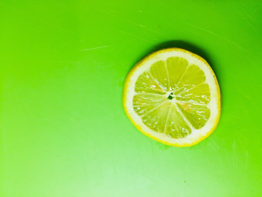
Is chartreuse green or yellow? We will start with this question. The chartreuse color can be described as being in between yellow and green. Since it is between these two colors on the color wheel, the different shades can lean either toward green or yellow. The color originated because of its likeness to the color of a French liqueur.
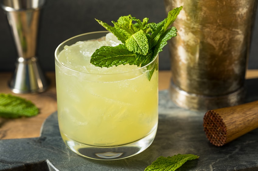
The chartreuse color is quite vibrant and takes its place alongside colors like lime, which has a certain dominance over other colors when it comes to attracting attention. Since chartreuse can lean towards green or yellow, this sometimes makes it confusing as to what the color is. Technically, the color is created by blending equal amounts of yellow and green. However, you do get chartreuse green as well as chartreuse yellow.
Is the chartreuse color cool or warm? All colors can have a color temperature, warmer colors are associated with red and orange colors, while cool colors are associated with blue and green. So, depending on what shade or tone of chartreuse you are working with, it can be cool or warm. Those closer to green are said to be cooler, while yellow moves to the warmer side of the scale.
| Chartreuse Shade | Hex Code | CMYK Color Code (%) | RGB Color Code | Chartreuse Color |
| Chartreuse Green | #7fff00 | 50, 0, 100, 0 | 127, 255, 0 | |
| Chartreuse Yellow | #dfff00 | 13, 0, 100, 0 | 223, 255, 0 |
Chartreuse Color: A Brief History
The name Chartreuse is a French word that describes a greenish-yellow liqueur that consists of brandy and a few aromatic herbs. The liqueur was originally made by the Carthusian monks early on in the 17th century. The drink was made as a medicinal tonic; however, the drink became quite popular and now it is a general color as well.
The color became popular and made it into fashion from fabrics to wallpapers in the 18th century. However, the color or dye was achieved by using arsenic, which led to it being toxic and deadly. The dye was then recalled, and the trend faded into the background.
The actual color name was documented in the late 19th century; however, artists have been using it or various shades as a way to showcase springtime and other aspects. Jean-Honoré Fragonard, a French painter, was known to use this color in his paintings, such as in Le jeu de la main chaude (1800-1899). Vincent Van Gogh also used a lemon-lime shade similar to chartreuse in many of his paintings, such as Café Terrace at Night (1888).
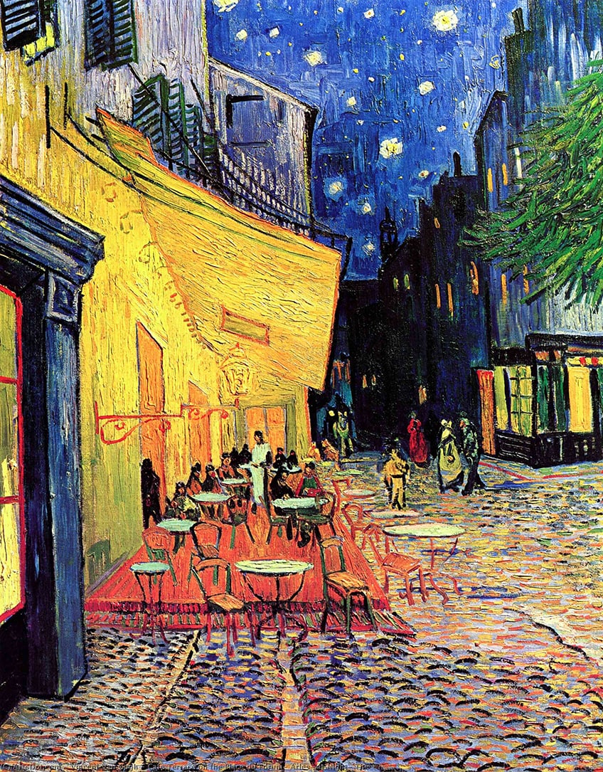
Café Terrace at Night (1888) by Vincent van Gogh; Vincent van Gogh, CC0, via Wikimedia Commons
In the 19th century, a safer version of the chartreuse color came back into fashion in Britain and was often seen in fabrics like velvet and silk. The color appeared in gowns, shoes, and other accessories like fans and purses.
The fashion trend hit its peak in the early 20th century, and only those who were more daring wore the vibrant color. The mid-20th century saw the color become popular again in fashion, but also as furniture and even automobiles. The color went out of fashion again and then came back during the 80s.
Moving into the 21st century, the color became popular amongst tech companies, for its energetic color. The chartreuse color also found its way onto the runway in 2019 and 2020. One of the reasons it became so popular during this time, is because Michelle Obama wore a gown and jacket in a chartreuse color. Many seamstresses today also still have the opinion that the color is bad luck. As for the chartreuse liqueur, the original recipe is still a secret of the monks.
The chartreuse yellow is also seen on traffic safety vests, as the bright yellow color, along with its reflective properties offers high visibility. Today, the chartreuse color has also seen popularity in modern interior design.
Meaning of the Chartreuse Color
Chartreuse is a bright color that has energy and vitality, and also has a cheerfulness and positivity about it. Since it has a green undertone, it is closely associated with health and healing as well as growth. You can find the color abundantly in nature from certain colored apples to new plant shoots. The color is vibrant and, therefore, is not aimed at relaxation, but it does inspire creativity and motivation.
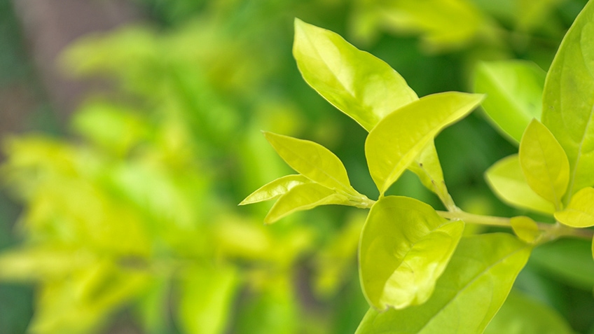
The chartreuse color is also associated with creative thinking as well as individuality and can help to promote focus and concentration. However, overuse of the color can become overwhelming and may put you off balance. Too much of this color can also produce anxiety or overstimulation.
Chartreuse Color Tones
As we have already mentioned, there are various shades of chartreuse. The most common of these include chartreuse green and chartreuse yellow. However, many colors lay in between. All of these are either greener, which brings in the freshness of springtime, or yellow, which offers more energy.
| Color Shade Name | Hex Code | RGB | CMYK (%) | Color Visualization |
| Acid Green | #B0BF1A | 176, 191, 26 | 8, 0, 86, 25 | |
| Apple | #66B447 | 102, 180, 71 | 43, 0, 61, 29 | |
| Apple Green | #8DB600 | 141, 182, 0 | 23, 0, 100, 29 | |
| Artichoke | #8F9779 | 143, 151, 121 | 5, 0, 20, 41 | |
| Asparagus | #87A96B | 135, 169, 107 | 20, 0, 37, 34 | |
| Avocado | #568203 | 86, 130, 3 | 34, 0, 98, 49 | |
| Bright Chartreuse | #B5BF50 | 181, 191, 80 | 5, 0, 58, 25 | |
| Bright Green | #66FF00 | 102, 255, 0 | 60, 0, 100, 0 | |
| Bud Green | #7BB661 | 123, 182, 97 | 32, 0, 47, 29 | |
| Cactus | #5B6F55 | 91, 111, 85 | 18, 0, 23, 56 | |
| Chartreuse | #DFFF00 | 223, 255, 0 | 13, 0, 100, 0 | |
| Citrine | #E4D00A | 228, 208, 10 | 0, 9, 96, 11 | |
| Citron | #DDD06A | 221, 208, 106 | 0, 6, 52, 13 | |
| Dark Chartreuse | #6BC71D | 107, 199, 29 | 46, 0, 85, 22 | |
| Dark Lime | #7EBD01 | 126, 189, 1 | 33, 0, 99, 26 | |
| Electric Green | #72FF13 | 114, 255, 19 | 55, 0, 93, 0 | |
| Electric Lime | #CCFF00 | 204, 255, 0 | 20, 0, 100, 0 | |
| Emerald | #50C878 | 80, 200, 120 | 60, 0, 40, 22 | |
| Fern Green | #4F7942 | 79, 121, 66 | 35, 0, 45, 53 | |
| Gold | #FFD700 | 255, 215, 0 | 0, 16, 100, 0 | |
| Granny Smith Apple | #A8E4A0 | 168, 228, 160 | 26, 0, 30, 11 | |
| Green-yellow | #ADFF2F | 173, 255, 47 | 32, 0, 82, 0 | |
| Harlequin | #3FFF00 | 63, 255, 0 | 75, 0, 100, 0 | |
| Honeydew | #F0FFF0 | 240, 255, 240 | 6, 0, 6, 0 | |
| Inchworm | #B2EC5D | 178, 236, 93 | 25, 0, 61, 7 | |
| June Bud | #BDDA57 | 189, 218, 87 | 13, 0, 60, 15 | |
| Key Lime | #E8F48C | 232, 244, 140 | 5, 0, 43, 4 | |
| Kiwi | #8EE53F | 142, 229, 63 | 38, 0, 72, 10 | |
| Lawn Green | #7CFC00 | 124, 252, 0 | 51, 0, 100, 1 | |
| Light Chartreuse | #CCCD75 | 204, 205, 117 | 0, 0, 43, 20 | |
| Light Green | #90EE90 | 144, 238, 144 | 39, 0, 39, 7 | |
| Light Lime | #AEFD6C | 174, 253, 108 | 31, 0, 57, 1 | |
| Lime | #BFFF00 | 191, 255, 0 | 25, 0, 100, 0 | |
| Lime (Web) (X11 Green) | #C0FF00 | 192, 255, 0 | 25, 0, 100, 0 | |
| Lime Chartreuse | #BFFF00 | 191, 255, 0 | 25, 0, 100, 0 | |
| Lime Green | #32CD32 | 50, 205, 50 | 76, 0, 76, 20 | |
| Lime Punch | #C0D725 | 192, 215, 37 | 11, 0, 83, 16 | |
| Limeade | #D3D95F | 211, 217, 95 | 3, 0, 56, 15 | |
| Mantis | #74C365 | 116, 195, 101 | 41, 0, 48, 24 | |
| Maximum Green Yellow | #D9E650 | 217, 230, 80 | 6, 0, 65, 10 | |
| Mellow Yellow | #F8DE7E | 248, 222, 126 | 0, 10, 49, 3 | |
| Middle Green Yellow | #ACBF60 | 172, 191, 96 | 10, 0, 50, 25 | |
| Moss Green | #8A9A5B | 138, 154, 91 | 10, 0, 41, 40 | |
| Olive | #808000 | 128, 128, 0 | 0, 0, 100, 50 | |
| Pale Chartreuse | #EFFD5F | 239, 253, 95 | 6, 0, 62, 1 | |
| Pale Green | #98FB98 | 152, 251, 152 | 39, 0, 39, 2 | |
| Pale Lime | #C5C951 | 197, 201, 81 | 2, 0, 60, 21 | |
| Pastel Green | #C1E1C1 | 193, 225, 193 | 14, 0, 14, 12 | |
| Pear | #D1E231 | 209, 226, 49 | 8, 0, 78, 11 | |
| Pistachio | #93C572 | 147, 197, 114 | 25, 0, 42, 23 | |
| Spring bud | #A7FC00 | 167, 252, 0 | 34, 0, 100, 1 | |
| Spring Chartreuse | #D4D06E | 212, 208, 110 | 0, 2, 48, 17 | |
| Tea Green | #D0F0C0 | 208, 240, 192 | 13, 0, 20, 6 | |
| Verdant Green | #12674A | 18, 103, 74 | 83, 0, 28, 60 | |
| Yellow-green | #9ACD32 | 154, 205, 50 | 25, 0, 76, 20 |
What Colors Go With Chartreuse?
When working out color combinations, you need to refer to color theory as well as the color wheel. All colors can be found on the color wheel and their position will help to determine the best color combinations. Since chartreuse comes in a variety of shades, some more green and others more yellow, you will need to consider this.
Since it is such as vibrant color, whatever the shade, it should be used carefully and can successfully be used as an accent color, or a color that simply highlights the other colors. The best colors that go with chartreuse include neutral colors such as black, gray as well as white. Sometimes, navy blue can also be considered a neutral color, and it goes very well with chartreuse. The various color combinations you have for chartreuse green are as follows.
Chartreuse Complementary Colors
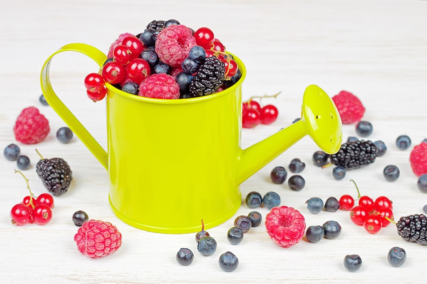
On opposite ends of the color wheel, you will be able to notice the complementary colors. That when placed together, create a strong contrast. The complementary color can be identified by using the hex code, while the other color codes are for web designs and printing purposes. Of course, you should also play around with various shades and hues. For example, pale lavender provides a more neutral background for chartreuse.
| Shade | Hex Code | CMYK Color Code (%) | RGB Color Code | Color |
| Chartreuse Green | #7fff00 | 50, 0, 100, 0 | 127, 255, 0 | |
| Violet | #8000ff | 50, 100, 0, 0 | 128, 0, 255 | |
| Pale Lavender | #dcd0ff | 14, 18, 0, 0 | 220, 208, 255 |
Chartreuse Monochromatic Colors
This color combination is shades and tones of a single color. A chartreuse color palette that is monochromatic provides a harmonious blend of colors. You can choose lighter and darker shades to create a specific mood. However, the color combination does lack contrast and may become too overwhelming or even boring.
| Shade | Hex Code | CMYK Color Code (%) | RGB Color Code | Color |
| Chartreuse Green | #7fff00 | 50, 0, 100, 0 | 127, 255, 0 | |
| Light Green | #a5ff4d | 35, 0, 70, 0 | 165, 255, 77 | |
| Strong Green | #59b300 | 50, 0, 100, 30 | 89, 179, 0 |
Chartreuse Analogous Colors
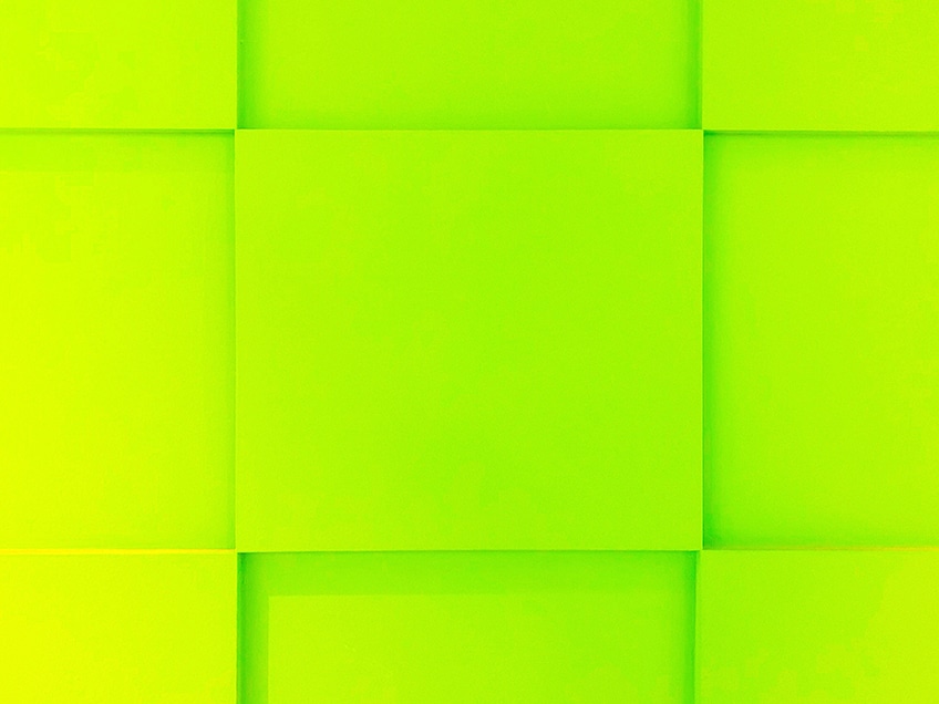
These colors are close to each other and on the same side when looking at the color wheel, are analogous colors. Just like the monochrome colors, the colors offer a harmonious look that is nice to look at. In this case, the analogous colors are shades of yellow and green.
| Shade | Hex Code | CMYK Color Code (%) | RGB Color Code | Color |
| Chartreuse Green | #7fff00 | 50, 0, 100, 0 | 127, 255, 0 | |
| Yellow | #ffff00 | 0, 0, 100, 0 | 255, 255, 0 | |
| Green | #00ff01 | 100, 0, 100, 0 | 0, 255, 1 |
Chartreuse Triadic Colors
Three contrasting colors form a triangle shape that has identical sides on the color wheel. These are similar to the complementary colors and also form great contrasting colors. For this specific chartreuse color combination, you have beautiful rose and azure colors.
| Shade | Hex Code | CMYK Color Code (%) | RGB Color Code | Color |
| Chartreuse Green | #7fff00 | 50, 0, 100, 0 | 127, 255, 0 | |
| Rose | #ff007f | 0, 100, 50, 0 | 255, 0, 127 | |
| Azure | #007fff | 100, 50, 0, 0 | 0, 127, 255 |
Four-Color Combinations
These form shapes on the color wheel as well, which can be seen as a square or rectangle. These colors also form bright contrasts. Four colors are more difficult to work with when forming color combinations. So, it is best to choose one main color and have the rest as accent colors. In the chartreuse tetradic color combination below, not only do you have azure and violet, but now you also have a vibrant orange in the mix.
| Shade | Hex Code | CMYK Color Code (%) | RGB Color Code | Color |
| Chartreuse Green | #7fff00 | 50, 0, 100, 0 | 127, 255, 0 | |
| Orange | #ff8000 | 0, 50, 100, 0 | 255, 128, 0 | |
| Azure | #007fff | 100, 50, 0, 0 | 0, 127, 255 | |
| Violet | #8000ff | 50, 100, 0, 0 | 128, 0, 255 |
How to Make Chartreuse-Color Paint
To make a chartreuse color using acrylic paint, you will need to blend green and yellow, which should produce a green-yellow color. You can then include a tiny amount of white to achieve a chartreuse color. You can adjust the ratios and create a chartreuse color palette, so you have an idea of what to do in the future.
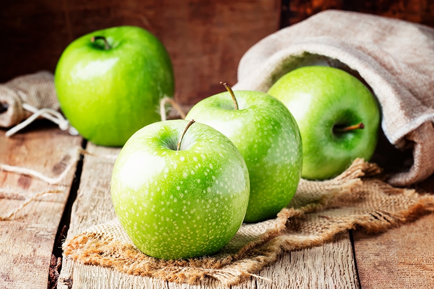
There are some options when deciding on how to make chartreuse colors. You can try out various kinds of green and yellow. For example, you can take one part viridian green paint, which is a green pigment that has a bluish undertone, then mix it with one part lemon yellow and one part cadmium yellow medium. You can add more of the yellow until you have reached the perfect chartreuse color.
Chartreuse Color Palettes for the Home
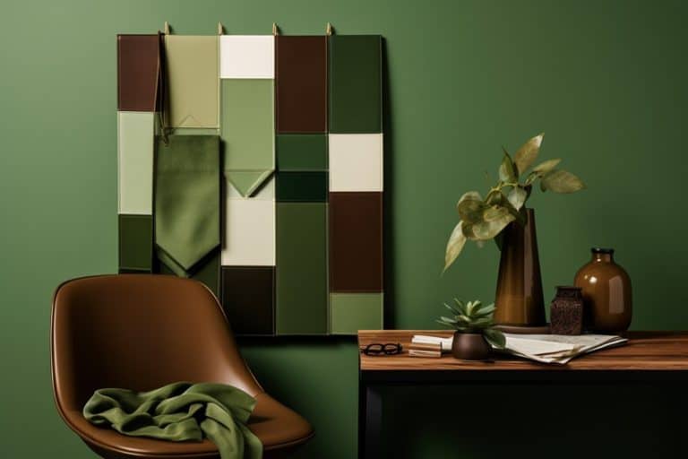
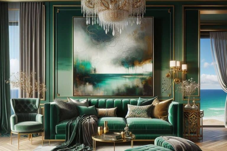
Chartreuse is a vibrant color that is extremely visible, and you can create some striking color combinations. The best way to use the chartreuse color is as an accent color, otherwise, it can become too overwhelming. Experiment with the different tones and shades until you discover the color you are happy with.
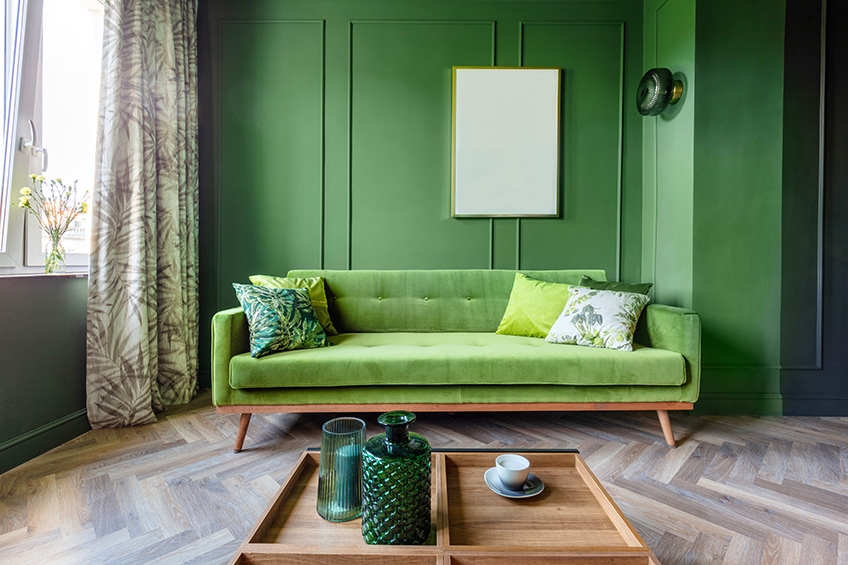
Besides using chartreuse in web design projects, it can also make a beautiful addition to an interior design. You should remember that colors appear differently digitally than as paint. So, always get some paint samples before you go out and purchase any paint.
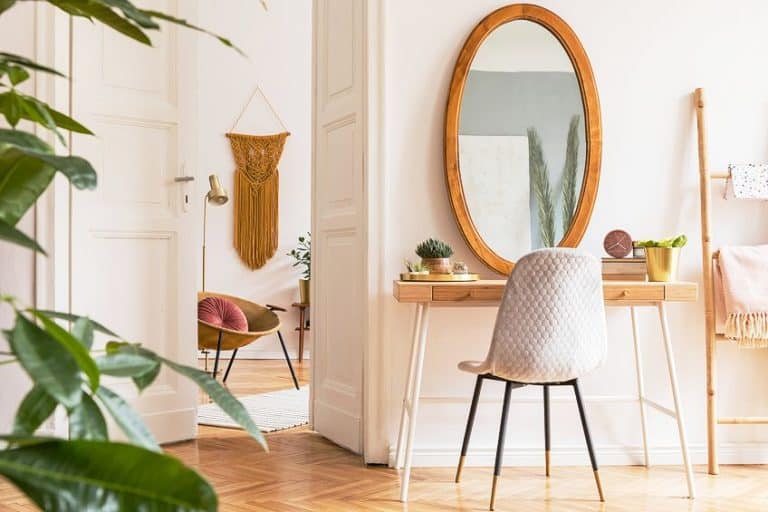
When using the chartreuse color, it depends on how much you want to use. You can paint all the walls, or maybe rather consider an accent wall. You can also simply bring in the color to brighten up a more neutral color scheme. You can do this by using bright pillows, throws, rugs, furniture, or even curtains in chartreuse. For example, gray or navy-blue walls with chartreuse couches.
Also, you do not have to stick to one tone, try incorporating different or muted shades. Lighting can also affect the way a color appears, so consider natural light and other lighting effects when making a decision. The chartreuse color can be used in most rooms in the home, however, if it comes to the bedroom, using a more conservative chartreuse color palette is best, as the color is quite energizing and stimulating. You could also use the color to great effect outside, for example using chartreuse-colored plant boxes.
Conclusion
Chartreuse is a happy and vibrant color and there is a wide range of chartreuse shades. This makes it quite versatile to be used in a variety of project designs from web pages to striking interior design schemes.
Frequently Asked Questions
What Color Is Chartreuse?
The most well-known chartreuse color can be described as a yellow-green color, as it sits in between yellow and green on the color wheel. However, various shades range from more green to others being more yellow.
What Colors Go With Chartreuse?
The best colors that go with chartreuse are neutral colors, mainly white as well as gray and black. However, there is also navy blue, and pale lavender that works great with chartreuse. The only thing to remember is what shade of chartreuse you are dealing with. Various shades of purple and even red can also go with chartreuse.
What Colors are Close to Chartreuse?
Since chartreuse can have more green or yellow, it does provide more color options. Colors that are close to chartreuse include other bright colors like lime or apple green. Other more subtle chartreuse colors include avocado or pistachio green.
In 2005, Charlene completed her Wellness Diplomas in Therapeutic Aromatherapy and Reflexology from the International School of Reflexology and Meridian Therapy. She worked for a company offering corporate wellness programs for a couple of years, before opening up her own therapy practice. It was in 2015 that a friend, who was a digital marketer, asked her to join her company as a content creator, and this is where she found her excitement for writing.
Since joining the content writing world, she has gained a lot of experience over the years writing on a diverse selection of topics, from beauty, health, wellness, travel, and more. Due to various circumstances, she had to close her therapy practice and is now a full-time freelance writer. Being a creative person, she could not pass up the opportunity to contribute to the Art in Context team, where is was in her element, writing about a variety of art and craft topics. Contributing articles for over three years now, her knowledge in this area has grown, and she has gotten to explore her creativity and improve her research and writing skills.
Charlene Lewis has been working for artincontext.org since the relaunch in 2020. She is an experienced writer and mainly focuses on the topics of color theory, painting and drawing.
Learn more about Charlene Lewis and the Art in Context Team.
Cite this Article
Charlene, Lewis, “Chartreuse Color – What Color is Chartreuse?.” Art in Context. October 31, 2022. URL: https://artincontext.org/chartreuse-color/
Lewis, C. (2022, 31 October). Chartreuse Color – What Color is Chartreuse?. Art in Context. https://artincontext.org/chartreuse-color/
Lewis, Charlene. “Chartreuse Color – What Color is Chartreuse?.” Art in Context, October 31, 2022. https://artincontext.org/chartreuse-color/.


