Shades of Green Color – The 100 Must-See Tones
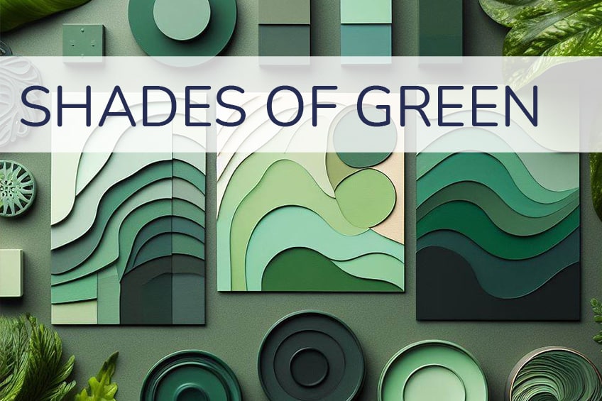
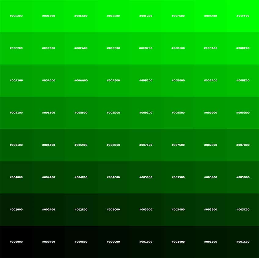
Because chlorophyll is green and supplies plants with their pigments, green is one of the most prevalent colors in the natural world. In fact, green is the color that most suitably symbolizes the natural world in art. Green, in all its many shades, sees extensive use in artworks of all kinds. We’ve created a curated list with 100 green shades, including visualization, description, and all color codes for you.
Most Popular Shades of Green
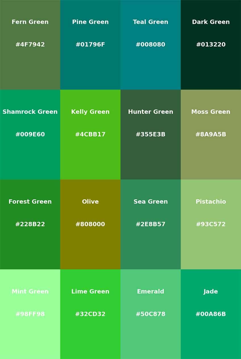
If you’re searching for a particular shade of green that’s on the tip of your tongue, or if you need to pair colors perfectly for your design project or website, you’ll discover a vast array of choices available – many of which might be new to you. Below is a selection of green hues, complete with their names and corresponding Hex, RGB, and CMYK color codes.
Acid Green
A vibrant, fluorescent green, reminiscent of acidic substances. It’s electric and eye-catching, often used in fashion for a bold statement.
| Hex: #B0BF1A RGB: 176, 191, 26 CMYK: 8, 0, 86, 25 |
Amazon
A deep, jungle green, echoing the lushness of the Amazon rainforest. It’s rich and earthy, suitable for natural-themed designs.
| Hex: #3B7A57 RGB: 59, 122, 87 CMYK: 52, 0, 29, 52 |
Android Green
The brand color of the Android operating system, this is a medium shade of green, signifying innovation and technology.
| Hex: #A4C639 RGB: 164, 198, 57 CMYK: 17, 0, 71, 22 |
Apple Green
A light, bright green with a youthful and fresh appeal. It’s reminiscent of the skin of Granny Smith apples.
| Hex: #8DB600 RGB: 141, 182, 0 CMYK: 23, 0, 100, 29 |
Army Green
A dark olive green, commonly associated with military uniforms. It evokes strength and reliability.
| Hex: #4B5320 RGB: 75, 83, 32 CMYK: 10, 0, 61, 67 |
Artichoke Green
A muted, grayish-green, similar to the color of an artichoke. It’s sophisticated and subdued.
| Hex: #8F9779 RGB: 143, 151, 121 CMYK: 5, 0, 20, 41 |
Avocado
A creamy, pale green, resembling the inside of an avocado. It’s natural and calming.
| Hex: #568203 RGB: 86, 130, 3 CMYK: 34, 0, 98, 49 |
Bitter Lemon
A sharp, vivid yellow-green, similar to the rind of a bitter lemon. It’s zesty and energetic.
| Hex: #CAE00D RGB: 202, 224, 13 CMYK: 10, 0, 94, 12 |
Blue Green Color Wheel
A green with a significant blue undertone. It’s a cool and serene shade, often found in color wheel representations.
| Hex: #064E40 RGB: 6, 78, 64 CMYK: 92, 0, 18, 69 |
Bottle Green
A dark shade of green, similar to traditional green glass bottles. It’s classic and elegant.
| Hex: #006A4E RGB: 0, 106, 78 CMYK: 100, 0, 26, 58 |
Bright Green
A high-saturation, vivid green. It’s lively and attention-grabbing, often used in design to signify energy.
| Hex: #66FF00 RGB: 102, 255, 0 CMYK: 60, 0, 100, 0 |
British Racing Green
A deep, rich green traditionally used in the livery of British racing cars. It’s associated with heritage and prestige.
| Hex: #004225 RGB: 0, 66, 37 CMYK: 100, 0, 44, 74 |
Brunswick Green
A dark, muted green with a touch of gray. It’s a traditional color, often seen in historical contexts.
| Hex: #1B4D3E RGB: 27, 77, 62 CMYK: 65, 0, 19, 70 |
Bud Green
A soft, spring-like green, reminiscent of new plant buds. It’s fresh and invigorating.
| Hex: #7BB661 RGB: 123, 182, 97 CMYK: 32, 0, 47, 29 |
Cadmium Green
A blend of blue and yellow, producing a deep, intense green. It’s often used in painting for its rich pigment.
| Hex: #006B3C RGB: 0, 107, 60 CMYK: 100, 0, 44, 58 |
Caribbean Green
A bright, tropical green, evocative of Caribbean waters. It’s playful and vibrant.
| Hex: #00CC99 RGB: 0, 204, 153 CMYK: 100, 0, 25, 20 |
Castleton Green
Named after Castleton University, this is a deep, sophisticated green, embodying tradition and academia.
| Hex: #00563F RGB: 0, 86, 63 CMYK: 100, 0, 27, 66 |
Celadon
A pale, grayish green, inspired by Chinese ceramics. It’s elegant and subtle.
| Hex: #ACE1AF RGB: 172, 225, 175 CMYK: 24, 0, 22, 12 |
Charleston Green
Almost black, Charleston Green is a very dark green, originating from the American South. It’s somber and mysterious.
| Hex: #232B2B RGB: 35, 43, 43 CMYK: 19, 0, 0, 83 |
Dark Green
A classic, deep green, evoking the depths of a forest. It’s strong and grounding.
| Hex: #013220 RGB: 1, 50, 32 CMYK: 98, 0, 36, 80 |
Dark Jungle Green
A very dark, almost black-green, resembling the dense foliage of a jungle at night. It’s mysterious and deep.
| Hex: #1A2421 RGB: 26, 36, 33 CMYK: 28, 0, 8, 86 |
Dark Moss Green
A rich, earthy green, similar to the color of damp moss. It’s natural and calming.
| Hex: #4A5D23 RGB: 74, 93, 35 CMYK: 20, 0, 62, 64 |
Dark Olive Green
A dark, muted green with a significant olive tone. It’s sophisticated and earthy.
| Hex: #556B2F RGB: 85, 107, 47 CMYK: 21, 0, 56, 58 |
Dark Pastel Green
A muted, soft green with a pastel tone. It’s gentle and soothing.
| Hex: #03C03C RGB: 3, 192, 60 CMYK: 98, 0, 69, 25 |
Dark Sea Green
A medium to dark green with gray undertones, reminiscent of a stormy sea. It’s moody and intense.
| Hex: #8FBC8F RGB: 143, 188, 143 CMYK: 24, 0, 24, 26 |
Dark Spring Green
A fresh, vibrant green that symbolizes the new growth of spring. It’s rejuvenating and lively, often used in designs that emphasize renewal and vitality.
| Hex: #177245 RGB: 23, 114, 69 CMYK: 80, 0, 39, 55 |
Dartmouth Green
Official color of Dartmouth College, this is a medium-dark green, representing tradition and prestige.
| Hex: #00703C RGB: 0, 112, 60 CMYK: 100, 0, 46, 56 |
Deep Jungle Green
A very dark, rich green, evoking the depth and mystery of the jungle. It’s immersive and intense.
| Hex: #004B49 RGB: 0, 75, 73 CMYK: 100, 0, 3, 71 |
Electric Green
A bright, neon green, highly saturated and vivid. It’s energizing and futuristic.
| Hex: #00FF00 RGB: 0, 255, 0 CMYK: 100, 0, 100, 0 |
Emerald Green
A bright, vivid green, named after the precious gemstone. It’s luxurious and radiant.
| Hex: #50C878 RGB: 80, 200, 120 CMYK: 60, 0, 40, 22 |
Eton Green
Associated with Eton College, this is a deep, sophisticated green, representing heritage and education.
| Hex: #96C8A2 RGB: 150, 200, 162 CMYK: 25, 0, 19, 22 |
Fern Green
A medium green resembling fern leaves. It’s natural and refreshing.
| Hex: #4F7942 RGB: 79, 121, 66 CMYK: 35, 0, 45, 53 |
Forest Green
A dark, dense green, reminiscent of the deep, shaded areas of a forest. It’s grounding and tranquil.
| Hex: #014421 RGB: 1, 68, 33 CMYK: 99, 0, 51, 73 |
French Lime
A bright, acidic green with a yellowish tone. It’s lively and effervescent.
| Hex: #9EFD38 RGB: 158, 253, 56 CMYK: 38, 0, 78, 1 |
Go Green
A vivid, energetic green, often associated with environmental movements. It’s motivating and positive.
| Hex: #00AB66 RGB: 0, 171, 102 CMYK: 100, 0, 40, 33 |
Granny Smith Apple
A light, vibrant green, similar to the skin of the Granny Smith apple. It’s fresh and crisp.
| Hex: #A8E4A0 RGB: 168, 228, 160 CMYK: 26, 0, 30, 11 |
Green Munsell
Based on the Munsell color system, this is a balanced, medium green. It’s standardized and consistent.
| Hex: #00A877 RGB: 0, 168, 119 CMYK: 100, 0, 29, 34 |
Green Cyan
A green with a strong blue undertone, giving it a cool, aquatic feel. It’s refreshing and modern.
| Hex: #009966 RGB: 0, 153, 102 CMYK: 100, 0, 33, 40 |
Green Lizard
A bright, vivid green with a slightly yellowish tone. It’s playful and dynamic.
| Hex: #A7F432 RGB: 167, 244, 50 CMYK: 32, 0, 80, 4 |
Green Sheen
A pale, yellow-green, with a shimmery, lustrous quality. It’s delicate and light.
| Hex: #6EAEA1 RGB: 110, 174, 161 CMYK: 37, 0, 7, 32 |
Harlequin
A bright, neon green, striking and highly visible. It’s theatrical and bold.
| Hex: #3FFF00 RGB: 63, 255, 0 CMYK: 75, 0, 100, 0 |
Hunter Green
A dark, muted green, commonly used in hunting attire. It’s traditional and natural.
| Hex: #355E3B RGB: 53, 94, 59 CMYK: 44, 0, 37, 63 |
India Green
A deep, rich green, featured in the lower band of the Indian national flag. It symbolizes fertility and prosperity.
| Hex: #138808 RGB: 19, 136, 8 CMYK: 86, 0, 94, 47 |
Jade Green
A medium, slightly bluish green, reminiscent of jade gemstones. It’s serene and sophisticated.
| Hex: #00A86B RGB: 0, 168, 107 CMYK: 100, 0, 36, 34 |
Jungle Green
A deep, tropical green, evoking the lushness of a rainforest. It’s vibrant and immersive.
| Hex: #29AB87 RGB: 41, 171, 135 CMYK: 76, 0, 21, 33 |
Kelly Green
A bright, pure green, named after the common Irish family name. It’s lively and festive.
| Hex: #4CBB17 RGB: 76, 187, 23 CMYK: 59, 0, 88, 27 |
Kombu Green
A dark, seaweed green, named after the Japanese kelp. It’s deep and organic.
| Hex: #354230 RGB: 53, 66, 48 CMYK: 20, 0, 27, 74 |
Laurel Green
A pale, muted green, like the leaves of the laurel plant. It’s soft and understated.
| Hex: #A9BA9D RGB: 169, 186, 157 CMYK: 9, 0, 16, 27 |
Lawn Green
A bright, fresh green, similar to well-maintained grass. It’s lively and natural.
| Hex: #7CFC00 RGB: 124, 252, 0 CMYK: 51, 0, 100, 1 |
Light Green
A soft, pale green, easy on the eyes and calming. It’s gentle and soothing.
| Hex: #90EE90 RGB: 144, 238, 144 CMYK: 39, 0, 39, 7 |
Light Sea Green
A medium green with a significant blue component, reminiscent of shallow seas. It’s refreshing and tranquil.
| Hex: #20B2AA RGB: 32, 178, 170 CMYK: 82, 0, 4, 30 |
Lincoln Green
Historically worn by Robin Hood, this is a rich, medium green. It’s associated with folklore and adventure.
| Hex: #195905 RGB: 25, 89, 5 CMYK: 72, 0, 94, 65 |
Malachite
A vibrant, striated green, similar to the malachite gemstone. It’s luxurious and dynamic.
| Hex: #0BDA51 RGB: 11, 218, 81 CMYK: 95, 0, 63, 15 |
Mantis
A light to medium green, resembling the color of a praying mantis. It’s natural and subtle.
| Hex: #74C365 RGB: 116, 195, 101 CMYK: 41, 0, 48, 24 |
Maximum Green
A deep, saturated green, representing the maximum intensity of the color in the spectrum. It’s bold and vivid.
| Hex: #5E8C31 RGB: 94, 140, 49 CMYK: 33, 0, 65, 45 |
Maximum Green Yellow
A bright green with a strong yellow undertone, highly saturated and vibrant. It’s energetic and cheerful.
| Hex: #D9E650 RGB: 217, 230, 80 CMYK: 6, 0, 65, 10 |
May Green
A fresh, spring green, reminiscent of new leaves in May. It’s rejuvenating and bright.
| Hex: #4C9141 RGB: 76, 145, 65 CMYK: 48, 0, 55, 43 |
Medium Aquamarine
A medium green with a significant blue component, like the aquamarine gemstone. It’s serene and refreshing.
| Hex: #66DDAA RGB: 102, 221, 170 CMYK: 54, 0, 23, 13 |
Medium Sea Green
A medium-dark green with grayish tones, evoking the color of the sea. It’s tranquil and balanced.
| Hex: #3CB371 RGB: 60, 179, 113 CMYK: 66, 0, 37, 30 |
Medium Spring Green
A vibrant, medium green with a slight blue undertone. It’s refreshing and lively.
| Hex: #00FA9A RGB: 0, 250, 154 CMYK: 100, 0, 38, 2 |
Michigan State University Green
The official green of MSU, this is a deep, rich green, embodying school spirit and tradition.
| Hex: #18453B RGB: 24, 69, 59 CMYK: 65, 0, 14, 73 |
Middle Blue Green
A balanced green with a noticeable blue component, creating a cool and soothing effect. It’s harmonious and serene.
| Hex: #8DD9CC RGB: 141, 217, 204 CMYK: 35, 0, 6, 15 |
Middle Green
A standard, medium green, neither too dark nor too light. It’s balanced and natural.
| Hex: #4D8C57 RGB: 77, 140, 87 CMYK: 45, 0, 38, 45 |
Midnight Green
A very dark, almost black green, reminiscent of the night sky. It’s mysterious and deep.
| Hex: #004953 RGB: 0, 73, 83 CMYK: 100, 12, 0, 67 |
Mint Green
A pale, refreshing green, like mint leaves. It’s light and invigorating.
| Hex: #98FB98 RGB: 152, 251, 152 CMYK: 39, 0, 39, 2 |
Moss Green
A medium, earthy green, similar to the color of moss. It’s natural and grounding.
| Hex: #8A9A5B RGB: 138, 154, 91 CMYK: 51, 0, 100, 1 |
Myrtle Green
A dark, bluish-green, named after the myrtle plant. It’s rich and sophisticated.
| Hex: #317873 RGB: 49, 120, 115 CMYK: 59, 0, 4, 53 |
Neon Green
A highly saturated, bright green, similar to neon lights. It’s electric and attention-grabbing.
| Hex: #39FF14 RGB: 57, 255, 20 CMYK: 78, 0, 92, 0 |
Ocean Green
A deep, blue-green, reminiscent of the ocean’s depths. It’s mysterious and calming.
| Hex: #48BF91 RGB: 72, 191, 145 CMYK: 62, 0, 24, 25 |
Olive Green
A muted, earthy green with a brownish tone, like olives. It’s natural and subdued.
| Hex: #708238 RGB: 112, 130, 56 CMYK: 14, 0, 57, 49 |
Pakistan Green
A dark, rich green, used in the national flag of Pakistan. It symbolizes Islam and prosperity.
| Hex: #006600 RGB: 0, 102, 0 CMYK: 100, 0, 100, 60 |
Paolo Veronese Green
Named after the Renaissance painter, this is a rich, deep green. It’s artistic and historical.
| Hex: #009B7D RGB: 0, 155, 125 CMYK: 100, 0, 19, 39 |
Paris Green
A bright, slightly bluish green, historically used in paintings. It’s vibrant and classic.
| Hex: #50C878 RGB: 80, 200, 120 CMYK: 60, 0, 40, 22 |
Persian Green
A medium, bluish green, evoking the richness of Persian art and culture. It’s elegant and exotic.
| Hex: #00A693 RGB: 0, 166, 147 CMYK: 100, 0, 11, 35 |
Phthalo Green
A dark, intense blue-green, widely used in artists’ paints. It’s vibrant and deep.
| Hex: #123524 RGB: 18, 53, 36 CMYK: 66, 0, 32, 79 |
Pine Green
A deep, rich green, reminiscent of pine forests. It evokes a sense of tranquility and natural beauty, often used in designs to convey stability and endurance.
| Hex: #01796F RGB: 1, 121, 111 CMYK: 99, 0, 8, 53 |
Pistachio
A light, soft green akin to the pale green of a pistachio nut’s shell. It’s fresh and airy, perfect for creating a soothing and calm ambiance.
| Hex: #93C572 RGB: 147, 197, 114 CMYK: 25, 0, 42, 23 |
Russian Green
A muted, grayish-green, reflective of the lush landscapes of Russia. It’s versatile and understated, suitable for elegant and timeless designs.
| Hex: #679267 RGB: 103, 146, 103 CMYK: 29, 0, 29, 43 |
Sacramento State Green
A vibrant, medium green that is both lively and earthy. It represents vitality and growth, commonly used in branding and sports uniforms.
| Hex: #043927 RGB: 4, 57, 39 CMYK: 93, 0, 32, 78 |
Sage Green
A gray-green resembling the herb, sage. This calming, neutral color is often associated with wisdom and sophistication.
| Hex: #BCB88A RGB: 188, 184, 138 CMYK: 0, 2, 27, 26 |
Sap Green
A yellowish-green, similar to the color of plant sap. It’s a natural and lively color, often used in artwork to depict foliage and landscapes.
| Hex: #507D2A RGB: 80, 125, 42 CMYK: 36, 0, 66, 51 |
Screamin Green
An intense, vivid green with a neon-like quality. It’s eye-catching and energetic, perfect for designs that aim to stand out.
| Hex: #66FF66 RGB: 102, 255, 102 CMYK: 60, 0, 60, 0 |
Sea Green
A medium to light green with a hint of blue, reminiscent of shallow seawater. It’s calming and refreshing, often used in spaces intended to relax.
| Hex: #2E8B57 RGB: 46, 139, 87 CMYK: 67, 0, 37, 45 |
Sea Green Crayola
A softer, more pastel version of sea green, with a playful and youthful vibe. It’s commonly found in children’s products and whimsical designs.
| Hex: #00FFCD RGB: 0, 255, 205 CMYK: 100, 0, 20, 0 |
Shamrock Green
A bright, vibrant green associated with the lushness of shamrocks and Irish culture. It’s lively and invigorating, often used in festive designs.
| Hex: #009E60 RGB: 0, 158, 96 CMYK: 100, 0, 39, 38 |
Sheen Green
A unique green with a shiny, almost metallic quality. It’s modern and sleek, ideal for futuristic or high-tech themes.
| Hex: #8FD400 RGB: 143, 212, 0 CMYK: 33, 0, 100, 17 |
Slimy Green
A bold, somewhat lurid green, reminiscent of cartoon slime. It’s playful and unusual, often used in fun and quirky contexts.
| Hex: #299617 RGB: 41, 150, 23 CMYK: 73, 0, 85, 41 |
Spanish Green
A deep, rich green with a hint of blue, reflective of the lush landscapes of Spain. It’s elegant and sophisticated, perfect for luxurious designs.
| Hex: #009150 RGB: 0, 145, 80 CMYK: 100, 0, 45, 43 |
Spring Green
A fresh, vibrant green that symbolizes the new growth of spring. It’s rejuvenating and lively, often used in designs that emphasize renewal and vitality.
| Hex: #00FF7F RGB: 0, 255, 127 CMYK: 100, 0, 50, 0 |
Tea Green
A pale, muted green similar to the color of green tea. It’s subtle and soothing, ideal for creating a calm and relaxing atmosphere.
| Hex: #D0F0C0 RGB: 208, 240, 192 CMYK: 13, 0, 20, 6 |
Tropical Rainforest
A deep, lush green that captures the essence of a rainforest’s verdant beauty. It’s rich and exotic, perfect for themes related to nature and adventure.
| Hex: #00755E RGB: 0, 117, 94 CMYK: 100, 0, 20, 54 |
Turquoise Green
A blend of green and blue, resembling the colors of tropical seas. It’s vibrant and refreshing, often used in designs that evoke a sense of escape and tranquility.
| Hex: #A0D6B4 RGB: 160, 214, 180 CMYK: 25, 0, 16, 16 |
Viridian Green
A deep, bluish-green, named after the pigment. It’s a classic and versatile shade, often used in art and interior design.
| Hex: #009698 RGB: 0, 150, 152 CMYK: 100, 1, 0, 40 |
Volt
A bright, electric green with a high-energy, modern feel. It’s striking and bold, commonly used in sports and tech industries.
| Hex: #CEFF00 RGB: 206, 255, 0 CMYK: 19, 0, 100, 0 |
Wintergreen Dream
A cool, minty green that evokes the refreshing scent of wintergreen. It’s crisp and invigorating, perfect for designs that aim to be fresh and clean.
| Hex: #56887D RGB: 86, 136, 125 CMYK: 37, 0, 8, 47 |
Yellow Green
A green with a significant amount of yellow, bright and lively. It’s cheerful and spring-like, often used in playful and youthful designs.
| Hex: #9ACD32 RGB: 154, 205, 50 CMYK: 25, 0, 76, 20 |
Yellow Green Color Wheel
A variation of yellow-green that is specifically calibrated for color wheel use. It’s balanced and harmonious, suitable for artistic and educational applications.
| Hex: #30B21A RGB: 48, 178, 26 CMYK: 73, 0, 85, 30 |
Zomp
A unique blend of blue and green, striking and deep. It’s reminiscent of the ocean’s depths and is often used in designs that want to capture a sense of mystery and intrigue.
| Hex: #39A78E RGB: 57, 167, 142 CMYK: 66, 0, 15, 35 |
The Shades of Green Color in Interior Decoration
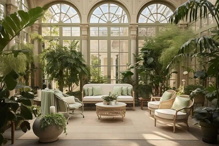
If you will recall, the most common symbolic and psychological associations that we make with green colors have to do with nature, good well-being, Zen, and peace. These sorts of themes make green a great color for homeowners to use when decorating their households. Greens are not only great at bringing the outdoors into the home space, but they can also provide a space with a relaxing atmosphere. Whether being used as accenting along the frames of walls or as a feature, shades of green are a natural fit in any home.
While green works for all sorts of rooms in the average household, it is most effective as a focal element in the living room where it can create an inviting atmosphere that is both calming and energizing. If you have bare white surfaces in your household, you can soften out the starkness using green as an accenting color. Green does not only work for surfaces, however, since it looks great on furniture and décor as well. Pot plants, for example, bring a charming element of green into the indoor space.
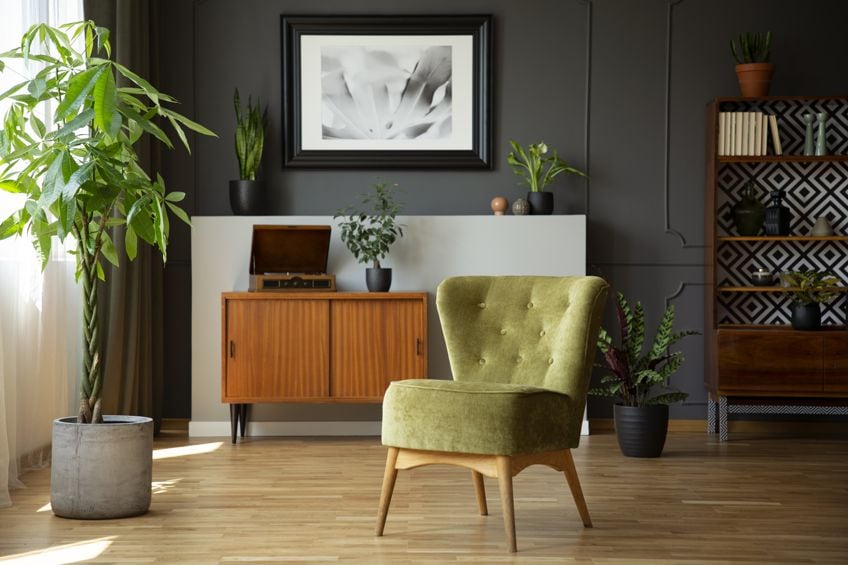
Green is widely used as a color choice when putting together tranquil living spaces.
Another fantastic attribute of greens is their versatility. Greens can be relaxing and calming while also still being stimulating. This multi-atmospheric quality of green colors makes them great choices when designing a space meant to be used for both work and relaxation. Since households are typically where relaxation and work tend to intersect for most people, the color green is a natural fit for decoration.
For dining rooms and kitchen spaces, green is a natural fit given its close association with fresh produce. More so, studies have shown that the color green can stimulate hunger and appetite which makes it even more suitable for these areas. If you are using green in your kitchen or dining room, adding yellows and oranges can provide the rooms with more warmth.
This all being said, it is not even entirely necessary for you to paint the walls or furniture of your house to introduce green into the palette. You can instead invest in some green décor, crockery, cutlery, or devices. Green boasts enough versatility for you to experiment with your use of the color inside your home. But if you are interested in learning more about how to pair your shades of green, below are a few popular examples.
Our Complicated History With the Color Green
The color green has a complex history, symbolizing both the vitality of nature and the threat of toxicity. This dual symbolism has roots in early human interactions with the natural world, where the dangers of venomous creatures like the eastern green mamba were learned through perilous experiences. In human history, the quest to produce green pigments has often led to the use of harmful chemicals, causing widespread illness.
Ancient civilizations, lacking modern medical knowledge, pursued the creation of green paint despite the risks. This was partly due to the rarity of natural green pigments, as most were derived from minerals. The Ancient Egyptians, for instance, used malachite with a high copper content to create green, symbolizing rebirth and renewal, though the color tarnished over time.
During the Roman Empire, a safer green pigment called Verdigris was developed by soaking copper plates in red wine, but this method was expensive and labor-intensive. In the Renaissance, green began to symbolize affluence and intelligence, but the pigments, derived from plants, were not durable.
The 18th century saw a worsening of the situation with the creation of Scheele Green by Carl Wilhelm Scheele. This popular pigment contained toxic chemicals like acidic copper arsenite, leading to widespread health issues. It was used in various products, including wallpapers and toys, and is believed to have caused numerous deaths, including that of Napoleon Bonaparte due to arsenite exposure.
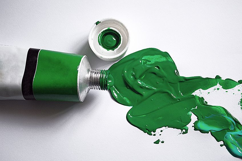
Famous painters like Renoir and Monet also suffered from the toxic effects of green paints, with Monet’s loss of sight partly attributed to them. Despite its popularity, Scheele Green was unstable and corrosive. By the 19th century, it fell out of fashion, and safer methods of producing green shades were developed.
Green in Modern Times
In today’s world, most shades of green color remain a potent symbol of nature. Notably, the green color palette dominates in terms of the colors that are most closely associated with environmentalism, and global warming activism.
The term “go green” is used to describe the intentions and sentiments of those who advocate for the protection of the natural environment.
Nevertheless, there are still many pigments of green that we still use to this day that, although they are not as lethal as Scheele, still contain chemicals with toxic qualities. There is a green color used commonly in plastic and paper materials, called Pigment Green 7, that contains chlorine and could cause health issues if ingested. And this is far from the only example.
In spite of our prevailing problems with green paint, the color has not lost its potency as a symbol of well-being, rejuvenation, and vitality within cultures from all across the world. This is, of course, largely a result of the cultural values we have inherited through the ages. In Islam, the color green is a powerful symbol and color found throughout the religion’s symbolic motifs. For the Irish, green is not only their national color but also the color flown and worn on St. Patrick’s Day.
Congratulations on making it this far. Hopefully, we have dispensed some information that, no matter where you are currently in your artistic journey, you have found to be useful. We hope that you found the section on our perilous relationship with green in art interesting and maybe even a bit entertaining. The last thing we want to do is dissuade you from going near green paint ever again. We encourage you to use this information simply as a basic introduction and reference guideline for working with shades of green color. More so than anything, you should experiment with the color in your own time until you figure out what works best for you and the sorts of projects you are working with – be it through trial and error or otherwise.
Frequently Asked Questions
Why Is Scheele Green Dangerous?
Scheele green was a shade of green created by Swedish Chemist Carl Wilhelm Scheele in the 18th century which saw frequent use until the mid-19th century when it was discovered to be incredibly harmful. The pigment of this paint contained toxic arsenite chemicals which we now know to cause numerous chronic diseases, including cancer.
What Is the Most Popular Shade of Green?
Given that it was voted the most popular shade of green in 2021, it is fair to say that sage green takes the top spot in this regard. Sage is an earthy grey-green color that takes its namesake from the similarly colored herb we use for seasoning in cooking. It is a muted color that works well on interior walls inside rooms intended for relaxing activities. The earthier shades of most colors will pair well with sage green.
In 2005, Charlene completed her Wellness Diplomas in Therapeutic Aromatherapy and Reflexology from the International School of Reflexology and Meridian Therapy. She worked for a company offering corporate wellness programs for a couple of years, before opening up her own therapy practice. It was in 2015 that a friend, who was a digital marketer, asked her to join her company as a content creator, and this is where she found her excitement for writing.
Since joining the content writing world, she has gained a lot of experience over the years writing on a diverse selection of topics, from beauty, health, wellness, travel, and more. Due to various circumstances, she had to close her therapy practice and is now a full-time freelance writer. Being a creative person, she could not pass up the opportunity to contribute to the Art in Context team, where is was in her element, writing about a variety of art and craft topics. Contributing articles for over three years now, her knowledge in this area has grown, and she has gotten to explore her creativity and improve her research and writing skills.
Charlene Lewis has been working for artincontext.org since the relaunch in 2020. She is an experienced writer and mainly focuses on the topics of color theory, painting and drawing.
Learn more about Charlene Lewis and the Art in Context Team.
Cite this Article
Charlene, Lewis, “Shades of Green Color – The 100 Must-See Tones.” Art in Context. October 13, 2022. URL: https://artincontext.org/shades-of-green-color/
Lewis, C. (2022, 13 October). Shades of Green Color – The 100 Must-See Tones. Art in Context. https://artincontext.org/shades-of-green-color/
Lewis, Charlene. “Shades of Green Color – The 100 Must-See Tones.” Art in Context, October 13, 2022. https://artincontext.org/shades-of-green-color/.


