Bordeaux Color – What Color is Bordeaux?
The world of color can become very confusing at times, as there are so many different shades and hues, so we need to understand these colors to be able to apply them in our art. Take the color, Bordeaux, for example, it can be many different shades from a light Bordeaux color to a dark red. So, to get a better understanding, let us take a closer look.
What Color is Bordeaux?
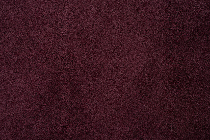
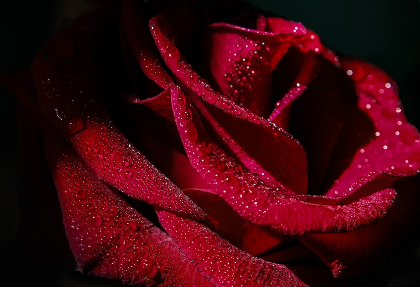
The color Bordeaux is a somber and deep shade of red and is also often referred to as maroon, burgundy, or even claret. It is a dark and shaded Merlot red color that has oaky undertones and is an ideal color for painting your dining room, entrance hall, and front door, as it makes a bold statement when entering your home.
| Bordeaux Shade | Hex Code | CMYK Color Code (%) | RGB Color Code | Bordeaux Color |
| Bordeaux | #4c1c24 | 0, 63, 53, 70 | 76, 28, 36 |
Bordeaux Color: A Brief History
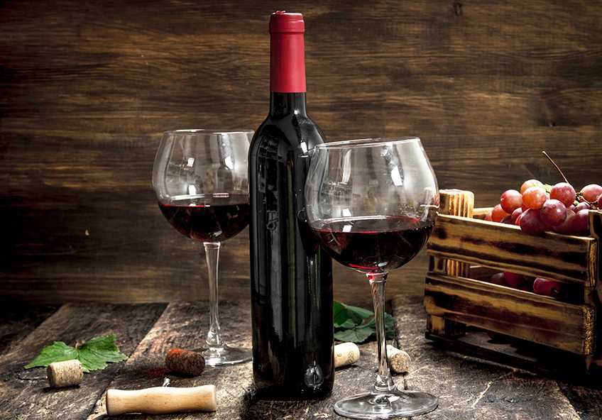
The color Bordeaux officially obtained its name in 1891 in honor of a French wine called Bordeaux, which has a very dark red color, similar to other wines produced such as cabernet and merlot. Before this, the Russians used the word chermny, which describes this shade of red. Ancient rulers or emperors often wore a burgundy color as their official shade or hue to display their status or office. It is a bit difficult to pinpoint the Bordeaux color in paintings, although some famous paintings using this shade include the French Riverscape (1829) by Peraire Paul Emmanuel and Rolla (1876) by Henri Gervex.
Meaning of the Bordeaux Color
The color Bordeaux signifies an opaque dark-red color, with a touch of purple. The color is named after the Bordeaux wine, which originated in France and has a very long history associated with the world of wines.
From one perspective, Bordeaux’s color shows the majesty and power of red, and on the other hand, it shows the joyfulness of yellow and the calm of dark blue. Bordeaux absorbs the quality of all the primary colors revealing a bright character, and expressing respectability, dignity as well as power. The color also adds a touch of Christmas to the holidays, and as such, most of the traditional decorations depicting the new year are very often a shade of Bordeaux.
Appreciation for the color of Bordeaux expresses, stability, confidence, and excellent organizational skills. However, when applied excessively, it begins to reveal depression and heaviness. It is a very elegant and sober color signifying love, passion, sensuality, and vigor, and is a popular autumn color where home décor and clothing are concerned.
Shades of Bordeaux
There are many different shades of Bordeaux from light to dark Bordeaux. Bordeaux has also been referred to as Burgundy, claret, or maroon. Here are some colors that are closely related to Bordeaux:

Burgundy
Burgundy is a shade of Bordeaux that has a reddish-brown hue, inspired by a French wine of the same name, and can be made by mixing red and a dash of blue and green, resulting in purple and brown overtones. Burgundy is more refined than true red and symbolizes power, ambition, and wealth.
| Bordeaux Shade | Hex Code | CMYK Color Code (%) | RGB Color Code | Bordeaux Color |
| Burgundy | #800020 | 0, 100, 75, 50 | 128, 0, 32 |
Carmine
The color carmine is a deep vivid red with a slightly purplish tone. However, is closer to red than it is to crimson, and some rubies have the color of a rich deep carmine. Carmine dye is a natural extract that comes from the crushed shells of the female cochineal insect and is often used to color strawberry yogurt, designer drinks, candy, and different shades of lipstick.
| Bordeaux Shade | Hex Code | CMYK Color Code (%) | RGB Color Code | Bordeaux Color |
| Carmine | #d70040 | 0, 100, 70, 16 | 215, 0, 64 |

Claret
Claret is a rich, deep, and dark shade of red, and is often referred to as Bordeaux. It can be acquired by mixing red and black, and due to its many shades, is often used in winter and autumn color schemes. Claret represents nobility and is often found in women’s clothing and cosmeics, and can also be applied in your home using dark or lighter tones.
| Bordeaux Shade | Hex Code | CMYK Color Code (%) | RGB Color Code | Bordeaux Color |
| Claret | #811331 | 0, 85, 62, 49 | 129, 19, 49 |
Maroon
Maroon has a deep red hue, and it can show up as brown in different designs. Maroon can be combined with various deep colors like dark purple and navy blue, giving it a very mysterious and intense effect. Maroon can also be mixed with peach or amber, giving you a much bolder color combination. Maroon is also coupled with passion, depth, and force due to its very dark quality, and also arouses sentiments of wisdom and spirituality due to the color’s intimate relationship with Buddhism.
| Bordeaux Shade | Hex Code | CMYK Color Code (%) | RGB Color Code | Bordeaux Color |
| Maroon | #800000 | 0, 100, 100, 50 | 128, 0, 0 |
What Colors Go With Bordeaux?
When combining colors with Bordeaux, you will find red expresses tranquility and power, dark blue gives a burst of enthusiasm, and yellow brings out a cheerful atmosphere. In fashion, the Bordeaux hue pairs well with olive, black, tomato, gray, and most shades of red, and it provides a great balance to most berry tones, such as blueberries, blackberries, and elderberries.
Other colors that give a well-balanced combination with Bordeaux are pink, brown, ultramarine, blue-green, turquoise, orange, Umber, and coral. The numerous color combinations that go with Bordeaux are as follows.
Bordeaux Complementary Colors
Many people seem to be confused with the term “complementary” as it means appreciative, approving, harmonizing, and supportive in the English language. However, when it is about colors, it can also mean opposite or contrasting. This means that complementary colors face one another on the color wheel.
When talking about pigments and paint and mixing these colors, they tend to cancel each other out. If you mix paints with them, you will produce a more muted color, which can be gray or muddy brown.
This type of combination gives you a high impact and contrasting colors that appear to be more prominent and brighter. So, what is the complementary color of Bordeaux? Let us consider the below chart for the answer to this question.
| Shade | Hex Code | CMYK Color Code (%) | RGB Color Code | Color |
| Bordeaux | #4c1c24 | 0, 63, 53, 70 | 76, 28, 36 | |
| Midnight Green | #1c4c44 | 63, 0, 0, 70 | 28, 76, 76 |
Bordeaux Monochromatic Colors
A monochromatic color palette is a variation of different tones, tints, or shades of one single color, which gives you a conservative and subtle color combination. This versatile color combination will give designs a harmonious look. So, what are the monochromatic colors for Bordeaux? let us take just two of the monochromatic colors and show them in the chart below.
| Shade | Hex Code | CMYK Color Code (%) | RGB Color Code | Color |
| Bordeaux | #4c1c24 | 0, 63, 53, 70 | 76, 28, 36 | |
| Dark Red | #8b0000 | 27, 100, 100, 34 | 139, 0, 0 | |
| Moderate Red | #bc495c | 0, 61, 51, 26 | 188, 73, 92 |
Bordeaux Analogous Colors
An analogous color scheme is easy to understand, as it groups three or more hues that appear right next to one another on the color wheel, which comprises the main dormant color and two supporting colors on either side of it. Let us now consider some of the analogous colors for Bordeaux in the chart below.
| Shade | Hex Code | CMYK Color Code (%) | RGB Color Code | Color |
| Bordeaux | #4c1c24 | 0, 63, 53, 70 | 76, 28, 36 | |
| Dark Pink | #4c1c3c | 37, 97, 39, 52 | 105, 22, 57 | |
| Dark Orange | #bc4424 | 19, 82, 92, 9 | 188, 68, 36 |
Bordeaux Triadic Colors
Triadic color combinations consist of three colors equally spaced, in the form of a triangle, on the traditional color wheel. The best way to use these colors includes a dominant color and other equally spaced colors that can serve as accent colors. The triadic color scheme allows the colors to be eye-catching, vibrant, and lively whenever they are used together. Let us now consider the three triadic colors for Bordeaux in the chart below.
| Shade | Hex Code | CMYK Color Code (%) | RGB Color Code | Color |
| Bordeaux | #4C1C24 | 0, 63, 53, 70 | 76, 28, 36 | |
| Dark Blue | #1c244c | 100, 32, 38, 39 | 28, 36, 76 | |
| Dark Lime Green | #41A317 | 75, 6, 100, 1 | 65, 163, 23 |
How to Make Bordeaux Color Paint for Artworks
When mixing paint, to create a Bordeaux color for your painting, you need to have the following colors. The exact proportions of paint you will need for the mix are dependent on the medium you are going to use, such as watercolor acrylic or oil paint.
| Shade | Hex Code | CMYK Color Code (%) | RGB Color Code | Color |
| Phthalo Blue | #000f89 | 100, 89, 0, 46 | 0, 15, 137 | |
| Cadmium Red | #d22b2b | 0, 80, 80, 18 | 210, 43, 43 | |
| Cadmium Yellow | #fdda0d | 0, 14, 95, 1 | 253, 218, 13 | |
| Burnt Umber | #6e260e | 0, 65, 87, 57 | 110, 38, 14 | |
| White | #ffffff | 0, 0, 0, 0 | 255, 255, 255 |
Let us now follow the process you need to follow to create the perfect color mix of Bordeaux paint color. On your palette squeeze out some blue, red, and brown paint. Drag a small amount of the red paint into the center of your palette forming a circle. Take a very small amount of blue paint and mix it with the red paint. Take twice as much brown as blue paint and mix it with the red paint. Continue to mix until you reach the color you are looking for.
Bordeaux Color Palettes in Design and Fashion
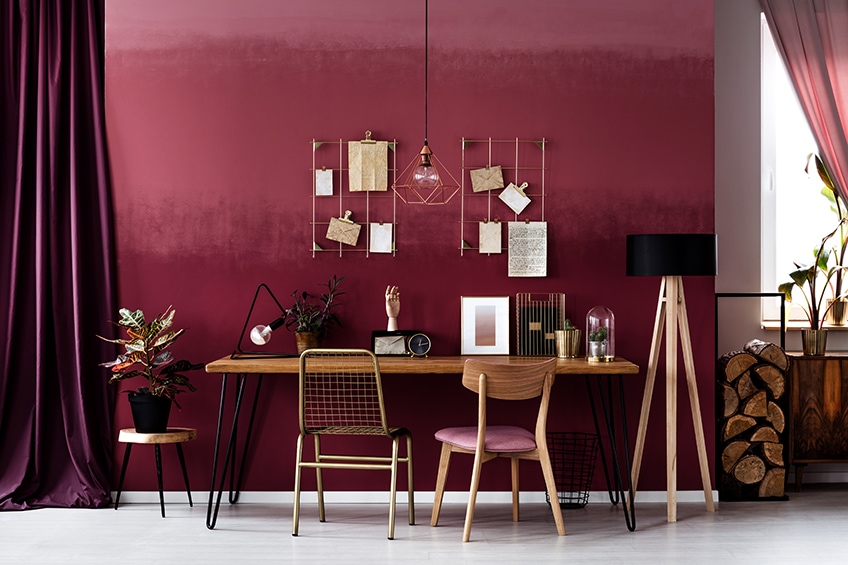
The use of Bordeaux paint in your home can create a lively and welcoming atmosphere, and used in private spaces, like the master bedroom, can create a feeling of energy. However, you must make use of neutral tones, such as white or light gray, to keep the intensity of the color down, so as not to overshadow the space. Subtly bring in the color using patterned rugs, cushions, luxurious couches, or drapes within a neutral-based room. You can also use shades of light Bordeaux color, for less of a dramatic effect.
Bordeaux Color in Fashion
When discussing fashion, and it comes to the autumn season, it is virtually impossible not to consider the color Bordeaux, as it is regarded as an extremely versatile color in most fashion brands throughout the world. Its versatility makes it an ideal color to combine with colors such as gray and burgundy, and it also blends perfectly with green, mustard, and persimmon.
For garments worn on the upper body like shirts or blouses, it can work well when combined with black or gray trousers and for the lower body like trousers, Bordeaux blends well with shirts with warm colors like mustard or pink. The color Bordeaux will always go well with colors like black and white.

Conclusion
The Bordeaux color is very bold, and you will be able to create amazing effects when it comes to home décor. When the Bordeaux color is paired with hunter green or gold, it produces an extremely sophisticated appearance. We sincerely hope you have enjoyed this article about the vibrant Bordeaux color with all its color combinations.
Frequently Asked Questions
What Color Is Bordeaux?
Bordeaux is a very rich color and is a very somber and deep red color like burgundy, claret, and maroon. The color got its name from the dark red wine with a similar name.
Is Bordeaux a Warm or Cool Color?
With its rich red harmonious color, Bordeaux is considered a warm color. In ancient history, emperors used to wear a shade of Bordeaux, which has the majesty and power of warm red but also has the calming effect of dark blue and the joyful effect of yellow.
What Does the Bordeaux Color Represent?
Bordeaux represents stability, confidence, power, love, passion, and enterprise, but if used in excessive amounts, it can tend to become depressing and heavy. Good pairings for the Bordeaux color are light gray, ivory, white, beige, milk, and cream.
In 2005, Charlene completed her Wellness Diplomas in Therapeutic Aromatherapy and Reflexology from the International School of Reflexology and Meridian Therapy. She worked for a company offering corporate wellness programs for a couple of years, before opening up her own therapy practice. It was in 2015 that a friend, who was a digital marketer, asked her to join her company as a content creator, and this is where she found her excitement for writing.
Since joining the content writing world, she has gained a lot of experience over the years writing on a diverse selection of topics, from beauty, health, wellness, travel, and more. Due to various circumstances, she had to close her therapy practice and is now a full-time freelance writer. Being a creative person, she could not pass up the opportunity to contribute to the Art in Context team, where is was in her element, writing about a variety of art and craft topics. Contributing articles for over three years now, her knowledge in this area has grown, and she has gotten to explore her creativity and improve her research and writing skills.
Charlene Lewis has been working for artincontext.org since the relaunch in 2020. She is an experienced writer and mainly focuses on the topics of color theory, painting and drawing.
Learn more about Charlene Lewis and the Art in Context Team.
Cite this Article
Charlene, Lewis, “Bordeaux Color – What Color is Bordeaux?.” Art in Context. November 12, 2022. URL: https://artincontext.org/bordeaux-color/
Lewis, C. (2022, 12 November). Bordeaux Color – What Color is Bordeaux?. Art in Context. https://artincontext.org/bordeaux-color/
Lewis, Charlene. “Bordeaux Color – What Color is Bordeaux?.” Art in Context, November 12, 2022. https://artincontext.org/bordeaux-color/.

