What Is the Opposite of Green? – Color Theory 101
Welcome to the vibrant world of color exploration, where hues dance and shades whisper secrets of the spectrum! Today, we embark on a delightful journey to unravel a curious conundrum: What exactly is the opposite of green? As we delve into the captivating realm of color theory, prepare to be enchanted by the harmonious interplay of tones, the captivating contrasts, and the wondrous revelations that await us in this chromatic adventure. So, fasten your seatbelts, dear readers, as we set sail to discover the enigmatic counterpart to green and unlock the mysteries of the color wheel!
Key Takeaways
- The opposite of green on the modern RGB color wheel is magenta.
- Complementary colors are used in color theory to create high contrast and visual interest.
- Understanding and applying the opposite of green can enhance design and artistic endeavors.
| Shade | Hex Code | CMYK Color Code (%) | RGB Color Code | Color |
| Magenta | #FF00FF | 0, 100, 0, 0 | 255, 0, 255 |
Understanding Color Theory
In the realm of color theory, finding the opposite of a color involves more than just intuition; it requires a systematic approach using the color wheel as a guide. When I examine the color wheel, it becomes clear that each color has a complementary, or opposite, color that provides the greatest contrast and balance. For the color green, the direct opposite on the color wheel isn’t a primary color such as red or blue, but rather a secondary color: magenta.
Understanding the complementary nature of green is critical for various applications in design, art, and visual communications.
Applying this knowledge, I can create visually compelling content, as the contrast between green and its opposite can enhance the overall aesthetic and effectiveness of visual projects. In this section, I’ll explain the basic principles of color theory, focusing on the relationships between colors and how they are used to achieve balance and harmony in design.
Primary and Secondary Colors
In art and design, primary colors are the foundation from which all other colors are derived. In the RYB color model, commonly used in traditional painting, the primary colors are red, yellow, and blue. Mixing these colors produces the secondary colors: orange, green, and purple. For instance:
- Red and yellow = orange
- Yellow and blue = green
- Blue and red = purple
Tertiary colors are created by mixing a primary color with a secondary color, yielding hues like red-orange or blue-green.
Color Models and Wheels
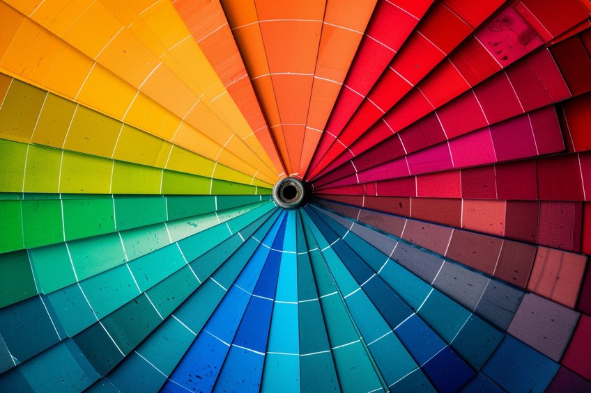
There are several color models that articulate color relationships and creation through different mediums such as light and pigments. The RGB color model is an additive color mixing model, using light to create color and primarily used in digital mediums. In contrast, the CMYK color model stands for cyan, magenta, yellow, and key (black) and is a subtractive color mixing model used in printing where inks or pigments absorb light.
Two of the dominant color wheels are:
- RGB color wheel (used for digital screens): Red, green, and blue as primary colors.
- RYB color wheel (used for artistic purposes): Red, yellow, and blue as primary colors.
Complementary and Opposite Colors
Complementary colors are pairs that, when combined in the right proportions, produce a neutral color such as white or black. In color theory, the opposite color of one is its complementary color on the color wheel. For green, in the RYB color model, the complementary color is red because these two colors share no common components and they provide the highest contrast. In the RGB model, the opposite of green would be magenta because the RGB model is centered on light. Here’s how opposition works in additive and subtractive color mixing:
- Additive (RGB): Green light mixed with magenta light results in white light.
- Subtractive (CMYK): Green pigment mixed with red pigment results in a darker, neutral color.
By considering color space and contrast, artists and designers use these relationships to create visual interest and direct viewer attention.
How to Find the Correct Opposite to Green
In the quest for harmony in color design, knowing how to pinpoint the precise opposite of green is essential. This involves understanding color theory and the applications within various contexts.
Identifying Green’s Complementary Color
In Color Theory, to identify green’s complementary color, I refer to the standard RGB (Red, Green, Blue) color wheel because it is widely used in art and design. On this wheel, the color directly across from any hue is considered its complementary color. For green, specified with the hex code #00FF00, the complementary color is magenta, a blend of red and blue, represented with the hex code #FF00FF.
- In print: When dealing with subtractive color mixing, such as in printing, the opposite of green is in the CMYK (Cyan, Magenta, Yellow, Black) color model. Here, I would mix red and blue to produce magenta as the complementary color to green.
- In light (additive color mixing): If I’m working in a context that involves light, such as on computer screens, I utilize the RGB color model. In this model, the opposite of green is again magenta since mixing the other two primary colors of light, red and blue, yields this color.
It’s crucial to note that the context I’m working in determines which color model and method I use to find the opposite of green. By staying within the logic of these models, I can apply the concept of complementary colors effectively and accurately.
The Opposite of Green
In color theory, the opposite of green, also known as its complementary color, varies according to different color models. This means that while one model might consider red to be the opposite, another might suggest a different hue altogether.
I’ll explain what constitutes the opposite of green in different color systems below.
What Is the Opposite of Green in RGB?
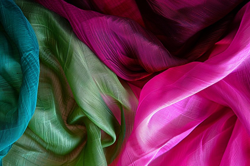
In the RGB (Red, Green, Blue) color model, which is a primary color model for mixing light, the opposite of green is magenta. This is because the RGB model uses light as a medium, and when green light is subtracted from pure white light, magenta is the resulting color. In this model, magenta is made by mixing red and blue, with no green contribution.
- Green: (0, 255, 0)
- Opposite (Magenta): (255, 0, 255)
What Is the Opposite of Green in CMY?
The CMY color model, which stands for Cyan, Magenta, and Yellow, is primarily used in printing. In this model, the complementary color of green is red. This is because green combines cyan and yellow, so its opposite needs to block out both those components.
- Green: Combination of Cyan and Yellow
- Opposite (Red): Absence of Cyan and Yellow
What Is the Opposite of Green in RYB?
Finally, in the traditional RYB (Red, Yellow, Blue) color model often taught to children and used by artists to mix paints, the opposite of green is a hue between red-orange and red-violet. These hues provide the maximum contrast to the various shades of green, like emerald green or olive, commonly seen in foliage, and create vibrant visual effects when paired together.
- Green Hues (emerald, olive, chartreuse, etc.): Traditional tertiary colors
- Opposite Hues: red-orange (amber) and red-violet (violet, purple)
How to Use Greens and Their Opposite Colors
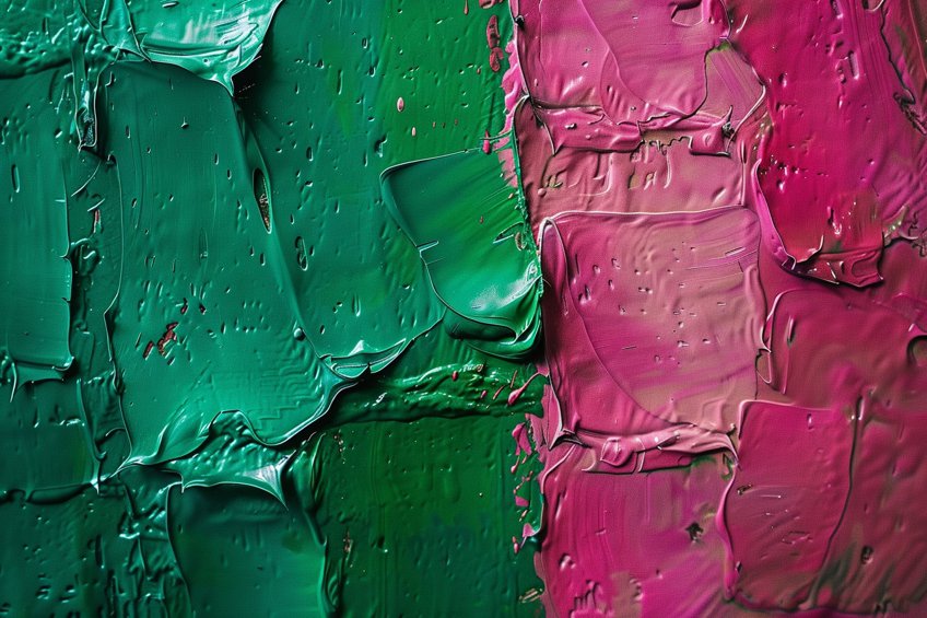
When I consider incorporating greens in design, I look towards complementary colors for a visual contrast that is both striking and harmonious. Here’s how I approach utilizing green’s opposite colors effectively. In color theory, the concept of opposites illuminates the fascinating interplay of hues on the basic color wheel. It reveals that the opposite of green is red, a dynamic contrast that extends across various shades of green. Consider the vibrant lime green, whose complementary color veers towards a reddish-purple, creating a striking visual harmony. Similarly, the earthy tones of olive green find balance and contrast with a more muted red, forming a harmonious partnership that captivates the eye and ignites the imagination.
In the realm of art and design, understanding green’s complement is key to creating captivating visual experiences.
Leveraging contrast, I employ bold red elements against a green backdrop to make subjects leap from the canvas, infusing energy and dynamism into the composition. Moreover, in pursuit of balance, I strategically integrate hints of red within predominantly green scenes, guiding the viewer’s gaze and imbuing the artwork with layers of depth and intrigue. Through these intentional choices, green and its complement dance in harmony, enriching the visual narrative and captivating the observer’s imagination. In the colorful realm of painting, I delve into the art of mixing colors to achieve nuanced and naturalistic shades. To tame the vibrancy of greens and craft serene landscapes, I deftly blend in touches of red, infusing the palette with depth and subtlety.
Conversely, when seeking to evoke the richness of natural reds, I delicately incorporate hints of green, allowing the hues to harmonize and bloom with authenticity. Through the alchemy of color mixing, I unlock a world of possibilities, where each hue finds its perfect counterpart, enriching the canvas with beauty and resonance. In the realm of digital design, I navigate the nuances of color theory with precision, mindful of how green’s complementary counterpart evolves in the digital spectrum.
Within the RGB model, where colors are generated by combinations of red, green, and blue light, the complement of green (hex #00FF00) transforms into magenta, a luminous fusion of red and blue wavelengths.
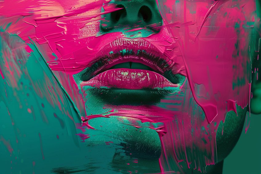
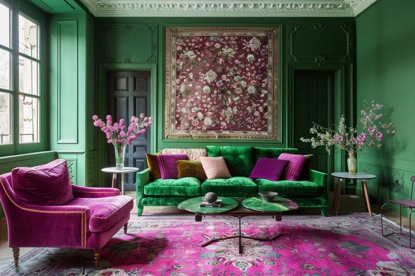
This dynamic interplay of light and color underscores the intricate dance of hues in the digital domain, shaping experiences and aesthetics with finesse and innovation. In interior design, contrasting colors breathe life into spaces, infusing them with personality. To enhance interiors, try accent pieces that pair green with magenta—a bold throw pillow can transform a sofa. Also, explore green artwork against walls with red hues for dynamic contrasts. By embracing complementary colors, interiors reflect creativity and style, inviting immersion in visual delight.
As we draw the colorful curtains on our exploration of the enigmatic opposite of green, let us bask in the kaleidoscope of insights and revelations uncovered along the way. From the vibrant realms of digital design to the serene landscapes of painting, and the dynamic interplay of hues in interior spaces, the quest for green’s counterpart has taken us on a whimsical journey through the wondrous world of color theory. Yet, as we bid adieu to this chromatic adventure, let us remember that the true magic lies not only in the discovery of opposites but in the endless possibilities they unlock—the hues that paint the canvas of our lives with brilliance, creativity, and boundless imagination. So, dear readers, may your world forever be awash in the vibrant hues of discovery, and may you continue to explore the colorful tapestry of existence with joy and wonder.
Frequently Asked Questions
What Color Contrasts the Most With Green?
The color that contrasts the most with green is magenta. In optics, magenta is the complementary color to green, meaning they provide the highest contrast when placed next to each other.
Which Hue Is Directly Across from Green on the Color Wheel?
Directly across from green on the color wheel is red. In traditional color models and art, red is considered the complementary color to green, sitting opposite it on the wheel for maximum contrast and visual impact.
In 2005, Charlene completed her Wellness Diplomas in Therapeutic Aromatherapy and Reflexology from the International School of Reflexology and Meridian Therapy. She worked for a company offering corporate wellness programs for a couple of years, before opening up her own therapy practice. It was in 2015 that a friend, who was a digital marketer, asked her to join her company as a content creator, and this is where she found her excitement for writing.
Since joining the content writing world, she has gained a lot of experience over the years writing on a diverse selection of topics, from beauty, health, wellness, travel, and more. Due to various circumstances, she had to close her therapy practice and is now a full-time freelance writer. Being a creative person, she could not pass up the opportunity to contribute to the Art in Context team, where is was in her element, writing about a variety of art and craft topics. Contributing articles for over three years now, her knowledge in this area has grown, and she has gotten to explore her creativity and improve her research and writing skills.
Charlene Lewis has been working for artincontext.org since the relaunch in 2020. She is an experienced writer and mainly focuses on the topics of color theory, painting and drawing.
Learn more about Charlene Lewis and the Art in Context Team.
Cite this Article
Charlene, Lewis, “What Is the Opposite of Green? – Color Theory 101.” Art in Context. March 1, 2024. URL: https://artincontext.org/what-is-the-opposite-of-green/
Lewis, C. (2024, 1 March). What Is the Opposite of Green? – Color Theory 101. Art in Context. https://artincontext.org/what-is-the-opposite-of-green/
Lewis, Charlene. “What Is the Opposite of Green? – Color Theory 101.” Art in Context, March 1, 2024. https://artincontext.org/what-is-the-opposite-of-green/.


