Greige Color – Learning to Mix Gray and Beige
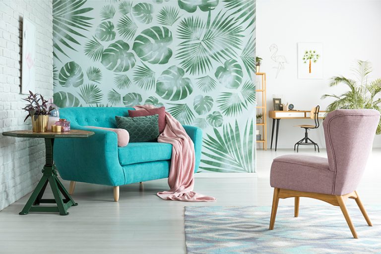
Gray and beige are both colors that have interesting histories and have been popular color choices for many years. So, to create a more unique look, somebody decided to create a combination of these two colors and called it “greige”. Is this an interesting development or is it just another dull color? To gain a better understanding and to see why it is so popular, read further to learn more about the trendy greige color!
What Color Is Greige?
The answer is simple as the name says it all, greige is a combination of gray and beige. There are many variations, but the general description is of a gray that has warm orange or brown undertones. Like beige and gray, greige is also a popular neutral color that works well with most other colors. Since gray is generally seen as a cool color, greige can work with warm and cool tones and fits in nicely with a variety of design styles. Below is an example of a greige color found online, along with its identifying hex code and color codes.

| Shade | Hex Code | CMYK Color Code (%) | RGB Color Code | Color |
| Greige | #b0a999 | 0, 4, 13, 31 | 176, 169, 153 |
Greige Color: A Brief History
Greige does not have such an extensive history as gray and brown or beige and only came onto the scene in the 20th century. Giorgio Armani (born 1934), an Italian fashion designer, made the color popular. He also came to be known as “the King of greige” because he used the color in many of his designs in the mid to late 1970s. Since then, the greige color has become quite popular in many areas of design. One of the more popular celebrities who love the greige color is Kim Kardashian, who enjoys using neutral colors in her fashion choices and inside her home.
Today, there is also a variety of popular greige paint colors that are used to paint the walls, as it works perfectly as a neutral within an interior color scheme.
Meaning of the Greige Color
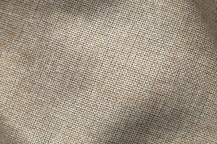
All colors have meaning and are often connected to various emotions. Gray is a color that mainly represents balance and neutrality, while beige is seen as a color that symbolizes comfort, trust, simplicity, and wisdom. Greige, therefore, also exhibits these traits, being a color that also represents neutrality and balance. The greige color is also modest but provides warmth and comfort.
Being classed as a neutral color, greige is also simple, calming, and trustworthy.
Colors Similar to Greige
The greige color has many variations, many of which are associated with greige paint colors. We will be dealing with some of the popular greige paint colors further on in this article. Below, are two examples of similar colors to greige, which can be seen as lighter or darker variations.
Taupe
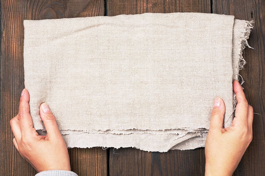
The taupe color is the number one hue that is often mistaken for greige. Taupe is a color that also falls somewhere between gray and brown but is a darker color when compared to greige. The taupe color is also a bit of a vague term, which often refers to a variety of brown-gray colors.
| Shade | Hex Code | CMYK Color Code (%) | RGB Color Code | Color |
| Greige | #b0a999 | 0, 4, 13, 31 | 176, 169, 153 | |
| Taupe | #483c32 | 0, 17, 31, 72 | 72, 60, 50 |
Mushroom
The mushroom color can be described as a tone of brown with a grayish undertone. The color most likely is derived from the brown mushroom, which looks similar to the color. This particular color also forms part of the well-known Pantone color system and is recognized as Pantone 14-1305 TPX.

| Shade | Hex Code | CMYK Color Code (%) | RGB Color Code | Color |
| Greige | #b0a999 | 0, 4, 13, 31 | 176, 169, 153 | |
| Mushroom | #bcaba0 | 0, 9, 15, 26 | 188, 171, 160 |
Best Greige Color Combinations
When trying to figure out what color combinations work, the best route to follow is learning to understand color theory and the color wheel. The color wheel is a visual picture of all the colors or hues available. However, gray and brown are not colors and, therefore, do not appear on a traditional color wheel, and are considered true neutrals, along with white and black. So, how will this work then? Beige can be described as a light brown and brown is also known as a composite color, which is a mixture of two or more primary hues in varying proportions. Brown can also be defined as being a shade of orange. Now, you can use orange as your base to create the different color combinations. Gray can either be a mixture of black and white, or it can be created by combining all three primary colors.
So, a mixture of a lighter shade of brown and gray should create a version of greige. The greige color goes well with most colors from both warm and cool varieties.
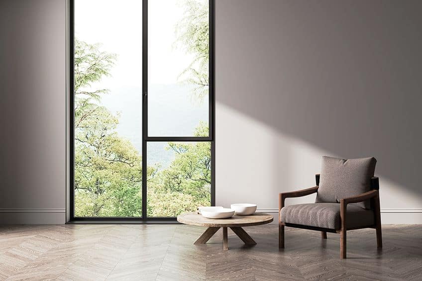
However, it pairs well with other neutrals like white and black, other shades of gray, and warmer tones of brown. Remember, that creating a color combination also needs to consider balance, which means using your main color as your base color, while other hues are used less. These colors are also known as accent colors. A popular idea to follow is the 60,30,10 rule, which is the percentage of each color in a color scheme. Below, we are going to use our chosen greige color to see what color combinations we can come up with. Greige can also easily be influenced by the colors it is paired with, these colors can determine whether the color palette leans towards cool or warm.
Complementary Greige Colors
When looking at the color wheel you find, for example, the color orange. The color on the opposing end is your complementary color. These colors help each other to stand out, or in other words, they create contrast. In the case of our chosen greige, the complementary hue can be described as a dark grayish blue. However, you can experiment with different shades of blue to see what you like best.
Navy blue, for example, adds more drama and contrast.

| Shade | Hex Code | CMYK Color Code (%) | RGB Color Code | Color |
| Greige | #b0a999 | 0, 4, 13, 31 | 176, 169, 153 | |
| Dark Grayish Blue | #99a0b0 | 13, 9, 0, 31 | 153, 160, 176 | |
| Navy | #000080 | 100, 100, 0, 50 | 0, 0, 128 |
Analogous Greige Colors
Colors on the color wheel that are found close to each other can be classified as analogous. So, since we are working with grayish brown or orange, the analogous colors would include shades of red, yellow, and orange. Greige is mostly warm, similar to these colors, and adds some depth to a look that is easy on the eyes. A vibrant red and yellow can add a nice pop of color to a greige room.
Softer pastels can also add a more airy and dreamy look.

| Shade | Hex Code | CMYK Color Code (%) | RGB Color Code | Color |
| Greige | #b0a999 | 0, 4, 13, 31 | 176, 169, 153 | |
| Blush | #de5d83 | 0, 58, 41, 13 | 222, 93, 131 | |
| Saffron | #f4c430 | 0, 20, 80, 4 | 244, 196, 48 | |
| Coral | #ff7f50 | 0, 50, 69, 0 | 255, 127, 80 |
Monochromatic Greige Colors
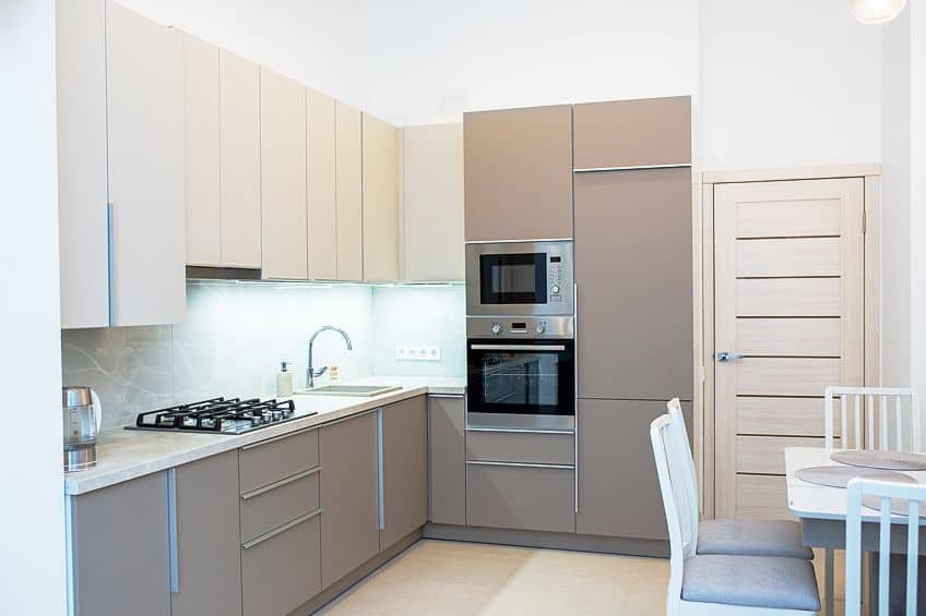
You can also create a neutral theme by using different variations of greige. When using lighter and darker shades of greige, this can help to create a calming look that also provides some depth and including patterns and texture, can also provide more interest.
| Shade | Hex Code | CMYK Color Code (%) | RGB Color Code | Color |
| Greige | #b0a999 | 0, 4, 13, 31 | 176, 169, 153 | |
| Light Greige | #d1cdc4 | 0, 2, 6, 18 | 209, 205, 196 | |
| Dark Greige | #403b31 | 0, 8, 23, 75 | 64, 59, 49 |
Triadic Greige Colors
Triadic color combinations are a little more challenging to work with, but if you create a balanced look with all the colors, it can produce an eye-catching and appealing look. The three colors in this color combination can be seen on the color wheel, as they form an equal-sided triangle. To create a cooler and calm look, consider a shade of purple or blue green like turquoise.
Various shades of green like olive can also work well with greige.

| Shade | Hex Code | CMYK Color Code (%) | RGB Color Code | Color |
| Greige | #b0a999 | 0, 4, 13, 31 | 176, 169, 153 | |
| Lilac | #c8a2c8 | 0, 19, 0, 22 | 200, 162, 200 | |
| Turquoise | #40e0d0 | 71, 0, 7, 12 | 64, 224, 208 | |
| Olive | #808000 | 0, 0, 100, 50 | 128, 128, 0 |
How to Mix a Greige Acrylic Paint Color
Mixing paints can become a bit confusing, especially if you are trying to mix more unusual colors like greige. This is because, according to color theory, you might not get the color you thought you were mixing. When you mix normal colors like yellow and red, which are both primary colors in the traditional color system, you will get orange, which is a secondary color. Or if you mix blue and yellow, you will get green. However, what happens if you mix blue with orange, which are complementary colors? These colors will produce a dark brownish color, as do all complementary colors when they are mixed.
Another strange thing happens when you blend all of the primary color’s red, yellow, and blue. This will also create a dark brown-gray color. It gets tricky when some blue paints can also be considered warm, which means they could have reddish undertones.
So, if you mix this blue that contains blue and red with yellow, it will produce a muddy color because you are combining all three primary colors. So, to get the greige color that you are looking for, might take some experimentation. Remember, to always keep a color palette as a reference so that you can know what paint proportions you used to create a specific color. The first method you can try to create greige is to mix gray paint and a beige or light brown paint that you can purchase from an art store.

Next, you can try making beige first by using a dark orange like burnt umber and mixing it with some cadmium yellow and titanium white. Create a lighter version of beige, so add in a little more white. Separately, mix your gray by combining all three primary colors, then add small amounts of this to your beige. Again, you will need to experiment with proportions to get the color you want.
Using Greige Colors for Home Interiors
Greige is used in many different industries and is popular in fashion and even in graphic design. However, its popularity is as a greige paint color for interior design. There are numerous varieties of greige paint colors that you can choose, each one creating the perfect neutral tone that can be used in any room of the home. However, there are a few things to take into consideration when painting your walls this color.

- Always get a sample of the greige paint color to test out in different rooms.
- You should monitor the paint color at different times of the day in natural light and how it looks in artificial lighting.
- Always check out the LRV (Light Reflection Value), which can affect how it picks up surrounding colors.
- To create a warmer look, try pairing greige with natural elements, such as wood. You can also include warmer accent colors, for example, cushions or rugs.
- When dealing with a neutral color scheme, make sure to bring in more patterns and textures.
- To bring in a more natural feel, consider adding plants and flowers, which can also act as a contrast.
- You can also consider adding gold or brass metal finishes to bring in more warmth to the look.
- Try pairing greige or neutral colors with rustic elements in a room, such as distressed furniture, stone fireplaces, or wooden beam ceilings. These elements can add style without needing too many colors.
Popular Greige Paint Colors
Before we get into a few of the more popular greige paint colors, as we have mentioned, you should always test out the color in each room and at different times of the day. Paint colors can also look different on screen and in reality. Many of the well-known paint manufacturers like Sherwin-William offer peel-and-stick paint samples that are easy to use and are made by using real paint. You should also look at the light reflectance value (LRV), which can be found on a scale of zero to 100. Zero is black, while 100 is white.
The darker the color of the paint, the lower the LRV number will be, and the lighter, the higher the number will be. This can ultimately affect how the paint will look, depending on the amount of lighting. For instance, any paint color will look lighter when exposed to direct light, whether it is natural or artificial.
So, any color that is above 50 on the scale is lighter, so it reflects more light, which can help to create a more open feeling in a room. Lower than 50, the colors tend to absorb more light, and they also reflect more. The darker colors are best if you want a more moody or cozy feel. Using gray and beige separately is easier to handle.

However, when you mix the two, creating a balance between warm and cool can be challenging. But if you follow a few basic steps like testing out the colors first, greige can add a calming and welcoming tone to any room of the home. You will find below a few of the more popular greige colors from some well-known paint manufacturers. We have also included examples of these colors; however, they might look slightly different online versus the actual paint colors.
Agreeable Gray from Sherwin-Williams
One of the more popular greige colors is Agreeable Gray by Sherwin-Williams. This was one of the most searched paint colors in 2022 and is one of the company’s top sellers. The paint color is quite versatile and provides the ideal neutral for any room. This greige color is perfect for those who love the clean look of white but are looking for something a little different. It is the perfect warm gray that also provides a touch of elegance.
Agreeable gray has a medium light reflectance value, so it works well in different rooms and lighting conditions.

| Shade | Hex Code | CMYK Color Code (%) | RGB Color Code | Color |
| Agreeable Gray | #d1cac0 | 0, 3, 8, 18 | 209, 202, 192 |
Anew Gray from Sherwin-Williams
Sherwin-Williams offers many variations of greige, and the Anew Gray color is just that. It has a slightly lower reflectance value, so is seen as a darker version of the above Agreeable Gray greige paint color. However, it is another excellent option if you are looking for a mid-tone neutral gray, which can work wonderfully in any room. The color does tend to lean more towards gray in most lighting conditions, so it can appear cooler than other greige paint colors. The paint color offers a rich look that is not too dark and works well with white and black.
The color also pairs well with natural wood tones. This greige color is great for the kitchen, which has dark wood flooring and beautiful marble tops.

| Shade | Hex Code | CMYK Color Code (%) | RGB Color Code | Color |
| Anew Gray | #bfb6aa | 0, 5, 11, 25 | 191, 182, 170 |
Worldly Gray from Sherwin Williams
This can be described as a soft and neutral greige that leans more toward gray. The color is not too cold or too warm and is the perfect neutral. You can use the paint color on anything from walls and cabinetry to exterior surfaces. Consider painting the outside window trims this color. How you see the paint can change according to the lighting.
If exposed to warm and natural light, it can give off slight purplish undertones, but in less light, it can give off a slight greenish undertone.

| Shade | Hex Code | CMYK Color Code (%) | RGB Color Code | Color |
| Worldly Gray | #cfc6ba | 0, 4, 10, 19 | 207, 198, 186 |
Edgecomb Gray from Benjamin Moore
This greige paint color provides a warm and earthy look and is in the mid-LRV range. The color can be closely compared to Agreeable Gray, which is one of the more popular greige paint colors. The paint color is a more subtle greige that has minimal undertones, so it can work well in any room.

| Shade | Hex Code | CMYK Color Code (%) | RGB Color Code | Color |
| Edgecomb Gray | #dad1c4 | 0, 4, 10, 15 | 218, 209, 196 |
Revere Pewter from Benjamin Moore
This is one of the top greige paint colors in the Benjamin Moore range and is a favorite among many. The paint color looks amazing in any space and also has a mid-range reflectance value. The warm undertones of the paint tend towards the yellow side, which makes it a great choice for creating a cozier feel.
However, it does not make a room feel any smaller, but it does offer a more inviting appeal.

| Shade | Hex Code | CMYK Color Code (%) | RGB Color Code | Color |
| Revere Pewter | #ccc4b8 | 0, 4, 10, 20 | 204, 196, 184 |
Classic Gray from Benjamin Moore
This is another example of an ideal neutral and offers a subtle greige look that can also be described as being off-white. It has a relatively high reflectance value, making it one of the brighter greige paint colors. It is a simple color that still offers a little warmth and can be used throughout the house, without being affected too much by different lighting conditions.
The color is also versatile and will work with any design elements, such as flooring, furniture, or other finishes.

| Shade | Hex Code | CMYK Color Code (%) | RGB Color Code | Color |
| Classic Gray | #e3dfd5 | 0, 2, 6, 11 | 227, 223, 213 |
Whether you want a lighter or darker shade of greige, we have provided a few examples of the more popular greige paint colors above. Remember that the only way to see if the color you choose is right for your home is to get a sample to test out on your walls. There are many more greige options for you to explore, but whatever you choose, you cannot go wrong if you are searching for a versatile and appealing neutral in the form of greige!
Frequently Asked Questions
What Color Is Greige?
The greige color can be described as a blend of gray and beige, which creates a warmer type of neutral gray.
What Colors Make Greige Stand Out?
The greige color is quite versatile and can pair well with most colors. However, it does tend to go well with bold accent colors, which can provide eye-catching pops of color. Any bold color, such as navy blue, vibrant greens, and yellows will make greige stand out.
How Can You Choose a Greige Paint Color That Works Best for You?
The best way to choose a paint color is to select a few options and then get sample paint colors to test out on the walls. How the color looks in different lighting conditions can affect how it appears. The greige paint color you choose should also complement existing colors and décor.
In 2005, Charlene completed her Wellness Diplomas in Therapeutic Aromatherapy and Reflexology from the International School of Reflexology and Meridian Therapy. She worked for a company offering corporate wellness programs for a couple of years, before opening up her own therapy practice. It was in 2015 that a friend, who was a digital marketer, asked her to join her company as a content creator, and this is where she found her excitement for writing.
Since joining the content writing world, she has gained a lot of experience over the years writing on a diverse selection of topics, from beauty, health, wellness, travel, and more. Due to various circumstances, she had to close her therapy practice and is now a full-time freelance writer. Being a creative person, she could not pass up the opportunity to contribute to the Art in Context team, where is was in her element, writing about a variety of art and craft topics. Contributing articles for over three years now, her knowledge in this area has grown, and she has gotten to explore her creativity and improve her research and writing skills.
Charlene Lewis has been working for artincontext.org since the relaunch in 2020. She is an experienced writer and mainly focuses on the topics of color theory, painting and drawing.
Learn more about Charlene Lewis and the Art in Context Team.
Cite this Article
Charlene, Lewis, “Greige Color – Learning to Mix Gray and Beige.” Art in Context. November 3, 2023. URL: https://artincontext.org/greige-color/
Lewis, C. (2023, 3 November). Greige Color – Learning to Mix Gray and Beige. Art in Context. https://artincontext.org/greige-color/
Lewis, Charlene. “Greige Color – Learning to Mix Gray and Beige.” Art in Context, November 3, 2023. https://artincontext.org/greige-color/.


