


Zorn Palette – How to Create and Use Your Own Zorn Palette Colors
There are many color terms, ideas, and techniques painters need to learn to understand art and painting in general. Some of these terms are more common than others, for example, color theory, gesso, palette, underpainting, or even alla prima. However, other things are not as familiar, and a Zorn palette is one of them. So, to demystify what Zorn palette colors are, we are going to uncover the meaning of a Zorn palette.
What Is a Zorn Palette?
Let us get right to the basic definition of a Zorn palette, which can also be described as a limited palette. The Zorn palette colors can be traced back to a Swedish artist, Anders Zorn, during the late 19th and early 20th centuries. The colors present in a Zorn palette consist of the absolute minimum of colors, which included only four paint colors yellow ochre, vermillion, flake white, and ivory black.
Today, cadmium red light is more commonly used instead of vermillion. Also, flake white is not available anymore, so titanium white is the paint used today. Technically, you can say that the Zorn palette was heavily influenced by what is known as “The Palette of the Apelles.” Apelles was a well-known Ancient Greek painter who often used what was then known as a tetrachromat palette. The basic colors this was made up of included chalk white, yellow ochre, red ochre, and vine black. Does this seem familiar? So, as you can see, the idea of using a limited color palette was used a long time before Zorn brought it to light again.
| Shade | Hex Code | CMYK Color Code (%) | RGB Color Code | Color |
| Chalk White | #e0dbd1 | 0, 2, 7, 12 | 224, 219, 209 | |
| Titanium White | #f3f4f7 | 2, 1, 0, 3 | 243, 244, 247 | |
| Yellow Ochre | #cb9d06 | 0, 23, 97, 20 | 203, 157, 6 | |
| Red Ochre | #913832 | 0, 61, 66, 43 | 145, 56, 50 | |
| Cadmium Red Light | #d82429 | 0, 83, 81, 15 | 216, 36, 41 | |
| Vine Black | #1e2223 | 14, 3, 0, 86 | 30, 34, 35 |
So, you might be thinking, is it possible to paint an entire piece with just these four colors? Some say that such a palette never really existed, as there is proof that Zorn used other colors in his paintings. However, this just tells us that he did not stick to a set rule of using only four colors and used an array of other colors when he wanted to. There is also some evidence that tells us that he preferred the limited palette.
Even though other colors were discovered in his palette, the four colors did show prominence. He also completed a self-portrait with only these four colors, which proves it is possible.

Zorn was not the only artist to experiment with a limited color palette, many other artists like Rembrandt, Monet, and Titian. Although, they would also use other colors if it was required. Once more pigment colors became available after the 19th century, the use of a limited palette became less. However, many artists still use this method of painting today. Below are some examples of paintings Zorn did with these colors. The last painting in the list shows how he also used other colors in his paintings.
- In the Woods (1893)
- Self-Portrait With Model (1896)
- Self-Portrait With Fur (1915)

Before Zorn began painting with oils, he had already done many paintings using watercolors. His main theme was to paint figures who wore their traditional clothing and explore different cultures. Other paintings were almost a documentation of his travels, some of them including his wife, Emma Zorn, and others also included family members such as his mother. Below are a few of his watercolor examples.
- Summer Vacation (1816)
- Bedouin Girl (1886)
- Our Daily Bread (1886)
- Man and Boy in Algiers (1887)
How Do the Zorn Palette Colors Work?
You could say that in some small way, the yellow ochre, cadmium red, and black could act as your primary colors. The black is an alternative to a cool, dark blue, while the cadmium red is the only vibrant color. The main use for the black and white colors is to change the value of a color. This particular palette creates a variety of tonal values.

The limited palette is not the best choice when considering painting a landscape, however, it can work when dealing with skin or flesh tones, which makes sense as Zorn was particularly well-known for portrait painting. Also, you can try painting interesting atmospheric landscape images. To sum up, the Zorn palette’s basic function is as follows.
- The white and black paint colors are mainly used to change the value of a color and to make various tints and shades of a particular color.
- The ivory black is considered more of cool color and can be seen as a substitute for blue, which means that the black, yellow, and red can be thought of as your primary colors.
- The cadmium red is the most saturated color of all the options in a Zorn palette.
The Pros and Cons of Zorn Palette Colors
Why would an artist want to choose a limited palette in the first place? One of the main benefits includes helping artists improve their mixing skills. You only use a limited number of colors to create a variety of effects. You learn to understand how colors work, how they correlate with various objects, and how to adjust color values and tones.

Pros of a Zorn Palette
Some art teachers even begin by using a color palette with no colors, then move on to something like the Zorn palette, and finally onto a more complex color palette. This teaches you how to work with the color value and temperature when painting, instead of just the color to provide emphasis to forms. The focus on warm and cool colors also helps to improve the creation of contrast.
There are many color pigments available today, and it is easy to access the colors. So, some might think that using all of these colors and shades available is what works best. However, when using so many colors, you need to also take into account color temperatures, values, and how each color interacts with another.
It is better to begin by producing a monochrome painting that has no color, so you can learn how to correctly proportion an image. Then, you can slowly add color to create a better overall painting.
Another advantage of using a limited color palette is reducing the risk of creating muddy colors. When working with many different paint colors, there is a high risk of blending too many and forming muddy colors and creating colors that are dull and less vibrant.
Using a limited palette can be what helps with creating a more balanced painting. So, the practice helps to simplify the painting process. However, using the colors can be challenging to begin with. A blend of all the colors can also produce a selection of neutral colors. Another benefit is that it is the perfect palette to travel with, as there are fewer supplies needed.
Cons of a Zorn Palette
A limited palette sums up why a Zorn palette is not used often, as you are missing out on the range of colors available. You can maybe substitute a blue for a cool gray when you mix the black with white, however, there is no way to create any green or purple colors. The general saturation of colors is mostly dull, with brown and gray tones, and as mentioned, is better for portrait painting than something like landscapes.
[su_shadow style=”simple”][su_panel]- Use as a teaching aid
- Helps with understanding color value
- Helps with understanding color temperatures
- Reduces the risk of muddying colors
- Creates a balanced painting
- Can be used to make neutral colors
- Fewer colors to transport
- Challenging to work with
- Color choices are limited
- Saturation is dull
Creating a Zorn Palette of Colors
Creating a Zorn-type color palette can help you to become more familiar with how colors work and how they interact with each other. Creating a color chart or palette is the perfect way to explore and experiment with a limited color palette. Maybe, the lack of other colors like blue can be challenging. However, mixing a Zorn palette can also show you how much potential there is in only these four colors.
You need to create a color chart or palette with the four basic colors of cadmium red, ivory black, yellow ochre, and titanium white. These are then blended to create various shades and tints of color. You may also decide to paint with oils or acrylics. You will then need a painting surface like acrylic painting paper or canvas panels or boards to paint on.

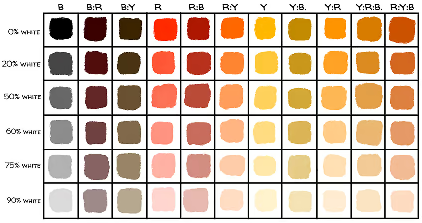
Mixing paints is also done more easily using a palette knife. There are various sizes you can choose for painting. Just remember to wipe off any excess paint after blending before you mix again. To make the chart easier to make, you can create a grid-work of one-inch squares. Take some masking tape, which can be about a centimeter thick, and lay it along the grid lines until each square is marked off. The mixed colors will then be painted within each square as you go.
Once this is done, you can get ready to blend the paint colors. The top grid or row can contain the paint colors that are from the paint tube and are pure. This means the top horizontal axis would read the specific hue, and in-between each color, there are columns with the mixed ratios of each color. So, you will have three columns that state your main color from the tube, and next to each color, the ratios. For example, the pure yellow ochre, then a 2:1 ratio of yellow to red, next to that a 1:1 ratio of yellow to red, and then a 1:2 ratio of yellow to red.
The next color column would be your red, which will then have columns with similar ratios as above with red to black. The final column will be black, with the same ratios as above, with black and yellow.
The vertical axis of the grid will deal with the percentage of color, an approximate value. The aim is to add white to the different colors and create a gradual tint for each row. You can slowly add in more white for each row of color in the first four rows.
The following five rows can involve experimenting with the tertiary colors. If you want a better visual representation, begin with the pure colors on the bottom row and work your way up by adding in traces of the missing color. For example, the first column of colors that involve yellow and red will need traces of black. The next column of red and black will have yellow, and the last columns of black and yellow will have traces of red.
So, after the last row, where you have added white, you will begin adding only the smallest amount of black, then the next row increases and the next, until you have the darkest shades in the last row. Try starting the chart by mixing each column, one at a time.

So, you will begin by placing, for example, the yellow ochre onto a mixing palette. To this add five more blobs of paint onto the palette. You can then add the pure color, then gradually mix in the white as you move down the column. After that is done, make sure to always wipe excess paint off the palette knife and paintbrush. You can then move on to the next portion of the column, by adding traces of black in increasing amounts as you go.
This visual representation of the various colors and tones can help you immensely when painting. You can see what is possible and then reproduce the effects. As mentioned, skin tones are something you can focus on when using this type of color palette. The various transparencies, and color variations as well as reflected light and shadows can be achieved by this color palette. It helps you to focus on using only small variations and then layering colors to achieve the results you want.
Zorn palette colors, even though a limited color palette, can be a great teaching tool for artists. When working with this type of color palette, one can create a better understanding of how colors work and interact with each other. So, before you dismiss the idea, try creating your own Zorn color palette to see what you can achieve.
Frequently Asked Questions
Who Takes Credit for the Zorn Palette?
This limited color palette was made famous by the artist Anders Zorn from Sweden. He created some of his own art with only four colors, most of them self-portraits. However, he also produced other works using more colors with blues and greens.
What Is a Zorn Palette?
Zorn palette colors consist of only four colors, namely red, yellow, black, and white. The specific paint colors used today are cadmium red light and yellow ochre, and titanium white. Black and white are mainly used in creating various tonal values and creating different shades and tints of color.
How Can You Use a Zorn Palette?
This type of color palette is perfect for creating various skin tones, so it is used mostly for portraits and painting body forms indoors. However, it can also be used for certain natural landscapes, but this can be quite challenging.
What Are Some Advantages of a Zorn Palette?
The most obvious benefit of using a Zorn palette is to help you focus on the value as well as the composition of a painting. You can discover how to use light and shadow and create harmony. You will gain a better understanding of how to mix colors and you can blend some wonderful neutrals from this color palette.

In 2005, Charlene completed her Wellness Diplomas in Therapeutic Aromatherapy and Reflexology from the International School of Reflexology and Meridian Therapy. She worked for a company offering corporate wellness programs for a couple of years, before opening up her own therapy practice. It was in 2015 that a friend, who was a digital marketer, asked her to join her company as a content creator, and this is where she found her excitement for writing.
Since joining the content writing world, she has gained a lot of experience over the years writing on a diverse selection of topics, from beauty, health, wellness, travel, and more. Due to various circumstances, she had to close her therapy practice and is now a full-time freelance writer. Being a creative person, she could not pass up the opportunity to contribute to the Art in Context team, where is was in her element, writing about a variety of art and craft topics. Contributing articles for over three years now, her knowledge in this area has grown, and she has gotten to explore her creativity and improve her research and writing skills.
Charlene Lewis has been working for artincontext.org since the relaunch in 2020. She is an experienced writer and mainly focuses on the topics of color theory, painting and drawing.
Learn more about Charlene Lewis and the Art in Context Team.
Cite this Article
Charlene, Lewis, “Zorn Palette – How to Create and Use Your Own Zorn Palette Colors.” Art in Context. June 17, 2022. URL: https://artincontext.org/zorn-palette/
Lewis, C. (2022, 17 June). Zorn Palette – How to Create and Use Your Own Zorn Palette Colors. Art in Context. https://artincontext.org/zorn-palette/
Lewis, Charlene. “Zorn Palette – How to Create and Use Your Own Zorn Palette Colors.” Art in Context, June 17, 2022. https://artincontext.org/zorn-palette/.


