Jasper Johns – Abstract Expression, Neo-Dada, and Pop Artist
Abstract Expressionist painter Jasper Johns’ paintings are playful, provocative artworks that examine the approaches we use to view and understand the world around us. Jasper Johns’ artworks eschewed art that was disconnected from ordinary life by making basic markers, such as targets and flags, the focus of his Minimalism art. From the 1950s to the present, Jasper Johns’ paintings have had an impact on practically every creative trend.
Jasper Johns’ Biography
| Nationality | American |
| Date of Birth | 15 May 1930 |
| Date of Death | N/A |
| Place of Birth | Augusta, Georgia |
Expounding on the contrasting styles of Abstract Expressionism and Dada, the renowned Abstract Expressionist painter developed a refined aesthetic that addressed themes of individuality, playfulness, and intellectual interaction. Jasper Johns’ artworks effectively created the groundwork for Pop Art’s adoption of consumer society by tearing down the customary barriers between fine art and ordinary life.
The expressive distribution of paint in Jasper Johns’ paintings is evocative of most of Abstract Expressionism, however, he does not fill it with the philosophical or metaphysical complexity that his contemporaries did.
Childhood
Jasper Johns was born on the 15th of May, 1930 in Augusta, Georgia, and raised in the rural regions of South Carolina with his grandparents when his folks separated when he was a baby. His grandmother’s artworks were displayed at his grandfather’s home, where he stayed until he was nine years old, and were his sole encounter with art during his boyhood.
Johns started sketching at an early age with the vaguely defined notion of becoming a painter, but only explored formal art study in college.
He spoke on his youthful dream to be a painter, saying, “I had no idea what it meant. I believe I misinterpreted that to indicate that I might be in a better circumstance from the one I was in.” In his teens, Johns relocated to his Aunt Gladys, who tutored him and two other children in a one-room classroom.
Johns later reconciled with his mother, graduating as valedictorian of his high school.
Early Training
Beginning in 1947, Johns attended the University of South Carolina after graduating from high school. In 1948, he came to New York on the advice of his tutors and completed one term at the Parsons School of Design. Unfortunately, Parsons was not the best match for Johns, and he dropped out, making him available for the military draft. He was recruited into the army in 1951 and served for two years.
In 1953, when Johns returned to New York after receiving an honorable release from the army, he encountered the youthful painter Robert Rauschenberg, who introduced him to the art world. From 1954 until 1961, the two artists had a passionate romantic and creative connection.
“I learned what artists were by observing Rauschenberg,” Johns said. The pair of artists finally moved in together, shared workshop space, and were each other’s viewing audience when few others were enthusiastic about their artwork.

They profoundly affected each other’s art by sharing concepts and approaches that deviated from the then-prevalent trend of Abstract Expressionism. Both were involved in college and rejected the psychological and existentialist discourse that surrounded the dominating New York School of art at the time. During this period, Johns started to paint his American flag pictures and targets on canvas with encaustic wax, employing a process that blended shreds of newsprint and remnants of material on paper.
These efforts blended Dadaist gestures with elements of Minimalism art and Conceptual Art. According to Johns, the inspiration for “Flag” (1955) happened to come to him one evening in 1954 while dreaming about creating a giant American flag. The next day, he converted the dream to reality, and he finally finished multiple canvases of the very same subject.
Johns delighted in making works that could be interpreted in a variety of ways, stating that “these paintings are no more about a symbol than brushstrokes or the tangibility of paint.” In 1958, Rauschenberg and Johns flew to Philadelphia to examine the Duchamp exhibition at the Philadelphia Museum, where the senior Dada creator’s readymades had a tremendous impression on both of them.
In 1959, Duchamp paid a visit to Johns’ workshop, establishing a direct link between the previous 20th century avant-garde and the current wave of American painters. Johns’ creative technique grew as a result of these encounters, as he integrated new techniques into his own works.
Mature Period
Despite the fact that he had only shown his work Green Target (1955) in a collective exhibition at the Jewish Museum in 1957, Johns had his debut solo show in 1958, when Rauschenberg recommended him to the emerging, prominent gallerist, Leo Castelli. The solo exhibition included Johns’ seminal work Flag (1955), as well as previously viewed pieces from the previous several years.
The Castelli Gallery exhibition charmed some visitors, such as artist Allan Kaprow, but perplexed others.
Although the painting’s surfaces have the drip-like properties of Willem de Kooning’s and Jackson Pollock’s gestural canvases, the emotional expressionism of those works was lacking. Notwithstanding initial doubts, Johns’ debut solo show got overwhelmingly good critical attention and launched him into the public limelight. The director of The Museum of Modern Art purchased three works for the institution, which was unprecedented for a youthful, obscure artist.
As the Pop Art trend blossomed around him, Johns abandoned his vibrant paintings of recognizable movements and motifs in favor of a darker palette. Some commentators credit his turn away from colors and toward the blacks, grays, and whites that characterize many of his paintings since the early 1960s to the tumultuous conclusion of his partnership with Rauschenberg. Despite the fact that they did not leave their New York workshops until 1961, their connection was already deteriorated by 1959.
That same year, Rauschenberg opened a workshop in Florida, and shortly afterward, Johns opened a workshop on South Carolina’s Edisto Island.
Though they spent some time alone in New York, they gradually drifted apart. The conclusion of such a significant and influential connection had a great psychological effect on Johns, and he buried himself in his art. He stated in 1963 that he “had the impression of coming to a place where there was no space to remain.” Despite these reservations, he proceeded to broaden the scope and confusing interpretations of his paintings.
During this period, he was a component of the Merce Cunningham Dance Company, where he functioned as artistic director from 1967 until 1980.
Late Period
Following the burning to the ground of his Edisto Island studio in 1968, Johns spent his time between St. Martin Island, and Stony Point, New York; in the early 1970s, he purchased facilities in two locations. During this time, Johns adopted the crosshatching theme into his repertory, and this approach dominated his production until the early 1980s.
All through the 1980s and 1990s, Johns’ works took on a more contemplative tone as he added more self-referential material. Though, as Johns cleverly noted, “there is a phase in which I started to utilize pictures from my daily existence, but whatever you utilize is from your daily existence,” implying that his works had always included an autobiographical aspect.
In the years after his separation from Rauschenberg, Johns remained progressively recluse, nearly never granting interviews and keeping a very modest public presence; yet, he maintained close touch with a limited number of the art world’s elites. Johns made news again in 2013, when his workshop helper James Meyer, was accused of stealing $6.5 million in paintings from a file of incomplete works that Johns had forbidden from being sold.
Meyer stole 22 pieces from Johns’ studio in Sharon, Connecticut, and tried to sell them via an anonymous gallery in New York, saying they were presents from Johns. Johns made no remark about the theft, although he fired Meyer soon after finding the stolen artwork.
Jasper Johns’ Artworks
Johns blurred the line between fine art and mainstream culture by using discarded materials, newspaper slivers, and even mass-produced commodities. This moved contemporary art toward the mid-century American consumer scene, sparking a slew of Pop artists during the 1960s.
By utilizing everyday themes such as targets and flags, Johns dabbled in both abstract and representational art.
Targets and flags are both naturally flat, therefore when used as the topic for technical painting, they draw emphasis to the picture pane’s flatness. He does not endow the work with the same profundity that his forefathers did.
Rather, he effectively mimics the gesturally expressive brushstroke, viewing the artist’s mark as only another sign or device that added to the multitude of interpretations within his works.
Flag (1955)
| Date Completed | 1955 |
| Medium | Collage and Oil on Plywood |
| Dimensions | 107 cm x 154 cm |
| Location | Museum of Modern Art |
Through his rendering of a familiar commonplace image – the American flag – Jasper Johns’ first significant painting diverged from the Abstract Expressionist tradition of non-objective art. Furthermore, rather than applying oil paint to the panel with a paintbrush, Johns created the flag using a highly dynamic surface formed of shredded newspapers soaked in encaustic, enabling bits of text to show through the wax.
As the liquid, colored wax solidified, it set the fragments of newsprint in aesthetically distinguishable markings reminiscent of much Abstract Expressionism’s expressive brushwork. Johns’ fascination with semiotics, or the examination of symbols and signs, was expressed by the apparently frozen droplets and motions.
In essence, Johns referenced the Action Artists’ expressive brushstrokes, converting them into a metaphor for artistic creativity instead of a straight way of expressing. This experimentation launched his career-long inquiry into “why and how we perceive reality the way we do.”
To this very day, the American flag emblem holds a plethora of implications and connotations that vary from person to person, making it the ideal topic for Johns’ first journey into graphically examining the “things the mind already knows.”
With his deceptively banal subject matter, he purposefully eroded the barriers between fine art and life in general.
Flag was painted by Johns during the civil rights struggle. Some observers, both then and today, may read patriotic feelings or liberty in the artwork, while others will only perceive colonialism and tyranny. Johns was among the first painters to confront spectators with the dualities inherent in the national emblem.
False Start (1959)
| Date Completed | 1959 |
| Medium | Oil on Canvas |
| Dimensions | 171 cm x 137 cm |
| Location | Private Collection |
Jasper Johns used words to engage spectators in a conversation with this painting. The words “orange, red, yellow, and blue” are stenciled in multiple positions over the canvas’s surface among the gestural areas of colors. The shift in topic matter from nonverbal indicators of targets and markers to communication itself pushed Johns deeper into semiology and how humans understand and decode signs and symbols.
As he mentioned, “The colors on the targets and flags are arranged in a certain pattern. I wanted to develop a technique to apply color in such a manner that the color was chosen by another means.” Johns abstracted each hue and the phrases that describe them by focusing on them and eliminating the customary connotations that accompanied them.
Instead of hand-painting each word, Johns utilized a shop-bought stencil – a ready-made process for creating an image without showing the artist’s touch. As he worked, he stenciled the color phrases on top and below the numerous layers of paint.
Most of the words were converted into objects by Johns by painting them in hues unconnected to the one they linguistically represent; for example, “RED” appears done in vivid orange in the middle of the painting over an area of yellow. The contradiction between the phrases and the hues was uncovered by Johns, transforming their role from identification to a simple aggregation of symbols ready for reassessment.
Johns was using the gesture-based methodology of implementing specific parts of color to the work of art relative to random arm movements instead of any preexisting placing for each specific brushstroke, affected by John Cage’s intrigue in the role of probability in the artistic process, a method he termed “brush marking.” His usage of brush marking produced spectacular explosions of color, as if in a pyrotechnics show, that both highlighted and obscured the unnervingly hued phrases dispersed around the painting, producing a semiotic conflict.
By introducing words into his visual vocabulary, Johns broadened his communication with viewers to include the role of both visible and spoken signals. Such investigations are evident forerunners of the late 1960s Conceptual Art movement’s analysis of words and concepts.
Painted Bronze (1960)
| Date Completed | 1960 |
| Medium | Painted Bronze |
| Dimensions | 34 cm x 20 cm |
| Location | Museum Ludwig, Cologne |
Johns blurs the boundary between discovered objects and creative replication in this bronze sculpture. Willem de Kooning allegedly sneered that gallery owner Leo Castelli could sell whatever, even two beer cans, prompting him to create the artwork. Johns took up the challenge inherent in De Kooning’s remark, casting and hand-painting two cans of Ballantine Ale in bronze, which Leo Castelli instantly sold.
Because the bronze mirrors the natural hue of the beer cans, Johns achieved a trompe l’oeil impression; nevertheless, he gently undermined the effect by leaving his brushstrokes apparent in the painted labels, producing an imperfection discernible only with careful attention.
Jasper Johns created one open-top can and placed the Ballantine emblem and the word Florida on it. The other can is sealed, unlabeled, and completely inaccessible. Some commentators see the contrasts between the cans as a metaphor for Johns and Rauschenberg’s connection.
IThe open can depicted the outgoing and famous Rauschenberg, who started investing much of his time in his Florida workshop in 1959, whereas the sealed can symbolized Johns and his silent, impermeable public face.
Others argue for a less personal narrative that simply depicts ordinary life, with the shut can referring to the prior, to potential, and the open can referring to the after effect, to repercussions. Obviously, Johns never stated his favored reading, leaving room for interpretation. In many respects, Johns’ depiction of mass-produced items foreshadowed the Pop Art style.
Periscope (1962)
| Date Completed | 1962 |
| Medium | Oil on Canvas |
| Dimensions | 137 cm x 101 cm |
| Location | Collection of the Artist |
In this work, Johns incorporated some of his earlier patterns and symbols in a limited palette of black, gray, and white. Half of a circle is depicted in the artwork’s upper-right edge. In 1959, Johns began using a method in which he glued a wooden slat to the work, generally a ruler or canvas stretcher, to form a compass-drawn circle. The gadget pulled through the paint, making a target reminiscent of his previous works. He did, however, disturb the target’s concentric rings with an impression of his extending hand here.
The handprint hints that the artist’s hand has been replaced by a mechanical instrument. The artist’s hand is a recurrent shape in a sequence of works by Johns from 1962 to 1963, including “Periscope”, which centers on the poet Hart Crane, whose work connected strongly with Johns.
Crane allegedly committed himself at the age of 32 while returning from the tropics by jumping off a boat into the Gulf of Mexico. He raised his hand above the waters just before vanishing beneath the waves.
Thus, Johns’ handprint might be seen as a visual connection to Crane’s suicide. It was executed shortly after the end of his partnership with Rauschenberg, and it represents Johns’ personal sorrow in the aftermath of their split. The periscope in the name also alludes to Crane’s work Cape Hatteras (1929), which was significant to Johns on two levels. In 1961, he not only relocated into a workshop near Cape Hatteras, but the poetic verse also follows the alterations in one’s memories with time.
Following their separation, Johns most likely associated with the concept of transition and loss, which he depicted with the grabbing hand, mirrored phrases, and showy brushwork that imitated waves smashing around a drowning man. In stark contradiction to the coolly mechanical look of Pop Art, which he helped to establish, Johns filled his early 1960s paintings with complex sentiments of loss and psychological struggle.
According to What (1964)
| Date Completed | 1964 |
| Medium | Oil on Canvas |
| Dimensions | 200 cm x 487 cm |
| Location | Private Collection |
This dizzyingly large artwork was produced by Johns by linking many canvases together and putting different found things to the layer of paint: a chair, a casting of limbs, another extended canvas with a hinge, metal lettering, and a coat hook.
He used methods from previous works, such as “brush marking,” stenciled color designations, a hinged cover that can be sealed, and cast parts of the body. He also broadened his visual vocabulary by inserting pieces of silkscreened news pages reporting on the Kremlin in the painting’s center.
While Robert Rauschenberg and Andy Warhol employed silk-screening to reproduce images in paintings without showing the artist’s hand, Johns feverishly colored into and around the screen titles, emphasizing the concept of the artist’s hand and gadgets to make mechanical replicas.
The many parts combine to provide layers of possible interpretations, like in many of Jasper Johns’ artworks. While many of the parts appear to hint at a hidden message, one overt allusion reminds the audience of Johns’ homage to his master, Marcel Duchamp. An indistinct picture of Duchamp and his monogram “MD” may be found on the far-left panel.
“Duchamp made a piece that was a ripped square,” Johns remembered. “I traced the profile, hung it by a rope, and cast its shadow, causing it to become deformed and no longer square. I purposefully altered Duchamp’s work in order to create a sort of parody on whose work it was”.
“According to What” exemplifies Johns’ ongoing experimentation with creative ownership, and as usual, he invites the audience to participate in meaning-making by displaying diverse pieces without a clear map of their relationships.
Corpse and Mirror II (1974)
| Date Completed | 1974 |
| Medium | Oil and Sand |
| Dimensions | 146 cm x 191 cm |
| Location | Art Institute of Chicago |
In 1972, Johns discovered a new theme, the crosshatch, which he would pursue over the next decade. Artists have traditionally used the crosshatch, an assortment of lines, to produce gradations of shadow in drawing and printmaking; more closely packed lines make deeper shadows, while sparser arrangements create lighter shadows.
In his trademark whimsical style, Johns abstracted and repeated the theme over the canvas in bright hues to create a throbbing, abstract picture.
“I just noticed it for a second, but I knew instantly that I was intending to utilize it,” Johns said of seeing the pattern on a passing automobile. It has all of the characteristics that pique my interest: literalness, repetition, an intense aspect, order with daftness, and the danger of a complete absence of meaning.”
While the pattern may be “dumb” and devoid of significance, Johns’ title Corpse and Mirror II hints that there is something more at work. Many people believe that the title relates to both the Surrealist activity Exquisite Corpse, a collaborative game formed by sequential creative actions, and Marcel Duchamp’s iconic and mysterious work.
Johns’ genealogy and aesthetic interests are gently suggested through connections to Surrealism and Dadaism.
While the paintings’ lines are somewhat painterly, their repetitiveness implies coolness or technicality free of feelings, but the title, with its references to death and perception, implies something grislier and more intellectual, generating a strain between structure and subject matter that Johns constantly exploits.
Catenary (1999)
| Date Completed | 1999 |
| Medium | Encaustic on Canvas |
| Dimensions | 64 cm x 85 cm |
| Location | Collection of the Artist |
Following further retrospective in the mid-1990s, Johns began a series studying catenaries – curves generated by a length of thread or chain swinging loosely from two fixed locations. In Catenary, a household thread is hung between two cantilevered pieces of wood on either side of the canvas. Shadows are produced on the rich dark gray ground by both the string and the wood strips.
Shifting to encaustic, Johns’ monochromatic surface preserves the expressive strokes of distribution, producing a thick palimpsest of traces that is provocative and opaque.
The basic curved design is reminiscent of bridges and the connections they give, but it also conjures natural forms, such as the dips and curves of the human body. Some commentators have seen the rope’s reaction to gravity as a metaphor for the evolution of one’s life, or the interconnections and restrictions that come with growing older. Aside from the wooden toy,
Jacob’s ladder relates to the biblical account in which Jacob dreamed of a ladder connecting heaven and earth. Allusions abound throughout the artwork, as is typical of Johns’ work, yet they all revolve around concepts of connectedness. The painter stenciled a set of letters with no gaps between them at the bottom of the painting, in the same gray as the backdrop, and one can figure out the name and the year of the artwork, but only with effort.
In this delicate, yet fun, compositional decision, Johns returns to issues that have plagued him for decades: the complexities of meaning and interpretation, the conflation of figures and ground, abstract and depiction, and the intention to participate the spectator beyond passive staring.
Legacy of Jasper Johns
As a member of the Neo-Dada movement, Johns crossed the stylistic divide between Pop Art and Abstract Expressionism in the late 1950s, continuing to broaden his topics, materials, and techniques to this day.
Pop painters like James Rosenquist and Andy Warhol benefited from Johns’ pioneering shift into the sphere of culture, presenting everyday items and mass-produced commodities as suitable subjects for high art.
Johns set the foundation for Conceptual Art in the 1960s with his research of the changing meanings of pictures and symbolism. Johns’ expanding creative work helped herald in trends and organizations like Body Art, and Performance Art through partnerships with entertainers like Allan Kaprow and Merce Cunningham. While Pop painters immediately absorbed Johns’ image of the outer world, postmodernism’s bricolage style is heir to his concern in appropriation, multiple interpretations, and semiotic play.
Finally, Johns and his Neo-Dada peers transformed the American avant-garde, forecasting the experimentation and audience involvement that would come to define art in the latter half of the 20th century.
Recommended Reading
Did you enjoy learning about Abstract Expressionist painter Jasper Johns’ paintings? Maybe you want to learn even more about Jasper Johns’ biography and art? Well then simply peruse our list of recommended books!
Jasper Johns: Mind/Mirror (2021) by Carlos Basualdo
Jasper Johns is often regarded as the most important living artist. Over the last 65 years, he has created a bold and diverse body of work that has been distinguished by ongoing reinvention. This book, inspired by the artist’s longstanding preoccupation with mirroring and doubles, offers a fresh and fascinating take on Johns’ work and its continuing significance. A broad collection of curators, scholars, artists, and writers provide a series of essays—many of which are paired texts—that examine features of the artist’s work, such as repeating motifs, investigations of place, and use of a variety of mediums in his hybrid Minimalist art.
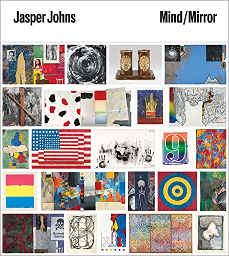
- An retrospective look at the work of an iconic American artist
- Lavishly illustrated volume features rarely published works
- Includes never-before-published archival content
Jasper Johns (2017) by Jasper Johns
This beautifully designed book collects Johns’ canvases, sculptures, prints, and sketches. It focuses on several periods of Johns’ career and discusses the international relevance of his work, from his advances in sculpture to his use of collage in paintings. This anthology, which includes comments from a variety of scholars, promises to delve into the breadth and depth of Johns’ output, which spans more than a half-century.
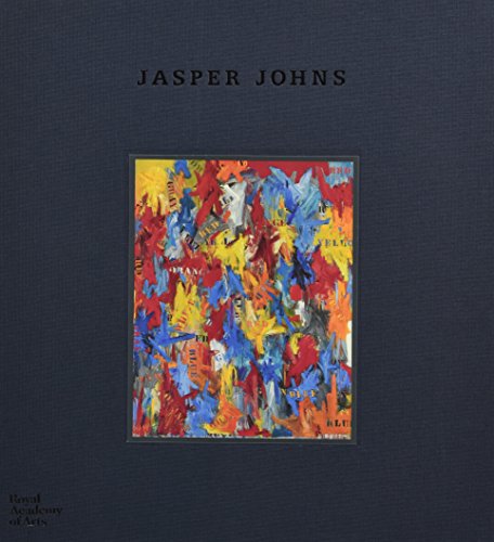
- Brings together Johns’ paintings, sculptures, prints, and drawings
- Gives focus to different chapters of Johns’ career
- Examines the international significance of his work
The Abstract paintings of expressionist painter Jasper Johns are humorous, provocative works that question how we perceive and comprehend the world around us. Jasper Johns’ artworks avoided art that was divorced from everyday life by making simple indicators, such as targets and flags, the focal point of his Minimalism art. From the 1950s to the present, Jasper Johns’ paintings have influenced nearly every creative trend.
Frequently Asked Questions
Who Was Jasper Johns?
Jasper Johns is widely considered as one of the 20th century’s most significant painters, and he has remained vital to American art. Johns, together with his then-partner Robert Rauschenberg, contributed to establishing a definitive new direction in the art world, which was dubbed as Neo-Dada at the time. Johns’ remarkable use of common iconography, as he phrased it, things the mind already knows (flags, numerals, maps), rendered the familiar unusual and had a massive influence in the art world, becoming a touchstone for Pop, minimalist, and conceptual art.
What Kind of Art Did Jasper Johns Produce?
In the mid-1950s, Jasper Johns had his big breakthrough as a painter when he began integrating famous, popular motifs in his paintings, an explosive move at a time when the progressive painting was thought to be solely abstract. The lush, painterly surfaces of Johns’ mid-century paintings resemble those of Abstract Expressionism, but Johns achieved them using laborious, labor-intensive procedures and media such as encaustic. Throughout his 60-year career, Johns has experimented with a variety of mediums and techniques, allowing him to investigate the interaction of materials, meaning, and representation in art.

Isabella studied at the University of Cape Town in South Africa and graduated with a Bachelor of Arts majoring in English Literature & Language and Psychology. Throughout her undergraduate years, she took Art History as an additional subject and absolutely loved it. Building on from her art history knowledge that began in high school, art has always been a particular area of fascination for her. From learning about artworks previously unknown to her, or sharpening her existing understanding of specific works, the ability to continue learning within this interesting sphere excites her greatly.
Her focal points of interest in art history encompass profiling specific artists and art movements, as it is these areas where she is able to really dig deep into the rich narrative of the art world. Additionally, she particularly enjoys exploring the different artistic styles of the 20th century, as well as the important impact that female artists have had on the development of art history.
Learn more about Isabella Meyer and the Art in Context Team.
Cite this Article
Isabella, Meyer, “Jasper Johns – Abstract Expression, Neo-Dada, and Pop Artist.” Art in Context. March 14, 2022. URL: https://artincontext.org/jasper-johns/
Meyer, I. (2022, 14 March). Jasper Johns – Abstract Expression, Neo-Dada, and Pop Artist. Art in Context. https://artincontext.org/jasper-johns/
Meyer, Isabella. “Jasper Johns – Abstract Expression, Neo-Dada, and Pop Artist.” Art in Context, March 14, 2022. https://artincontext.org/jasper-johns/.