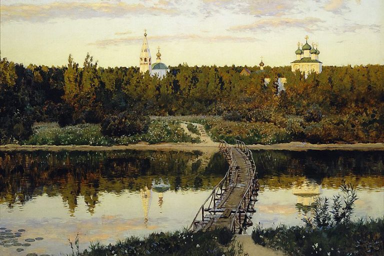


Harmony in Art – Looking at Different Examples of Harmony in Art

Harmony in art is the sense that a composition’s parts belong together. Artists create it by relating color, value, line, shape, form, texture, and space through repetition, proximity, proportion, rhythm, and a shared visual character. Harmony does not require everything to match. The strongest compositions usually combine recognizable relationships with enough variety and contrast to remain clear, active, and memorable.
What Is Harmony in Art?
Harmony is a principle of art that describes how visual elements relate convincingly to one another. The elements of art—color, line, shape, form, value, texture, and space—are the raw materials of a composition. Harmony concerns the relationships among those materials: repeated curves, closely related colors, consistent edges, similar proportions, or textures that seem to belong to the same visual world.
Harmony can arise through similarity, but it can also include carefully controlled difference. A complementary color scheme contains opposition, for example, yet it can feel harmonious when the artist balances saturation, value, placement, and proportion. The useful question is not “Are these parts identical?” but “What makes these differences feel intentional?”

Claude Monet’s Water Lilies demonstrates harmony without uniformity. Greens, blues, violets, and small warm notes vary across the surface, while related values, soft transitions, repeated lily-pad shapes, and a continuous field of brushwork hold the painting together. Individual marks remain active, but they contribute to a coherent whole.
Harmony, Unity, Balance, Rhythm, Variety, and Contrast
Several principles of art overlap, but they answer different questions. Harmony concerns compatible relationships among parts. Unity is the broader impression that the artwork functions as a complete whole. Harmony is one path toward unity, but balance, hierarchy, repetition, and a clear focal structure can also contribute.
Variety introduces changes in color, shape, scale, direction, or texture. Contrast creates a stronger difference, such as light against dark or smooth against rough. Neither is the opposite of harmony. Too little variation may make a composition predictable; too much unrelated variation may make it fragment. Harmony allows difference to remain visible without becoming accidental.
| Principle | Main Question | Typical Evidence |
|---|---|---|
| Harmony | How do particular elements belong together? | Related colors, echoed shapes, consistent marks, or controlled contrasts |
| Unity | Does the composition work as a complete whole? | A clear visual system in which no major part feels unrelated |
| Balance | How is visual weight distributed? | Symmetrical, asymmetrical, or radial organization |
| Rhythm | How does repetition guide the eye through time and space? | Recurring shapes, intervals, colors, lines, or gestures |
| Variety | What changes keep the work from becoming monotonous? | Differences in scale, direction, hue, texture, or complexity |
| Contrast | Where is the strongest difference? | Light versus dark, warm versus cool, large versus small, rough versus smooth |

In Gustav Klimt’s The Kiss, rectangles, circles, spirals, gold surfaces, and flower-like details connect figure and ground. The man’s block-like pattern and the woman’s softer circular motifs create variety, but the shared gold field, repeated ornament, and compressed space integrate them. Local differences remain readable while contributing to overall unity.
A Harmony Diagnostic Matrix
Use this matrix to identify what is holding a composition together and what prevents it from becoming monotonous.
| Visual Element | Evidence of Harmony | Useful Variety or Contrast | Question to Ask |
|---|---|---|---|
| Color | Repeated hue family, temperature, saturation level, or color role | A small accent, complementary pair, or temperature shift | Does the accent support the palette or overpower it? |
| Value | A coherent high-key, middle-key, or low-key range | One concentrated light or dark focal area | Can the major value masses still be read in grayscale? |
| Shape and form | Echoed curves, angles, proportions, or geometric families | Changes in scale, orientation, or complexity | Which forms repeat, and which one deliberately breaks the pattern? |
| Line and direction | A shared flow, contour character, or directional rhythm | A counter-direction that creates emphasis | Where does the line system carry the eye? |
| Texture | Consistent mark-making or related surface qualities | A smoother, rougher, denser, or more transparent focal passage | Does the change clarify material, depth, or emphasis? |
| Space | Repeated intervals, proximity, alignment, or depth cues | An open pause against a dense cluster | Do positive and negative spaces feel deliberately related? |
How Artists Create Harmony
Artists rarely create harmony through one element alone. Color may establish the first impression, while repeated shapes, related edges, and a stable spatial rhythm reinforce it. The same principle applies to painting, sculpture, drawing, photography, graphic design, architecture, and installation, although each medium offers different tools.

Pierre-Auguste Renoir’s The Umbrellas shows that harmony can bridge visible stylistic differences. Renoir worked on the canvas in stages, and parts of the scene use softer Impressionist handling while others are modeled with firmer contours. Repeated umbrella arcs, overlapping figures, blue-gray clothing, and closely packed shapes nevertheless connect the busy street scene.
Harmony Through Color and Value
A color harmony is an organized relationship, not simply a collection of “pleasant” colors. A color wheel can help plan monochromatic, analogous, complementary, split-complementary, or triadic schemes. The scheme alone does not guarantee harmony. The artist must still control how much of each color appears, how intense it is, how warm or cool it feels, and where it sits in the value structure.
Monochromatic and analogous palettes make similarity easy to see. Complementary and triadic palettes usually require stronger control of proportion. One hue may dominate while another appears in smaller accents, or opposing colors may be softened to related saturation and value levels.

In Bridge over a Pond of Water Lilies, Monet repeats greens across foliage, water, and reflected forms. Blue-violet shadows and small warm notes vary the palette, while the bridge’s arch connects the upper garden to the curved forms below. Color, shape, edge, and reflection reinforce one another instead of operating as separate effects.

Vincent van Gogh’s still life organizes quinces, lemons, pears, and grapes around a dominant yellow family. The fruits differ in hue, size, and contour, yet their related warm colors, repeated rounded forms, and close placement unify the arrangement. Red and green notes add energy without breaking the whole.
Value in art means relative lightness and darkness. A high-key composition concentrates on lighter values; a low-key composition favors darker ones. Value harmony is especially important because it establishes large visual masses before the viewer notices small color differences.

The fog in the Charing Cross Bridge painting shown above compresses contrast, allowing pale shifts of color to carry the scene. By comparison, James McNeill Whistler’s Arrangement in Grey and Black No. 1, often called Whistler’s Mother, uses a darker and more restrained value structure. Both can be harmonious even though their emotional effects differ.
Harmony Through Shape, Form, and Space
Repeated shape families can connect distant parts of a composition. Circles may recur as heads, fruit, wheels, or empty intervals; diagonals may repeat in roofs, limbs, and shadows. Exact duplication is unnecessary. A shared proportion, angle, curvature, or degree of simplification is often enough to create a visual rhyme.
Paul Cézanne’s Mont Sainte-Victoire is built from interlocking angular and rounded masses. Trees, roofs, fields, and mountain slopes remain distinct, but their faceted treatment and repeated diagonals make the landscape feel structurally related from foreground to distance.

Space also contributes to harmony. Proximity groups related parts; alignment creates order; repeated intervals establish rhythm. Negative space is not leftover background. Its shape and scale can echo the positive forms. In abstract art, where recognizable subjects may be absent, these spatial relationships often become the main source of coherence.
Harmony Through Line, Texture, and Rhythm
Lines create harmony when they share a directional flow or consistent character. Repeated verticals may stabilize a composition, while curves can carry the eye across it. A contrasting diagonal can still belong when it is echoed elsewhere or placed to clarify emphasis.
Texture may be actual, as in carved stone or layered collage, or implied through marks in a painting or drawing. Consistent brushwork establishes a shared surface language. A deliberate change in texture can then identify a focal point, separate materials, or suggest depth.
Van Gogh’s Olive Trees uses short, energized strokes across sky, ground, trunks, and foliage. Their directions vary, yet their related pressure, density, and rhythm make the landscape feel continuous.

Georges Seurat created a different kind of surface unity in A Sunday on La Grande Jatte—1884. Small touches and dots recur across figures, grass, water, and the painted border. Repeated vertical figures and curved parasols organize the scene, while contrasting hues add luminosity and variety.

Harmony Across Different Art Forms
Harmony is not limited to painting. The principle changes with the medium, but the underlying task remains the same: create relationships that make separate decisions feel connected.
| Art Form | Common Harmonizing Devices | Useful Difference |
|---|---|---|
| Sculpture | Repeated volumes, related materials, consistent surface treatment, and coordinated voids | A change in scale, weight, polish, or direction |
| Photography | Recurring light, tonal range, geometry, viewpoint, or depth | A sharply focused detail within softer surroundings |
| Graphic design | Type hierarchy, grid, spacing, repeated colors, and consistent icon or image treatment | A distinct headline, call to action, or accent shape |
| Architecture and interiors | Related proportions, materials, structural rhythms, circulation, and light | A focal room, contrasting material, or change in ceiling height |
| Installation | Repeated objects, sound, light, route, or spatial intervals | A disruption that changes the viewer’s movement or attention |
Famous Examples of Harmony in Art
The artworks on this page use different visual systems, which is why they are more useful together than as interchangeable examples. Some rely mainly on color; others depend on shape, value, surface, or spatial rhythm.
| Artwork | Main Harmonizing Devices | Variety That Prevents Monotony |
|---|---|---|
| Water Lilies (1906) | Related cool colors, soft edges, repeated lily pads, and continuous brushwork | Warm accents, shifting reflections, and changing mark density |
| The Kiss (1908, completed 1909) | Gold field, repeated ornament, compressed space, and linked figure-ground pattern | Rectangular motifs against circles, flowers, and organic contours |
| Bridge over a Pond of Water Lilies (1899) | Related greens, reflected forms, repeated curves, and soft transitions | Warm notes and the bridge’s stronger structural arch |
| Quinces, Lemons, Pears and Grapes (1887) | Dominant yellow family, rounded fruit, and close grouping | Red-green accents and differences in contour and scale |
| Mont Sainte-Victoire (1904–1906) | Faceted shapes, repeated diagonals, and linked color planes | Changing depth, scale, and edge from trees to mountain |
| A Sunday on La Grande Jatte—1884 (1884–1886) | Repeated touches, vertical figures, recurring curves, and measured spacing | Complementary hues, varied poses, and open water against dense groups |
How to Analyze Harmony in an Artwork
Begin with the whole composition before naming individual elements. Harmony is relational, so an isolated blue patch or circular shape proves little by itself. The question is whether multiple decisions reinforce one another across the work.
| Analysis Step | What to Observe | Evidence You Can State |
|---|---|---|
| 1. Find the dominant family | The main color, value, shape, line, texture, or spatial character | “Most of the composition uses cool, middle-value colors and rounded forms.” |
| 2. Track repetition | Where that family recurs and whether intervals form a rhythm | “The arch is echoed by lily pads, branches, and reflections.” |
| 3. Locate the strongest difference | The clearest contrast, scale change, edge, or break in texture | “A small warm accent interrupts the green field near the focal area.” |
| 4. Explain integration | Why the difference still belongs to the whole | “The accent repeats in smaller marks and shares the surrounding value range.” |
| 5. Connect form to effect | How the relationships shape movement, mood, emphasis, or unity | “Soft transitions slow the eye, while the dark vertical provides stability.” |
| 6. Test an alternative | What would change if the repeated element or accent disappeared? | “Without the warm accent, the palette would remain coherent but lose its focal pull.” |
Avoid calling a work harmonious only because it looks beautiful or calm. Harmony can be tense, energetic, severe, or unsettling. A strong analysis names the visual relationships that create coherence and separates observation from interpretation.
How to Create Harmony Without Monotony
Harmony is strongest when it establishes expectations and then varies them deliberately. Decide which relationship should dominate—perhaps an analogous palette, a family of curves, or one mark-making language—then make other choices support it. Variety should serve emphasis, movement, material, or meaning rather than appear as unrelated decoration.
Harmony Myths and Better Working Rules
| Myth | Better Rule |
|---|---|
| Harmony means every color must match. | Colors can oppose one another when value, saturation, area, and placement make the relationship controlled. |
| More repetition always creates more harmony. | Repetition needs variation in interval, scale, direction, or density to remain active. |
| Contrast destroys harmony. | Contrast can clarify hierarchy and keep the composition from becoming flat. |
| A harmonious artwork must feel calm. | Fast rhythms, sharp angles, and strong contrasts can still form a coherent system. |
| Harmony is purely subjective. | Responses differ, but repeated colors, shapes, values, and intervals provide observable evidence for analysis. |
A Five-Pass Studio Checklist
Use these passes while planning a composition or reviewing a work in progress:
- Silhouette pass: Reduce the work to major positive and negative shapes. Check whether their proportions and intervals feel related.
- Grayscale pass: View or photograph the work without color. Confirm that the value masses create a clear structure and that the focal contrast is intentional.
- Palette pass: Identify the dominant hue family, secondary support, and smallest accent. Remove colors that have no relationship or role.
- Rhythm pass: Trace repeated lines, shapes, edges, or marks. Vary their size or spacing where the eye needs movement and rest.
- Exception pass: Find the strongest difference. Keep it if it improves focus or meaning; echo, soften, relocate, or remove it if it feels accidental.
This first video introduces harmony as a design principle and shows how similarity can organize a composition:
This National Gallery Singapore video demonstrates how relationships among parts shape the experience of a composition:
Related Principles for Further Reading
Harmony rarely operates alone. Compare it with unity, rhythm, balance, and emphasis to see how repetition, visual weight, and contrast work together. A broader overview is available in the principles of art guide.
Frequently Asked Questions
What Is Harmony in Art?
Harmony in art is the coherent relationship among visual elements such as color, value, line, shape, form, texture, and space. It can arise through repetition, proximity, related qualities, proportion, rhythm, or controlled contrasts that make separate parts feel intentionally connected.
What Is the Difference Between Harmony and Unity in Art?
Harmony describes compatible relationships among particular elements, while unity is the broader sense that an artwork functions as a complete whole. Harmonious colors, shapes, spaces, or textures can contribute to unity, but balance, hierarchy, proportion, and emphasis also help create it.
Does Harmony Mean an Artwork Has No Contrast?
No. Contrast can strengthen harmony by creating focus, hierarchy, and variety. A contrasting color, value, scale, direction, or texture remains harmonious when its placement and proportion relate clearly to the rest of the composition instead of appearing accidental.
Can a Harmonious Artwork Feel Tense or Energetic?
Yes. Harmony describes coherence, not a required mood. Sharp diagonals, rapid rhythms, intense complementary colors, or rough textures can create tension while still following a consistent visual system. A work may feel dramatic or unsettling and remain harmonious when its differences are organized purposefully.
How Can Color Create Harmony?
Color creates harmony through relationships among hue, value, saturation, temperature, and proportion. Monochromatic and analogous schemes emphasize similarity, while complementary or triadic schemes can remain harmonious when one color dominates and the others operate as controlled accents.
How Can You Test Harmony in Your Own Artwork?
Check the composition as silhouettes, in grayscale, and as a limited palette. Then trace repeated lines, shapes, intervals, edges, and textures before evaluating the strongest exception. Each difference should support emphasis, movement, material, or meaning rather than compete with the whole.

Alicia du Plessis is a multidisciplinary writer. She completed her Bachelor of Arts degree, majoring in Art History and Classical Civilization, as well as two Honors, namely, in Art History and Education and Development, at the University of KwaZulu-Natal, South Africa. For her main Honors project in Art History, she explored perceptions of the San Bushmen’s identity and the concept of the “Other”. She has also looked at the use of photography in art and how it has been used to portray people’s lives.
Alicia’s other areas of interest in Art History include the process of writing about Art History and how to analyze paintings. Some of her favorite art movements include Impressionism and German Expressionism. She is yet to complete her Masters in Art History (she would like to do this abroad in Europe) having given it some time to first develop more professional experience with the interest to one day lecture it too.
Alicia has been working for artincontext.com since 2021 as an author and art history expert. She has specialized in painting analysis and is covering most of our painting analysis.
Learn more about Alicia du Plessis and the Art in Context Team.
Cite this Article
Alicia, du Plessis, “Harmony in Art – Looking at Different Examples of Harmony in Art.” Art in Context. March 23, 2022. URL: https://artincontext.org/harmony-in-art/
du Plessis, A. (2022, 23 March). Harmony in Art – Looking at Different Examples of Harmony in Art. Art in Context. https://artincontext.org/harmony-in-art/
du Plessis, Alicia. “Harmony in Art – Looking at Different Examples of Harmony in Art.” Art in Context, March 23, 2022. https://artincontext.org/harmony-in-art/.