What Colors Go With Blue? – Crafting 20 Vibrant Combinations
Blue is a great color to incorporate into your interior, as it exudes a calming ambiance and pairs exceptionally well with a variety of decor styles, from modern and minimalist to classic and eclectic, allowing you to create a space that reflects your personal taste and style. Throughout this article, we will delve into 20 color combinations that go with blue in an interior setting. We will give you tips and tricks on how you can incorporate blue into your home!
Blue Color Combinations
Blue can be successfully combined with many colors, especially if color theory is taken into consideration. Colors that appear in certain positions against the chosen hue are considered good color combinations for blue. When wondering what colors go with blue, these theories can be very helpful if understood. It is important to note that for the examples below, a pure blue shade will be made use of. A pure blue is a very intense bright shade of blue that isn’t overly warm or overly cold in hue, as it sits right in the middle. However, for each shade of blue, the value and colors of the resulting color theories will be different. Be sure to play around with the tonal values of the shades that will be discussed below to find interesting color combinations.

Denim Blue and Burnt Orange
It is no surprise that orange and blue are a great color combination, seeing as these colors sit complementary to each other on the color wheel. However, instead of the obvious bright blue, introducing a softer, denim blue against a bright orange makes for an unexpected, yet satisfying color combination.
This pairing works best when the denim blue is used at a large scale and the orange is introduced through the use of accents.
| Shade | Hex Code | CMYK Color Code (%) | RGB Color Code | Color |
| Blue | #718EC9 | 44, 29, 0, 21 | 113, 142, 201 | |
| Orange | #CA6908 | 0, 48, 96, 21 | 202, 105, 8 |

Blue and Green
Blue and green are rarely seen used in interior design as a pair. However, the fact that both of these colors appear so frequently together in nature, suggests otherwise. Pairing green furniture with blue backdrops is such a strong metaphor for the earth and the sky. Using the correct hues here is crucial: Stray clear of blue with a purple tint, and rather lean more towards a blue with a green tint such as turquoise.
| Shade | Hex Code | CMYK Color Code (%) | RGB Color Code | Color |
| Dusty Turquoise | #73B1B1 | 35, 0, 0, 31 | 115, 177, 177 | |
| Mint | #649A72 | 35, 0, 26, 40 | 100, 154, 114 |

Blue and Brown
If earthy is the look you are going for, but you don’t like the idea of adding green to your interior, then the combination of blue and brown should be the perfect fit. Opt for a dirty-looking, muted storm blue, and you would be surprised how making use of blue can warm up a space and make it feel so cozy.
This is the perfect color combination for a relaxing bedroom.
| Shade | Hex Code | CMYK Color Code (%) | RGB Color Code | Color |
| Strom Blue | #42648A | 52, 28, 0, 46 | 66, 100, 138 | |
| Brown | #81562B | 0, 33, 67, 49 | 129, 86, 43 |

Blue and Red
Blue and red are the epitome of sophistication if done right. Many fear the use of these two colors together, as they are so vibrant on their own, both being primary colors. A good example of this pairing would be to make use of solid red colors in your furniture pieces, like red velvet, and introduce blue through detailed patterned textiles in your curtains or the flooring, and other blue decor elements.
| Shade | Hex Code | CMYK Color Code (%) | RGB Color Code | Color |
| Blue | #0B33B5 | 94, 72, 0, 29 | 11, 51, 181 | |
| Red | #D00000 | 0, 100, 100, 18 | 208, 0, 0 |

Blue and White
There is no denying that blue and white are a perfect match. One look at Chinese porcelain or Greek-themed homes would support this statement. Blue and white combined can work for almost any room. This is a popular color scheme in holiday home design, and for good reason. It screams luxury, rest, and freshness. The typical aspect ratio when making use of this color combination is to use white as the backdrop and incorporate blue in the form of accessories and textiles. For a more contemporary version, try the opposite.
| Shade | Hex Code | CMYK Color Code (%) | RGB Color Code | Color |
| Blue | #0B33B5 | 94, 72, 0, 29 | 11, 51, 181 | |
| White | #FFFFFF | 0, 0, 0, 0 | 255, 255, 255 |

Blue and Cream
Similar to blue and white, but a bit warmer and more familiar in a way. The familiarity of this color combination might stem from the psychological image of the beach with the blue sea against the beige sandy beach. This combination works particularly well when a dark, navy blue is paired with a cream color.
This color pairing works well for a sophisticated beach house.
| Shade | Hex Code | CMYK Color Code (%) | RGB Color Code | Color |
| Blue | #0B33B5 | 94, 72, 0, 29 | 11, 51, 181 | |
| Cream | #FFE7CD | 0, 9, 20, 0 | 255, 231, 205 |

Blue and Yellow
Yellow is one of those colors that go with blue in almost any shade and hue combination. The reason this color works as well as it does in interior design is most likely because the happiness of yellow balances out the perceived sadness of blue. For a very dramatic look, make use of dark blue as your background, with pops of yellow, or inverse the colors for more of a fun, happy ambiance.
| Shade | Hex Code | CMYK Color Code (%) | RGB Color Code | Color |
| Blue | #00518E | 100, 43, 0, 44 | 0, 81, 142 | |
| Mustard | #FFD469 | 0, 17, 59, 0 | 255, 212, 105 |

Sapphire Blue and Coral Pink
This dynamic pairing combines the calming essence of sapphire blue with the vibrant energy of coral pink. The deep, sophisticated blue serves as a grounding anchor, while the lively coral injects warmth and playfulness. This combination is perfect for spaces where you want a balance between serenity and spirited personality, such as a contemporary living room or bedroom.
| Shade | Hex Code | CMYK Color Code (%) | RGB Color Code | Color |
| Saffire Blue | #0066CC | 100, 53, 0, 20 | 0, 102, 204 | |
| Coral | #FF6F61 | 0, 63, 61, 0 | 255, 111, 97 |

Navy Blue and Mustard Yellow
Navy blue exudes timeless elegance, and when paired with the rich, optimistic hue of mustard yellow, the result is a striking and sophisticated combination. The deep contrasts create a sense of drama and depth, making this duo ideal for creating a cozy yet refined atmosphere in spaces like a study or a luxurious dining room.
| Shade | Hex Code | CMYK Color Code (%) | RGB Color Code | Color |
| Navy Blue | #001F3F | 100, 75, 25, 49 | 0, 31, 63 | |
| Mustard Yellow | #FFDB58 | 0, 6, 70, 0 | 255, 219, 88 |

Turquoise Blue and Charcoal Gray
Turquoise and charcoal gray strike a harmonious balance between cool and neutral tones. The refreshing and invigorating turquoise adds a touch of coastal tranquility, while the deep charcoal gray brings a sense of modern sophistication. This combination works exceptionally well in spaces where you want a contemporary feel with a hint of relaxed, beachy charm, such as a stylish kitchen or a home office.
| Shade | Hex Code | CMYK Color Code (%) | RGB Color Code | Color |
| Turquoise Blue | #40E0D0 | 69, 0, 19, 0 | 64, 224, 208 | |
| Charcoal Gray | #36454F | 70, 50, 50, 100 | 54, 69, 79 |

Teal Blue and Peach
Teal blue and peach form a delightful pairing that blends the calming nature of teal with the warmth of peach. This combination brings a sense of youthful freshness to a space, making it perfect for a lively and inviting atmosphere in areas like a playroom or a creative studio. The contrast between the cool and warm tones adds visual interest without overwhelming the senses.
| Shade | Hex Code | CMYK Color Code (%) | RGB Color Code | Color |
| Teal Blue | #008080 | 100, 0, 33, 50 | 0, 128, 128 | |
| Peach | #FFDAB9 | 0, 16, 24, 0 | 255, 218, 185 |

Sky Blue and Terracotta
The soft, airy quality of sky blue finds a perfect companion in the earthy richness of terracotta. This combination creates a tranquil and welcoming ambiance reminiscent of a Mediterranean escape. Ideal for spaces like a sunlit kitchen or a cozy reading nook, this duo invites a sense of relaxation and connection to nature.
| Shade | Hex Code | CMYK Color Code (%) | RGB Color Code | Color |
| Sky Blue | #87CEEB | 35, 5, 0, 11 | 135, 206, 235 | |
| Terracotta | #E2725B | 0, 54, 45, 11 | 226, 114, 91 |

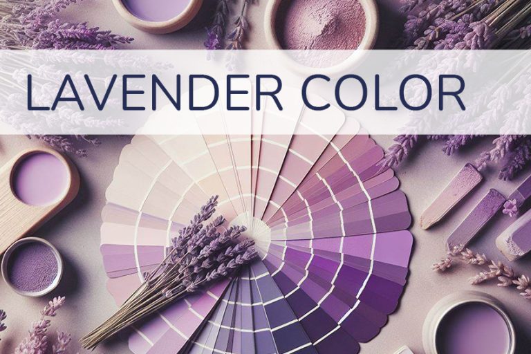
Royal Blue and Lavender
Royal blue and lavender come together to create a regal and serene ambiance. The deep intensity of royal blue is softened by the gentle tones of lavender, making this combination perfect for a sophisticated bedroom or a luxurious lounge. It exudes a sense of tranquility and opulence, providing a retreat-like atmosphere within the home.
| Shade | Hex Code | CMYK Color Code (%) | RGB Color Code | Color |
| Royal Blue | #4169E1 | 65, 48, 0, 11 | 65, 105, 225 | |
| Lavender | #E6E6FA | 8, 8, 0, 2 | 230, 230, 250 |

Powder Blue and Olive Green
Powder blue and olive green bring together a subtle and refreshing palette. The softness of powder blue complements the earthy richness of olive green, resulting in a balanced and nature-inspired combination. Ideal for spaces like a sunroom or a bedroom, this pairing instills a sense of calm and connection to the outdoors.
| Shade | Hex Code | CMYK Color Code (%) | RGB Color Code | Color |
| Powder Blue | #B0E0E6 | 26, 0, 0, 10 | 176, 224, 230 | |
| Olive Green | #556B2F | 64, 0, 100, 50 | 85, 107, 47 |

Cerulean Blue and Gold
Cerulean blue paired with gold creates a luxurious and timeless aesthetic. The cool tones of cerulean are elevated by the richness of gold accents, making this combination ideal for creating a glamorous atmosphere in spaces like a dining room or a master bedroom. The contrast between the cool and warm tones adds depth and sophistication.
| Shade | Hex Code | CMYK Color Code (%) | RGB Color Code | Color |
| Cerulean Blue | #007BA7 | 90, 28, 0, 31 | 0, 123, 167 | |
| Gold | #FFD700 | 0, 2, 100, 0 | 255, 215, 0 |

Steel Blue and Blush Pink
Steel blue and blush pink strike a delicate balance between strength and softness. The muted tones of steel blue provide a grounded backdrop, while the blush pink introduces a touch of warmth and femininity. This combination is well-suited for a chic and modern living room or a stylish bedroom, creating an atmosphere of understated elegance.
| Shade | Hex Code | CMYK Color Code (%) | RGB Color Code | Color |
| Steel Blue | #4682B4 | 59, 34, 0, 29 | 70, 130, 180 | |
| Blush Pink | #FFB6C1 | 0, 24, 10, 0 | 255, 182, 193 |

Indigo Blue and Mint Green
Indigo blue paired with mint green results in a refreshing and invigorating combination. The deep richness of indigo is uplifted by the coolness of mint green, making this duo ideal for spaces like a bathroom or a home office. The contrast between the bold and soft tones creates a lively and energizing atmosphere.
| Shade | Hex Code | CMYK Color Code (%) | RGB Color Code | Color |
| Indigo Blue | #4B0082 | 80, 100, 0, 49 | 75, 0, 130 | |
| Mint Green | #98FF98 | 8, 0, 19, 0 | 152, 255, 152 |

Cornflower Blue and Terracotta
Cornflower blue and terracotta come together to evoke a sense of rustic charm and warmth. The softness of cornflower blue complements the earthy tones of terracotta, making this combination perfect for a cozy kitchen or a welcoming entryway. It brings a touch of the countryside indoors, creating a relaxed and inviting atmosphere.
| Shade | Hex Code | CMYK Color Code (%) | RGB Color Code | Color |
| Cornflower Blue | #6495ED | 52, 34, 0, 6 | 100, 149, 237 | |
| Terracotta | #E2725B | 0, 54, 45, 11 | 226, 114, 91 |

Periwinkle Blue and Champagne
Periwinkle blue paired with champagne creates an ethereal and sophisticated ambiance. The calming nature of periwinkle is elevated by the elegance of champagne, making this combination perfect for a serene bedroom or a refined dining space. It exudes a sense of understated luxury and tranquility.
| Shade | Hex Code | CMYK Color Code (%) | RGB Color Code | Color |
| Periwinkle Blue | #CCCCFF | 18, 18, 0, 0 | 204, 204, 255 | |
| Champagne | #F7E7CE | 0, 5, 26, 8 | 247, 231, 206 |

Baby Blue and Mauve
Baby blue and mauve form a gentle and soothing pairing. The softness of baby blue is complemented by the subtle elegance of mauve, creating a serene atmosphere in spaces like a nursery or a cozy reading corner. This combination offers a timeless and calming aesthetic, perfect for creating a comforting retreat within the home.
| Shade | Hex Code | CMYK Color Code (%) | RGB Color Code | Color |
| Baby Blue | #89CFF0 | 41, 0, 7, 0 | 137, 207, 240 | |
| Mauve | #E0B0FF | 20, 37, 0, 0 | 224, 176, 255 |

Hopefully, you now have a better idea of colors that go with blue. Whether you want to create a bright, fun, and playful interior, a more sophisticated, yet relaxed interior, or anything in between, there is surely a color combination that will suit your needs. Remember to play around with not only the shades of blue but also with the different hues, as how warm or cool a blue is makes a very big difference in a room, especially with a color that is inherently perceived as cold. Hopefully, you now have more of an idea as to what to pair with your blue in your home, to make you less blue.
Take a look at our “what colors go with blue” webstory here!
Frequently Asked Questions
What Are Colors That Go With Blue?
Wondering what colors go with blue? Depending on the exact shade of blue, there are a few colors that complement blue well. These colors include green, red, brown, orange, yellow, cream, and white. If the blue you want to make use of has warm undertones, make sure that the color you are pairing it with has the same undertone value and vice versa.
What Is the Complementary Color of Blue?
The complementary color of blue can be found directly opposite the specific shade of blue on the color wheel. In most instances, the complementary color of blue tends to be a shade of orange. If the blue shade has more of a purple undertone, then the complementary orange will have more of a yellow undertone.
How Do I Incorporate Blue Into My House?
Depending on other colors that you plan on incorporating, or already have in your home, and the exact shade of blue you are planning on using, there are a few ways in which you can incorporate the color into your home: Paint an accent wall blue, make use of blue soft furnishings or blue decor, decorate with blue flowers.

Kylie Deyzel is an interior designer and sustainability enthusiast from Cape Town, South Africa. She has a passion for writing and educating others on various interior design topics. Her favorite interior design topics include interior design theory, interior design history, and most of all: sustainable interior design.
She received her B-tech degree in interior design from the University of Johannesburg in 2018 and has worked at various interior design firms since and had a few of her own freelance interior design clients under her company name binnekant.
Learn more about the Art in Context Team.
Cite this Article
Kylie, Deyzel, “What Colors Go With Blue? – Crafting 20 Vibrant Combinations.” Art in Context. January 20, 2023. URL: https://artincontext.org/what-colors-go-with-blue/
Deyzel, K. (2023, 20 January). What Colors Go With Blue? – Crafting 20 Vibrant Combinations. Art in Context. https://artincontext.org/what-colors-go-with-blue/
Deyzel, Kylie. “What Colors Go With Blue? – Crafting 20 Vibrant Combinations.” Art in Context, January 20, 2023. https://artincontext.org/what-colors-go-with-blue/.