Shades of Magenta Color – More Than 70+ Tones to Discover
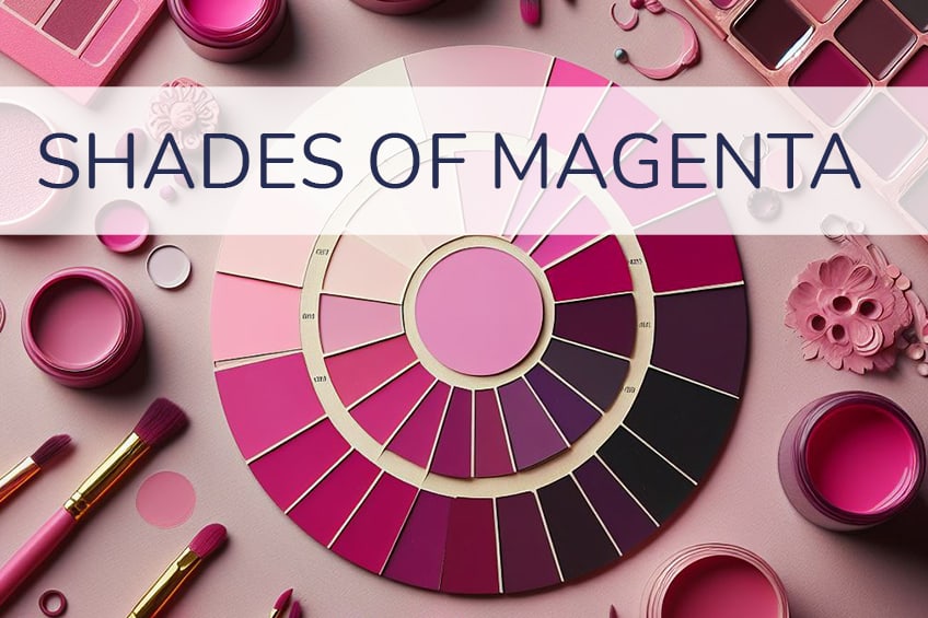
Welcome to the vibrant world of magenta, a color that dances between the lines of pink and purple with captivating grace. In this blog, we’re thrilled to showcase a stunning array of over 70 shades of magenta, each with its own visual charm and character. From the gentle whisper of pastel tones to the deep resonance of bold hues, we’ll guide you through a visual journey, complete with insightful descriptions and practical tips. Whether you’re a creative soul searching for inspiration or a color enthusiast hungry for the details, you’ll find all the color codes you need to bring these magenta shades to life in your own creations. Get ready to embrace the warmth and versatility of magenta, a color that’s as playful as it is profound!
What Color is Magenta?
Magenta, a color that defies conventional placement within the color spectrum, is a paradoxical hue that commands attention. I’ve always been fascinated by magenta’s origins—it’s a color that comes to life not through a specific wavelength of light, but through the additive mixing of red and blue light, with the absence of green.
This process creates a vivid and saturated color that lives between the warmth of red and the coolness of blue, a visual representation of balance and harmony. Magenta’s enigmatic presence in the world of color theory challenges the very way we perceive color, embodying the idea that the most impactful hues are often those that cannot be easily defined or categorized.
I’ve observed magenta’s unique ability to evoke a range of emotions, from the passionate vibrancy of a fuchsia to the gentle caress of a soft pink. It’s a color that doesn’t shy away from making a statement, whether it’s the focal point of a painting or the accent in a designer’s palette. In the CMYK color model, magenta is a primary color, highlighting its foundational role in the creation of countless other shades.
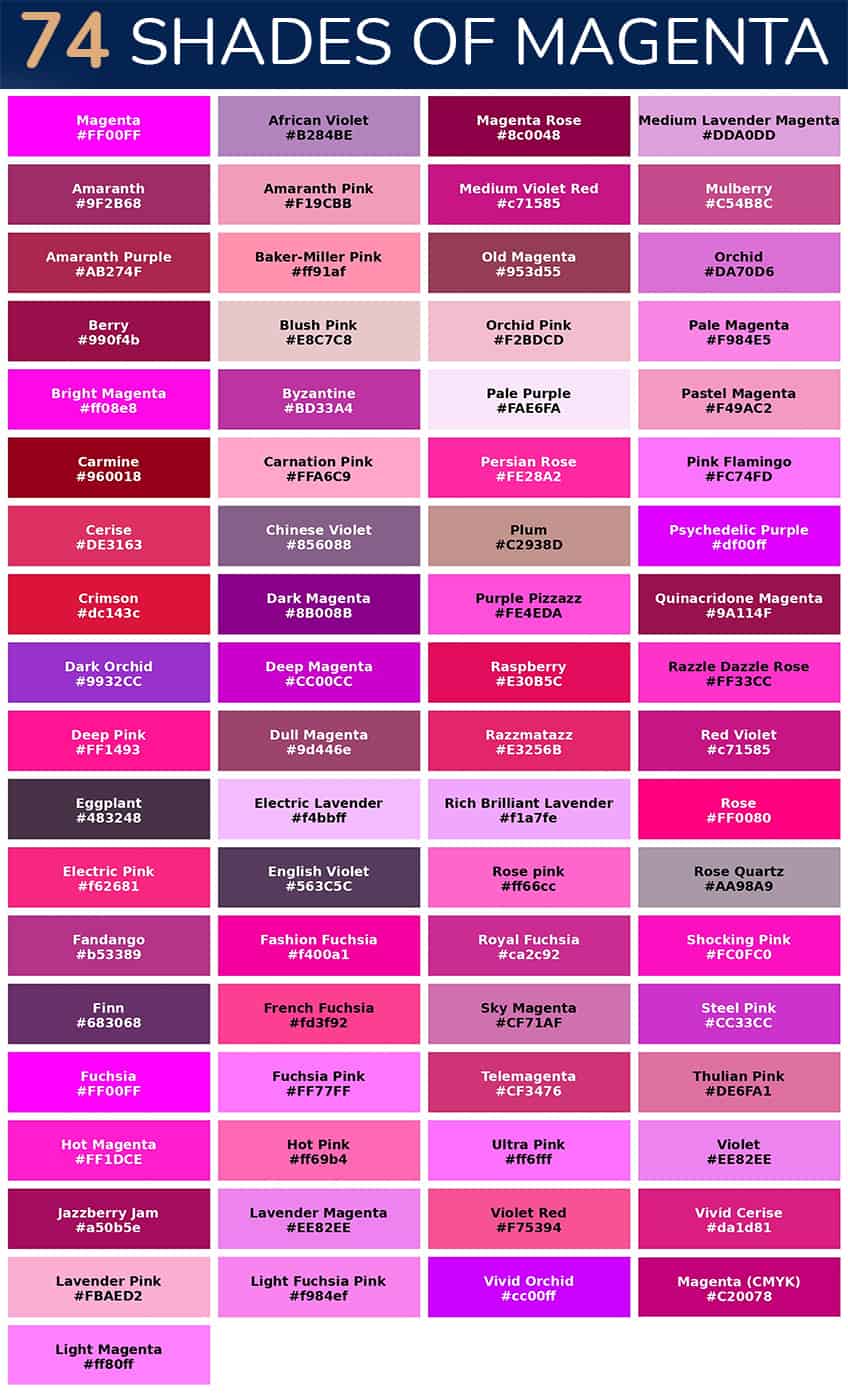
70+ Shades of Magenta to Discover
Magenta
Magenta is a vivid, purplish-red color, striking and bold. It’s perfect for accentuating details in design and fashion. Tip: Use it to inject energy into creative projects.
| Hex: #FF00FF RGB: 255, 0, 255 CMYK: 0, 100, 0, 0 |
African Violet
African Violet is a soft, muted purple with hints of gray, reminiscent of the delicate flowers. Ideal for serene and elegant spaces. Tip: Pair it with light greens for a natural palette.
| Hex: #B284BE RGB: 178, 132, 190 CMYK: 6, 31, 0, 25 |
Amaranth
Amaranth is a rich, deep pink-red, vibrant and eye-catching. It works well in energetic, dynamic designs. Tip: Use it sparingly to create focal points.
| Hex: #9F2B68 RGB: 159, 43, 104 CMYK: 0, 73, 35, 38 |
Amaranth Pink
Amaranth Pink is a lighter, softer version of Amaranth, exuding warmth and femininity. Great for romantic and gentle themes. Tip: Combine with whites for a delicate look.
| Hex: #F19CBB RGB: 241, 156, 187 CMYK: 0, 35, 22, 5 |
Amaranth Purple
Amaranth Purple is a deep, blue-toned purple, luxurious and mysterious. Suitable for sophisticated and moody atmospheres. Tip: Use with metallic accents for a luxurious feel.
| Hex: #AB274F RGB: 171, 39, 79 CMYK: 0, 77, 54, 33 |
Baker-Miller Pink
Baker-Miller Pink is a soft pink shade, known for its calming effect. It’s used in spaces intended for relaxation. Tip: Ideal for bedrooms or areas for meditation.
| Hex: #ff91af RGB: 255, 145, 175 CMYK: 0, 43, 31, 0 |
Berry
Berry is a rich, deep red-purple, reminiscent of ripe berries. It’s perfect for creating a feeling of abundance and vitality. Tip: Pair with earthy tones for a grounded look.
| Hex: #990f4b RGB: 153, 15, 75 CMYK: 0, 90, 51, 40 |
Blush Pink
Blush Pink is a delicate, soft pink with a hint of peach. It’s ideal for creating a light, airy, and romantic ambiance. Tip: Works well with pastels for a feminine touch.
| Hex: #E8C7C8 RGB: 232, 199, 200 CMYK: 0, 14, 14, 9 |
Bright Magenta
Bright Magenta is a highly saturated, intense purplish-pink. It’s perfect for bold statements in art and fashion. Tip: Balance it with neutrals to avoid overpowering.
| Hex: #ff08e8 RGB: 255, 8, 232 CMYK: 0, 97, 9, 0 |
Byzantine
Byzantine is a rich, medium purple with a hint of red. It exudes a sense of luxury and historic elegance. Tip: Combine with gold accents for a regal appearance.
| Hex: #BD33A4 RGB: 189, 51, 164 CMYK: 0, 73, 13, 26 |
Carmine
Carmine is a deep, vivid red with a slightly bluish undertone. It’s often used in artistic and ceremonial contexts. Tip: Use as an accent color to add depth and intensity.
| Hex: #960018 RGB: 150, 0, 24 CMYK: 0, 100, 84, 41 |
Carnation Pink
Carnation Pink is a light, soft pink, reminiscent of the flower. It’s perfect for gentle, nurturing themes. Tip: Blend with greens for a fresh, floral look.
| Hex: #FFA6C9 RGB: 255, 166, 201 CMYK: 0, 35, 21, 0 |
Cerise
Cerise is a deep, vivid pink with a touch of red. It’s vibrant and playful, great for youthful and energetic designs. Tip: Pair with dark blues for a striking contrast.
| Hex: #DE3163 RGB: 222, 49, 99 CMYK: 0, 78, 55, 13 |
Chinese Violet
Chinese Violet is a deep, muted purple with gray undertones. It conveys sophistication and mystery. Tip: Use in muted color schemes for an elegant backdrop.
| Hex: #856088 RGB: 133, 96, 136 CMYK: 2, 29, 0, 47 |
Crimson
Crimson is a rich, deep red, symbolizing passion and energy. It’s a classic choice for emphasis and drama. Tip: Combine with black for a powerful, intense look.
| Hex: #dc143c RGB: 220, 20, 60 CMYK: 0, 91, 73, 14 |
Dark Magenta
Dark Magenta is a deep, purplish-red, more subdued than bright magenta. It’s suitable for mature, sophisticated themes. Tip: Works well with dark greens for contrast.
| Hex: #8B008B RGB: 139, 0, 139 CMYK: 0, 100, 0, 45 |
Dark Orchid
Dark Orchid is a medium dark purple with hints of pink. It’s exotic and mysterious, ideal for unique and creative spaces. Tip: Accentuate with silver for a modern twist.
| Hex: #9932CC RGB: 153, 50, 204 CMYK: 25, 75, 0, 20 |
Deep Magenta
Deep Magenta is a rich, dark version of magenta, full of depth and intensity. Perfect for adding warmth and drama. Tip: Use in dimly lit spaces for a cozy atmosphere.
| Hex: #CC00CC RGB: 204, 0, 204 CMYK: 0, 100, 0, 20 |
Deep Pink
Deep Pink is a strong, bright pink, full of life and excitement. It’s great for playful, dynamic designs. Tip: Offset with light grays for a balanced look.
| Hex: #FF1493 RGB: 255, 20, 147 CMYK: 0, 92, 42, 0 |
Dull Magenta
Dull Magenta is a muted, understated version of magenta, versatile and subdued. Ideal for backgrounds and subtle accents. Tip: Combine with bright colors for a pop of contrast.
| Hex: #9d446e RGB: 157, 68, 110 CMYK: 0, 57, 30, 38 |
Eggplant
Eggplant is a dark, brownish-purple, resembling the vegetable. It’s perfect for creating depth and richness in a space. Tip: Use with warm woods for an earthy, natural feel.
| Hex: #483248 RGB: 72, 50, 72 CMYK: 0, 31, 0, 72 |
Electric Lavender
Electric Lavender is a bright, neon purple, energetic and modern. It’s great for futuristic or avant-garde themes. Tip: Best used in small, impactful doses.
| Hex: #f4bbff RGB: 244, 187, 255 CMYK: 4, 27, 0, 0 |
Electric Pink
Electric Pink is a vibrant, intense pink, radiating excitement and fun. Ideal for lively, spirited designs. Tip: Balance with black or white for a graphic effect.
| Hex: #f62681 RGB: 246, 38, 129 CMYK: 0, 85, 48, 4 |
English Violet
English Violet is a dark, smoky purple, evoking a sense of traditional elegance. It’s perfect for formal or classic settings. Tip: Pair with creamy whites for a refined look.
| Hex: #563C5C RGB: 86, 60, 92 CMYK: 7, 35, 0, 64 |
Fandango
Fandango is a bold, medium-dark purple, playful and eye-catching. Great for creative and whimsical applications. Tip: Use with lighter purples for a monochromatic scheme.
| Hex: #b53389 RGB: 181, 51, 137 CMYK: 0, 72, 24, 29 |
Fashion Fuchsia
Fashion Fuchsia is a bright, intense pink-purple, trendy and stylish. It’s perfect for modern, fashion-forward designs. Tip: Combine with black for a chic, contemporary look.
| Hex: #f400a1 RGB: 244, 0, 161 CMYK: 0, 100, 34, 4 |
Finn
Finn is a unique, muted purple with gray undertones, understated and sophisticated. Ideal for minimalist or modern aesthetics. Tip: Works well with metallics for a sleek finish.
| Hex: #683068 RGB: 104, 48, 104 CMYK: 0, 54, 0, 59 |
French Fuchsia
French Fuchsia is a bright, deep pink, chic and elegant. It’s associated with luxury and sophistication. Tip: Use in accessories for a touch of glamour.
| Hex: #fd3f92 RGB: 253, 63, 146 CMYK: 0, 75, 42, 1 |
Fuchsia
Fuchsia is a vivid, purplish-red, striking and lively. It’s great for eye-catching accents in decor and fashion. Tip: Pair with green for a vibrant, complementary contrast.
| Hex: #FF00FF RGB: 255, 0, 255 CMYK: 0, 100, 0, 0 |
Fuchsia Pink
Fuchsia Pink is a lighter, more vivid pink version of fuchsia. It’s playful and feminine, perfect for youthful themes. Tip: Combine with oranges for a warm, energetic palette.
| Hex: #FF77FF RGB: 255, 119, 255 CMYK: 0, 53, 0, 0 |
Hot Magenta
Hot Magenta is an intense, bright purple-pink, full of energy and vibrancy. Ideal for bold, expressive designs. Tip: Use as an accent color against a neutral backdrop.
| Hex: #FF1DCE RGB: 255, 29, 206 CMYK: 0, 89, 19, 0 |
Hot Pink
Hot Pink is a bright, neon pink, fun and attention-grabbing. It’s great for adding a pop of color to any space. Tip: Use in small amounts to create a focal point.
| Hex: #ff69b4 RGB: 255, 105, 180 CMYK: 0, 59, 29, 0 |
Jazzberry Jam
Jazzberry Jam is a deep, berry-like purple, rich and luxurious. Perfect for cozy, intimate spaces. Tip: Complement with soft creams for a lush look.
| Hex: #a50b5e RGB: 165, 11, 94 CMYK: 0, 93, 43, 35 |
Lavender Magenta
Lavender Magenta is a soft, muted blend of purple and pink. It’s calming and gentle, suitable for relaxing environments. Tip: Pair with light blues for a serene color scheme.
| Hex: #EE82EE RGB: 238, 130, 238 CMYK: 0, 45, 0, 7 |
Lavender Pink
Lavender Pink is a pale, soft pink with a hint of lavender. It’s delicate and dreamy, ideal for tranquil settings. Tip: Use in nurseries or restful areas.
| Hex: #FBAED2 RGB: 251, 174, 210 CMYK: 0, 31, 16, 2 |
Light Fuchsia Pink
Light Fuchsia Pink is a softer, lighter version of fuchsia, tender and sweet. It’s perfect for subtle, feminine touches. Tip: Combine with grays for a modern, chic look.
| Hex: #f984ef RGB: 249, 132, 239 CMYK: 0, 47, 4, 2 |
Light Magenta
Light Magenta is a pale, less intense version of magenta, soft and versatile. Ideal for backgrounds or soft accents. Tip: Blend with pastel colors for a harmonious look.
| Hex: #ff80ff RGB: 255, 128, 255 CMYK: 0, 50, 0, 0 |
Magenta (CMYK)
Magenta (CMYK) is a pure, printer’s magenta, vibrant and essential for color printing. It’s a key component in full-color printing. Tip: Use in graphic designs for clean, vivid color reproduction.
| Hex: #C20078 RGB: 194, 0, 120 CMYK: 0, 100, 38, 24 |
Magenta Rose
Magenta Rose is a deep, rosy pink with a touch of magenta, lush and romantic. Ideal for intimate, elegant settings. Tip: Use in floral designs to add a rich, vibrant touch.
| Hex: #8c0048 RGB: 140, 0, 72 CMYK: 0, 100, 49, 45 |
Medium Lavender Magenta
Medium Lavender Magenta is a balanced blend of lavender and magenta, soft yet striking. Great for creating a calm yet colorful atmosphere.
| Hex: #DDA0DD RGB: 221, 160, 221 CMYK: 0, 28, 0, 13 |
Medium Violet Red
Medium Violet Red is a deep, warm purple-red, versatile and inviting. Perfect for adding depth to a color scheme without overwhelming.
| Hex: #c71585 RGB: 199, 21, 133 CMYK: 0, 89, 33, 22 |
Mulberry
Mulberry is a rich, dark purple-red, reminiscent of the berry. It’s ideal for creating a sense of luxury and abundance.
| Hex: #C54B8C RGB: 197, 75, 140 CMYK: 0, 62, 29, 23 |
Old Magenta
Old Magenta is a muted, darker shade of magenta, conveying a sense of vintage elegance. Great for adding a sophisticated, historical touch to designs.
| Hex: #953d55 RGB: 149, 61, 85 CMYK: 0, 59, 43, 42 |
Orchid
Orchid is a soft, light purple, delicate and refined. It’s perfect for creating a serene, sophisticated ambiance. Tip: Enhance its beauty by pairing with complementary green hues.
| Hex: #DA70D6 RGB: 218, 112, 214 CMYK: 0, 49, 2, 15 |
Orchid Pink
Orchid Pink is a light, soft pink with a hint of purple, gentle and soothing. Ideal for peaceful, calming spaces.
| Hex: #F2BDCD RGB: 242, 189, 205 CMYK: 0, 22, 15, 5 |
Pale Magenta
Pale Magenta is a soft, subdued version of magenta, offering a hint of color without overpowering. Perfect for subtle, understated elegance.
| Hex: #F984E5 RGB: 249, 132, 229 CMYK: 0, 47, 8, 2 |
Pale Purple
Pale Purple is a light, muted purple, offering a sense of tranquility and softness. Ideal for creating a restful, calming environment.
| Hex: #FAE6FA RGB: 250, 230, 250 CMYK: 0, 8, 0, 2 |
Pastel Magenta
Pastel Magenta is a light, soft magenta, perfect for creating a playful yet sophisticated look. It’s great for spaces that require a touch of whimsy.
| Hex: #F49AC2 RGB: 244, 154, 194 CMYK: 0, 37, 20, 4 |
Persian Rose
Persian Rose is a bright, vibrant pink with a hint of red, exotic and lively. Ideal for spaces that need a pop of vivid color. Tip: Use in small doses to energize a room.
| Hex: #FE28A2 RGB: 254, 40, 162 CMYK: 0, 84, 36, 0 |
Pink Flamingo
Pink Flamingo is a bright, neon pink, fun and flamboyant. Great for spaces that aim to be bold and playful.
| Hex: #FC74FD RGB: 252, 116, 253 CMYK: 0, 54, 0, 1 |
Plum
Plum is a deep, rich purple, conveying a sense of depth and luxury. It’s perfect for creating a sophisticated and cozy atmosphere.
| Hex: #C2938D RGB: 194, 147, 141 CMYK: 0, 24, 27, 24 |
Psychedelic Purple
Psychedelic Purple is a bright, vivid purple, energetic and eye-catching. Ideal for artistic or contemporary spaces that embrace boldness.
| Hex: #df00ff RGB: 223, 0, 255 CMYK: 13, 100, 0, 0 |
Purple Pizzazz
Purple Pizzazz is a vibrant, lively purple, full of energy and fun. Great for spaces that require a playful, dynamic touch.
| Hex: #FE4EDA RGB: 254, 78, 218 CMYK: 0, 69, 14, 0 |
Quinacridone Magenta
Quinacridone Magenta is a vivid, intense pink-purple, known for its excellent colorfastness. It’s perfect for artistic endeavors that require lasting vibrancy.
| Hex: #9A114F RGB: 154, 17, 79 CMYK: 0, 89, 49, 40 |
Raspberry
Raspberry is a deep, berry red-pink, rich and inviting. Ideal for creating a sense of warmth and comfort in a space.
| Hex: #E30B5C RGB: 227, 11, 92 CMYK: 0, 95, 59, 11 |
Razzle Dazzle Rose
Razzle Dazzle Rose is a bright, neon pink, vibrant and lively. Great for adding an energetic, playful touch to any setting.
| Hex: #FF33CC RGB: 255, 51, 204 CMYK: 0, 80, 20, 0 |
Razzmatazz
Razzmatazz is a deep, vibrant pink-red, full of energy and excitement. Perfect for creating a focal point in a bold, dynamic design.
| Hex: #E3256B RGB: 227, 37, 107 CMYK: 0, 84, 53, 11 |
Red Violet
Red Violet is a deep, warm blend of red and purple, luxurious and intense. Ideal for adding depth and richness to a color scheme.
| Hex: #c71585 RGB: 199, 21, 133 CMYK: 0, 89, 33, 22 |
Rich Brilliant Lavender
Rich Brilliant Lavender is a bright, vivid lavender, exuding cheerfulness and lightness. Great for uplifting and energizing spaces.
| Hex: #f1a7fe RGB: 241, 167, 254 CMYK: 5, 34, 0, 0 |
Rose
Rose is a classic, medium pink, conveying a sense of romance and tenderness. It’s perfect for creating a soft, nurturing atmosphere.
| Hex: #FF0080 RGB: 255, 0, 128 CMYK: 0, 100, 50, 0 |
Rose pink
Rose Pink is a soft, delicate pink, gentle and soothing. Ideal for spaces that aim to be comforting and serene.
| Hex: #ff66cc RGB: 255, 102, 204 CMYK: 0, 60, 20, 0 |
Rose Quartz
Rose Quartz is a pale, gentle pink, evoking a sense of calm and tranquility. Perfect for creating a peaceful, restful environment.
| Hex: #AA98A9 RGB: 170, 152, 169 CMYK: 0, 11, 1, 33 |
Royal Fuchsia
Royal Fuchsia is a deep, intense pink-purple, luxurious and bold. Great for adding a touch of drama and sophistication to a space.
| Hex: #ca2c92 RGB: 202, 44, 146 CMYK: 0, 78, 28, 21 |
Shocking Pink
Shocking Pink is a bright, vivid pink, fun and attention-grabbing. Ideal for spaces that want to make a bold statement.
| Hex: #FC0FC0 RGB: 252, 15, 192 CMYK: 0, 94, 24, 1 |
Sky Magenta
Sky Magenta is a soft, airy pink with a hint of purple, light and ethereal. Perfect for creating a dreamy, whimsical atmosphere.
| Hex: #CF71AF RGB: 207, 113, 175 CMYK: 0, 45, 15, 19 |
Steel Pink
Steel Pink is a muted, metallic pink, offering a modern, industrial feel. Great for contemporary spaces that embrace a sleek, urban aesthetic.
| Hex: #CC33CC RGB: 204, 51, 204 CMYK: 0, 75, 0, 20 |
Telemagenta
Telemagenta is a vibrant, purplish-pink, modern and eye-catching. Ideal for designs that aim to be fresh and lively. Tip: Use in tech or youth-oriented designs for a pop of color.
| Hex: #CF3476 RGB: 207, 52, 118 CMYK: 0, 75, 43, 19 |
Thulian Pink
Thulian Pink is a dusky, soft pink with a hint of gray, subtle and sophisticated. Perfect for creating a refined, understated look.
| Hex: #DE6FA1 RGB: 222, 111, 161 CMYK: 0, 50, 27, 13 |
Ultra Pink
Ultra Pink is a bright, intense pink, full of life and vibrancy. Great for spaces that require a lively, dynamic touch.
| Hex: #ff6fff RGB: 255, 111, 255 CMYK: 0, 56, 0, 0 |
Violet
Violet is a deep, blue-purple, conveying a sense of mystery and depth. It’s perfect for creating an ambiance of intrigue and sophistication.
| Hex: #EE82EE RGB: 238, 130, 238 CMYK: 0, 45, 0, 7 |
Violet Red
Violet Red is a warm, deep purple-red, rich and intense. Ideal for adding a luxurious, dramatic touch to a design.
| Hex: #F75394 RGB: 247, 83, 148 CMYK: 0, 66, 40, 3 |
Vivid Cerise
Vivid Cerise is a bright, bold pink-red, playful and energetic. Great for spaces that want to be lively and vibrant.
| Hex: #da1d81 RGB: 218, 29, 129 CMYK: 0, 87, 41, 15 |
Vivid Orchid
Vivid Orchid is a bright, intense purple, exuberant and striking. Perfect for creating a bold, expressive atmosphere.
| Hex: #cc00ff RGB: 204, 0, 255 CMYK: 20, 100, 0, 0 |
Shades of Magenta in Interior Design
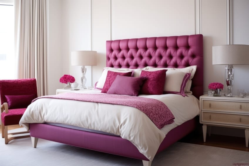
In interior design, shades of magenta bring a bold and vibrant energy into any space. This dynamic hue can range from soft, muted tones ideal for creating a tranquil and cozy atmosphere, to vivid, saturated magenta that makes a strong, confident statement. Here are some ways to incorporate magenta into interiors:
- Earthy tones for a nature-inspired palette
- Metallics like gold or copper for a luxurious feel
- Pastels for a playful, whimsical vibe
- Dark hues like navy or black for a dramatic and modern aesthetic

Incorporating magenta into interior design offers a versatile range of options, from bold statements to subtle accents, allowing for personal expression and creativity to shine in any living space.
Magenta Shades in Fashion
Incorporating shades of magenta into fashion breathes life and vibrancy into any wardrobe, offering a bold statement that ranges from playfully feminine to confidently edgy. This versatile hue can be paired with a multitude of colors to create eye-catching ensembles suitable for every season and occasion. Here are six chic color combinations featuring magenta:
- Magenta and navy blue for a sophisticated, nautical-inspired look.
- Magenta and emerald green to evoke a luxe, jewel-toned elegance.
- Magenta and charcoal grey for a modern, urban-chic vibe.
- Magenta and cream for a soft, romantic palette.
- Magenta and teal for a lively, tropical contrast.
- Magenta and metallic gold for a touch of opulent glamour.
Color Meaning of Magenta
Magenta embodies a blend of passion and serenity, representing balance, universal love, and emotional well-being. It encourages creativity and innovation, often associated with non-conformity and the breaking of traditional boundaries. This color uplifts the spirit, symbolizing optimism and change, and in design, it adds a touch of sophistication and luxury.
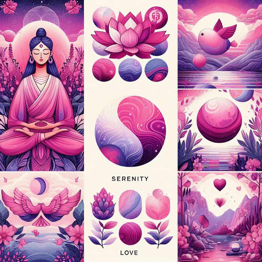
Magenta is a versatile hue that conveys both boldness and gentle warmth, perfect for expressing individuality and inspiring positive transformation.
Frequently Asked Questions
How Does Lighting Affect the Appearance of Magenta Shades?
Lighting can significantly affect how magenta shades appear; natural light tends to enhance the vibrancy, while artificial light can either warm up or cool down the hue.
What Considerations Should Be Taken When Choosing the Right Shade of Magenta for a Project?
Consider the size of the space, the existing color palette, the amount of natural light, and the intended psychological impact when choosing the right shade of magenta.
In 2005, Charlene completed her Wellness Diplomas in Therapeutic Aromatherapy and Reflexology from the International School of Reflexology and Meridian Therapy. She worked for a company offering corporate wellness programs for a couple of years, before opening up her own therapy practice. It was in 2015 that a friend, who was a digital marketer, asked her to join her company as a content creator, and this is where she found her excitement for writing.
Since joining the content writing world, she has gained a lot of experience over the years writing on a diverse selection of topics, from beauty, health, wellness, travel, and more. Due to various circumstances, she had to close her therapy practice and is now a full-time freelance writer. Being a creative person, she could not pass up the opportunity to contribute to the Art in Context team, where is was in her element, writing about a variety of art and craft topics. Contributing articles for over three years now, her knowledge in this area has grown, and she has gotten to explore her creativity and improve her research and writing skills.
Charlene Lewis has been working for artincontext.org since the relaunch in 2020. She is an experienced writer and mainly focuses on the topics of color theory, painting and drawing.
Learn more about Charlene Lewis and the Art in Context Team.
Cite this Article
Charlene, Lewis, “Shades of Magenta Color – More Than 70+ Tones to Discover.” Art in Context. December 1, 2023. URL: https://artincontext.org/shades-of-magenta-color/
Lewis, C. (2023, 1 December). Shades of Magenta Color – More Than 70+ Tones to Discover. Art in Context. https://artincontext.org/shades-of-magenta-color/
Lewis, Charlene. “Shades of Magenta Color – More Than 70+ Tones to Discover.” Art in Context, December 1, 2023. https://artincontext.org/shades-of-magenta-color/.


