What Is Tone in Art? – Light and Dark Color Values
You might know what a tone is in music, but have you ever wondered what is a tone in art? What is the definition of tone in art and how does it affect art? Tonality in art is an important aspect to consider, and we will be exploring how tone is used to highlight and create dimension in paintings.
What Is a Tone in Art?
The term “tone” in art refers to the value or character of color. It is determined by whether a hue is seen as warm or cool, brilliant or dull, or bright or dark.
The tonal range in an artwork may have a range of impacts, from defining the mood to emphasizing certain elements.
You’ve probably heard the expression “tone it down”: In the world of art, this refers to making a color less vibrant. Toning things up, on the other hand, might imply getting colors to burst out of an artwork, sometimes to stunning effect. Tonality in art, however, extends well beyond this basic definition.

Each color has an almost unlimited number of tones. Consider the nearly endless variations between midnight blue and baby blue. Tone is currently a major concept in color theory and a necessary tool for all painters – a painting could potentially seem flat and lifeless if it lacks tone.
A command of tonal value, on the other hand, enables the artist to produce powerful compositions that elicit strong emotions.
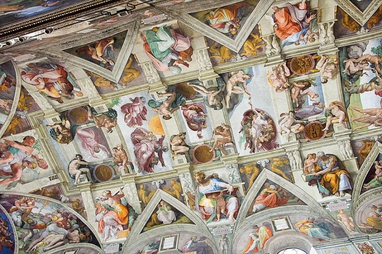
The concept gained popularity in the 19th century when artists started to focus on the natural world and reproduce the numerous tones seen in landscapes.

Tone and Value
Tone is yet another name for value, which is one of the most important aspects of art. The term tonal value is frequently employed; however, shade can also be utilized. Whatever you name it, it all refers to the darkness or brightness of a given color. Everything around us has a range of tones. For instance, the sky is not a uniform hue of blue. It is rather a series of blue tones that create a range from dark to light. Even a solid-color object, such as a brown leather couch, will have tones when painted or photographed.
The tones in this scenario are formed by the way lighting falls on the subject. Even though it is one uniform hue, in reality, the highlights and shadows give it character.
Local and Global Tone
A painting can have an overall tone in art, which we term the “global tone”. A cheerful landscape, for example, may have a dynamic global tone, whilst a sadder one may have a darker global tone.
This tonal range may set the emotional tone for the work as well as convey an overarching message to the audience.
It is one of the techniques that artists employ to communicate their intentions to us when we admire their artworks. Similarly, painters employ a “local tone”. This is a tone that embraces a certain section of a work of art. For instance, you could come upon a painting of a port on a stormy night. The overall tone may be somber, but the painter may opt to add light in the region of a sailboat as if the clouds were parting just over it. This section would feature a localized bright tone and may lend a romantic atmosphere to the work.

Seeing the Tone of Colors
Consider several shades of gray while trying to visualize a change in tone. As you move along the grayscale, the intensity may be changed from the darkest black to the lightest white. For example, a black-and-white image consists of only a collection of tones; the best of these contain a broad spectrum, which increases the visual appeal. The image looks lifeless and “muddy” without the contrasts between blacks and whites with varied gray tones somewhere between.
A similar exercise may be done when we think in terms of color. The infinite number of tones that can exist for any hue might be difficult to discern since the color itself diverts our attention
We may remove the hue from a color, providing us with simply the gray values, to examine the tonal values. Before computers, removing color from materials like paint pigments required the employment of several monochrome filters. But today, everything is a lot easier: Just snap a photo of anything that is only one color, such as a green leaf.
Use a black-and-white filter or desaturate the image in any picture editing software. You can see the wide range of tones that are possible in that color in the final image. Even the number of tones you notice in something you had thought was tonally flat could surprise you.
Contrasting Tones
Tone may be used to create contrast within an artwork by establishing a sense of tension between distinct elements or by drawing attention to certain portions of the composition. The use of contrast in art may be traced all the way back to the Renaissance when it became more popular in Italy’s creative circles.
This method was known as chiaroscuro, and it entailed combining black ink for darker tones and white gouache for brighter tones, with mid-tones created on blue paper, which was popular in Northern Italy during the Renaissance.
These methods continue to inspire modern art and are frequently employed to achieve striking results. A low contrast between the darkest and brightest tones will provide a more subdued or peaceful image. The bigger the contrast between tones, the more dramatic the mood.
Tone and Emotion
Emotions represent one of the most important parts of making and appreciating art, and tone may have a significant impact on this. While the theme, style, medium, and many other factors influence the overall feeling of a composition, few have as direct an influence as tone.
We detect a piece’s tone fairly intuitively; a dark global tone might quickly be understood as a depressing or oppressive environment, whereas a bright global tone gives an uplifting and pleasant impact.
Dramatic emotions are created by striking contrasts, whilst warmth and comfort are shown by minimum contrasts. Most colors in nature have a gray value, thus artists who know how to appropriately combine precise shades, tints, or tones may assist the artist in accurately portraying the varied highlights and shadows of the object they are portraying.

The Three Types of Tone
Directional light may be divided into three types of tones in its most basic form. The highlights, shadows, and mid-tones. How would this be applied in art? We can look at how to reduce a topic by simply dividing it into lights and darks in a shadow mapping sketch. Now we may add another layer of nuance by incorporating a mid-tone. We develop our mid tone on the drawing by sketching with a pencil and pressing it into the cartridge paper.
But now we may start experimenting by utilizing tonal paper as our mid-tone. Then, using white chalk for the highlights, and charcoal for the darker sections, we may begin to develop a drawing while still looking at three-tone types but using the tonal charcoal paper’s mid-tone.

Creating Depth With Tone
In an artwork, changing tone may be utilized to indicate distance and depth. The progressive tone is a technique for gradually transitioning from a lighter tone in the forefront to a darker tone in the background or vice versa. This implies that the amount of light hitting things varies with their distance from the spectator.
In The Open Window (1921), for example, Juan Gris used black and somber colors to highlight areas of the space that are in shadow. In the foreground, soft tones are employed to depict sunshine striking the table and a sheet of paper.

Caspar David Friedrich used his darkest tones in The Wanderer Above the Sea of Fog (1818). The prominent person and the rock on which he stands are practically silhouettes. The most extreme values depict the spinning white fog beneath the figure. The hills and boulders, mist, and sky become lighter and brighter in the distance as the tones go lighter.
Monotone vs. Duotone
Tonality in art does not have to be realistically applied. Stylized graphics may be made in graphic communication and design by restricting the number of tones or colors utilized. Monotone refers to the use of only one color. This is especially used to refer to black and white.
Many photographers like to work in black and white. Without color, the images rely entirely on tone to express shape, light, and form. Because of the inherent great contrast between black and white, monotone photographs may be quite appealing.
The spectrum of tones employed, on the other hand, will determine how forceful or delicate the finished work is. A duotone is comparable to a monotone but has two colors instead of black and white. A painter or designer can use color to make a picture appear warm or cooler, aggressive or subtle.

Using Tone to Create Form
Two-dimensional paintings cannot depict true shapes. To create the appearance of the shape, use varying tones that represent different quantities of light striking the subjects presented.
This can deceive the eye into thinking it is looking at a three-dimensional image.
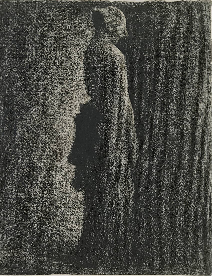
The figure in George Seurat’s The Black Bow (c.1882) seems three-dimensional. The lightest tones imply highlights on the woman’s arm and shoulder as well as in the front of her hat. The tones become darker as you move around the figure. The deepest tones may be seen at the rear. These imply shadows at the bottom of her dress, the small of her back, and behind the brim of her hat. These shifting tones provide the impression that light is striking a genuine form.
These shifting tones provide the impression that light is falling across a genuine form.
The Mixing of Tones
Different tones can be achieved in painted artworks or pastels by combining different colors. In a monotone composition, black, gray, and white can be blended to create different tones. They may be mixed with other colors to make shades, tints, and tones. Albrecht Durer used black, brown, and white in Young Hare (1502), to represent distinct colors of fur and to indicate areas on the hare’s eye, cheeks, and side of the face.
Single white strokes represent light striking particular strands on the animal’s back. Shadows are created using black, such as under the lips and between the front legs. Adding varied quantities of water to watercolor artworks might result in softer, lighter colors.

Hatching and Shading of Tones
In a drawing, shading is utilized to produce distinct tones. Tone building may be accomplished using a variety of approaches. Hatching is the process of creating tone with lines.
The number and thickness of lines and the distance between them all contribute to the appearance of the shape.
Cross -hatching makes use of lines that intersect at varying angles. Contour hatching employs curved lines that mimic the shape of a subject.
Tone in Color Theory
In color theory, the term “tone” has a somewhat narrower meaning than in general usage. Here the darkness and lightness of colors fall across three different spectrums based on how they are mixed.
When a color is lightened by the addition of white it is referred to as a tint. When a color is darkened by the addition of black it is referred to as a shade. When a color is made duller by the addition of gray, it is described as a tone.
Interestingly, although colors made darker by adding black are called shades, one of the best methods for depicting shadows while retaining the color of an object, is not by adding black, but by creating a gray version or a darker tone of the main color, usually by adding a small amount of the main color’s complementary color to create that darker tone as a chromatic gray.

Chart showing the difference between tints, tones, and shades in color theory; Stock-image
So, if you are painting a red ball, and you want to create a sense of depth by making parts of it darker, steer clear of black, and instead mix some green with the red to define those less illuminated areas. By using this chromatic (colored) gray, you will produce a tonal shift of your main color.
As can be seen in Impressionist art, this technique allows you to far more effectively mimic the absence of color vibrancy that results from direct light, than the simple addition of black.

As we have learned today, tonality in art is useful for so many aspects of the production process. It can make pictures stand out by adding depth and dimension, and it can create a mood and ambiance that affects one’s emotions significantly. Contrasting tones can add a feeling of life or tension to your paintings.
Take a look at our tone in art webstory here!
Frequently Asked Questions
What Is a Tone in Art Production?
The tone is the relative brightness or darkness of a color in a painting. A single color can have an almost endless number of tones. Tone can also refer to the actual color. The word appears to have gained popularity with the emergence of straight-from-nature painting in the 19th century, when painters grew concerned with finding and replicating the whole range of tones inherent in a specific subject. This sparked an interest in color for its own qualities, as well as color theory.
What Is the Definition of Tone in Art Theory?
The tone is just how bright or dark the color seems to be. The significance of employing the right tonal characteristics in a painting cannot be overstated. If you do it wrong, your artwork will seem lifeless and uninspired; get it right, and your artwork will shine! The tone is vital in producing the sense of shape, space, and depth in realistic paintings; in more abstract works, tonal shifts may be employed extremely efficiently to lead the eye around the piece, generating motion and energy.

Isabella studied at the University of Cape Town in South Africa and graduated with a Bachelor of Arts majoring in English Literature & Language and Psychology. Throughout her undergraduate years, she took Art History as an additional subject and absolutely loved it. Building on from her art history knowledge that began in high school, art has always been a particular area of fascination for her. From learning about artworks previously unknown to her, or sharpening her existing understanding of specific works, the ability to continue learning within this interesting sphere excites her greatly.
Her focal points of interest in art history encompass profiling specific artists and art movements, as it is these areas where she is able to really dig deep into the rich narrative of the art world. Additionally, she particularly enjoys exploring the different artistic styles of the 20th century, as well as the important impact that female artists have had on the development of art history.
Learn more about Isabella Meyer and the Art in Context Team.
Cite this Article
Isabella, Meyer, “What Is Tone in Art? – Light and Dark Color Values.” Art in Context. February 13, 2023. URL: https://artincontext.org/what-is-tone-in-art/
Meyer, I. (2023, 13 February). What Is Tone in Art? – Light and Dark Color Values. Art in Context. https://artincontext.org/what-is-tone-in-art/
Meyer, Isabella. “What Is Tone in Art? – Light and Dark Color Values.” Art in Context, February 13, 2023. https://artincontext.org/what-is-tone-in-art/.