
Colors That Start With Y: 8 Names, HEX, and RGB Codes

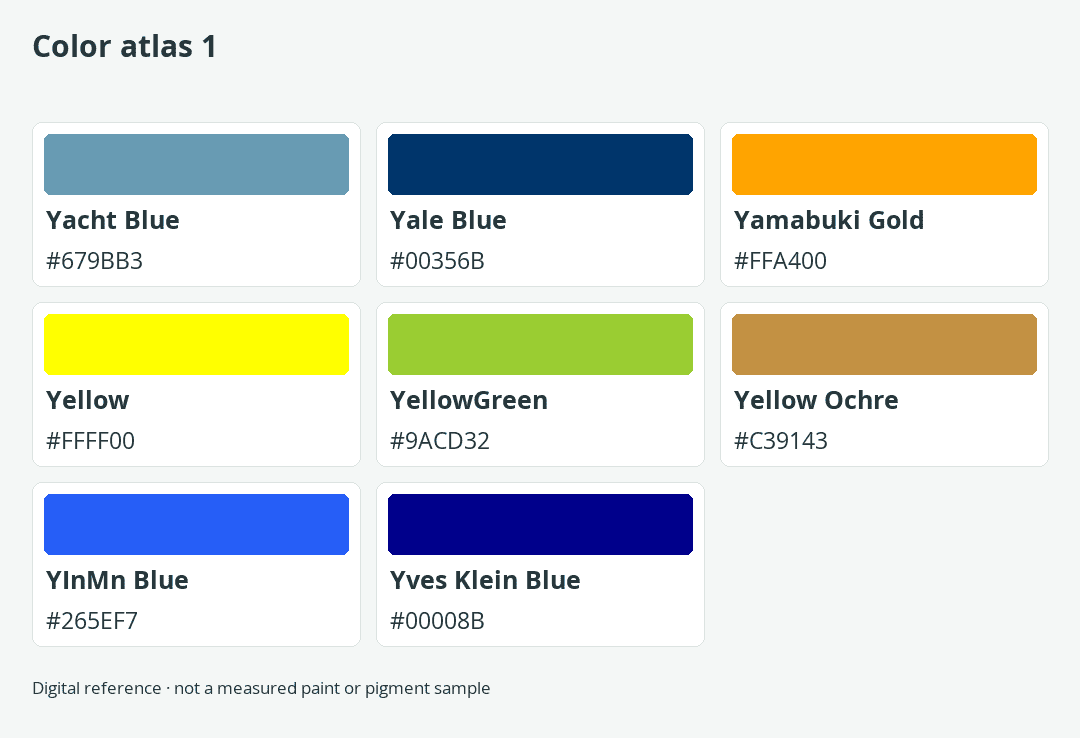
Yellow may be the first Y color that comes to mind, but this small corner of the alphabet also includes navy blue, mineral blue, ochre, gold, and green. This atlas presents eight carefully classified Y color-name entries with matching HEX values, RGB values, and digital swatches. Along the way, it shows why a web standard, an institutional color, a creative name, and a physical pigment cannot be treated as the same kind of reference.
How Many Colors Start With Y?
There is no universal total for colors that start with Y. This focused atlas contains eight distinct color-name and value entries, while one maintained creative catalog contains 204 Y-initial records. Those numbers answer different questions: eight is the scope of the classified reference below, whereas 204 is the size of one catalog’s candidate pool rather than an official inventory of every Y color.
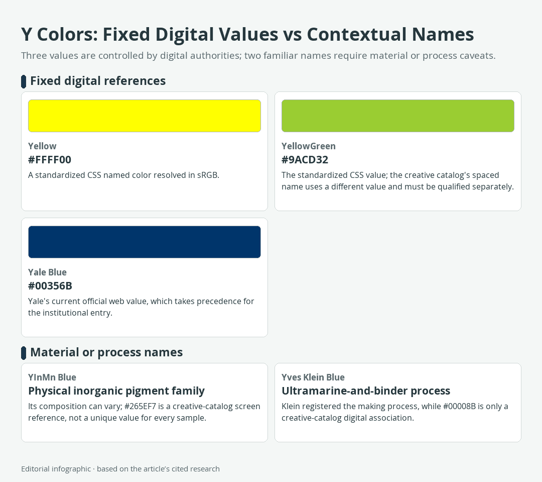
Download the complete color reference sheet (PNG): Y Colors: Fixed Digital Values vs Contextual Names (PNG) · Color atlas 1
Color naming systems overlap without sharing one governing authority. CSS defines keywords for web use, institutions publish identity colors, artists and researchers name materials or processes, and creative catalogs collect descriptive labels. A total can therefore rise or fall according to what the compiler accepts, whether spelling variants are merged, and whether a physical material must have a single reproducible digital value.

The Short Answer
The eight entries include two standardized CSS keywords, one institution-controlled web color, three creative-catalog associations, one physical pigment name paired with a catalog screen reference, and one artistic-process name paired with a catalog screen reference. Every displayed name begins with Y, and no spelling or punctuation variant is counted as an extra color.
This limited total is deliberate. A long alphabetical list is useful only when readers can tell what each number means. Adding hundreds of labels without preserving their authority and medium would create the appearance of breadth while making it harder to distinguish a reliable web value from a descriptive association.
What Counts as a Y Color?
Each atlas entry needs a distinct displayed name, a complete six-digit HEX value, a matching RGB triplet, and a source-class label. In six-digit hexadecimal notation, the RR, GG, and BB pairs represent the red, green, and blue components of an sRGB color. The HEX value controls each row, so its RGB numbers and visible swatch describe the same digital reference.
A shared first letter is the only feature all eight entries have in common. The list is alphabetical, not a family of related hues. That is why several blue names belong beside yellow, green, gold, and ochre entries. The words identify colors whose names begin with Y; they do not predict where those colors sit on a color wheel.
Identity also matters. Changing a space, hyphen, or capitalization does not automatically create a genuinely different color. A variant deserves a separate entry only when it has a distinct, qualified value or authority. This atlas therefore avoids padded near-duplicates and keeps the controlling context visible.
Readers interested in the larger naming problem can consult the guide to how many colors exist. The answer changes with the color model, medium, observer, measuring method, and naming system.
Standards, Institutions, Materials, and Creative Names
The source-class column prevents unlike references from appearing equally official. Read the labels as follows:
- CSS standard identifies a named web keyword with a defined sRGB value. It is the controlling class when writing CSS that uses that keyword.
- Institutional identifies a web value specified by the organization whose identity the color represents. That guidance controls the organization’s branded use.
- Creative catalog identifies an attributable design name and digital association. It is useful for discovery and palette work but is not an official color standard.
- Pigment name; catalog HEX identifies a physical pigment family paired with a convenient screen reference. The HEX value does not define every material sample.
- Artistic process; catalog HEX identifies a material or making process paired with a descriptive digital value. The swatch is an approximation for screen-based comparison.
These classes are not a ranking from good to bad. They answer different practical questions. A CSS keyword can be exact for browser code but irrelevant as a paint recipe. An institutional value can be authoritative for a university website without becoming a universal definition of every color carrying the same name.
The Curated Y Color Atlas
The eight entries appear in one main table, ordered case-insensitively while ignoring spaces, hyphens, apostrophes, and diacritics. Displayed spellings are preserved, and the final column makes the alphabetical groups visible without separating the colors into different tables. Use the HEX column when reproducing a digital reference, and read the source class before deciding how much authority that value carries outside a screen-based project.
Eight Colors in One Main Table
The table is deliberately compact: it keeps eight distinct Y-starting names whose displayed HEX values can be tied to the source classes explained above. Read each row as a digital reference, not as proof that a pigment, paint, or institutional color has one universal appearance.
| Name | HEX | RGB | Color | Source Class | Concise Note | Alphabetical Group |
|---|---|---|---|---|---|---|
| Yacht Blue | #679BB3 | 103, 155, 179 | Creative catalog | Catalog-based digital association. | Ya to Ye | |
| Yale Blue | #00356B | 0, 53, 107 | Institutional | Yale’s current official web value. | Ya to Ye | |
| Yamabuki Gold | #FFA400 | 255, 164, 0 | Creative catalog | Catalog-based digital association. | Ya to Ye | |
| Yellow | #FFFF00 | 255, 255, 0 | CSS standard | Standardized CSS keyword. | Ya to Ye | |
| YellowGreen | #9ACD32 | 154, 205, 50 | CSS standard | Standardized CSS keyword. | Ya to Ye | |
| Yellow Ochre | #C39143 | 195, 145, 67 | Creative catalog | Digital catalog association only. | Ya to Ye | |
| YInMn Blue | #265EF7 | 38, 94, 247 | Pigment name; catalog HEX | Screen reference, not a universal pigment value. | Yi to Yo | |
| Yves Klein Blue | #00008B | 0, 0, 139 | Artistic process; catalog HEX | Screen reference, not a universal process value. | Yu to Yv |
How to Read and Compare the Entries
Begin with the source class rather than the appearance of the swatch. If the task involves CSS, the standardized keyword is decisive. If the task represents Yale, the institution’s identity value controls. For a creative palette, a catalog association can be useful as long as the project records the exact HEX value instead of assuming the name will mean the same thing everywhere.
The RGB column offers a direct check on each HEX value. For example, #679BB3 separates into hexadecimal pairs 67, 9B, and B3, which correspond to decimal RGB values 103, 155, and 179. That agreement matters because a mislabeled swatch can look plausible while still encoding the wrong color.
For the material-linked entries, the swatch answers a narrower question: what digital value is associated with this name in the catalog? It does not answer what every pigment batch, painted surface, print, photograph, or illuminated object will look like. Keeping that distinction attached to the row makes the table useful without giving the HEX code false physical authority.
When One Y Color Has More Than One HEX
A color name can point to a web standard, an identity system, a physical material, an artistic process, or a creative association. When values conflict, choose the authority that governs the intended use. Averaging codes or presenting every listing as interchangeable removes the context that makes a value useful.

Yellow and YellowGreen as CSS Keywords
The complete CSS named-color table has two opaque keywords beginning with Y: Yellow at #FFFF00 and YellowGreen at #9ACD32. These are standardized sRGB references for web code. The names can be used as CSS keywords, and their six-digit values provide the same digital references.
A creative catalog associates the spaced label Yellow Green with #C8FD3D. That association does not replace or revise the CSS keyword. When a stylesheet calls for the standardized color, use yellowgreen or #9ACD32. If a project intentionally adopts the creative value, store #C8FD3D explicitly and label it as a separate catalog association rather than calling it the standard keyword.
Even the familiar name Yellow remains medium-specific. Its CSS definition does not prescribe a paint mixture, printing ink, dye formula, or the appearance of a photographed yellow object. It defines a value for an sRGB-oriented digital context.
Which Yale Blue Value Should You Use?
Use #00356B when representing Yale Blue on the web. Yale’s current identity guidance controls that institutional use. The creative-catalog association #0F4D92 belongs to a different naming context and should not replace the institution’s web value.
The decision illustrates a general rule: the organization represented by a brand color has stronger authority for that identity than a broad naming catalog. The catalog value can remain useful as a descriptive blue in another project, but attaching the Yale Blue label to it may imply an institutional match that the value does not provide.
The web value should not be copied blindly into print production. Yale separates its web color from print guidance and notes that absolute color consistency cannot be maintained across different production processes. A screen preview is a digital reference, not proof of how the final ink and paper combination will appear.
Pigments and Artistic Processes Are Not Fixed Pixels
YInMn Blue was discovered in 2009 in Mas Subramanian’s Oregon State University laboratory by graduate student Andrew Smith. Its name refers to yttrium, indium, and manganese. The pigment belongs to a YIn1-xMnxO3 solid solution, and its blue intensity changes with the indium-to-manganese ratio.
That variability is central to interpreting the table. The atlas value #265EF7 is a creative-catalog screen reference, not an official HEX value for every composition, manufactured sample, lighting condition, or reproduction. The value can anchor a digital palette inspired by the pigment, but it cannot certify that a screen matches a physical sample.
Yves Klein Blue requires a different caveat. Klein’s Milan exhibition of blue monochromes took place in 1957. The registration dated May 19, 1960 concerned a process combining ultramarine pigment with a Rhodopas M binder, not legal ownership of blue itself. The listed #00008B is a descriptive catalog association rather than a universal measurement of that pigment-and-binder process.
The physical distinction is fundamental. Screens emit light, while pigments and other objects are perceived through reflected light under particular illumination. Device gamut, material composition, output conditions, and lighting can change the appearance. A HEX swatch can guide a digital composition, but it cannot turn a material or artistic process into a fixed pixel value.
A Simple Authority Check
Before choosing between conflicting values, ask four questions:
- What is being represented? A browser keyword, an institution, a named material, an artwork-related process, or a creative project may require different evidence.
- What is the output medium? Screen, print, paint, and dye do not reproduce color through the same physical process.
- Who controls the definition? A technical standard controls its keyword, while an institution controls its identity guidance.
- What does the value claim? A catalog association is useful when presented as a digital reference, but it should not be promoted into an official or measured material value.
This check resolves the apparent contradictions in the atlas. YellowGreen follows CSS for a CSS task, Yale Blue follows Yale for an institutional web task, and the YInMn and Yves Klein entries retain explicit approximation labels.
How to Use Y Colors in Design
Start with the job a color must perform, then select the authority, value, and medium that fit that job. The guides to basic color theory and complementary colors can help organize hue relationships once the correct kind of reference has been chosen.
Choose by Role, Not by Name Alone
A memorable name can help a team discuss a palette, but the name does not determine how much space the color should occupy. Assign a role before judging a combination:
- Dominant field: YellowGreen or the warmer Yellow Ochre reference can cover a broad area without using the maximum digital intensity of pure CSS Yellow.
- Supporting tone: Yacht Blue can bridge a dark blue anchor and a warmer accent without claiming institutional or pigment status.
- Accent: Yellow, Yamabuki Gold, and the YInMn Blue screen reference can create focused areas of high visual emphasis. Their exact effect still depends on neighboring colors and scale.
- Dark anchor: Yale Blue and the Yves Klein Blue screen reference add visual weight. Neither name guarantees that overlaid text will meet a contrast requirement.
A color name may suggest a mood, but it does not prove a universal emotional response. Audience, scale, surrounding hues, use, and cultural context all shape interpretation. For a more focused set of warm combinations, the guide to colors that work with mustard yellow offers a related starting point.
Build Palettes With Explicit Roles
The following arrangements use only values from the atlas. They are starting structures for non-text color composition, not automatic accessibility approvals:
- Cool structure with a warm signal: Use Yacht Blue
#679BB3as the dominant field, Yellow Ochre#C39143as the supporting tone, and Yellow#FFFF00as a limited accent. - Dark anchor with botanical contrast: Use Yale Blue
#00356Bas the anchor, YellowGreen#9ACD32as the supporting color, and Yamabuki Gold#FFA400as the accent. - Blue-led digital study: Use Yacht Blue
#679BB3for the largest area, the YInMn Blue catalog reference#265EF7as a stronger supporting blue, and Yellow Ochre#C39143as the warm counterpoint.
These role labels make revision easier. If a bright accent becomes distracting, reduce its area or replace it without changing the entire structure. If the dominant color must carry text, evaluate that foreground-background pair separately rather than relying on the palette’s overall appearance.
Check Contrast Before Publishing
WCAG 2.2 Level AA requires a contrast ratio of at least 4.5:1 for normal text and 3:1 for large text. Here, large text means at least 18 point, or at least 14 point when bold. The enhanced thresholds are 7:1 for normal text and 4.5:1 for large text.
These thresholds describe the measured relationship between a foreground and its background. They are not properties built into names such as Yellow, Yale Blue, or Yacht Blue. A dark-looking swatch can still fail with one foreground, and a light-looking swatch can fail with another.
Test the actual pair that will appear in the finished interface, including the intended font size and weight. Repeat the test when either value changes. Do not transfer a passing result to a similar-sounding color, a neighboring shade, or a material sample, because the result belongs to the exact digital foreground and background values.
Keep Screen, Print, and Paint Separate
Use the HEX and RGB columns for sRGB-oriented screen work. For print, follow the printer’s requested color profile, proofing process, paper, and ink conditions instead of accepting an unprofiled CMYK conversion. A print proof addresses a different output problem from a browser swatch.
For paint or dye, make physical samples with the actual materials and inspect them under the intended light. Digital values are not physical mixing recipes. If the goal is to create a hue with pigments, follow material-specific guidance on mixing paint colors and judge the dried sample rather than copying an RGB triplet.
A photograph does not remove this limitation. The photographed surface is affected by illumination and capture conditions, and the resulting image is then reproduced by another display. Use photography for visual documentation, not as proof that a screen swatch is a measured material match.
A Practical Y-Color Workflow
- Define the task. State whether the color is for CSS, an institutional identity, a general digital palette, print production, or a physical material.
- Select the correct authority class. Use a standard for a standard keyword and institutional guidance for an institution. Keep catalog and material references qualified.
- Copy the complete HEX value. Preserve all six digits and the leading number sign so the RGB channels and swatch remain aligned.
- Assign a role. Decide whether the color is dominant, supporting, accent, background, or foreground before expanding the palette.
- Test text contrast. Evaluate the exact foreground-background pair against the applicable WCAG threshold.
- Verify the output medium. Use device checks for screens, proofs for print, and physical samples for paint or dye.
- Record the decision. Keep the displayed name, controlling HEX, source class, intended medium, and palette role together so a later revision does not substitute a conflicting value silently.
This sequence turns a name list into a repeatable tool. It also makes disagreements easier to diagnose: a conflict may come from a different authority, a different medium, or a different intended role rather than from a simple transcription error.
Frequently Asked Questions
These answers focus on adapting the atlas within a working color system.
Can I Rename an Atlas Color Inside My Own Project?
An internal alias can make a palette easier for a team to navigate. Keep the atlas name, exact HEX value, and source class in the project record so the alias does not quietly turn a creative association into a standardized or institutional color.
How Should I Record a Lighter or Darker Version I Create?
Give the modified color its own project-specific label and complete six-digit HEX value. Keep it separate from the original atlas entry, since changing the value creates a new digital reference rather than a new definition of the CSS keyword, institutional color, pigment, or artistic process.
Can I Filter the Atlas by Source Class?
Yes. A working copy can group CSS and institutional entries for authority-sensitive tasks, catalog entries for exploratory palette work, and material-linked names for qualified visual inspiration. Preserve the complete alphabetical table as the master reference so filtered views do not change the eight-entry total.

Matthew Matthysen is an educated multidisciplinary artist and illustrator. He successfully completed his art degree at the University of Witwatersrand in South Africa, majoring in art history and contemporary drawing. The focus of his thesis was to explore the philosophical implications of the macro and micro-universe on the human experience. Matthew uses diverse media, such as written and hands-on components, to explore various approaches that are on the border between philosophy and science.
Matthew organized various exhibitions before and during his years as a student and is still passionate about doing so today. He currently works as a freelance artist and writer in various fields. He also has a permanent position at a renowned online gallery (ArtGazette) where he produces various works on commission. As a freelance artist, he creates several series and successfully sells them to galleries and collectors. He loves to use his work and skills in various fields of interest.
Matthew has been creating drawing and painting tutorials since the relaunch in 2020. Through his involvement with artincontext.org, he has been able to deepen his knowledge of various painting mediums. For example, watercolor techniques, calligraphy and lately digital drawing, which is becoming more and more popular.
Learn more about Matthew Matthysen and the Art in Context Team.
Cite this Article
Matthew, Matthysen, “Colors That Start With Y: 8 Names, HEX, and RGB Codes.” Art in Context. October 9, 2026. URL: https://artincontext.org/colors-that-start-with-y/
Matthysen, M. (2026, 9 October). Colors That Start With Y: 8 Names, HEX, and RGB Codes. Art in Context. https://artincontext.org/colors-that-start-with-y/
Matthysen, Matthew. “Colors That Start With Y: 8 Names, HEX, and RGB Codes.” Art in Context, October 9, 2026. https://artincontext.org/colors-that-start-with-y/.