


Sap Green Color: HEX, Paint History, and Palettes

Sap green looks like a muted, leafy yellow-green, but its name can point to three very different things: an old buckthorn colorant, a modern tube of paint, or a digital swatch. Knowing which version you are working with makes it much easier to choose a paint, adjust a foliage mixture, or build a usable color palette. Here is how to identify each one without mistaking a convenient name for a fixed formula.
What Color Is Sap Green?
Sap green is commonly understood as a medium-dark yellow-green with an earthy, subdued character. It sits closer to natural foliage than to the sharp brightness of lime green, yet it usually appears livelier and more yellow than many olive greens.
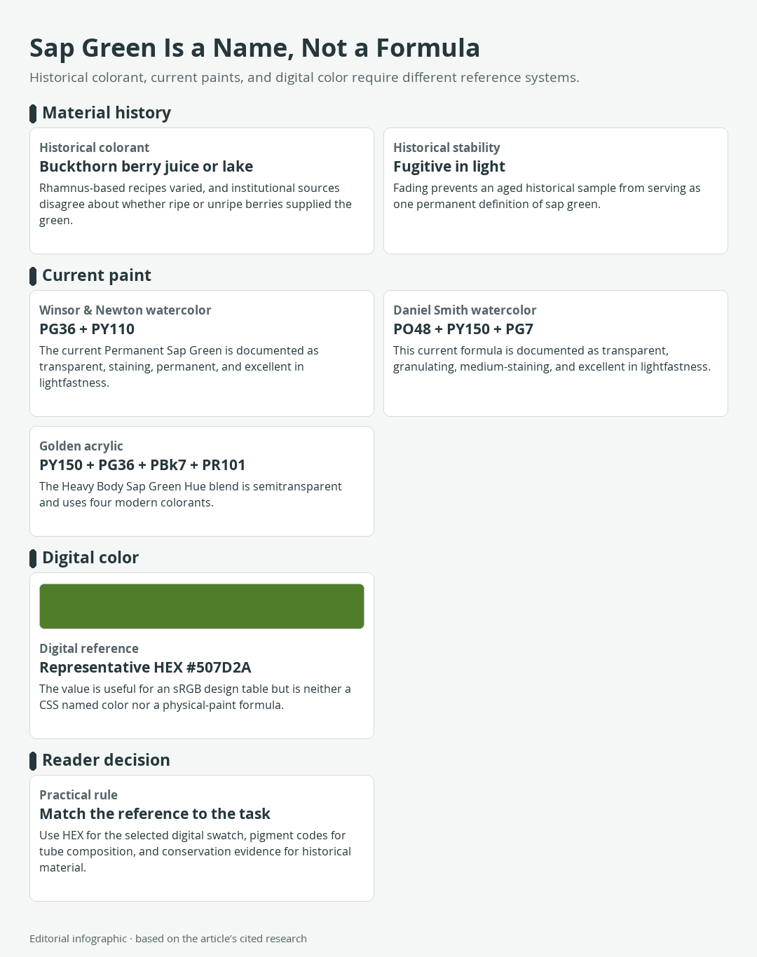
Download the complete color reference sheet (PNG): Sap Green Is a Name, Not a Formula (PNG)
The important qualification is that sap green is a color name, not one immutable color specification. Historical sap green came from plant material, present-day artists’ paints contain different synthetic pigment mixtures, and digital color directories commonly associate the name with HEX #507D2A.
Sap Green at a Glance
- General appearance: A muted yellow-green of medium-dark value
- Representative digital value: #507D2A
- RGB value: 80, 125, 42
- CSS status: Not a standardized CSS named-color keyword
- Historical material: A variable buckthorn-derived colorant
- Modern paint: A convenience color whose pigments depend on the manufacturer
These categories should not be substituted for one another. HEX is useful when specifying a color in sRGB, a common digital color space. Pigment codes identify the colorants in a tube, while conservation evidence is needed to understand historical material.
The Representative HEX Value
HEX #507D2A is a useful digital reference because more than one color directory associates it with Sap Green. It is not an official universal definition, however, and the W3C does not include sapgreen in its standardized list of CSS color names. For web work, use the explicit declaration #507D2A rather than treating the name as a browser keyword.
The value describes an sRGB color made from emitted light. It does not prescribe a paint mixture, reproduce a faded historical sample, or guarantee the same appearance on every display or printer.
Eight Exact Digital References
The first row below is the selected Sap Green reference. The remaining colors are standardized CSS companions or useful comparisons, not seven additional varieties of Sap Green. CSS tokens are written without spaces, as shown in the Name column.
| Name | HEX | RGB | Color |
|---|---|---|---|
| Sap Green | #507D2A | 80, 125, 42 | |
| YellowGreen | #9ACD32 | 154, 205, 50 | |
| OliveDrab | #6B8E23 | 107, 142, 35 | |
| DarkOliveGreen | #556B2F | 85, 107, 47 | |
| Cornsilk | #FFF8DC | 255, 248, 220 | |
| Sienna | #A0522D | 160, 82, 45 | |
| DarkSlateGray | #2F4F4F | 47, 79, 79 | |
| Indigo | #4B0082 | 75, 0, 130 |
YellowGreen helps reveal how comparatively muted #507D2A is. OliveDrab and DarkOliveGreen show nearby earthy territory, while Cornsilk, Sienna, DarkSlateGray, and Indigo provide practical light, warm, neutral, and cool partners.
How Buckthorn Became Sap Green
The original color did not begin as a numbered industrial pigment. Historical sap green referred to organic colorants obtained from buckthorn plants in the genus Rhamnus. Several species could supply the raw material, and changes in the plant, preparation, and added ingredients could change the result.

Buckthorn Berries and Manuscript Color
Buckthorn-derived green appears in medieval manuscript traditions, where organic greens could be used for small details such as stems and leaves. Some recipes were adjusted with indigo or woad when a different green was wanted. Sap green later became familiar in watercolor work during the seventeenth and eighteenth centuries.
That history explains the botanical name, but it does not establish a single surviving hue. A handmade colorant varied with its materials and processing, unlike a digital value that can be repeated numerically.
Why Sources Disagree About Berry Ripeness
Reputable technical and institutional descriptions do not give one consistent answer about the berries. Some describe color extracted from ripe buckthorn berries, while others describe historical sap green as a preparation made from unripe fruit.
The conflict should not be solved by declaring one stage universally correct. It instead points to variations in recipes, plant species, terminology, and workshop practice. Even colorants from the same broad plant source could produce different colors under different conditions.
Bladder Green and the Lake Process
Historical preparations could involve berry juice, an alkali or alum, and gum. Alum could help turn a soluble dye into a lake pigment, meaning a colorant attached to an insoluble material so it could be handled more like a pigment. Other preparations were concentrated to a syrup and stored in animal bladders, leading to the related name bladder green.
These descriptions clarify the material history, but they do not supply one universal modern studio recipe. Documented recipes and materials varied, and the old colorant was not durable enough to serve as a permanent reference.
Why the Historical Color Faded
Historical buckthorn sap green was fugitive, which means that exposure to light could make it fade. The consequences can be more complicated than a green merely becoming paler. If a green passage combined a blue pigment with a yellow lake, fading of the yellow component could leave the area looking blue.
Conservation analysis has identified this type of change in paintings, yet it cannot always reconstruct the exact original hue. A centuries-old object therefore cannot supply one definitive screen value for sap green. Its present color may reflect aging as much as the artist’s initial choice.
Modern Sap Green Paint and How to Mix It
Modern manufacturers preserve the useful color concept while replacing the fugitive plant colorant with more durable pigments. The result is a convenience color: a prepared mixture intended to give artists a practical leafy green. Because each manufacturer can build that mixture differently, two tubes bearing the same name may vary in hue, transparency, staining, and mixing behavior.

Three Current Formulas, Three Different Results
| Product | Medium | Listed Pigments | Documented Handling |
|---|---|---|---|
| Winsor & Newton Permanent Sap Green | Professional watercolor | PG36, PY110 | Transparent, staining, permanent, excellent lightfastness |
| Daniel Smith Sap Green | Watercolor | PO48, PY150, PG7 | Transparent, medium-staining, excellent lightfastness |
| Golden Sap Green Hue | Heavy body acrylic | PY150, PG36, PBk7, PR101 | Semitransparent, excellent lightfastness |
In watercolor descriptions, staining refers to how difficult the dried color is to lift from the paper. The formulas above share neither the same number nor the same selection of pigments. Their handling descriptions also differ, so substituting one for another can change both the color and the behavior of a passage. Product data can change over time, making the label or current manufacturer chart the best reference for the tube in hand.
Why Pigment Codes Matter
Color Index codes such as PG36 and PY150 identify pigment categories more dependably than proprietary paint names. The letter group denotes a broad color class, such as Pigment Green or Pigment Yellow, and the number identifies the listed colorant. These codes do not guarantee that finished paints will look identical because concentration, particle properties, binder, and other formulation choices still matter.
The word Hue generally indicates a substitute mixture for a traditionally referenced pigment or color, including an obsolete historical material. Usage is not perfectly universal, so the pigment list remains more informative than the front name alone. A reader comparing Sap Green with a single green pigment can also consult this guide to viridian color.
Adjusting Sap Green on the Palette
Start by swatching the Sap Green you actually own. Compare a thin application with a stronger one before deciding which adjustment the color needs.
- For a lighter or warmer green: Introduce yellow gradually.
- For a darker or cooler green: Add blue in small increments.
- For a quieter, earthier green: Add a tiny amount of red or another contrasting warm color to reduce saturation.
These are adjustment directions, not universal ratios. A yellow-rich Sap Green will respond differently from a mixture containing black and red oxide. If you want to construct the base rather than alter a convenience color, the broader guide to mixing green colors explains how the biases of blue and yellow affect the result.
Daniel Smith documents product-specific mixtures in which its Sap Green and French Ultramarine form deeper forest greens, while Burnt Sienna and related warm colors produce mossy greens and green-browns. Those results belong to that formulation and should be tested before being transferred to another brand.
Watercolor and Acrylic Labels Are Not Interchangeable
The reviewed watercolor products and acrylic product document different pigment mixtures and handling descriptions. Treat terms such as transparent, staining, and semitransparent as claims about the named product rather than properties of every Sap Green or every paint in that medium.
Use the pigment list and current manufacturer data for the exact tube in hand. A mixture demonstrated with one product should be tested before it is applied to another brand or medium.
Sap Green Palettes for Digital Design
The following palettes use #507D2A as their controlling Sap Green value. Their roles are editorial recommendations, not claims that a color produces a universal emotional response. Each table describes screen colors in sRGB. Printed output still depends on the printer, ink, paper, color profile, and gamut, which is the range of colors a device can reproduce.
Botanical Notebook Palette
Use Cornsilk as the dominant field, Sap Green for headings or structural details, and Sienna as a restrained accent. The pale background keeps the combination open, while Sienna introduces a warmer plant-and-soil contrast.
| Name | HEX | RGB | Color |
|---|---|---|---|
| Cornsilk | #FFF8DC | 255, 248, 220 | |
| Sap Green | #507D2A | 80, 125, 42 | |
| Sienna | #A0522D | 160, 82, 45 |
Tonal Foliage Palette
Let Sap Green dominate, use DarkOliveGreen for depth, and reserve YellowGreen for small highlights. The narrow range creates cohesion, but its low internal contrast makes it better for illustrations, borders, and large shapes than for text-heavy interfaces.
| Name | HEX | RGB | Color |
|---|---|---|---|
| Sap Green | #507D2A | 80, 125, 42 | |
| DarkOliveGreen | #556B2F | 85, 107, 47 | |
| YellowGreen | #9ACD32 | 154, 205, 50 |
Editorial Contrast Palette
Cornsilk again serves as the dominant background, Sap Green supports navigation or secondary headings, and Indigo supplies a decisive accent. DarkSlateGray can be introduced as a separately tested body-text color when the design needs a softer alternative to black.
| Name | HEX | RGB | Color |
|---|---|---|---|
| Cornsilk | #FFF8DC | 255, 248, 220 | |
| Sap Green | #507D2A | 80, 125, 42 | |
| Indigo | #4B0082 | 75, 0, 130 | |
| DarkSlateGray | #2F4F4F | 47, 79, 79 |
For more examples of how warm, cool, light, and dark partners affect green, see these practical color combinations for green.
Accessibility and Print Limitations
WCAG 2.2 requires a contrast ratio of at least 4.5:1 for normal text and 3:1 for large text under its minimum-contrast criterion. Compliance belongs to an exact foreground-background pair, not to the color name. The decisions below use unrounded calculations; the displayed ratios are concise two-decimal summaries.
- Sap Green #507D2A against Cornsilk #FFF8DC is about 4.58:1 and passes the minimum for normal text.
- Sienna #A0522D against Cornsilk is about 5.27:1 and passes for normal text.
- Indigo #4B0082 against Cornsilk is about 12.16:1 and passes comfortably.
- DarkSlateGray #2F4F4F against Cornsilk is about 8.38:1 and passes comfortably.
- YellowGreen #9ACD32 against DarkOliveGreen #556B2F is about 3.16:1. It passes the stated threshold for large text but not normal text.
- Sap Green against Sienna, DarkOliveGreen, YellowGreen, or Indigo does not reach 3:1. Do not rely on those pairs for text.
Contrast is only one part of legibility. Font weight, size, spacing, interaction states, and color-vision differences also affect use. Test the final interface rather than assuming that an attractive palette is automatically accessible.
Print introduces another conversion. Screens emit RGB light, while printed surfaces reflect light, and a printer may not reproduce every sRGB color. Use a suitable print profile and inspect a physical proof on the intended paper. A generic HEX-to-CMYK conversion cannot promise a universal ink formula.
Frequently Asked Questions
Two distinctions are especially useful when identifying sap green: its temperature depends on the comparison and formulation, and its name does not make it interchangeable with olive green.

Is Sap Green Warm or Cool?
Sap green usually leans toward yellow and can read as warm beside a blue-green. Its temperature is relative, however. A particular tube may lean warmer or cooler because manufacturers use different pigments, and surrounding colors can shift the comparison.
Is Sap Green the Same as Olive Green?
No. Both names cover muted yellow-green territory, but olive green generally appears browner or grayer. Neither name guarantees one universal value. For a digital comparison, representative Sap Green #507D2A is greener than the standardized CSS OliveDrab value #6B8E23.

Demi Bucklow is an independent artist and photographer living in Cape Town, South Africa. Since graduating from the University of Cape Town in 2018 from Michaelis School of Fine Art with a degree specializing in fine art photography, she currently works as a freelance artist, content creator and writer. Demi’s particular interests explore a range of multimedia illustration, collage art, photography and videography, darkroom processing and stop-motion animation. Her work is an exploration of nature and its phenomenon – somewhere between art and space.
Artistic practice presents the ability to communicate a vision. It is through techniques of pointillism and realism that form, and substance are explored as a metaphor for matter; super-imposing a thousand marks and points until an image is formed before our eyes. From illustrations to surrealist landscapes, Demi translates corporeality – mixing the obtuse and vacuous with the astute and expressive which leads to a mixture of irrevocable pondering over what is and what could be.
Learn more about the Art in Context Team.
Cite this Article
Demi, Bucklow, “Sap Green Color: HEX, Paint History, and Palettes.” Art in Context. November 6, 2026. URL: https://artincontext.org/sap-green/
Bucklow, D. (2026, 6 November). Sap Green Color: HEX, Paint History, and Palettes. Art in Context. https://artincontext.org/sap-green/
Bucklow, Demi. “Sap Green Color: HEX, Paint History, and Palettes.” Art in Context, November 6, 2026. https://artincontext.org/sap-green/.


