


Quinacridone Magenta: Pigments, Color, and Paint Mixing

Quinacridone Magenta can shift from a dark violet-red stroke to a luminous pink wash, but the name does not identify one universal pigment or screen color. Knowing how to read the label explains why two tubes can behave differently and why an online swatch cannot guarantee a match to physical paint. This guide turns those differences into practical mixing tests, digital palettes, and accessible design choices.
What Color Is Quinacridone Magenta?
Quinacridone Magenta is generally a deep, blue-leaning violet-red or magenta. In concentrated paint it may appear close to a dark red-purple, while a thin transparent application can reveal a clearer pink or red-violet undertone. The exact result depends on the product, medium, application thickness, ground, and viewing light.
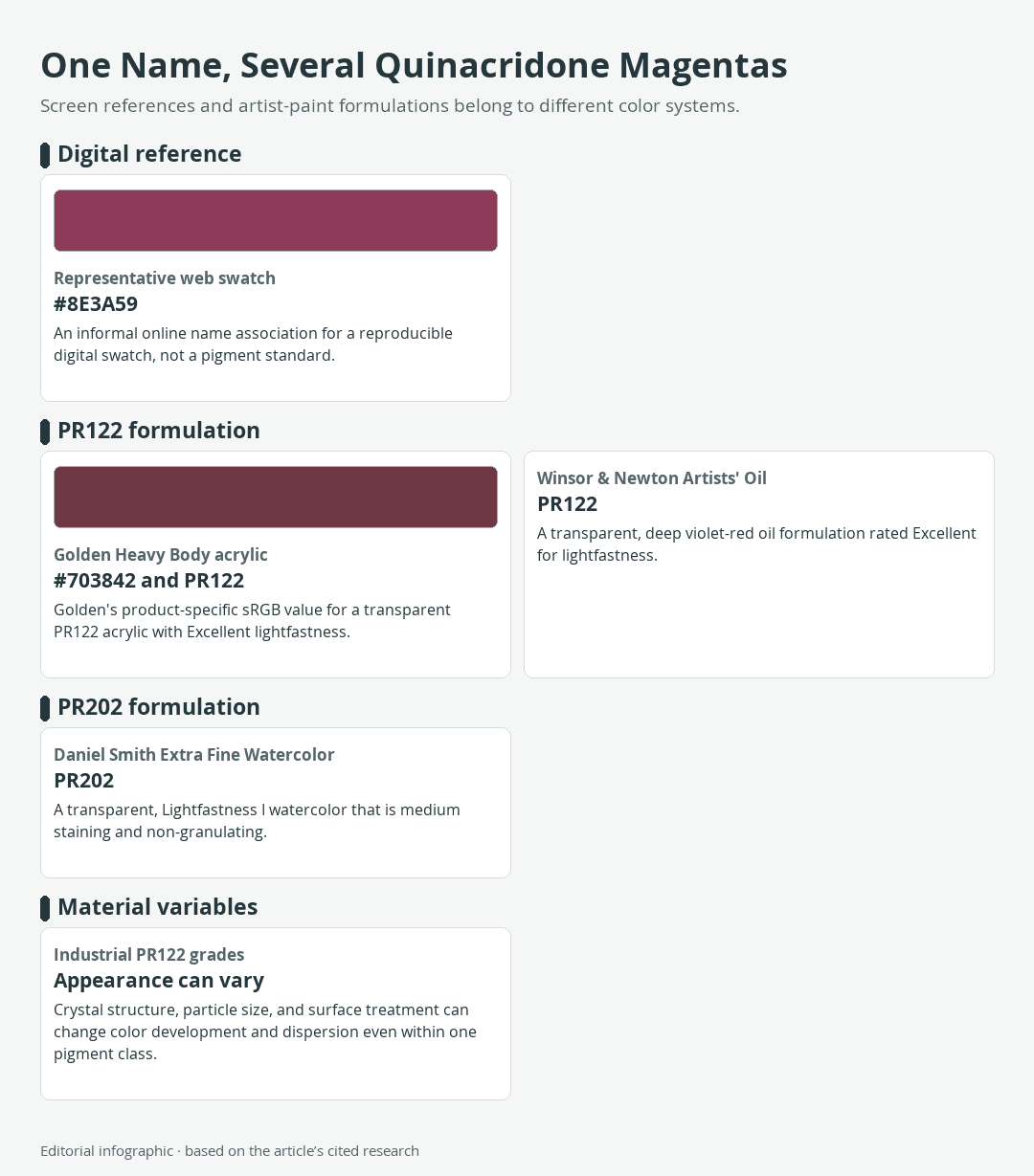
Download the complete color reference sheet (PNG): One Name, Several Quinacridone Magentas (PNG)
Quinacridone Magenta at a Glance
There is no single official HEX code for every material sold under this name. For repeatable digital work, #8E3A59 is a useful representative web association. It is a descriptive screen reference, not a pigment specification. Golden publishes the darker #703842 as the product-specific sRGB value for its Heavy Body acrylic, illustrating how a manufacturer reference can differ from a general web swatch.
For paint, look beyond the color name to the pigment code. PR122 is a common association, but at least one current watercolor named Quinacridone Magenta uses PR202. That distinction matters more to a painter than choosing between two HEX values.
Eight Exact Digital References
The first two rows distinguish a representative online color from a manufacturer-specific digital value. The other six are standardized CSS named colors selected as useful palette companions. They are not quinacridone pigment variants.
| Name | HEX | RGB | Color |
|---|---|---|---|
| Quinacridone Magenta representative | #8E3A59 | 142, 58, 89 | |
| Golden Heavy Body Quinacridone Magenta | #703842 | 112, 56, 66 | |
| LavenderBlush | #FFF0F5 | 255, 240, 245 | |
| MistyRose | #FFE4E1 | 255, 228, 225 | |
| MidnightBlue | #191970 | 25, 25, 112 | |
| Goldenrod | #DAA520 | 218, 165, 32 | |
| Ivory | #FFFFF0 | 255, 255, 240 | |
| SeaGreen | #2E8B57 | 46, 139, 87 |
Why One Screen Swatch Cannot Define the Paint
A HEX value controls an sRGB screen color. Paint is a reflective material whose appearance includes qualities that a flat digital sample cannot reproduce, such as transparency, gloss, texture, and the difference between a dense layer and a thin glaze. Even two displays may render the same sRGB value differently because their gamut, calibration, color profile, and viewing environment differ.
The swatches above are therefore precise digital references, not measured paint samples. They are useful for page layouts, prototypes, and palette planning, but they cannot guarantee a match to paint, ink, or printed output.
What the Name Means on a Paint Tube
A paint name tells you the intended color family. The Color Index code on the tube identifies the pigment more specifically: “PR” means Pigment Red, followed by the pigment number. Reading both pieces of information prevents the common mistake of assuming that every Quinacridone Magenta is chemically identical.

PR122: The Common Association
PR122 is associated with 2,9-dimethylquinacridone, a synthetic organic pigment in the quinacridone family. Golden Heavy Body Quinacridone Magenta uses PR122 and lists that acrylic as transparent with Excellent lightfastness. Winsor & Newton also uses PR122 in its Artists’ Oil Colour Quinacridone Magenta, which it describes as a transparent, deep violet-red with an Excellent lightfastness rating.
Those shared details do not make the acrylic and oil interchangeable. Each binder creates a different paint film and handling experience, while pigment processing can affect color development and dispersion.
PR202: A Documented Alternative
Daniel Smith Extra Fine Watercolor demonstrates why the front-label name is not enough. Its Quinacridone Magenta uses PR202 rather than PR122. The manufacturer classifies this formulation as transparent and Lightfastness I. It also rates the paint medium staining, meaning dried color has a moderate tendency to resist lifting from the paper, and non-granulating, meaning it does not produce the visibly mottled particle pattern associated with granulating washes.
These ratings describe that particular watercolor within the manufacturer’s system. They should not be transferred automatically to every PR202 paint, every quinacridone, or every product called Quinacridone Magenta.
Masstone, Undertone, and Tint
Masstone is the appearance of a sufficiently covering paint layer. Undertone becomes visible when paint is spread thinly over white. A tint is produced by mixing a color with white in an opaque medium. Transparent quinacridone paint can change strikingly across these three conditions, moving from a dense violet-red toward clearer pinks.
Make purchasing comparisons from dried paint test swatches when possible. A printed catalog square or monitor preview cannot show how the paint behaves over white, in a glaze, or in a white mixture.
From Industrial Red to the Artist’s Palette
Quinacridones belong to a modern family of synthetic organic pigments. Their chemistry was first synthesized in 1896, but useful commercial pigments emerged during the 1950s, when DuPont marketed quinacridone colors under the Monastral name. The family subsequently found applications in paint, printing ink, and plastics.

The 1950s Commercial Breakthrough
The delay between early chemistry and commercial color was not simply a matter of discovering a molecule. Manufacturers needed pigment forms that delivered useful color strength, durability, and processing behavior. A 1958 US patent describes alpha, beta, and gamma quinacridone crystal phases and connects milling and particle-size control with tinting strength, meaning how powerfully a pigment affects a mixture, and practical pigment performance.
This industrial work helps explain why quinacridones became valuable to artists. They offered clear red, magenta, and violet directions in durable synthetic pigments, including transparent formulations suited to glazing and watercolor washes.
Why Crystal and Particle Structure Matter
A pigment code narrows the identity, but it does not describe every property of finished paint. Industrial PR122 grades can differ through crystal structure, particle size, surface treatment, and the way the pigment disperses. The binder and complete product formulation add further differences once the pigment becomes acrylic, oil, watercolor, ink, or another material.
This is why two legitimate PR122 paints may not match perfectly in hue or handling. The code is an essential label decoder, not a promise that all brands will produce one identical swatch.
How to Mix Quinacridone Magenta
Ordinary red and blue paints can make a purple-red, but they cannot guarantee the color intensity, transparency, staining behavior, or handling of a single-pigment quinacridone paint. If the goal is the characteristic material behavior, begin with the desired tube and modify it. For broader approaches to creating the hue from other paints, see the guide to mixing magenta.
Mixing Red and Orange Directions
Add yellow to push Quinacridone Magenta toward warmer reds and then toward orange. In Golden acrylics, a documented starting mixture of five parts Benzimidazolone Yellow Medium to one part Quinacridone Magenta produces a bright red. Treat that ratio as a brand-specific exercise, not a universal formula for every yellow and magenta.
Mix a small, measured batch first. A warmer or duller yellow, a different pigment load, or another medium can move the result away from the example. Record both product names and the ratio beside the dried swatch.
Mixing Violet and Blue Directions
Blue pulls the color toward violet. Golden’s acrylic guide gives one part Phthalo Blue Green Shade to two parts Quinacridone Magenta as a starting point for an approximate primary blue mixture. Because even a small amount of Phthalo Blue can strongly shift a mixture, introduce it in small increments.
Do not expect the mixture to duplicate either component’s transparency or handling. It is a two-pigment color, and its result depends on the actual products used. A broader paint-mixing guide can help with hue bias, color intensity, and systematic ratio tests.
Making Pinks, Glazes, and Dark Neutrals
In acrylic or oil, Titanium White turns Quinacridone Magenta into pink tints and makes small hue differences easier to see. White also increases opacity, so it does not reproduce a transparent pale wash. For a luminous glaze, thin the paint with a compatible transparent medium according to the product instructions rather than substituting white.
In watercolor, clean water reveals transparent washes. Daniel Smith describes its PR202 version as moving from a dark red-violet application to clear washes; its non-granulating, medium-staining behavior belongs specifically to that formulation.
An opposing green reduces the magenta’s color intensity and can produce dark neutrals. Yellow-green is a documented partner for the Daniel Smith watercolor. The outcome depends on the exact green and ratio, so “complement” is a direction for experimentation rather than one guaranteed neutral. The relationship is easier to anticipate with a color wheel.
A Four-Step Swatch Test
- Identify the materials. Record the brand, medium, pigment codes, paper or ground, and any added medium.
- Show four applications. Make a dense stroke, a thin undertone over white, a white tint for opaque paint or a diluted wash for watercolor, and one mixture with a companion color.
- Measure the mixture. Begin with a simple ratio such as 1:1 or a documented manufacturer exercise, then change one component at a time.
- Judge it after drying. Label the final swatch with its ratio because wet appearance, application thickness, and the surface can obscure useful comparisons.
This compact test reveals more than a color name alone. It shows whether the paint leans red or violet, how readily it dominates mixtures, and whether a pale result comes from transparency or added white.
Digital Palettes and Accessible Design
The following palettes use the representative #8E3A59 swatch so their values remain reproducible. They are editorial design suggestions, not standardized harmonies, pigment matches, or paint recipes. If you replace that magenta with Golden’s product-specific #703842, recalculate every foreground and background contrast pair.

Soft Gallery Palette
Use LavenderBlush as the dominant field, MistyRose for supporting panels, and Quinacridone Magenta as the accent. The close pale backgrounds create a restrained setting in which the darker accent can mark headings, rules, or selected details.
| Name | HEX | RGB | Color |
|---|---|---|---|
| LavenderBlush | #FFF0F5 | 255, 240, 245 | |
| MistyRose | #FFE4E1 | 255, 228, 225 | |
| Quinacridone Magenta representative | #8E3A59 | 142, 58, 89 |
Nocturne Palette
Let MidnightBlue dominate, use Quinacridone Magenta as the supporting color, and reserve Goldenrod for small accents. This arrangement combines two deep fields with a much lighter warm note, making the gold especially useful for emphasis. It does not mean that all three colors are suitable for text on one another.
| Name | HEX | RGB | Color |
|---|---|---|---|
| MidnightBlue | #191970 | 25, 25, 112 | |
| Quinacridone Magenta representative | #8E3A59 | 142, 58, 89 | |
| Goldenrod | #DAA520 | 218, 165, 32 |
Botanical Contrast Palette
Use Ivory as the dominant background, SeaGreen for supporting areas, and Quinacridone Magenta for focused accents. Green and magenta provide an opposing hue relationship, while Ivory gives both room to remain distinct. For more on why opposing hues intensify one another or neutralize in mixtures, consult the guide to complementary colors.
| Name | HEX | RGB | Color |
|---|---|---|---|
| Ivory | #FFFFF0 | 255, 255, 240 | |
| SeaGreen | #2E8B57 | 46, 139, 87 | |
| Quinacridone Magenta representative | #8E3A59 | 142, 58, 89 |
Contrast and Non-Color Cues
An attractive palette is not automatically accessible. Test the exact foreground and background values with a WCAG contrast calculator. At Level AA, normal text requires a contrast ratio of at least 4.5:1, while large text requires at least 3:1, subject to the standard’s exceptions. Necessary graphical objects and interface states generally need 3:1 contrast against adjacent colors.
Contrast testing is especially important when placing the representative magenta over another dark color. Two hues can look clearly different yet remain too similar in lightness for readable text.
Color also must not carry meaning alone. Pair magenta warnings, selections, or chart categories with labels, icons, shapes, line styles, or patterns. A person who cannot distinguish the hues should still be able to understand the information.

Demi Bucklow is an independent artist and photographer living in Cape Town, South Africa. Since graduating from the University of Cape Town in 2018 from Michaelis School of Fine Art with a degree specializing in fine art photography, she currently works as a freelance artist, content creator and writer. Demi’s particular interests explore a range of multimedia illustration, collage art, photography and videography, darkroom processing and stop-motion animation. Her work is an exploration of nature and its phenomenon – somewhere between art and space.
Artistic practice presents the ability to communicate a vision. It is through techniques of pointillism and realism that form, and substance are explored as a metaphor for matter; super-imposing a thousand marks and points until an image is formed before our eyes. From illustrations to surrealist landscapes, Demi translates corporeality – mixing the obtuse and vacuous with the astute and expressive which leads to a mixture of irrevocable pondering over what is and what could be.
Learn more about the Art in Context Team.
Cite this Article
Demi, Bucklow, “Quinacridone Magenta: Pigments, Color, and Paint Mixing.” Art in Context. November 16, 2026. URL: https://artincontext.org/quinacridone-magenta/
Bucklow, D. (2026, 16 November). Quinacridone Magenta: Pigments, Color, and Paint Mixing. Art in Context. https://artincontext.org/quinacridone-magenta/
Bucklow, Demi. “Quinacridone Magenta: Pigments, Color, and Paint Mixing.” Art in Context, November 16, 2026. https://artincontext.org/quinacridone-magenta/.


