


Lettering Styles – Guide to Types of Hand-Lettering
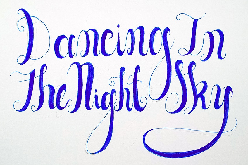
Understanding different types of lettering styles can enhance your hand lettering skills. Adding different types of lettering styles to hand lettering artwork or letters can provide a more visual richness to the end product. Lettering styles can be broken up into a variety of different categories, however, understanding a few essentials can be enough to enhance your lettering repertoire. There are many different lettering types, but understanding the fundamentals can give you a basis for your hand lettering styles. Sometimes knowing the basic lettering styles gives us enough information to create new adaptations, or utilize some of the strokes and line variations. So, let us look at a few essential lettering styles within this tutorial.
An Easy Guide to Essential Lettering Styles
There are many different types of letter styles to explore, however, most of the various lettering styles are simply adaptations of a few basic styles. There are a few basic lettering styles that are adapted and turned into various other quirky hand-lettering variations.
In this tutorial, we will be introduced to four fundamental lettering styles, and we will then be taught how to draw through an easy step-by-step process.
We will want to make sure we have a few basic tools for this tutorial, as we explore the basic variations of lettering. These lettering styles will be demonstrated with hand lettering tools; however, the principles can be applied to any digital application. Let us see what materials we will need for this tutorial.
Necessary Materials
We will be exploring four different lettering styles in this tutorial, all of which can be practiced with simple tools. Firstly, we will want a pencil, as this will help us with constructing some of our hand letters. We will explore block, serif, brush, and faux lettering. For most of them, we will use a pencil and pen to construct our letters.
However, for brush lettering, we will use a simple brush pen.
Some lettering techniques will require straight lines, so we’ll want to have a ruler. We will also encounter a few mistakes throughout the process, so make sure you have an eraser as well. Lastly, we will need some paper, any paper will do since this is intended for practicing these four different lettering styles. All materials can be found through the links below:
- Calligraphy Pen
- Micron Pens
- Pencil
- Koi Brush Pen
- Paper (Any paper will do)
How to Draw Different Lettering Styles
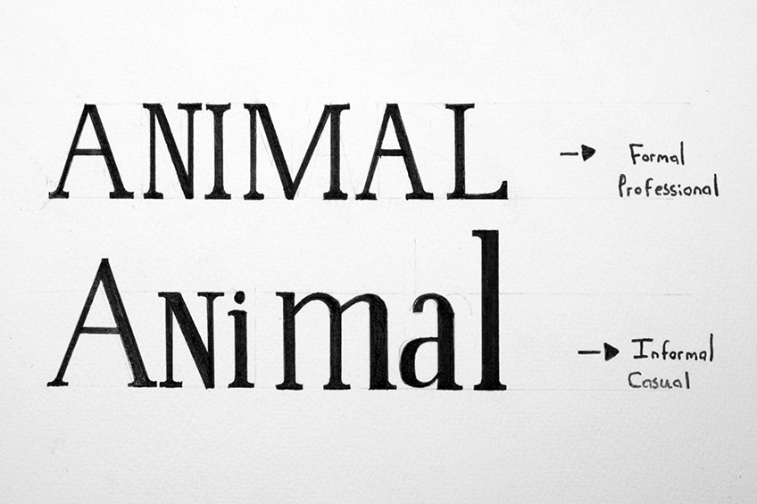
In this tutorial, we will go through four different lettering styles that are foundational for most hand lettering. These four lettering styles can be changed to look both formal and casual. We will be introduced to all four, following which we will be given a simple step-by-step guide that describes how to draw each. We will also look at how these letters can be turned from formal and professional to quirkier and more casual.
Knowing how to draw different lettering styles in both a casual and professional way gives you an option for making lettering types that are for professional reasons and more personal creative reasons.
In general, it is always great to broaden the variety of lettering choices. Now that we know what to expect, let us go through the different types of letter styles.
Normal Block Lettering
Block lettering is probably the foundational lettering style that influences most other lettering drawing processes. The construction of block lettering is an easy process and demonstrates how you can turn simple line text into thicker text, giving it its block letter quality. Learning how to do block lettering through a hand style is a great entry point into the lettering. It’s easy and it provides you with skills that will carry over into other lettering styles within this tutorial.
Let us take a look at the process of forming block letters.
How to Draw Block Letters
We will go through a few simple steps that give you an indication of the letter forming process for block lettering. Block lettering is a great entry point into lettering as it provides a fundamental process of forming letters, which can be used in different types of lettering.
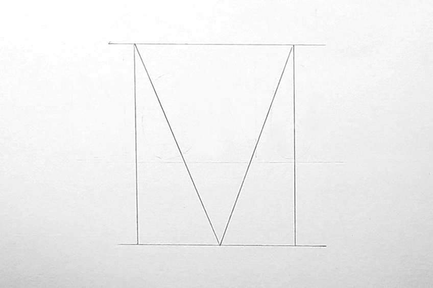
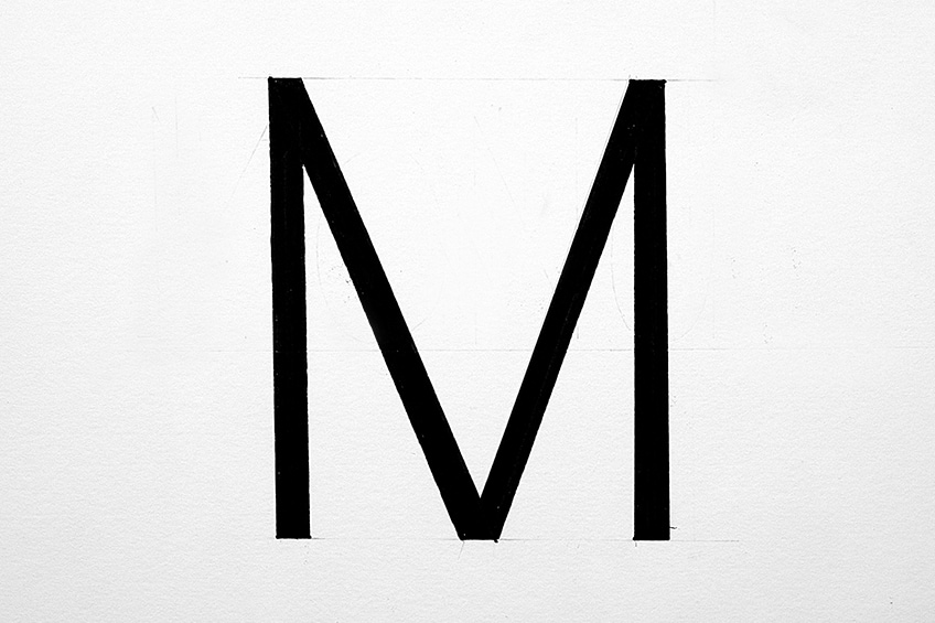
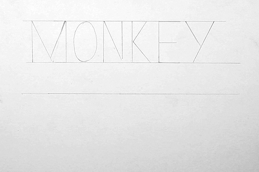
Step 1: Writing Letters
Block lettering begins with writing a letter as you would do with a pencil. However, keeping the letter as geometric as possible will be conducive to giving the letter the iconic blocky style. Let us begin by taking our pencils and writing out the letter “M”.
Use your ruler to keep the lines straight. You can also draw two horizontal lines to guide you in your letter formation.
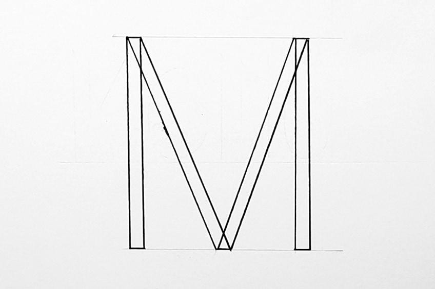
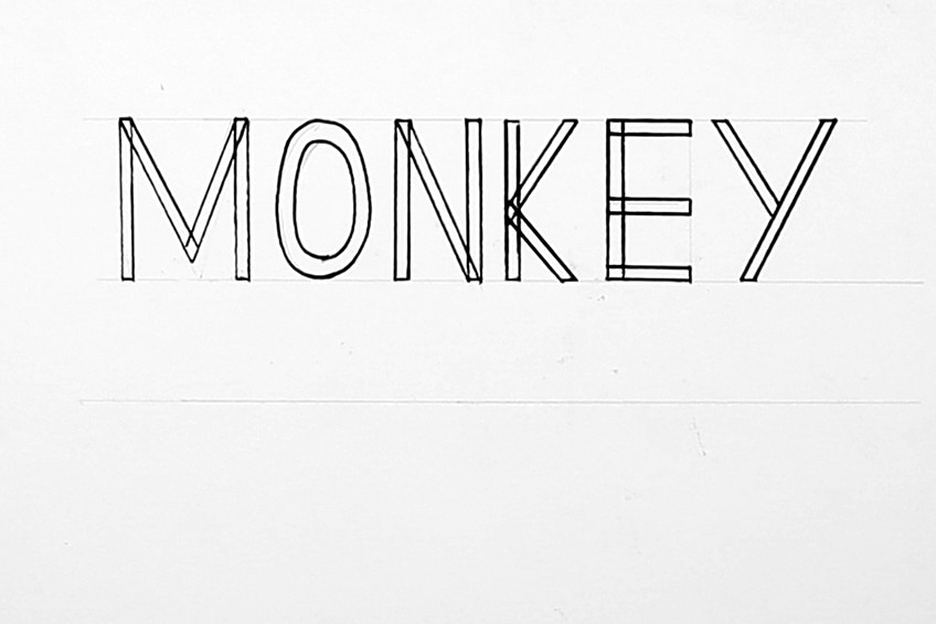
Step 2: Making the Letter Block-Style
Using our ruler and pencil, we want to draw parallel lines along each line of the letter. As we do this, we want to keep all the parallel lines as consistent as possible for each line of the letter. This means the width of each set of lines within the letter should be as consistent as possible.
By doing this, we are creating a formalized version of a block letter.

Step 3: Filling in the Text
From here we can proceed to take our black micron pens and outline the text. Again, you want to use your ruler for creating seamless straight lines. Slowly go over the pencil lines with your micron pen.
Going over the lines with our marker also makes us less likely to go outside of the lines when filling in the letter.
Then we can proceed to fill in the text with our black marker or micron pen, making the letter completely black. Of course, you can leave the text open or even fill it with different colors. This is just a formal form of block lettering, and it’s a way of familiarizing you with the general process of filling in a text.
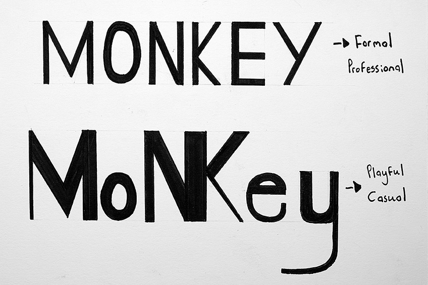
Consistent for Formal
To make a text look professional and formal, consistency is key. Keeping consistency in thickness, width, and spacing gives the text a uniform appearance. This makes the text look professional. You could develop text this way by creating guidelines in which you write your text.
Even the earlier stage of writing out the text should be done so with consistency.
Once your word is written, you will apply the same process of adding parallel lines next to each line that makes up a letter. Remember, as you do this you want to keep consistency in thickness. You should always use a ruler when writing straight lines.
For curved lines, it’s more a matter of going slowly and cautiously.

If you are filling in your letter with a single color, you want to make sure that you go over the pencil lines with the color of your choice. Going over the lines provides us with a bolder lining in each letter, making it easier for us to fill in each letter.
Lastly, you then can proceed to fill in your letters. Again, take your time, especially if you are wanting to create a professional-looking hand lettering image. Lettering is a process that does require patience. However, there are a few ways to informalize lettering.
Make lettering more casual and quirkier for personal hand lettering endeavors.

Inconsistent for Casual
Making lettering look more playful and casual is all about tweaking the rules of lettering. For instance, you know how to write letters and thicken them with parallel lines. However, to make letters more playful, you could play around with inconsistencies.
This could be capitalized and lower-case combinations, thickening different parts of a single letter, or even conjoining letters.

Once you understand the fundamentals of a lettering style, it’s always fun to make adaptations, using the rules but tweaking them to create unique-looking texts. Inconsistency is the best mental note to remember when creating a more playful text. So, explore inconsistencies within your lettering.

Now you understand the general process of constructing block letters. You know how to make them both professional looking as well as playful and quirky. Both methods can be used for different reasons.
Lettering is utilized for various reasons, so knowing how to make and then adapt lettering is essential.

Serif Lettering
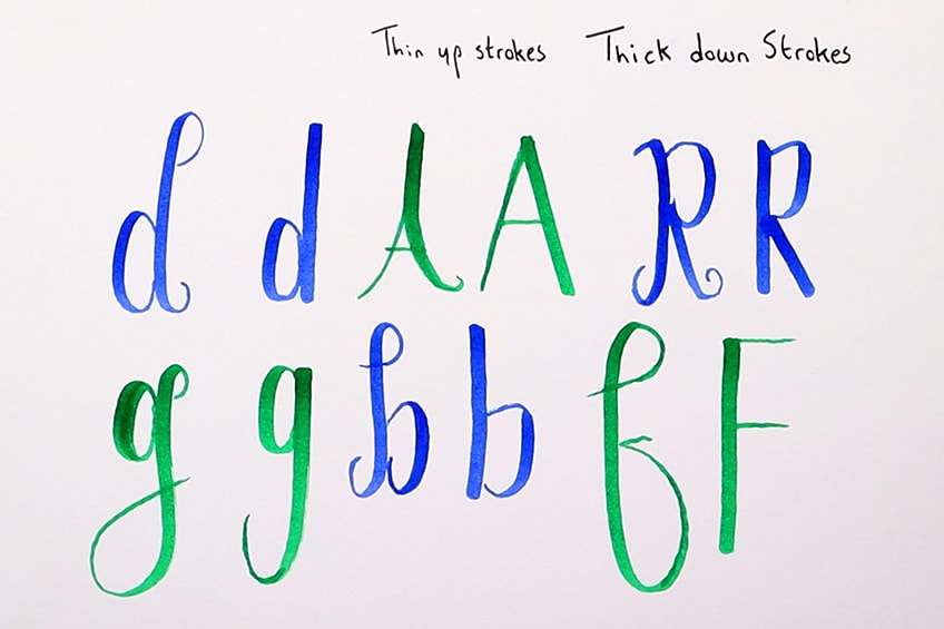
Serif is a different type of adaptation of block lettering, this time there are two things to remember. The first is the strokes, every upstroke is a thin stroke and every thick stroke is a downstroke. Also, all horizontal strokes will be thin as well, which means just down strokes are thick.
Secondly, there are little additional strokes that are added to each letter, which gives serif lettering its iconic serif look. We will similarly form letters; however, we will change the width of lines within each letter. From there we will add the final little strokes. Let us take a look at a general guide for this type of lettering.
How to Draw Serif Letters
The drawing process is very similar to the block lettering process. However, we want to consider how we write letters normally. Generally, there is a hand gesture for each letter that has movements going up and down to form a letter.
Remember this, because now when we draw the letters, we want to remember that every stroke that goes up will be thin and every stroke that goes down will be thick. Let’s take a look at a few steps on drawing serif.
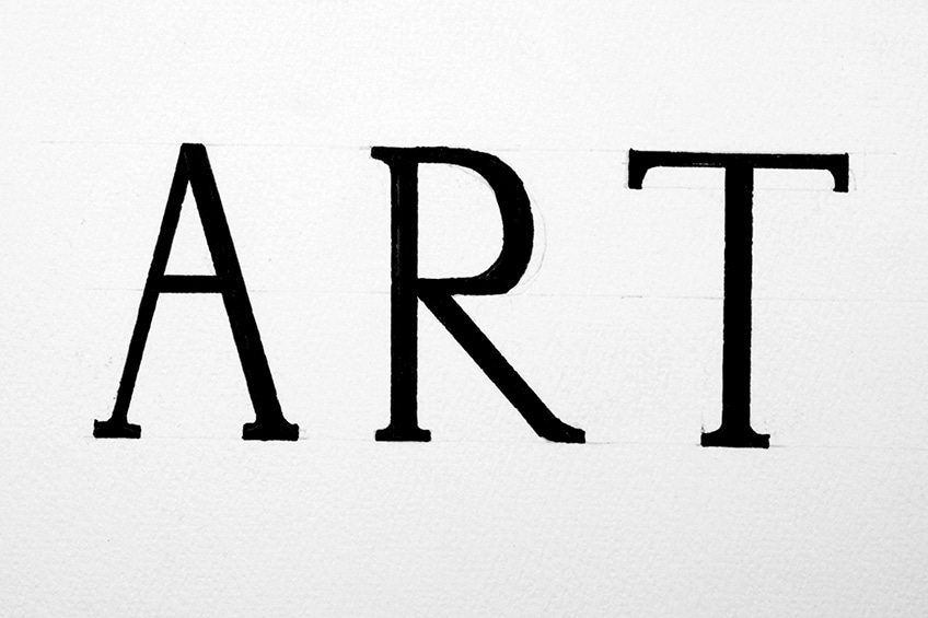
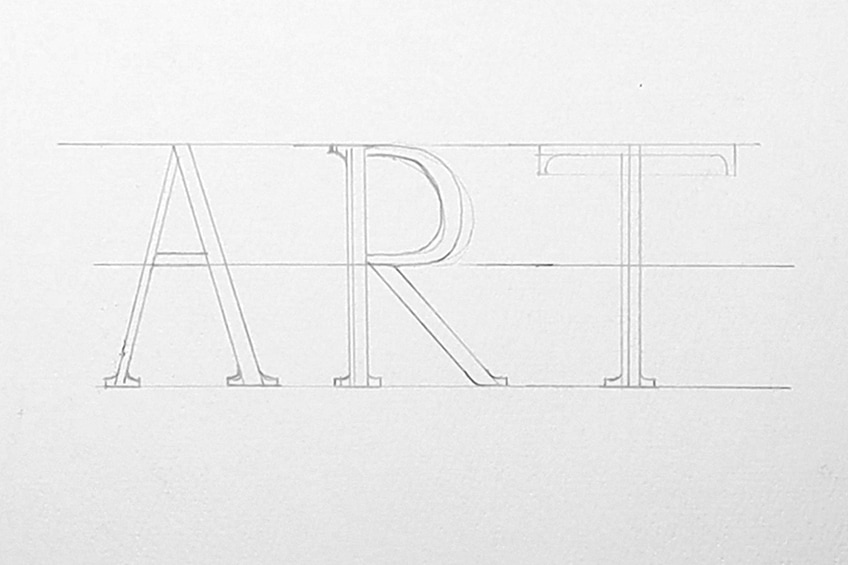
Step 1: Writing Letters
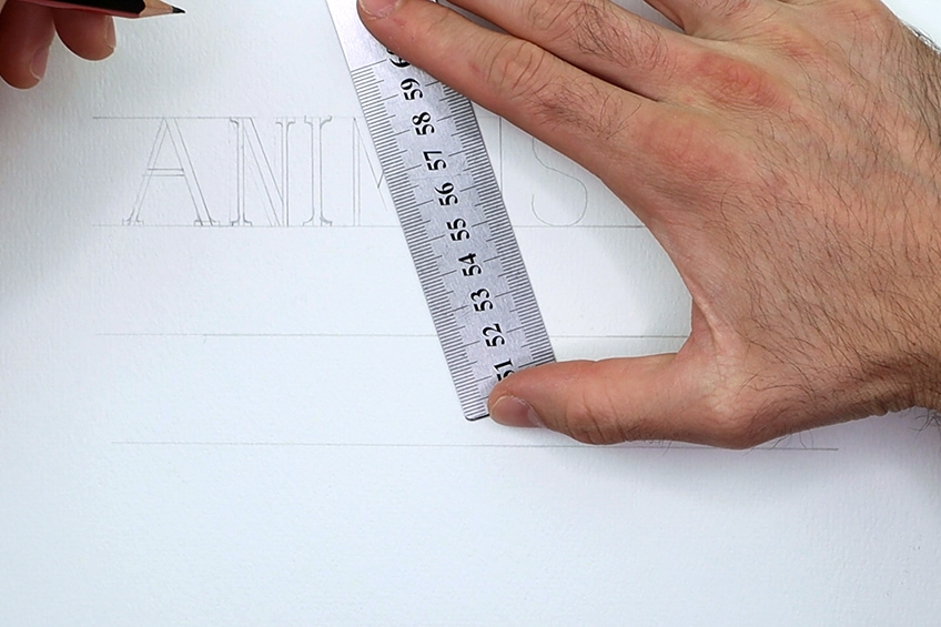
Same as block lettering we draw out some horizontal guidelines, which we then proceed to write letters within as normal. Remember to use your ruler for straight lines, and keep your letters spaced out and within the horizontal guidelines. Let’s try together by writing the word “ART”.

Step 2: Making the Letter Serif-Styled
From here we will give each line of our letter a parallel line that runs alongside it. However, this time we want to remember how a normal letter is written with strokes. For every stroke that goes up, we want it to be thin and for every stroke that goes down, we want it to be thicker.
All horizontal lines can be thin as well.
From here, we can add in the serif strokes at the ends of each letter. A good suggestion is to do some research and look at a serif alphabet to guide you in placing your serif strokes. Another useful idea is to make sure that they are consistent in thickness and width within each letter.
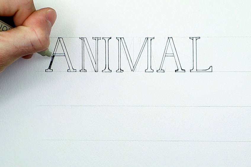
Step 3: Filling in the Text
From here we can proceed to take our micron marker and go over the pencil lines to outline the text. Again, make sure you use your ruler for straight lines and take your time, cautiously going over any curved lines.
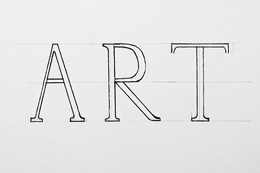
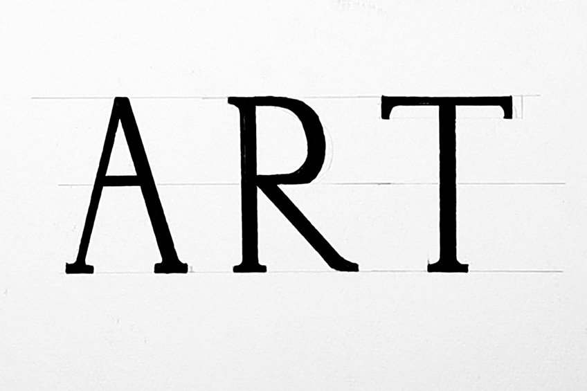
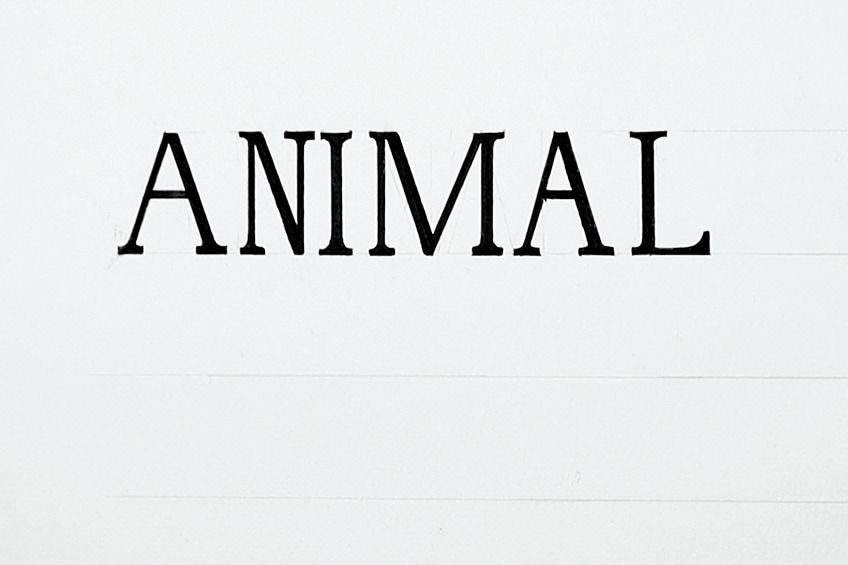
From here we can then proceed to fill in the text with our black marker. This is the general process of creating a serif-styled text. We can see that it is similar to block lettering, except we have thin and thick strokes within each letter and we add the little serif strokes.
Again, there are two ways to utilize these rules for a professional and casual look.
Consistent for Formal
Making serif look professional is all about consistency. A good way to start is by writing out your letter within horizontal guidelines that will keep your lettering in a straight line. Spacing your letters as you write them should also be consistent. Lastly, making sure that straight lines are drawn with a ruler is important.
Making sure you remember how a normal letter is written is important. This way you know where to put the lines that indicate the thick strokes within each letter. A good suggestion is to construct a single letter at a time, this way you can use the last drawn letter as a reference for the next.
Make sure there is consistency between them, including the serif strokes.
You must take your time with formal lettering. This also means it’s okay if you make a mistake with your pencil in the earlier stages. You can always tweak and erase your lettering until you are satisfied that it looks uniform.
From there, it is simply a matter of outlining your text.
When you want to fill in a text with a single color, it is always helpful to outline the text before filling it in. This will just make it easier for yourself when you want to fill in the text adequately.
Once you have outlined your text, you want to slowly fill in each letter. Taking your time is important, you don’t want to go out of the lines of the letter, compromising the formal quality of the text.
Inconsistent for Casual
For a more casual and playful look of serif lettering, we can play around with the rules that we have learned. This means we can play around with capitalized and lowercase letters.
We can also play around with the spacing; however, we want to keep the serif strokes as well as the thin upstroke and thick downstroke qualities.

Another method of constructing the serif lettering is by establishing your drawn letters and then outlining them before adding the serif strokes. This means that once our letters are drawn in pencil, we can go straight to outlining them.
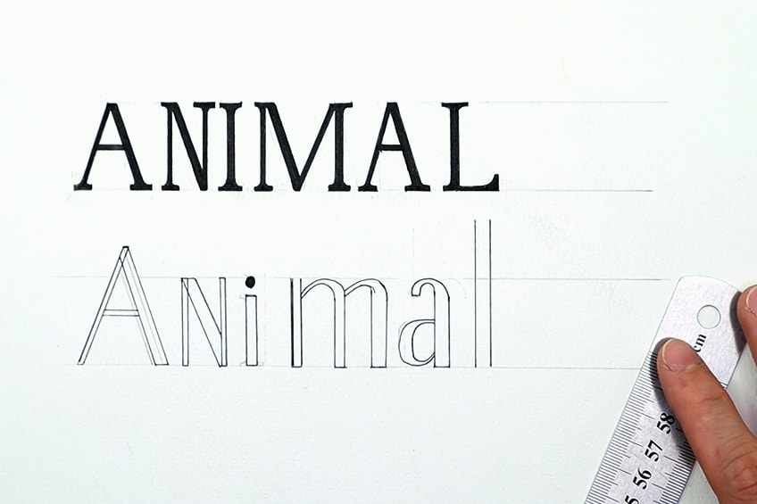
Once you have outlined your text and filled in each letter, you can fill in your letters. Keeping the strokes and the serif strokes are still important. However, you can still play around with the inconsistencies of how thick and thin each set of lines are within individual letters.
Once your letters are filled in you then can go ahead and draw each serif stroke for each letter. This is just another way of adding serif strokes to a serif-styled text.
However, for more playful approaches, you can also explore various colors within your lettering.

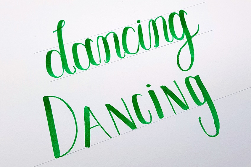
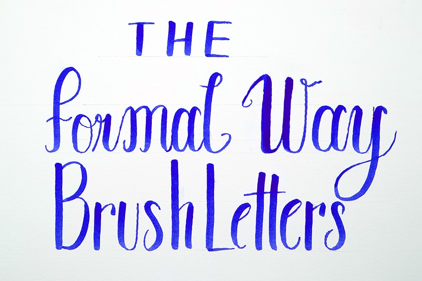
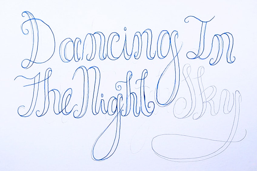
Brush Lettering
Brush lettering is a great lettering style to move on from serif, as it also uses the thin upstroke and thick downstroke rule. Similar to serif, in brush lettering, we use thin upstrokes and thick downstrokes, however, there are a few basic calligraphy strokes to memorize that will enhance your brush lettering.
These basic strokes can be applied to all types of calligraphy-style lettering.

For brush lettering, we use different pressures on the brush to define the thickness of different strokes, rather than having to construct each stroke individually. What is nice about brush lettering is you can combine different styles of text, simply by using the method of thin upstrokes and thick downstrokes.
By using this method of letter construction, you will find a coherence within your hand-lettering that looks beautiful. Let’s go through the process of constructing brush letters.
How to Draw Brush Letters
Drawing brush letters is a simple task, once you understand the basic strokes form calligraphy and the rule of thin upstrokes and thick downstrokes. These two concepts are foundational to brush lettering and can give the iconic look of brush letters.
That being said, let us look as this different letter style and how to draw it.
Step 1: Understand the Basic Strokes
We want to understand how to approach both the cursive and block style lettering, and we will use the thin upstroke and thick downstroke methods for both. For calligraphy-styled letters, we want to be acquainted with the basic strokes. You want to practice writing them out with your brush pen.

Step 2: Construct a Word With Basic Strokes
From there we can construct a simple word using the basic strokes to form each letter. As long as we understand each letter in its calligraphic form, we can easily assemble each letter using the basic strokes.
A good suggestion is to write out words using the basic strokes, to acquaint yourself with the process of constructing letters.
Step 3: Apply Thin and Thick Strokes to Other Letter Styles
To create a range in our brush lettering, we can apply this thin and thick stroke rule to any letter style. This is a secondary part of brush lettering, where we utilize the brushes’ capabilities to create unique lettering combinations. Applying this rule to simple lettering forms and other letter styles is a great way to create variety in your brush lettering drawings.
Consistency for Formal Styled Lettering
Once you have the hang of the brush pen and understand how different pressures create different strokes, you can begin to play around with lettering combinations. However, as you write out your letters using guidelines to keep them straight will help to create a formal and uniform look.
Another good suggestion for creating a formal look is to keep different letter styles in different rows or different guidelines. This works well when creating a lettering artwork that fills a page, keeping each row of letters the same.
While you can play around with different letter variations, using guidelines to keep letters the same is another suggestion.

However, the most successful way of creating a formalized brush lettering drawing is by using guidelines in the first place. Keeping letters more straight gives the brush lettering a more professional quality and can be a great technique for formally-styled hand lettering. Again, you can change the different letter styles within a brush lettering artwork, where you change the lettering style for each word.
However, using horizontal guidelines on the page is the best way to keep a text uniform and well placed on a page.
Inconsistency for Casual Styled Lettering
Again, we can use the tool of inconsistency to give ourselves a little more freedom with hand lettering. Especially, with brush lettering, we can play around with subtle curves in the letter placement, different lettering styles in a single row, and breaking letters up in an individual word.
Inconsistency can be applied in various ways, it’s all a matter of tweaking the rules.

Faux Calligraphy
Moving from brush lettering to a different calligraphy-styled text such as faux calligraphy is a good transition. Now that you are acquainted with the strokes that make up letters within the calligraphy-styled text, you can assemble these letters with a new lettering style.
Faux calligraphy is a great way to construct letters because it can be done with simple tools, such as a pencil and pen.
However, this time, we won’t make thicker lines with a single stroke. Rather, we will draw them into an already existing letter with lines that can be colored in. Let us take a look at how to draw a faux calligraphy text.
How to Draw Faux Calligraphy
Faux calligraphy is a great way to learn a more classical form of calligraphy. This is because the process is much easier than normal calligraphy. The main difference is that instead of making a thick stroke with a brush, you add them in by drawing a set of lines in each letter that can be colored in. Similar to how you draw letters such as in serif-styled lettering.
However, this time, we are going to construct a letter using the calligraphy basic strokes, and then add in the thicker areas within each letter.
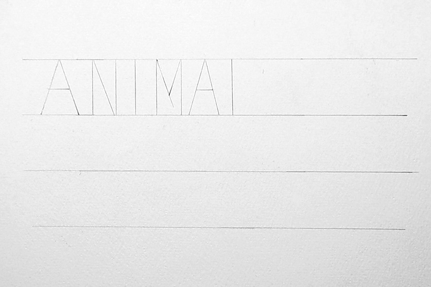
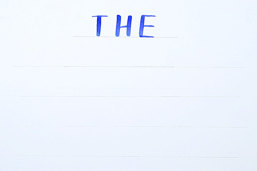
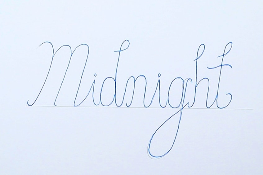
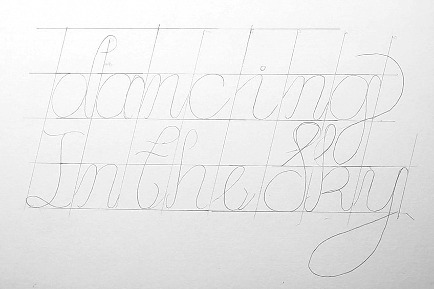
Step 1: Writing a Word With the Basic Strokes
You can begin by making a simple horizontal line on the page, on which you can write a word. You can write any word. We want to write this word with our pencils, the same way we would construct calligraphy-styled letters. If you want to reacquaint yourself with the strokes, refer back to the brush lettering section.

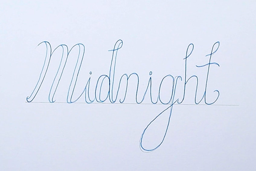
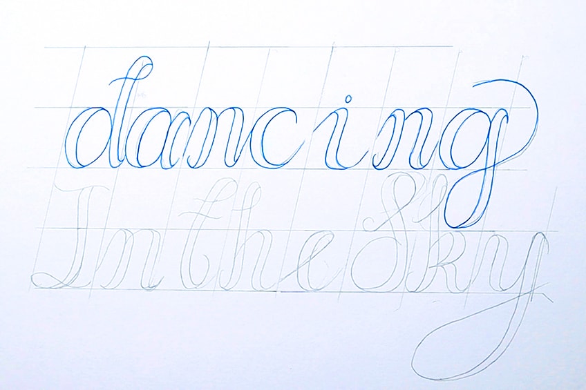
Step 2: Drawing in the Thicker Stroke Lines
Once our letter is written in pencil, we can then go over them with our micron pen. You want to take note of where the thick lines would be placed within each letter. Once we understand where the thicker letters will be placed within each letter, we will then draw them in with our pens.
When you begin to draw in each thicker line within each letter, you want to make sure you keep the thickness consistent. You want to make sure you place these lines where the thicker lines would exist within each letter.
Take your time as you draw in each set of lines for each letter, making sure there is consistency.
With faux calligraphy, it’s an easier way of creating calligraphy text. This is because we don’t need calligraphy tools for one, but we also don’t need to worry about making a perfect stroke the first time. You can take your time drawing in the lines for each letter to create thicker strokes.

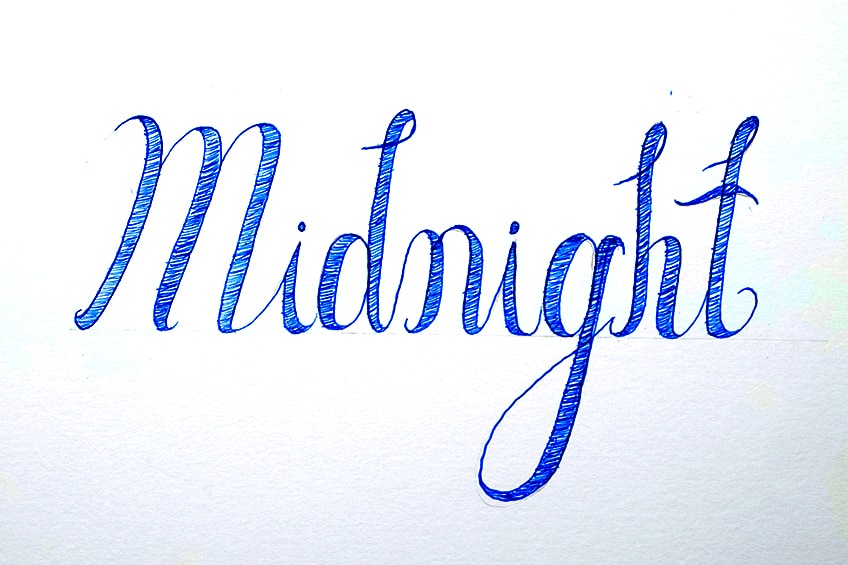
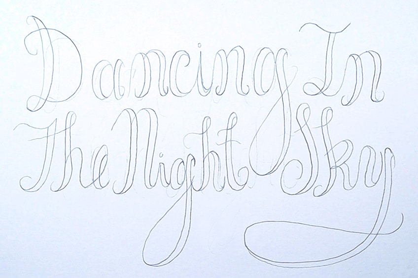
Step 3: Filling in the Thicker Strokes
We should have at this point a calligraphy-styled word, where all the thick strokes are empty or a better way of thinking about it is hollow. From here we can then fill in the thicker stroke areas with our pens or whatever tool that you have.
This is the general process of creating faux calligraphy-style lettering.
Consistency for Formal Styled Lettering
To make the lettering style more professional and formal, we can use guidelines to draw our faux calligraphy words. We do this by creating a grid where there are equal-sized blocks. You can have the grid straight or slanted, it’s all a matter of preference and how you would like your lettering to be positioned.
If you want to have your text slanted in a more calligraphic style, you can have a slanted grid.
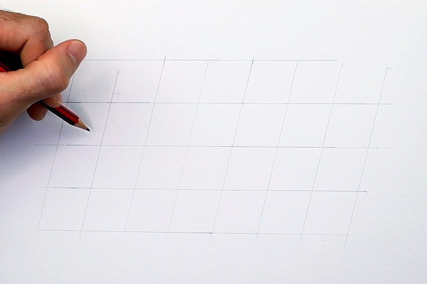
From there we can proceed to carefully write out our calligraphy text within the grid lines. Using the grid lines, we can manage consistency within our letters a little more effectively. This will give the text a more coherent and uniform look which is the more formal approach to faux calligraphy lettering. You can also use the grid to add other letters above or below your current text.
Using a grid is a great way to place letters on a page.
A grid allows you to keep the letter sizes are the same whilst the positioning is also uniform. You really want to take your time to draw letters in pencil first before going over them in pen.
Once our letters are drawn on the page within the grid, we can then proceed to add the thick lines within each letter. Again, you want to make sure that when you add in the lines to create thicker strokes within each letter, they are consistent in thickness.

From here, we can proceed to go over our text with our pens, making sure that we take our time. With faux calligraphy, you really want to establish the text in pencil.
From there, it’s more a matter of outlining and filling in the text.
Lastly, you can fill in the text. Again, for a uniform look, you want to make sure the text is drawn correctly in pencil, making sure spacing, and position is accurate and consistent. From there, you can outline your text and fill it in with your choice of color.

Inconsistency for Casual Styled Lettering
Again, inconsistency is your best tool for making quirky style lettering. This is where we can be playful with how we draw the words. Again, play around with the rules, however, you want to maintain the faux quality by adding in the lines that indicate thick sections in each letter.
A great suggestion is to write out a text without any guidelines.

As you write out your lettering, consider the form of words and how they pair together on a page. This means that you can add slight curvature to your letters formations and how they are positioned on the page. Allow yourself to play around with different ways of implementing inconsistencies within your text.
You can also play around with how thick you make your letters as you draw the faux lines in each letter.
You can change the thickness of each letter to give your text a weird fantastical quality. Once you understand the rules, you can play around with how you draw the different letters. That is completely up to you. Once your letters are drawn you can then outline your letters.
Lastly, you can then proceed to fill in your text. You can also play around with different colors or even leave some of their thick sections open and unfilled. Once you know how to use the rules of hand lettering, you can then experiment with them and tweak them to suit your own desired look for lettering.
Tips to Remember
- Use these different lettering styles to make your own. These lettering styles can easily, be tweaked with your own twist, so explore various adaptations.
- Experiment with combinations and adaptations. Use this tutorial as a resource not a rule, this means playing around using different techniques from the different lettering styles.
- Take your time. Hand lettering is a drawing process, not a writing process, so you want to be slow and attentive with your mark-making.
- Start with pencil marks. Developing a text in pencil first is always a great way to develop a beautiful lettering drawing.
- Most importantly, have fun. Again, this is a resource for you to use and apply to your own lettering styles in your own way.
Practicing different types of letter styles is a great exercise for refining your hand lettering skills and understanding how different letter styles pair together. Playing around with different combinations can give you a better sense of how to construct interesting and unique hand lettering artworks. Working on variations in your letter styles is also a great way to learn about how letters work on various scales. Most important thing is that you explore and experiment with different letter styles, which is how you find your own unique way of lettering.
Frequently Asked Questions
What Are Good Lettering Styles to Learn?
There are many lettering styles to learn, however, learning lettering styles that have simple lines and then some that have wavy and curvy lines gives you a good foundation for most lettering categories. So, lettering styles like serif and block lettering paired with brush and calligraphy-styled lettering provides you with more shape and line ranges. By learning these basic lettering styles, you are also learning types of lettering that are easily adaptable and can be changed with your own personal tweaking. Lettering is an interpretive activity, which means that there is no specific lettering style to learn that is better than the next. It is better to learn some and then use the different techniques to create your own interesting lettering styles. Remember, experimentation is key when it comes to lettering.
How Do I Advance My Hand Lettering Skills?
With hand lettering, the best way to advance your skills is simply by doing it regularly. Practice is the best way to enhance your lettering skills. Another great suggestion is to think about formalized and informalized lettering. With lettering, consistency equals professionalism, whereas inconsistency is a little less professional. So, if your intention is to create lettering that looks formal and professional work with grids and lines to get used to formalizing your lettering style. However, when you want to create something more playful, changing lines and creating more inconsistent letter formations can be a fun and quirky method for a lettering style. Utilizing both approaches can be a great way to create something more professional and something more personal and fun.
What Are the Different Styles of Lettering?
The simpler lettering styles are serif and block lettering. These lettering styles are easy to draw and can easily be modified. Learning how to do the simpler lettering styles like block lettering and serif provides a good base for other lettering types that are similar. These types of lettering also are formed with fundamental techniques that can easily be utilized in different types of lettering such as graffiti, gothic, vintage, and many others. More loose lettering styles include calligraphy-style letterings such as brush lettering, modern calligraphy, and faux calligraphy. These are more modern renditions of traditional calligraphy, as they use the traditional calligraphy strokes in a loose and modern adaptation. Understanding lettering types such as these also provide you with fundamental techniques that can be applied to formalized lettering activities. So, having a combination of skills from different lettering styles can provide you with a great lettering arsenal for your own lettering activities.

Matthew Matthysen is an educated multidisciplinary artist and illustrator. He successfully completed his art degree at the University of Witwatersrand in South Africa, majoring in art history and contemporary drawing. The focus of his thesis was to explore the philosophical implications of the macro and micro-universe on the human experience. Matthew uses diverse media, such as written and hands-on components, to explore various approaches that are on the border between philosophy and science.
Matthew organized various exhibitions before and during his years as a student and is still passionate about doing so today. He currently works as a freelance artist and writer in various fields. He also has a permanent position at a renowned online gallery (ArtGazette) where he produces various works on commission. As a freelance artist, he creates several series and successfully sells them to galleries and collectors. He loves to use his work and skills in various fields of interest.
Matthew has been creating drawing and painting tutorials since the relaunch in 2020. Through his involvement with artincontext.org, he has been able to deepen his knowledge of various painting mediums. For example, watercolor techniques, calligraphy and lately digital drawing, which is becoming more and more popular.
Learn more about Matthew Matthysen and the Art in Context Team.
Cite this Article
Matthew, Matthysen, “Lettering Styles – Guide to Types of Hand-Lettering.” Art in Context. September 9, 2022. URL: https://artincontext.org/lettering-styles/
Matthysen, M. (2022, 9 September). Lettering Styles – Guide to Types of Hand-Lettering. Art in Context. https://artincontext.org/lettering-styles/
Matthysen, Matthew. “Lettering Styles – Guide to Types of Hand-Lettering.” Art in Context, September 9, 2022. https://artincontext.org/lettering-styles/.


