
Colors That Start With R: A Practical Digital Guide

Red may be the obvious starting point, but R color names also reach into earthy browns, dusky pinks, purple, blue, and near-black. This 12-name atlas pairs each color with a consistent HEX value, RGB value, and digital swatch. It also shows why a standardized CSS keyword carries a different kind of authority from a product name, pigment term, survey result, or catalog label.
R Colors at a Glance
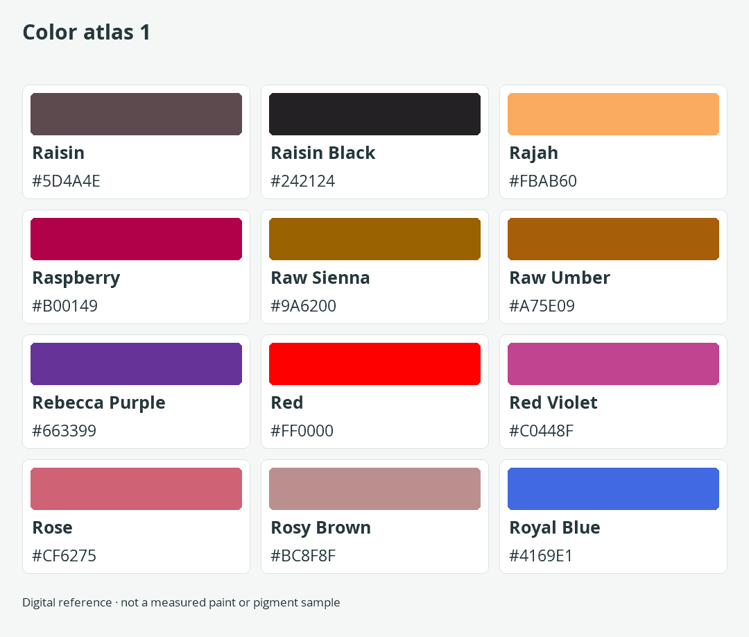
This guide presents 12 distinct color names beginning with R. The range moves from Raisin Black at the dark end to the bright orange warmth of Rajah, the saturated red of Red, and the cooler direction of Rebecca Purple and Royal Blue. It is a focused reference rather than an attempt to turn every descriptive phrase into a separate color.

HEX is the controlling digital value in every row. Each RGB triplet is the direct decimal expression of that six-digit HEX value, and the visible Color cell uses the same code. Keeping those fields synchronized prevents a common reference-table problem in which the label, numbers, and swatch point to different colors.
These values describe sRGB screen colors. A display can interpret their numerical coordinates consistently, but the color a person sees can still vary with device gamut and rendering conditions. The numbers are therefore suitable digital specifications, not promises that every monitor, printer, crayon, or paint mixture will look identical. The guide to basic color theory provides useful background on how hue, value, saturation, and color relationships shape what viewers perceive.
The Status column distinguishes the role each name plays:
- CSS keyword: A standardized named color that browsers can interpret directly.
- Surveyed screen name: A color association collected through a screen-color naming survey. It records shared usage but does not create a web standard.
- Product color: A documented commercial color name. Its accompanying screen reference does not measure every physical example of the product.
- Material term: A name connected with pigment or another physical coloring material. The listed HEX remains a digital reference.
- Curated catalog name: A documented descriptive name and value from a color-name catalog, not an official technical specification.
Four entries are CSS keywords: Rebecca Purple, Red, Rosy Brown, and Royal Blue. Rose represents surveyed screen usage, while Red Violet is identified as a product color with a separately qualified screen reference. The remaining entries use catalog values, with Raw Sienna and Raw Umber additionally marked as material terms.
A non-standard name is not unusable. It simply needs its numerical value attached. A designer who writes “Raspberry” in a style guide leaves room for interpretation, while “Raspberry, #B00149” supplies an exact digital instruction. That distinction matters whenever files move between people, applications, or production stages.
R Color Names, HEX Values, and RGB Values
The main list is alphabetized by display name. Copy the HEX value when a project needs a reproducible screen color, and retain the status label when the origin of the name matters. All 12 entries have complete six-digit HEX codes, matching RGB values, and swatches generated from the controlling HEX.
| Name | HEX | RGB | Color | Status |
|---|---|---|---|---|
| Raisin | #5D4A4E | 93, 74, 78 | Curated catalog name | |
| Raisin Black | #242124 | 36, 33, 36 | Curated catalog name | |
| Rajah | #FBAB60 | 251, 171, 96 | Curated catalog name | |
| Raspberry | #B00149 | 176, 1, 73 | Curated catalog name | |
| Raw Sienna | #9A6200 | 154, 98, 0 | Material term; catalog screen reference | |
| Raw Umber | #A75E09 | 167, 94, 9 | Material term; catalog screen reference | |
| Rebecca Purple | #663399 | 102, 51, 153 | CSS keyword | |
| Red | #FF0000 | 255, 0, 0 | CSS keyword | |
| Red Violet | #C0448F | 192, 68, 143 | Product color; screen reference | |
| Rose | #CF6275 | 207, 98, 117 | Surveyed screen name | |
| Rosy Brown | #BC8F8F | 188, 143, 143 | CSS keyword | |
| Royal Blue | #4169E1 | 65, 105, 225 | CSS keyword |
How to Read the List Without Guessing
Begin with the Color cell when you want to compare general appearance, then move to the status and numerical fields. Raisin and Raisin Black may sound closely related, for example, but their swatches and RGB values show a meaningful difference in lightness. Raw Sienna and Raw Umber both sit in an earthy range, yet the table still treats them as separate digital references.
Status becomes decisive when a color moves into code or a shared specification. A CSS keyword can be entered by name, while Raspberry, Rajah, Rose, and Red Violet require a numerical declaration if the result must be predictable. Even for a CSS color, keeping the HEX value nearby can make comparisons and design documentation easier to scan.
Do not rank the colors by how official their names sound. Royal Blue has a standardized CSS meaning, but Raspberry does not. Red Violet is a documented product name, although its listed number remains a qualified screen reference. The table makes those distinctions explicit so that a familiar phrase is not mistaken for a universal value.
Why the Total Is 12 Rather Than a Universal Count
No single registry controls every English color name. CSS defines a limited keyword set, product makers name their own colors, surveys summarize how people label screen samples, and creative catalogs pair additional descriptive terms with values. These systems overlap without becoming interchangeable.
That makes any total dependent on scope. This atlas favors distinct names with a clear digital value and a visible status instead of adding nearly identical swatches or unsupported labels to reach a larger number. The result is compact enough to compare but broad enough to show several different ways an R color name can function.
Why R Color Names Carry Different Meanings
A color name can act as a technical keyword, a commercial label, a material description, or an informal label for a screen color. Those roles determine what the name communicates by itself and what additional information a designer, artist, or developer must provide.

CSS Names Form a Small Standardized Set
Four CSS named-color keywords begin with R: Rebecca Purple (#663399), Red (#FF0000), Rosy Brown (#BC8F8F), and Royal Blue (#4169E1). They identify specified sRGB colors, so a browser can interpret values such as rebeccapurple and royalblue without a separate HEX declaration.
The standard applies to the keyword and its numerical color, not to every everyday use of the phrase. A paint sold as royal blue does not become a measured match for the CSS value merely because the words are the same. In the other direction, a creative name such as Raspberry can work perfectly well as a project label, but it needs an assigned number because browsers do not recognize it as a standard named color.
For a design system, the safest pattern is to separate the human-friendly token from its value. A token labeled Raspberry might point to #B00149, while the recorded value remains the actual instruction. If the team later changes that value, the descriptive token still organizes the interface without pretending to be an external standard.
Product and Catalog Names Need Their Numbers
Red Violet is a Crayola product color name, but it is not a CSS keyword. The table uses #C0448F as a qualified screen reference. That value produces a repeatable digital swatch without claiming that a display measures or duplicates a physical crayon in every viewing condition.
Curated catalog names work in a related way. Raisin, Raisin Black, Rajah, and Raspberry are useful labels attached to specific catalog values. Their usefulness comes from keeping name and number together. Sending only “Rajah” to another designer does not guarantee that the recipient will choose #FBAB60, because the word has no universal digital authority.
Product identity and digital identity should also remain separate in asset libraries. A product name answers which named item is being discussed. A HEX value answers which sRGB reference should appear in a digital composition. Combining both fields gives collaborators more information without suggesting that they measure the same physical property.
Material Terms Are Not Paint Measurements
Raw Sienna and Raw Umber are material color terms, while their listed values are sRGB references. Conservation practice measures physical color through spectral reflectance combined with standardized color-matching functions and an illuminant. A six-digit screen code does not replace that form of material measurement.
Binder interactions, chemical reactions, light exposure, and aging can alter the observed color of pigments. In some cases, an artwork’s exact original hue may no longer be recoverable. For that reason, Raw Sienna #9A6200 and Raw Umber #A75E09 should be read as atlas swatches, not as universal descriptions of every tube of paint or every aged painted surface.
The distinction also affects practical work. A digital mockup can use the HEX references to establish direction and hierarchy. A painter should test the actual pigment and binder, while a print designer should evaluate the produced sample. The screen swatch remains useful as a communication aid, but it does not become a physical recipe.
Rose Shows Why One Name Can Have Two Values
The atlas uses the surveyed Rose value #CF6275, a muted pink-red. A curated color catalog instead pairs Rose with #FF007F, which appears more saturated on an sRGB display. These values are not inconsistent conversions. They are separate digital associations attached to the same descriptive word.
The survey result records collective screen-color naming rather than a CSS rule or physical standard. The catalog pairing provides another documented reference, but it does not erase the survey usage. Choosing between them therefore depends on which definition a project adopts.
The practical solution is simple: place the number beside the name at the moment of selection. A palette note that says only “Rose” preserves the conflict. A note that says “Rose, #CF6275, surveyed screen reference” gives another person enough information to reconstruct the intended swatch.
What a Status Label Can and Cannot Tell You
A status label explains the name’s context. It can tell you that a browser recognizes Royal Blue, that Rose comes from surveyed screen usage, or that Red Violet is a product name paired here with a screen reference. It does not tell you automatically whether the color suits a brand, remains legible behind text, or can be reproduced exactly in another medium.
Those questions require separate decisions. Use the HEX value to define the screen color, examine its relationship with neighboring colors, test the actual foreground and background contrast, and inspect any physical output in its intended material. Treating these as separate tasks prevents the appealing name from doing work that only a numerical value or real sample can perform.
How to Use R Colors in a Palette
The table becomes more useful when each color receives a job. Choose a dominant field, a supporting color, and a limited accent, then test those roles at their actual sizes. A successful palette depends on relationships and contrast, not on whether its names sound as if they belong together.
Assign Each Color a Role
The two examples below use only values from the atlas. The qualified names in this secondary table make clear which naming system supplies each reference while keeping every HEX, RGB, and swatch field synchronized.
| Palette | Role | Name | HEX | RGB | Color |
|---|---|---|---|---|---|
| Warm earth | Dominant | Rosy Brown (CSS keyword) | #BC8F8F | 188, 143, 143 | |
| Warm earth | Supporting | Rajah (catalog reference) | #FBAB60 | 251, 171, 96 | |
| Warm earth | Accent | Raspberry (catalog reference) | #B00149 | 176, 1, 73 | |
| Cool jewel | Dominant | Rebecca Purple (CSS keyword) | #663399 | 102, 51, 153 | |
| Cool jewel | Supporting | Royal Blue (CSS keyword) | #4169E1 | 65, 105, 225 | |
| Cool jewel | Accent | Red Violet (product screen reference) | #C0448F | 192, 68, 143 |
In the warm grouping, Rosy Brown supplies a restrained field, Rajah adds a lighter supporting area, and Raspberry creates a stronger point of emphasis. The cool grouping places purple and blue across the larger roles, with Red Violet supplying a contrasting accent. These assignments are starting points, not fixed proportions.
Test the palette in the intended composition. A small accent can command attention even when it covers little space, while a dominant color changes the overall atmosphere because viewers encounter more of it. If the hierarchy feels flat, change the area, placement, or lightness relationship before adding more colors.
A color wheel can help locate hue relationships, while the guide to color harmony explains analogous, complementary, and triadic structures. When Red or Raspberry serves as the focal accent, the discussion of red’s contrasting color offers another way to consider opposition.
Build a Working Palette Step by Step
- Name the output first. Decide whether the work is a website, interface, digital illustration, printed piece, or physical artwork. That decision determines whether the HEX value is the final instruction or only an initial reference.
- Choose one anchor color. Select the color that should occupy the clearest visual role. It might establish a background, headline area, recurring object, or brand accent.
- Add support through comparison. Look for a second color that differs enough in hue, lightness, or saturation to remain distinguishable at the intended scale.
- Reserve the strongest accent. Use the accent where attention is useful rather than scattering it across every element.
- Test the real combinations. Evaluate text against its exact background, inspect interaction states, and preview the work in its final medium.
This sequence keeps naming separate from performance. A color may be memorable and still fail in the role assigned to it. Conversely, a modest catalog name such as Raisin can become useful when its dark screen value supports hierarchy or contrast within a tested composition.
Check Contrast and Color Independence
For WCAG 2.2 Level AA, ordinary text requires a contrast ratio of at least 4.5:1 against its background. Large-scale text requires at least 3:1. For roman text, large scale means at least 18 point when regular or at least 14 point when bold.
Calculate contrast from the actual foreground and background values. A color name cannot predict the result because contrast belongs to the pair. Rosy Brown may support one foreground but fail with another, and Royal Blue may require a different text choice depending on the surrounding value.
Test interactive components in every relevant state rather than checking only a static palette tile. Default, hover, selected, disabled, error, and focus states may place the same text or symbol against different backgrounds. Passing in one state does not establish the result for the others.
Color must not be the sole visual means of communicating information. Pair an error color with text or an icon, label chart series instead of relying only on differently colored lines, and provide a visible state change beyond hue. These measures help readers who cannot distinguish the intended color difference and also make interfaces easier to interpret in poor viewing conditions.
Match the Reference to the Output
The atlas describes sRGB screen colors. Use its HEX values for digital components, prototypes, and palette documentation, while remembering that gamut and rendering conditions can affect the visible result on different devices.
Paint, crayons, dyes, and printed colors are physical outputs rather than HEX colors. Treat the screen swatch as a directional reference and test the intended material directly. Raw Sienna #9A6200 identifies the atlas swatch, for example, but it is not a universal formula for Raw Sienna paint.
The same caution applies to a product color such as Red Violet. The digital reference can represent that name inside a layout or asset library, yet it should remain labeled as a screen reference. That wording prevents a useful approximation from being mistaken for a measured physical sample.
When a project spans several outputs, keep the naming record and the approved samples together. The HEX value can control the web version, while produced samples guide decisions in physical media. Each reference then answers the question it is equipped to answer.
Avoid Common Color-Specification Errors
| Common mistake | Why it causes trouble | Better approach |
|---|---|---|
| Providing only a non-standard name | Another person or application may associate the name with a different color. | Write the name and its six-digit HEX value together. |
| Copying HEX, RGB, and swatch fields separately | The three fields can drift apart during editing. | Use HEX as the controlling value and derive the RGB and swatch from it. |
| Treating every named color as a CSS keyword | Most names in the atlas are not standardized browser keywords. | Check the status and use a numerical declaration for non-CSS names. |
| Calling a screen swatch a paint formula | Physical color depends on material and viewing conditions that HEX does not encode. | Label the HEX as a screen reference and test the actual material. |
| Choosing text color by appearance alone | A visual impression does not establish the required contrast ratio. | Calculate the ratio for the exact foreground and background pair. |
| Using hue as the only signal | Some readers may not perceive the intended distinction. | Add labels, icons, patterns, shapes, or another non-color cue. |
A short specification can still be complete. Record the display name, authority or reference type, controlling HEX, intended role, and approved output sample where applicable. That small set of fields prevents many naming and medium errors without burying the palette in unnecessary description.
Frequently Asked Questions About R Colors
These answers address the boundaries that matter most when using the list: how many names exist, which ones browsers recognize, why values can conflict, and where a screen reference stops being reliable.
How many colors start with R?
There is no universal final count because CSS, product catalogs, surveys, material vocabularies, and creative catalogs define different sets. This focused atlas contains 12 distinct R names with complete digital values and clear status labels. A longer list may be possible under broader criteria, but a larger total does not automatically make its entries standardized or meaningfully different.
Which R color names work directly in CSS?
Rebecca Purple, Red, Rosy Brown, and Royal Blue are the four standardized CSS named-color keywords beginning with R. They can be used as keyword values in CSS. Other names in the table require an explicit numerical value, such as a HEX code, if they are to produce the intended digital color.
Is Red Violet a CSS color?
No. Red Violet is a product color name rather than a CSS named-color keyword. The #C0448F value in the table is a qualified screen reference. Use that number when defining the atlas version digitally, and do not treat it as a universal measurement of every physical Red Violet product.
Why does Rose have more than one HEX code?
Rose is a descriptive name rather than a CSS keyword. The surveyed screen value used here is #CF6275, while a curated catalog associates #FF007F with the same word. Neither value is a mistaken conversion. They represent different documented naming contexts, so a specification should always include the chosen number.
Can these HEX values be used as paint or print formulas?
No. They are sRGB screen references. Physical pigments and produced outputs must be evaluated in their intended medium, especially for material terms such as Raw Sienna and Raw Umber. Use the HEX swatch to communicate a digital direction, then approve the physical result from an appropriate sample rather than assuming a direct match.
Download the digital color reference sheets: Color atlas 1

Matthew Matthysen is an educated multidisciplinary artist and illustrator. He successfully completed his art degree at the University of Witwatersrand in South Africa, majoring in art history and contemporary drawing. The focus of his thesis was to explore the philosophical implications of the macro and micro-universe on the human experience. Matthew uses diverse media, such as written and hands-on components, to explore various approaches that are on the border between philosophy and science.
Matthew organized various exhibitions before and during his years as a student and is still passionate about doing so today. He currently works as a freelance artist and writer in various fields. He also has a permanent position at a renowned online gallery (ArtGazette) where he produces various works on commission. As a freelance artist, he creates several series and successfully sells them to galleries and collectors. He loves to use his work and skills in various fields of interest.
Matthew has been creating drawing and painting tutorials since the relaunch in 2020. Through his involvement with artincontext.org, he has been able to deepen his knowledge of various painting mediums. For example, watercolor techniques, calligraphy and lately digital drawing, which is becoming more and more popular.
Learn more about Matthew Matthysen and the Art in Context Team.
Cite this Article
Matthew, Matthysen, “Colors That Start With R: A Practical Digital Guide.” Art in Context. October 17, 2026. URL: https://artincontext.org/colors-that-start-with-r/
Matthysen, M. (2026, 17 October). Colors That Start With R: A Practical Digital Guide. Art in Context. https://artincontext.org/colors-that-start-with-r/
Matthysen, Matthew. “Colors That Start With R: A Practical Digital Guide.” Art in Context, October 17, 2026. https://artincontext.org/colors-that-start-with-r/.