Neutral Color Palette – 20 Elegant Earth Tones
As an interior design aficionado, I’ve always believed in the power of a neutral color palette to transform spaces into havens of tranquility and timeless elegance. Through my journey, I’ve discovered that neutrals are far from mundane; they are the foundation that allows creativity to flourish, providing a backdrop for textures, shapes, and accent colors to truly shine. In this piece, we’ll explore the nuanced world of neutrals, unveiling how they can elevate your space to a realm of sophistication and warmth, blending seamlessly with any design vision.
Neutral Know-How: Building a Timeless Color Palette
In my design ventures, mastering the neutrals has been akin to discovering a secret ingredient that transforms ordinary spaces into timeless sanctuaries. This journey has taught me that a well-curated neutral palette is not just a collection of shades but a delicate balance of tones that invite light, warmth, and serenity into any room. It’s about creating a backdrop that ages gracefully with the space, allowing personal touches and seasonal accents to evolve without clashing. Embracing neutrals has become my mantra for designing spaces that reflect a sense of peace and elegance, enduring through the ebb and flow of trends.
Classic Elegance
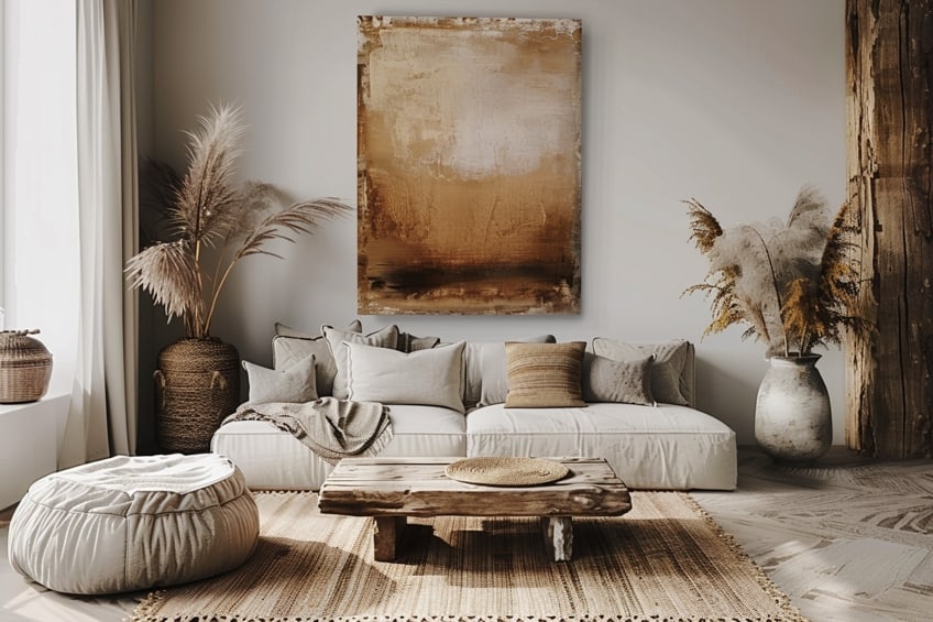
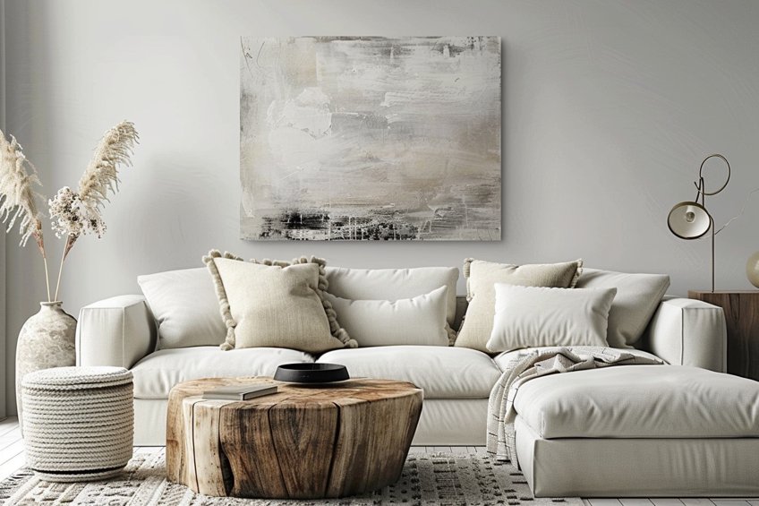
This palette combines cream, soft beige, and taupe to create a timeless and sophisticated atmosphere. The key is to use cream as the base for walls, allowing the space to feel open and bright. Soft beige can be introduced through furniture and larger decor items to add warmth, while taupe accents in textiles or as an accent wall will ground the space with depth. As an expert tip, layer different textures within this palette to add interest and elegance without overwhelming the senses.
| Shade | Hex Code | CMYK Color Code (%) | RGB Color Code | Color |
| Cream | #FFF8E7 | 0, 2, 9, 0 | 255, 248, 231 | |
| Soft Beige | #F5F5DC | 0, 0, 10, 3 | 245, 245, 220 | |
| Taupe | #483C32 | 0, 16, 30, 71 | 72, 60, 50 |
Modern Minimalist
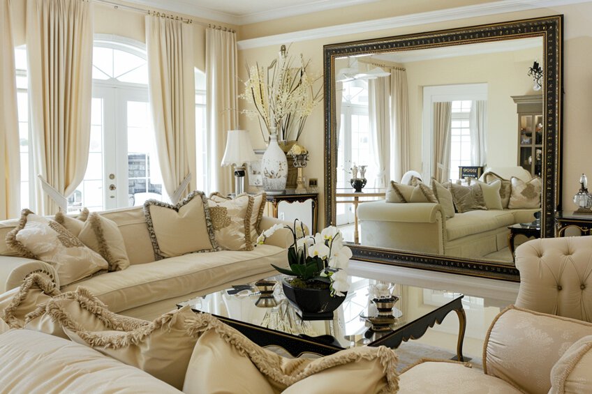
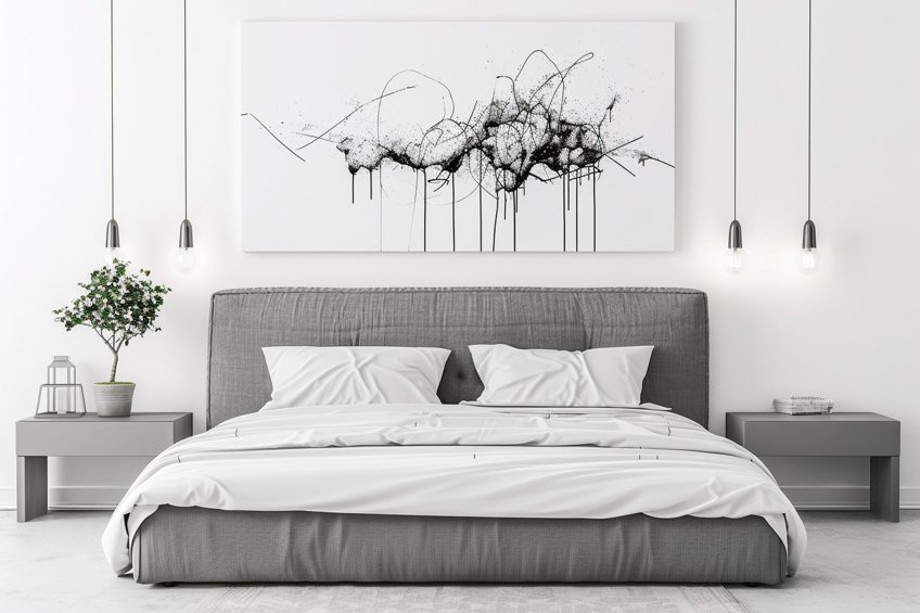
The modern minimalist palette uses white, light grey, and charcoal grey to craft spaces that feel clean and contemporary. Start with white walls to maximize natural light, then incorporate light grey furniture to maintain a soft, minimalist aesthetic. Use charcoal grey in accessories and art to provide contrast and visual interest. Personally, I recommend focusing on geometric shapes and clean lines within this palette to enhance the modern vibe.
| Shade | Hex Code | CMYK Color Code (%) | RGB Color Code | Color |
| White | #FFFFFF | 0, 0, 0, 0 | 255, 255, 255 | |
| Light Grey | #D3D3D3 | 0, 0, 0, 17 | 211, 211, 211 | |
| Charcoal Grey | #36454F | 31, 12, 0, 69 | 54, 69, 79 |
Warm Neutrals
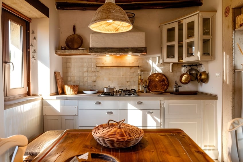
Warm neutrals like ivory, sand, and mocha create a cozy and inviting environment. Ivory should serve as the backdrop, offering a light and airy feel. Sand-colored textiles and furniture bring in warmth, and mocha accents, such as wooden elements or rugs, introduce an earthy, grounded feel. My tip here is to incorporate organic materials like wood, wool, or clay to amplify the natural warmth of this palette.
| Shade | Hex Code | CMYK Color Code (%) | RGB Color Code | Color |
| Ivory | #FFFFF0 | 0, 0, 5, 0 | 255, 255, 240 | |
| Sand | #C2B280 | 0, 8, 34, 23 | 194, 178, 128 | |
| Mocha | #7B3F00 | 0, 48, 100, 51 | 123, 63, 0 |
Cool Serenity
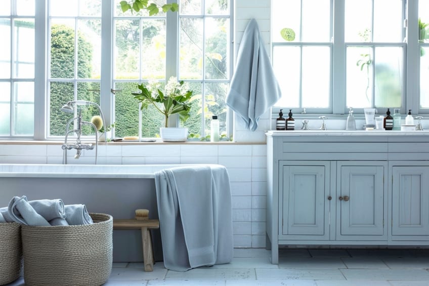
This palette is all about creating a tranquil retreat with off-white, slate grey, and pale blue. Use off-white for the walls to establish a serene base, complemented by slate grey furniture for a touch of sophistication. Pale blue accents, through cushions, art, or vases, can evoke a calming, restful mood. To personalize spaces with this palette, add in natural textures like linen and stone for a refreshing, spa-like atmosphere.
| Shade | Hex Code | CMYK Color Code (%) | RGB Color Code | Color |
| Off-White | #F8F8FF | 1, 1, 0, 0 | 248, 248, 255 | |
| Slate Grey | #708090 | 45, 25, 0, 44 | 112, 128, 144 | |
| Pale Blue | #AFEEEE | 25, 0, 0, 7 | 175, 238, 238 |
Earthy Chic
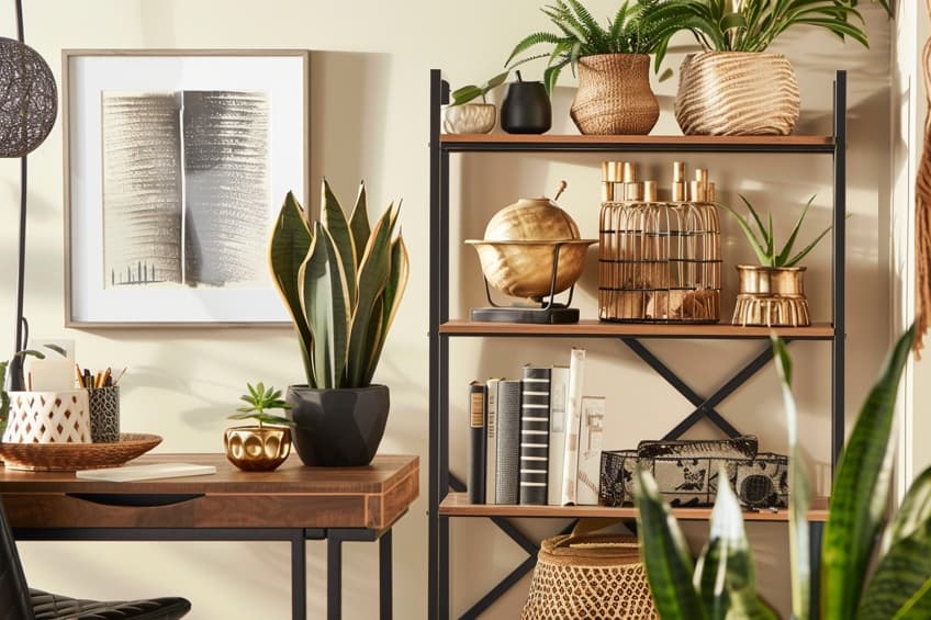
Combining oatmeal, clay, and olive green, this palette draws inspiration from the outdoors for a chic, natural look. Oatmeal walls set a neutral, warm foundation, while clay-colored furniture or decor pieces add richness. Olive green accents, whether in plants or textiles, bring vitality and a connection to nature. As a personal tip, mix in metallic finishes like brass or copper to elevate the earthy tones with a hint of luxury.
| Shade | Hex Code | CMYK Color Code (%) | RGB Color Code | Color |
| Oatmeal | #F5F5DC | 0, 0, 20, 5 | 245, 245, 220 | |
| Clay | #B66A50 | 0, 50, 70, 30 | 182, 106, 80 | |
| Olive Green | #708238 | 20, 0, 100, 50 | 112, 130, 56 |
Rustic Charm
The rustic charm palette features eggshell, caramel, and burnt sienna to create a cozy, inviting space with a bit of rustic edge. Start with eggshell for the walls to keep the space light and welcoming. Incorporate caramel in wood finishes or leather pieces for a warm, natural feel, and use burnt sienna in decorative accents for a pop of rustic color. My expert advice is to add handcrafted items and vintage finds to truly capture the essence of rustic charm.
| Shade | Hex Code | CMYK Color Code (%) | RGB Color Code | Color |
| Eggshell | #F0EAD6 | 0, 2, 14, 6 | 240, 234, 214 | |
| Caramel | #C68E17 | 0, 35, 100, 22 | 198, 142, 23 | |
| Burnt Sienna | #EA7E5D | 0, 53, 71, 8 | 234, 126, 93 |
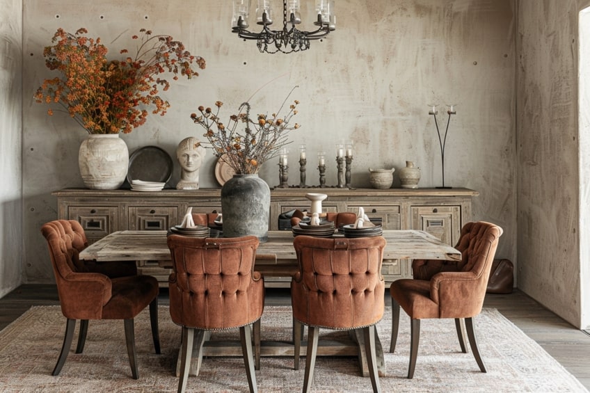
Sophisticated Grayscale
Sophisticated grayscale makes use of silver, granite, and black for a sleek, modern look. Begin with silver walls for a luminous, reflective quality, then introduce granite in major furniture pieces for stability and depth. Black should be used sparingly in accents for a dramatic effect. Personally, I suggest incorporating glossy finishes and plush textiles to add sophistication and comfort to the sleekness of grayscale.
| Shade | Hex Code | CMYK Color Code (%) | RGB Color Code | Color |
| Silver | #C0C0C0 | 0, 0, 0, 25 | 192, 192, 192 | |
| Granite | #615E5E | 0, 0, 0, 62 | 97, 94, 94 | |
| Black | #000000 | 0, 0, 0, 100 | 0, 0, 0 |

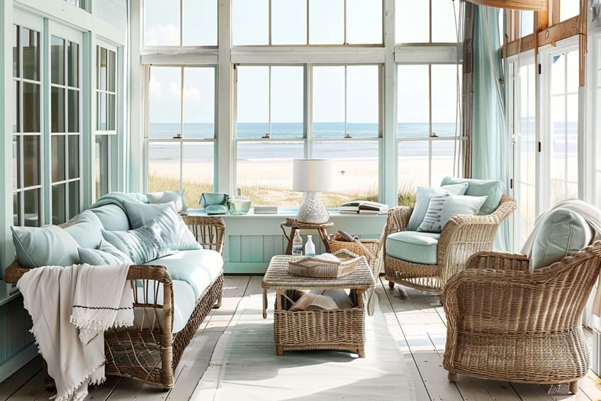
Coastal Calm
This palette evokes the peacefulness of the coast with seashell, driftwood, and seafoam. Seashell-colored walls provide a soft, light background, complemented by driftwood tones in wood furniture or flooring for warmth. Seafoam accents in textiles or wall art can mimic the refreshing feel of the ocean. As a tip, mix in elements like glass or ceramics that reflect the lightness and fluidity of the seaside.
| Shade | Hex Code | CMYK Color Code (%) | RGB Color Code | Color |
| Seashell | #FFF5EE | 0, 4, 7, 0 | 255, 245, 238 | |
| Driftwood | #847060 | 0, 25, 44, 48 | 132, 112, 96 | |
| Seafoam | #9FE2BF | 38, 0, 25, 12 | 159, 226, 191 |
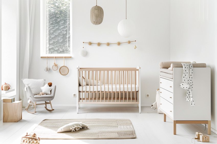
Scandinavian Simplicity
Scandinavian simplicity relies on snow, heather grey, and ash to create clean, bright, and airy spaces. Use snow as the primary color for walls and large surfaces to maximize light. Heather grey furniture and textiles offer subtle contrast, while ash accents in accessories or lighting fixtures add a modern touch. My personal recommendation is to prioritize functionality in your design, choosing pieces that are as practical as they are beautiful.
| Shade | Hex Code | CMYK Color Code (%) | RGB Color Code | Color |
| Snow | #FFFAFA | 0, 1, 1, 0 | 255, 250, 250 | |
| Heather Grey | #B6B6B4 | 0, 0, 0, 29 | 182, 182, 180 | |
| Ash | #B2BEB5 | 20, 0, 10, 30 | 178, 190, 181 |
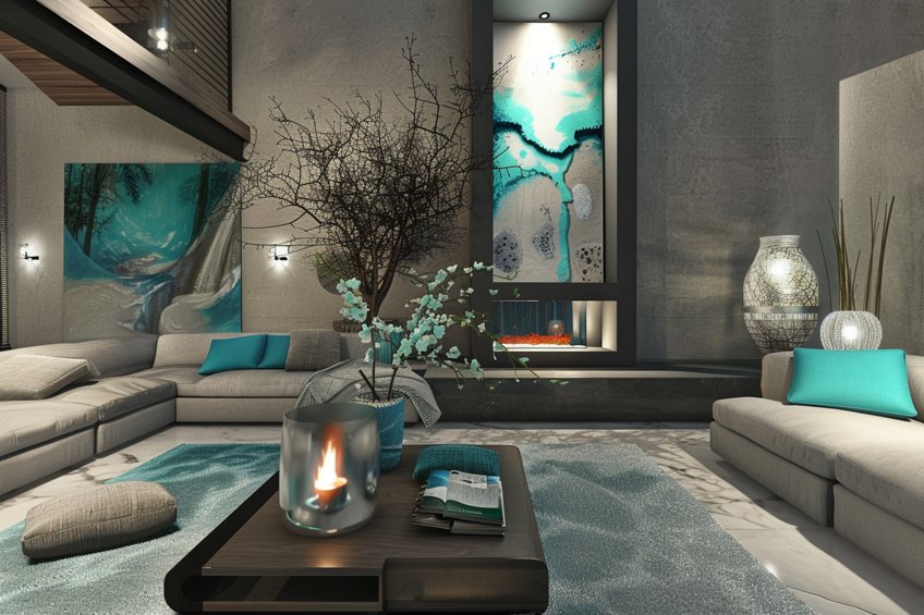
Contemporary Zen
The contemporary zen palette uses porcelain, dove grey, and teal to craft spaces that are both modern and tranquil. Porcelain should dominate the walls and larger surfaces for a calm, clean look, with dove grey in furniture to add depth. Teal accents provide a pop of color that’s both soothing and sophisticated. Incorporate natural elements like bamboo or water features as a personal tip to enhance the zen-like atmosphere.
| Shade | Hex Code | CMYK Color Code (%) | RGB Color Code | Color |
| Porcelain | #EFF0F1 | 2, 1, 0, 6 | 239, 240, 241 | |
| Dove Grey | #696969 | 0, 0, 0, 59 | 105, 105, 105 | |
| Teal | #008080 | 100, 0, 0, 50 | 0, 128, 128 |
Desert Hues
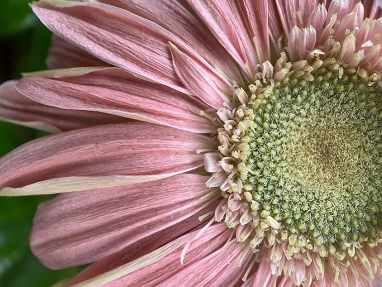
Desert hues bring the warmth and vibrancy of the desert indoors, with bone, dusty rose, and terracotta. Begin with bone as the primary wall color for a neutral, light background. Add furniture or textiles in dusty rose to inject a soft, romantic warmth into the room. Terracotta accents, whether in pottery, cushions, or wall art, can introduce an earthy, vibrant contrast. My personal tip is to incorporate natural, rough-textured materials like jute or sisal to enhance the desert vibe and add depth to the space.
| Shade | Hex Code | CMYK Color Code (%) | RGB Color Code | Color |
| Bone | #E3DAC9 | 0, 5, 15, 11 | 227, 218, 201 | |
| Dusty Rose | #DCAE96 | 0, 15, 25, 14 | 220, 174, 150 | |
| Terracotta | #E2725B | 0, 50, 70, 11 | 226, 114, 91 |
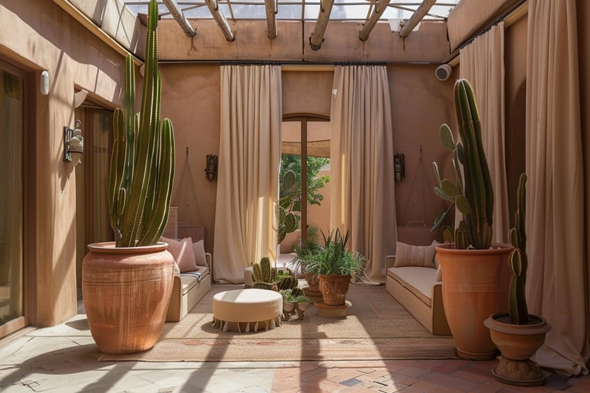
Whispering Woods
This palette aims to capture the essence of a tranquil forest with linen, mushroom, and forest fog. Use linen for walls or large upholstered pieces to create a soft, neutral base. Mushroom-colored elements, such as wood furniture or rugs, add a subtle, earthy depth. Accents in forest fog, through textiles or botanical prints, bring in the cool, mysterious qualities of the woods. I always recommend integrating live plants or greenery to truly connect the indoor space with the natural beauty of a forest.
| Shade | Hex Code | CMYK Color Code (%) | RGB Color Code | Color |
| Linen | #FAF0E6 | 0, 2, 8, 2 | 250, 240, 230 | |
| Mushroom | #BDAE9D | 0, 10, 20, 26 | 189, 174, 157 | |
| Forest Fog | #9DA9A0 | 20, 0, 10, 40 | 157, 169, 160 |
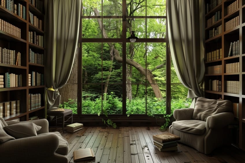
Urban Elegance
Urban elegance combines platinum, steel, and ink for a chic, cosmopolitan look. Platinum walls reflect light beautifully, making spaces feel larger and more open. Steel furniture or fixtures add an industrial yet refined touch, while ink accents provide dramatic depth and sophistication. As an expert tip, use sleek, modern lighting fixtures and geometric patterns to emphasize the urban aesthetic and add visual interest.
| Shade | Hex Code | CMYK Color Code (%) | RGB Color Code | Color |
| Platinum | #E5E4E2 | 2, 1, 0, 11 | 229, 228, 226 | |
| Steel | #B7C2C7 | 10, 5, 0, 22 | 183, 194, 199 | |
| Ink | #3F5161 | 50, 25, 0, 62 | 63, 81, 97 |
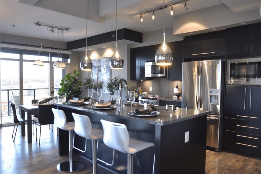
Frosty Dawn
The frosty dawn palette uses mist, iceberg, and slate to mimic the serene beauty of early morning light. Begin with mist for the walls to set a tranquil, airy backdrop. Incorporate furniture or decor in iceberg to bring in the cool freshness of dawn, and use slate accents to anchor the space with a touch of depth. My personal suggestion is to play with reflective surfaces like mirrors or metallics to mimic the sparkling quality of frost and enhance the light in the room.
| Shade | Hex Code | CMYK Color Code (%) | RGB Color Code | Color |
| Mist | #E5E5E5 | 0, 0, 0, 10 | 229, 229, 229 | |
| Iceberg | #71A6D2 | 45, 19, 0, 18 | 113, 166, 210 | |
| Slate | #708090 | 43, 25, 0, 44 | 112, 128, 144 |
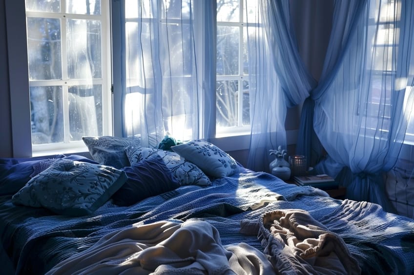
Golden Glow
Golden glow captures the warmth and richness of sunlight with vanilla, honey, and wheat. Vanilla walls serve as a soft, inviting background, complemented by honey-colored wood or accents to add warmth and luster. Wheat tones in textiles or rugs can introduce a subtle, natural texture and coziness. To personalize this palette, incorporate golden or brass accents to enhance the luxurious warmth and create a radiant, welcoming atmosphere.
| Shade | Hex Code | CMYK Color Code (%) | RGB Color Code | Color |
| Vanilla | #F3E5AB | 0, 1, 30, 5 | 243, 229, 171 | |
| Honey | #E4BD0B | 0, 10, 95, 11 | 228, 189, 11 | |
| Wheat | #F5DEB3 | 0, 5, 30, 4 | 245, 222, 179 |
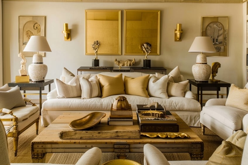
Luxe Monochrome
Luxe monochrome is all about sophistication with parchment, graphite, and pearl. Use parchment on the walls for a warm, neutral canvas. Furniture and main pieces in graphite provide a strong, elegant contrast, while pearl accents offer a subtle sheen and sophistication. My tip for this palette is to mix in luxurious textures like velvet or silk to add depth and interest, creating a space that feels both refined and inviting.
| Shade | Hex Code | CMYK Color Code (%) | RGB Color Code | Color |
| Parchment | #F1E9D2 | 0, 2, 15, 5 | 241, 233, 210 | |
| Graphite | #251F1F | 0, 13, 13, 85 | 37, 31, 31 | |
| Pearl | #FDEDFD | 1, 6, 0, 1 | 253, 237, 253 |
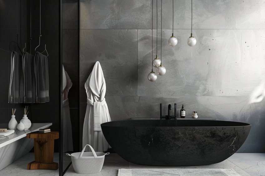
Harmony in Greige
Harmony in greige blends putty, greige, and pewter for a soft, sophisticated neutral scheme. Start with greige walls for a warm, versatile backdrop. Add furniture in putty for a subtle contrast, and accentuate with pewter in metal finishes or fixtures for a touch of modern elegance. Incorporating textured fabrics and mixed materials as an expert suggestion can add dimension and warmth to the greige palette, making it feel more inviting.
| Shade | Hex Code | CMYK Color Code (%) | RGB Color Code | Color |
| Putty | #7F7F7F | 0, 0, 0, 50 | 127, 127, 127 | |
| Greige | #928573 | 0, 9, 21, 43 | 146, 133, 115 | |
| Pewter | #95A5A6 | 10, 1, 0, 35 | 149, 165, 166 |

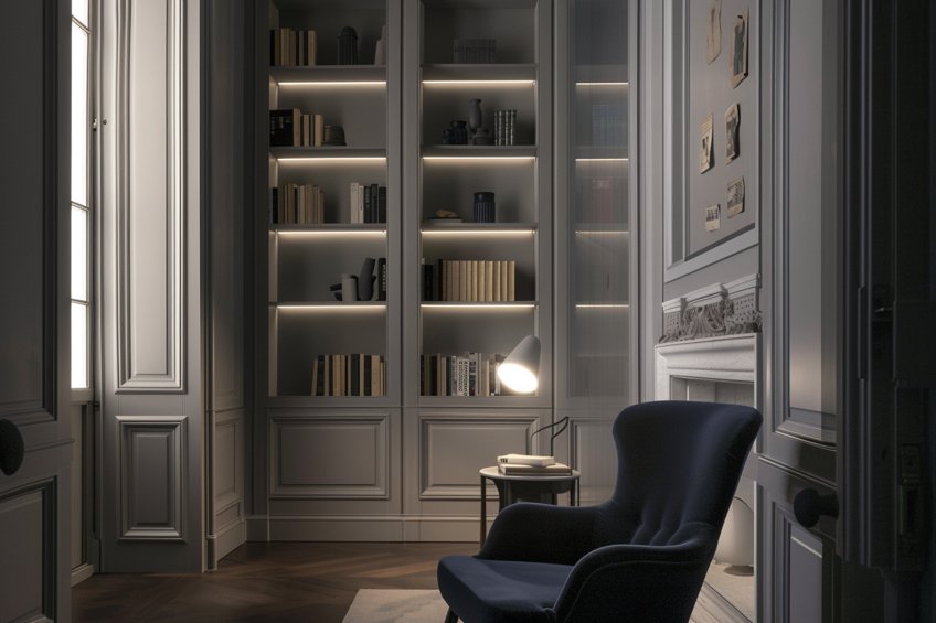
Soft Shadows
This palette, featuring alabaster, smoke, and midnight blue, is designed to create a serene yet sophisticated space. Alabaster walls keep the space bright and open, while smoke provides a gentle contrast in furniture or flooring. Midnight blue accents add a deep, calming element of color. My personal advice is to use soft, diffused lighting to enhance the shadows and depth of the palette, creating a tranquil, inviting atmosphere.
| Shade | Hex Code | CMYK Color Code (%) | RGB Color Code | Color |
| Alabaster | #F2F0E6 | 1, 0, 5, 5 | 242, 240, 230 | |
| Smoke | #738276 | 20, 0, 10, 52 | 115, 130, 118 | |
| Midnight Blue | #003366 | 100, 50, 0, 60 | 0, 51, 102 |
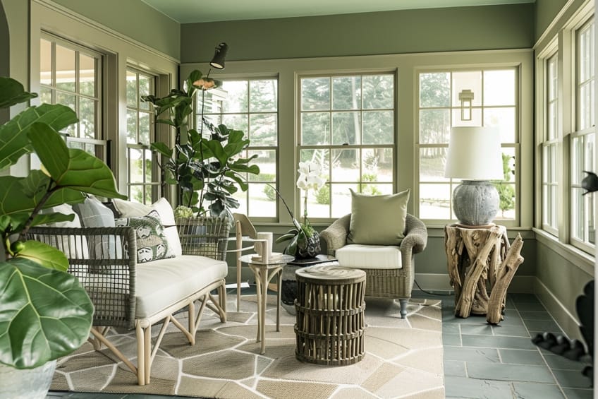
Nature’s Neutrals
Nature’s neutrals with sage, stone, and bark aim to bring the outdoors in. Sage walls can refresh any space with their subtle, earthy vibe. Incorporate stone hues through countertops, tiles, or textiles for a touch of natural elegance. Bark accents, through wooden elements or textured rugs, ground the space with an organic, robust feel. I recommend blending in natural textures and materials to emphasize the connection to the outdoors, enriching the overall aesthetic.
| Shade | Hex Code | CMYK Color Code (%) | RGB Color Code | Color |
| Sage | #9EA587 | 20, 0, 25, 35 | 158, 165, 135 | |
| Stone | #8A8D8F | 0, 0, 0, 44 | 138, 141, 143 | |
| Bark | #8B5A2B | 0, 50, 75, 45 | 139, 90, 43 |
Vintage Velvet
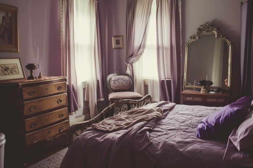
The vintage velvet palette combines champagne, mauve, and dust for a soft, romantic feel. Use champagne as the primary color for walls or large pieces, creating a light, effervescent foundation. Add depth with mauve in upholstered furniture or curtains, and introduce dust in accents like pillows or vintage finds for a touch of nostalgia. My tip for achieving the vintage velvet look is to incorporate antique or vintage-inspired pieces, adding character and timelessness to the design.
| Shade | Hex Code | CMYK Color Code (%) | RGB Color Code | Color |
| Champagne | #F7E7CE | 0, 5, 18, 3 | 247, 231, 206 | |
| Mauve | #E0B0FF | 12, 31, 0, 0 | 224, 176, 255 | |
| Dust | #B2996E | 0, 12, 44, 30 | 178, 153, 110 |
Throughout this article, I’ve shared my personal journey with the neutral color palette, hoping to inspire you to see these hues in a new light. The insights and examples provided are designed to empower you to blend these timeless shades into your own spaces, creating environments that are both elegant and deeply personal. It’s my belief that, armed with this knowledge, you can craft interiors that not only reflect your unique style but also stand the test of time. May this guide be your stepping stone to designing spaces that resonate with warmth, sophistication, and a touch of your own spirit.
Frequently Asked Questions
What Are the Benefits of Using a Neutral Color Palette in Interior Design?
Using a neutral color palette in interior design offers numerous benefits that resonate with my personal style and preferences. One advantage I appreciate is the timeless and sophisticated look that neutral colors impart, allowing for flexibility in decor styles and trends over time. Additionally, neutrals provide a versatile backdrop for layering with accent colors or seasonal decor, giving me the freedom to update and refresh my space effortlessly. Furthermore, I find that neutral tones create a serene and calming atmosphere, promoting relaxation and tranquility in my home.
Can I Mix Different Neutral Colors in a Single Room?
Mixing different neutral colors in a room is a strategy I often employ to create a harmonious and layered look. I enjoy playing with a mix of warm and cool tones, such as pairing creamy whites with soft grays or combining earthy beiges with cool taupes. Balancing these hues throughout the room helps create a sense of cohesion while adding visual interest. I’ve found that experimenting with different combinations allows me to tailor the color palette to suit the mood and style of the space.
How Can I Create Visual Interest Using a Neutral Color Palette?
Creating visual interest with a neutral color palette is one of my favorite design challenges. I’ve found that layering textures and patterns is key to adding depth and dimension to a space. Mixing different materials like wood, metal, and textiles adds richness and tactile appeal, while incorporating subtle variations in shade and tone prevents the space from feeling flat. Additionally, I love using accent pieces like statement furniture, artwork, or decorative accessories in contrasting colors or finishes to create focal points and draw the eye.
In 2005, Charlene completed her Wellness Diplomas in Therapeutic Aromatherapy and Reflexology from the International School of Reflexology and Meridian Therapy. She worked for a company offering corporate wellness programs for a couple of years, before opening up her own therapy practice. It was in 2015 that a friend, who was a digital marketer, asked her to join her company as a content creator, and this is where she found her excitement for writing.
Since joining the content writing world, she has gained a lot of experience over the years writing on a diverse selection of topics, from beauty, health, wellness, travel, and more. Due to various circumstances, she had to close her therapy practice and is now a full-time freelance writer. Being a creative person, she could not pass up the opportunity to contribute to the Art in Context team, where is was in her element, writing about a variety of art and craft topics. Contributing articles for over three years now, her knowledge in this area has grown, and she has gotten to explore her creativity and improve her research and writing skills.
Charlene Lewis has been working for artincontext.org since the relaunch in 2020. She is an experienced writer and mainly focuses on the topics of color theory, painting and drawing.
Learn more about Charlene Lewis and the Art in Context Team.
Cite this Article
Charlene, Lewis, “Neutral Color Palette – 20 Elegant Earth Tones.” Art in Context. February 23, 2024. URL: https://artincontext.org/neutral-color-palette/
Lewis, C. (2024, 23 February). Neutral Color Palette – 20 Elegant Earth Tones. Art in Context. https://artincontext.org/neutral-color-palette/
Lewis, Charlene. “Neutral Color Palette – 20 Elegant Earth Tones.” Art in Context, February 23, 2024. https://artincontext.org/neutral-color-palette/.


