

Ivan Bilibin: Illustrator, Book and Stage Designer

Ivan Bilibin made fairy-tale worlds feel solid enough to enter, filling them with dense forests, carved buildings, patterned clothing, and sharply defined figures. Behind that apparent magic stood careful field research and a designer who considered every border, letter, costume, and stage set part of a unified visual world. Following those connections reveals why his contribution reaches far beyond familiar pictures of firebirds and witches.
Who Was Ivan Bilibin?
Ivan Yakovlevich Bilibin was a Russian illustrator, book designer, painter, ethnographic collector, and stage designer. Born at Tarkhovka near St. Petersburg on August 16, 1876, he became closely associated with Mir iskusstva, or World of Art, an influential artistic association that connected graphic art, publishing, painting, and theater. He died in Leningrad on February 7, 1942, during the siege of the city.

Bilibin is best known for illustrations of Russian fairy tales and epic subjects, but that description captures only one part of his work. He approached a book as a coordinated object whose cover, type, initials, borders, small decorative images, and full-page scenes should belong to the same visual system. He later adapted that thinking to theatrical costumes and sets, where pattern and silhouette had to communicate across a large auditorium.
Ivan Bilibin at a Glance
Bilibin trained in art while completing a law degree, began illustrating fairy tales professionally in 1899, and exhibited with Mir iskusstva from 1900. Museum-sponsored expeditions through the Russian North between 1902 and 1904 gave him direct access to wooden architecture, regional dress, embroidery, carving, and domestic objects. Theater work followed during the 1900s, while revolution and civil war eventually carried him from Petrograd to Crimea, Egypt, and Paris. He returned to Leningrad in 1936 and taught graphic art during his final years.
His career therefore crossed several roles that are often considered separately. He gathered ethnographic material, organized printed pages, drew narrative scenes, designed wearable costumes, and conceived architectural environments for performance. The common thread was his ability to transform historical observation into clear, repeatable design choices.
Why His Work Is Immediately Recognizable
A typical Bilibin illustration combines a firm black outline with controlled areas of watercolor, intricate narrative detail, and an ornamental frame. Figures often read as crisp silhouettes even when their clothing carries elaborate patterns. Trees, huts, weapons, textiles, and fantastic creatures are rendered with enough specificity to establish a believable setting, while the shallow space and flat color keep the image close to the decorated surface of the page.
Bilibin is frequently discussed in relation to Art Nouveau, the international decorative movement that flourished around 1900. The label helps explain his attention to flowing contours, coordinated typography, and unified page design. It is not a complete definition, however. His imagery also grew from sustained study of Russian material culture, early printed books, popular prints, icons, and historical architecture. He was an Art Nouveau-era designer whose working method remained unusually tied to documented objects and places.
From Law Graduate to Fairy-Tale Illustrator
Bilibin pursued legal and artistic education at the same time before redirecting his career toward art near the end of the 1890s. His path included several forms of training in St. Petersburg and Munich before illustration became his principal professional focus.

Parallel Training in Law and Art
He completed the law faculty at St. Petersburg University in 1900, but art was never merely an after-hours pastime. He studied at the drawing school of the Society for the Encouragement of Arts, attended Anton Ažbe’s workshop in Munich, and worked at Princess Maria Tenisheva’s school under Ilya Repin. He also attended the Imperial Academy of Arts as an auditor.
These experiences exposed him to different forms of instruction rather than one fixed doctrine. Ažbe’s Munich workshop connected him with a wider European artistic environment, while Repin represented the technical seriousness and narrative force of Russian realist painting. Bilibin ultimately chose neither academic history painting nor naturalistic realism as his primary language. He directed his training toward reproducible graphic art, where line, pattern, lettering, and page structure could work together.
Vasnetsov and the 1899 Breakthrough
Institutional accounts identify Bilibin’s encounter with Viktor Vasnetsov’s Bogatyrs in 1899 as a decisive stimulus for his engagement with legendary Russian subjects. Vasnetsov demonstrated that medieval heroes and folklore could sustain ambitious contemporary art. For Bilibin, however, the encounter was a catalyst rather than a ready-made style. His own visual language developed through further observation, collecting, and experimentation with print.
During a stay in the Tver region that year, Bilibin sketched village architecture as well as Russian and Karelian clothing. These observations informed his early work on The Tale of Ivan Tsarevich, the Firebird and the Gray Wolf. In the image of Ivan Tsarevich reaching for the Firebird’s feather, the supernatural event appears within a carefully organized natural setting. The glowing object supplies the narrative focus, while dark contours and closely observed vegetation prevent the fantasy from dissolving into vagueness.
Mir Iskusstva and the State-Published Tales
Bilibin began producing fairy-tale illustrations in 1899 and soon received commissions from the Department for the Production of State Documents, which published his early tale books. This government production office could reproduce the coordinated colors, borders, and decorative elements on which his designs depended. The commission placed his work before a broad reading public and allowed him to treat illustration as a complete publishing project.
From 1900, he participated in exhibitions organized by Mir iskusstva. The association provided a professional setting for artists who challenged narrow divisions between fine and decorative art and took theater, print, and historical style seriously. Bilibin later chaired its committee in 1916. Within the broader history of Russian art, his career belongs to a period when artists actively reconsidered national traditions while remaining engaged with international design.
How Fieldwork Became the Bilibin Style
The most useful way to understand Bilibin’s folk imagery is to look past the general idea of inspiration. He did not rely only on inherited stories or a romantic image of village life. He traveled, photographed buildings, examined interiors, drew objects, and collected physical examples. This work supplied a practical archive that he could reorganize for books and theater.
The Russian North Expeditions of 1902 to 1904
Between 1902 and 1904, the Russian Museum’s Ethnographic Department sent Bilibin through northern provinces to study and document regional culture. His assignments encompassed wooden buildings and interiors as well as clothing, embroidery, carved decoration, and household objects. More than 420 objects collected through this work entered the museum department.
The number matters because it shows the scale of his engagement. A carved window surround, the cut of a garment, or an embroidered band was not simply a decorative motif waiting to be copied. Each belonged to a particular object, technique, and setting. By drawing, photographing, and collecting such material, Bilibin developed a store of structural ideas: how patterns divide a surface, how rooflines form silhouettes, how repeated shapes lead the eye, and how clothing indicates a figure’s social and narrative role.
His finished images did not function as neutral ethnographic records. He selected, simplified, and recombined what he had studied to serve a story. Yet the specificity of his source material gave his imaginary kingdoms a convincing material base. The towers, textiles, utensils, and interiors look related because they grew from connected fields of observation.
A Recognition Guide to Line, Color, Border, and Lettering
Four features offer a practical way to recognize Bilibin’s mature book work. First, a precise black contour defines people, plants, buildings, and small objects. It remains readable even where the image becomes dense. Second, transparent watercolor creates controlled color fields rather than concealing the drawing under heavily modeled paint. The result often resembles a colored print while preserving the energy of the line.
Third, the frame is an active part of the design. Borders may contain plants, animals, geometric repetitions, or motifs related to the tale. They establish a threshold between the reader’s page and the pictured world, but they can also comment on the action or quietly introduce another layer of detail. Fourth, lettering, initials, and small vignettes follow the same ornamental logic. Text and image do not look as if they were assembled by unrelated hands.
His range of sources was broader than Russian folk art alone. Museum research connects his work with lubok, the inexpensive Russian popular prints known for bold images and accessible stories, as well as icons, early books, Northern Renaissance graphics, and Japanese prints. These sources contributed different approaches to contour, compressed space, framing, and the balance between flat pattern and narrative description.
Close Reading: Baba Yaga in Vasilisa the Beautiful
Bilibin’s 1900 image of Baba Yaga offers a compact demonstration of this system. The witch travels through a tangled forest in a mortar, drives herself with a pestle, and uses a broom to erase the trail behind her. These attributes do more than identify the character. The mortar supplies a heavy rounded mass, the pestle creates a diagonal thrust, and the streaming broom extends the direction of travel.

The forest does not recede into soft atmospheric space. Birch trunks, fir branches, roots, and ground cover overlap in a dense screen, each element held in place by black contour. Flat areas of restrained color allow those outlines to remain legible. Baba Yaga’s bent body and angular limbs interrupt the vertical rhythm of the trees, making her movement feel abrupt and intrusive.
An ornamental Art Nouveau frame encloses the scene. Rather than treating the border as empty decoration, Bilibin uses it to remind the viewer that this threatening encounter belongs to a deliberately constructed book. The contrast is central to the image’s effect: the forest seems cramped and dangerous, but the page remains controlled. Narrative disorder occurs inside an exceptionally ordered design.
This close reading also explains why reproducing only the central figure loses something important. Baba Yaga is memorable, but the relationship among character, setting, margin, and page gives the scene its particular identity. Bilibin designed an encounter between reader and story, not merely a portrait of a witch.
From the Book Page to the Stage
Theater allowed Bilibin to expand his design principles without simply enlarging an illustration. A printed page is viewed at close range and remains still in the reader’s hands. A stage must communicate across distance while performers move through changing light. His scenography, meaning the visual design of a theatrical production, had to preserve clarity under those different conditions.

The Book as a Complete Visual System
Bilibin’s fairy-tale publications coordinated covers, decorative initials, frames, vignettes, lettering, and full illustrations. Each component established pace. A small ornament could mark a transition, a framed scene could pause the story for sustained viewing, and the cover could announce the visual rules before the reader reached the first line.
The Metropolitan Museum of Art’s copy of Fairy-Tales: Vasilisa the Beautiful records a 1902 St. Petersburg publication produced by the Department for the Production of State Documents. Its screenprinted illustrations appear in a volume measuring 34 by 27.5 centimeters. Those dimensions make the physical book substantial enough for borders and fine internal patterns to register clearly. They also distinguish the publication date of the volume from the 1900 date attached to the individual Baba Yaga image.
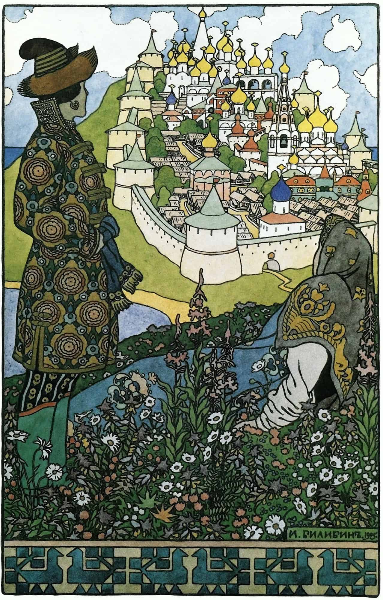
Bilibin applied the same integrated approach to Pushkin’s tales. His 1905 image of fortified Buyan Island for The Tale of Tsar Saltan joins landscape, architecture, framing, and narrative into a single page-sized world. The architecture does not function as a generic fairy-tale backdrop. Its walls and towers establish a readable destination while the decorative frame keeps that distant prospect connected to the book’s surface.
The Golden Cockerel and Theatrical Scale
By the late 1900s, Bilibin was working on major theatrical productions, including Boris Godunov and Nikolai Rimsky-Korsakov’s The Golden Cockerel. A surviving costume design for a Lezgin woman in the Zimin Opera’s 1908 to 1909 production of The Golden Cockerel shows how material and pattern entered his stage practice. The drawing, now held by the Bakhrushin Theatre Museum, measures 35.7 by 24.6 centimeters and combines pencil and watercolor with bronze and silver paints.
The metallic paints are especially suited to imagining a costume under theatrical light. Dense surface ornament establishes cultural and dramatic character, but the figure also requires a distinct overall silhouette. From the back of an auditorium, every tiny mark would not remain visible. The larger outline, color grouping, headdress, and distribution of reflective details had to carry the design.
His 1909 design of Tsar Dadon’s town square for Act Two of The Golden Cockerel applies comparable reasoning to architecture. Repeated roofs, towers, and patterned surfaces create a unified kingdom, while large masses keep the setting readable as a theatrical environment. The stage becomes a framed world, but one that actors can occupy rather than an image confined to paper.
What Changed Between Illustration and Scenography
On the page, Bilibin could reward close inspection with tiny plants, costume fastenings, and border motifs. In the theater, detail remained important but had to be subordinated to distance and movement. Costumes required strong silhouettes; sets required openings, levels, and visual routes for performers. Colors and metallic accents also responded to stage lighting rather than the stable illumination of a printed sheet.
What remained constant was the coordination of parts. A book joined typography, frame, and picture. A production joined costume, scenery, architecture, surface pattern, and moving bodies. Works for Sadko, Ruslan and Lyudmila, and other operatic subjects extended this practice, but the essential shift was not from illustration to an unrelated second career. It was from organizing a sequence of pages to organizing a shared physical space.
Exile, Return, and the Final Years
The upheavals after 1917 changed both Bilibin’s location and the institutions for which he could work. His later career nevertheless retained the combination of illustration, architectural decoration, and performance design established before the revolution.
Egypt: Religious Decoration and Performance
Bilibin left Petrograd for Crimea in 1917 and departed Russia in 1920. He settled first in Egypt, working in Cairo and Alexandria. There he designed Orthodox religious decoration and produced ballet designs for Anna Pavlova’s company.
These commissions demanded two distinct applications of his skills. Religious interiors called for coordinated imagery and ornament on an architectural scale, while ballet required designs that could move with performers. Both extended his knowledge of historical forms beyond the Russian publishing network in which his early career had developed.
Paris and International Stage Work
In 1925, Bilibin moved to Paris, a major center of the Russian émigré community. He continued working as an illustrator and theater designer, contributing to international projects connected with The Tale of Tsar Saltan, The Tsar’s Bride, Prince Igor, and Boris Godunov. His stage work also included a 1931 production of The Firebird in Buenos Aires.
The Paris years demonstrate the portability of his visual method. Productions could change language, company, and city, while recognizable elements of silhouette, historical costume, architecture, and patterned surface remained adaptable. Exile did not freeze him as a maker of pre-revolutionary fairy-tale books. It widened the geographical range within which his design system operated.
Return to Leningrad and Death During the Siege
Bilibin accepted Soviet citizenship in 1935 and returned to Leningrad in 1936. Back in the city, he became a professor in the Academy’s graphic workshop. His professorial rank and doctorate in art history were confirmed in 1939.
His late work included book illustration and designs for the Kirov Theatre’s 1937 production of The Tale of Tsar Saltan. When German forces surrounded Leningrad in 1941, he remained in the besieged city. Bilibin died on February 7, 1942, and was buried in a collective grave for Academy professors near the Smolensk Cemetery.
Major Works and Bilibin’s Legacy
Bilibin’s legacy cannot be measured only by how often his fairy-tale pictures are reproduced. Books, original drawings, theatrical designs, photographs, collected objects, writings, and personal effects preserve different stages of his process. Together they show how observation moved through drawing and design into printed and performed worlds.
Four Works and Projects to Know
The Tale of Ivan Tsarevich, the Firebird and the Gray Wolf marks the breakthrough of 1899, when Bilibin joined observed rural details to a legendary subject. Vasilisa the Beautiful contains the Baba Yaga image that most clearly demonstrates his command of contour, compressed forest space, narrative attributes, and ornamental framing. The 1902 volume cataloged by the Met also provides a precise record of how those images reached readers in a designed book.
The Tale of Tsar Saltan shows the artist adapting his approach to Pushkin, with the 1905 Buyan Island illustration organizing architecture and landscape into a coherent page. His return to the tale for a 1937 theater production also spans two distant periods of his career. The Golden Cockerel, finally, reveals the transition from page to performance through surviving costume and set designs from 1908 and 1909.
These works are useful together because they expose continuity without pretending that every medium behaves identically. The Firebird and Baba Yaga illustrations reward close reading. Buyan Island organizes a larger landscape and fortified settlement. The Golden Cockerel requires costumes and buildings to function amid distance, light, music, and movement.
What Museums Preserve
The Russian Ethnographic Museum preserves the field collections and documentation that underpin Bilibin’s visual vocabulary. These holdings allow viewers to compare designed fantasy with the buildings, textiles, carving, and domestic material he actually studied. They make his research process visible rather than treating the finished style as spontaneous folklore.
The Ivangorod Museum holds the largest collection of Bilibin’s works and personal effects. Its holdings include more than 300 objects from the joint family collection of Bilibin and his wife, Alexandra Shchekatikhina-Pototskaya, transferred by her son Mstislav Pototsky in 1980. Theater museums preserve working designs that reveal material choices and production details, while art museums and libraries retain illustrated volumes and individual sheets. No single collection contains the whole story. His practice survives across institutions because it originally crossed the boundaries among ethnography, publishing, fine art, and performance.
The Contribution of a Researching Designer
Bilibin’s most consequential achievement was the conversion of research into a flexible design language. He did not place copied folk ornaments around otherwise conventional pictures. He learned from the underlying organization of buildings, clothes, prints, and decorated objects, then used that knowledge to control line, color, rhythm, scale, and framing.
This offers a useful test when looking at an unfamiliar work attributed to him. Examine whether the black contour remains structurally clear, whether color reinforces rather than buries the drawing, whether historical detail supports the story, and whether the border or lettering participates in the composition. Then ask how those relationships change with the medium. A book page invites close inspection; a costume needs a legible moving silhouette; a set must organize human action across space.
Seen through that method, Bilibin was not simply an illustrator who later tried theater. He was a researching designer who could make documentation perform different jobs. The same disciplined attention could organize the margin of a page, the surface of a garment, or the architecture of an imaginary kingdom.
Frequently Asked Questions About Ivan Bilibin
Bilibin worked across illustration and stage design, joining Art Nouveau-era graphics with close study of Russian material culture. These answers clarify the visual traits of his style, his Baba Yaga image, and the upheavals behind his years abroad and return to Leningrad.
Was Ivan Bilibin an Art Nouveau Artist?
Yes, Art Nouveau is a useful context for Bilibin’s flowing contours, ornament, decorative frames, and integration of text and image. His work was also shaped by Russian folk art, historical books, icons, popular prints, field research, and international graphic sources, so the category does not explain his full method.
What Is the Bilibin Style?
The term usually describes illustrations built from precise black outlines, controlled watercolor color fields, detailed historical or folkloric settings, and coordinated borders and lettering. Its distinguishing feature is not one repeated motif but the way every part of the page belongs to the same visual system.
Did Bilibin Illustrate Baba Yaga?
Yes. His 1900 Baba Yaga image for Vasilisa the Beautiful shows the witch traveling through a dense forest in a mortar, using a pestle for propulsion and a broom to remove her tracks. The illustration is among the clearest examples of his combination of narrative detail, flat color, crisp contour, and ornamental framing.
Why Did Ivan Bilibin Leave Russia and Later Return?
Revolution and civil conflict displaced Bilibin from Petrograd to Crimea, and he left Russia in 1920 before living in Egypt and France. He accepted Soviet citizenship in 1935 and returned to Leningrad in 1936, where he became a professor in the Academy’s graphic workshop.

Isabella studied at the University of Cape Town in South Africa and graduated with a Bachelor of Arts majoring in English Literature & Language and Psychology. Throughout her undergraduate years, she took Art History as an additional subject and absolutely loved it. Building on from her art history knowledge that began in high school, art has always been a particular area of fascination for her. From learning about artworks previously unknown to her, or sharpening her existing understanding of specific works, the ability to continue learning within this interesting sphere excites her greatly.
Her focal points of interest in art history encompass profiling specific artists and art movements, as it is these areas where she is able to really dig deep into the rich narrative of the art world. Additionally, she particularly enjoys exploring the different artistic styles of the 20th century, as well as the important impact that female artists have had on the development of art history.
Learn more about Isabella Meyer and the Art in Context Team.
Cite this Article
Isabella, Meyer, “Ivan Bilibin: Illustrator, Book and Stage Designer.” Art in Context. November 13, 2026. URL: https://artincontext.org/ivan-bilibin/
Meyer, I. (2026, 13 November). Ivan Bilibin: Illustrator, Book and Stage Designer. Art in Context. https://artincontext.org/ivan-bilibin/
Meyer, Isabella. “Ivan Bilibin: Illustrator, Book and Stage Designer.” Art in Context, November 13, 2026. https://artincontext.org/ivan-bilibin/.


