

Edmund Dulac: Books, Watercolor, Theater, and Stamps

Edmund Dulac made color do more than decorate a story: moonlight reveals danger, dawn spreads over distant domes, and patterned rooms become miniature stages. His celebrated fairy-tale books were only one part of a career that also reached newspapers, theater, music, wartime graphics, and postage stamps. Following those shifts reveals an artist who repeatedly adapted his watercolor imagination to new forms of reproduction.
Who Was Edmund Dulac?
Edmund Dulac was a French-born British illustrator and designer whose color plates helped define the illustrated gift book in the early 20th century. Born Edmond Dulac in Toulouse on October 22, 1882, he adopted the English form of his first name after settling in Britain. He became a naturalized British citizen in 1912, lived in Morcombelake, Dorset, from 1939 to 1944, and died in London on May 25, 1953.

Dulac belongs to the period commonly called the Golden Age of Illustration, when advances in color printing, expanding publishing markets, and elaborate book production created new opportunities for artists. His reputation rests partly on sumptuous editions of the Arabian Nights, Shakespeare, Omar Khayyám, Hans Christian Andersen, and other authors. Yet his working life also encompassed portraits, newspaper and magazine covers, stage scenery, costumes, musical composition, wartime prints, and stamp design.
Edmund Dulac at a Glance
Dulac’s career can be followed through a series of clear turning points. After studying law for two years, he enrolled as a full-time art student in Toulouse in 1900. A scholarship took him briefly to Paris in 1903, and he moved to England the following year. An early Brontë commission opened the London publishing world to him, while his 1907 Stories from the Arabian Nights established the type of color gift book most closely associated with his name.
His career did not stop when that market weakened. The charity picture book he created for the French Red Cross appeared in 1915, and the following decade brought a major redirection. Beginning in 1924, he supplied work to The American Weekly. In 1937, he designed a coronation stamp for George VI and contributed music to a BBC program with W. B. Yeats. His final years included another return to children’s-book illustration.
Why His Career Extended Beyond Fairy-Tale Books
Dulac’s central skill was not simply drawing fantasy subjects. He could organize color, pattern, figures, and lettering for a specific printed format. That ability transferred readily from a large book plate to a newspaper cover or a tiny stamp. It also helps explain why theater attracted him: a stage set, like an illustration, requires the designer to control atmosphere while making a scene legible at a glance.
This wider view corrects the impression that Dulac faded from professional life with the luxury gift book. Changing markets altered his commissions, but he continued to apply his design intelligence across public and commercial media for more than three decades.
From Toulouse to London: Education and First Commissions
Dulac’s route into illustration began with a decisive change of study rather than a childhood legend. His training gave him a foundation in drawing, while migration placed him inside a publishing industry ready to invest in color reproduction.
Law, Art School, and a Brief Paris Interlude
Dulac studied law for two years before enrolling full time at the École des Beaux-Arts de Toulouse in 1900. In 1903, he won a scholarship that allowed him to attend the Académie Julian in Paris. His stay there was brief. By 1904, he had moved from formal artistic training into the search for professional work in England.
London offered publishers, galleries, periodicals, and professional clubs within a closely connected illustration market. There he began using Edmund rather than Edmond, an English form that became the name printed on his books and designs.
Becoming Edmund in London
Dulac entered networks that helped artists meet editors and publishers, including the London Sketch Club. His French background remained part of his identity, but his career developed in Britain, and his naturalization in 1912 formalized his British citizenship. Describing him as French-born and British therefore reflects both important parts of his biography.
Early French records may use Edmond, while his later British publications and designs identify him as Edmund. Recognizing both forms helps distinguish references to the same artist across different stages of his life.
The Brontë Commission and the Publisher-Gallery Network
J. M. Dent gave the young illustrator an early commission to produce images for Jane Eyre and other Brontë novels. The assignment placed his work before British readers soon after his arrival and demonstrated that he could interpret established literature for publication.
A second professional arrangement proved even more consequential. The Leicester Galleries exhibited Dulac’s original watercolors, while Hodder & Stoughton acquired the right to reproduce them in illustrated books. Exhibition visitors could encounter the paintings as individual works, and book buyers could own carefully printed versions. This connection among artist, gallery, and publisher helped turn each new title into both an exhibition and a publishing event.
The Gift Books That Made His Reputation
Gift books were designed as desirable objects as well as reading matter. Publishers offered trade editions and more expensive limited versions, often with color plates printed separately and attached to selected pages. Dulac’s watercolors suited this format because each plate could function as a self-contained scene while still advancing the story.

The Leicester Galleries and Hodder & Stoughton Model
The gallery-publisher arrangement gave an illustrated volume two lives. Before or around publication, the original watercolors could be displayed and sold. Reproductions then carried the same compositions to a much larger audience. The system connected the prestige of an art exhibition with the reach of commercial publishing.
Color plates were commonly tipped in, meaning that a separately printed sheet was attached along one edge to a page in the bound book. This method allowed printers to use glazed paper suited to color reproduction without printing the entire text on the same stock. It also encouraged readers to pause over each image as a distinct object.
Landmark Books From 1907 to 1913
Stories from the Arabian Nights, published in 1907, marked the beginning of Dulac’s best-known gift-book phase. It was followed by Shakespeare’s The Tempest in 1908 and The Rubáiyát of Omar Khayyám in 1909. The Sleeping Beauty and Other Fairy Tales appeared in 1910, Stories from Hans Andersen in 1911, Edgar Allan Poe’s The Bells and Other Poems in 1912, and Princess Badoura in 1913.
This sequence shows both continuity and experimentation. Dulac moved among drama, poetry, fairy tales, and story collections, adjusting his imagery to each text. The books also allowed his approach to pattern and space to develop. In the Rubáiyát illustration for the first quatrain, or four-line stanza, the viewer looks from a high terrace as daybreak touches domes and distant mountains. Orange, purple, and deep blue-green flashes make light itself the event.
His Andersen images likewise rely on color to control narrative attention. Figures, textiles, architecture, and surrounding objects form carefully arranged fields rather than merely filling a background. A reader may notice the decorative surface first, then discover how gestures and small contrasts direct the eye toward the crucial action.
The French Red Cross Picture-Book
World War I changed both the subjects and the purposes of Dulac’s work. Edmund Dulac’s Picture-Book for the French Red Cross was issued in 1915 with 20 color plates. It produced a documented profit of £1,000 for the organization, and Dulac took no personal salary for his drawings that year.
His wartime output also included public graphics beyond the charity volume. In 1917, he made the color lithograph Poland a Nation for the series The Great War: Britain’s Efforts and Ideals. A winged warrior, a bloodied sword, a white eagle, and a desolate landscape compress a political subject into a single emblematic composition. The work demonstrates how readily Dulac could turn from literary atmosphere to direct symbolic communication.
How to Recognize Edmund Dulac’s Art
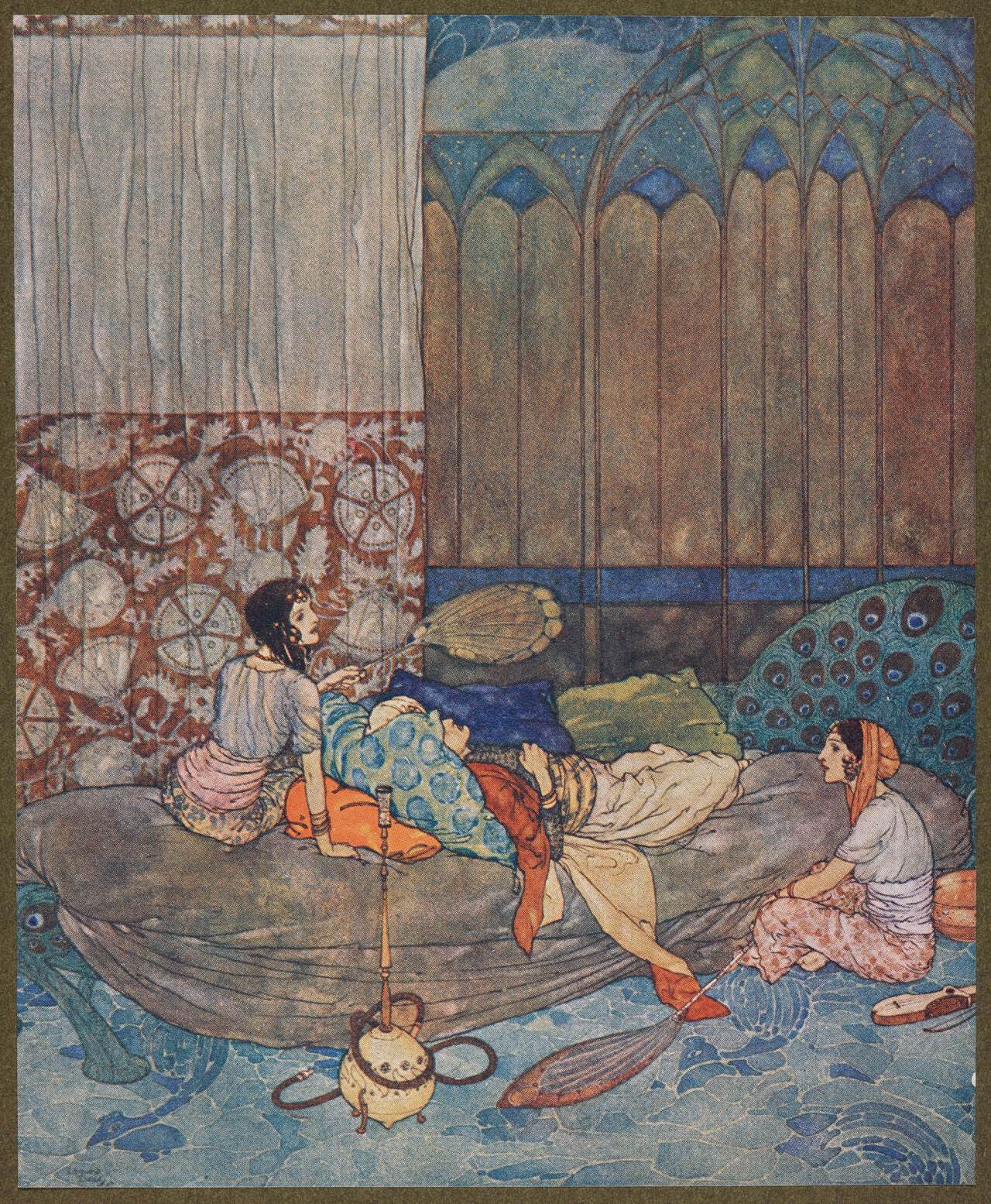
A Dulac illustration often announces itself through color before line. Look for figures embedded in broad areas of atmosphere, ornamental detail that remains readable at a distance, and spaces that feel compressed or tilted upward. These qualities grew from both his working method and the technologies used to reproduce it.

Watercolor Designed for Color Reproduction
The three-color halftone process separated an image through color-filtered negatives and produced yellow, red, and blue printing blocks. Tiny dots from those blocks combined optically to suggest a wider range of tones. The blocks had to align, or register, with considerable precision, and glazed paper helped preserve the printed color. Finished plates could then be tipped into a book.

Dulac built his images on careful pencil foundations, but he did not depend primarily on a heavy enclosing ink line. Watercolor carried much of the modeling, color, and atmosphere. Subtle transitions could make a figure emerge from shadow, while concentrated passages of red, gold, violet, or blue established the visual center. Printing technology did not mechanically create his style, but it gave his color-led method an effective commercial form.
Original sheets reveal more material variety than a reproduction may suggest. The Metropolitan Museum of Art’s The Weavers, dating to about 1910, combines watercolor, pen and black ink, graphite, and white and red conté crayon, a dense drawing stick, on paper. Measuring 34 by 27.6 centimeters, it is a modestly sized work assembled from several drawing and painting materials.
Pattern, Viewpoint, and Documented Visual Sources
Japanese prints and Persian and Indian miniature painting are documented sources for Dulac’s visual language. Rather than collapsing these traditions into a vague exotic category, it is more useful to identify what a viewer can see: asymmetrical arrangements, elevated viewpoints, compressed depth, intense color, and close attention to clothing, architecture, and surface pattern. Readers interested in the broader histories behind one of those sources can consult this overview of Japanese art and its major forms.
Dulac did not simply copy a single model. He recombined devices within the requirements of European publishing and narrative illustration. A high viewpoint might let a patterned floor occupy much of a composition, while overlapping figures establish just enough depth to clarify the action. In other works, decorative branches or folds of fabric bind the edge of the picture to its focal figure.
The 1919 Don Quixote . . . in His Blind and Rash Endeavors, now in the Cleveland Museum of Art, offers a particularly clear example. Made with gouache, an opaque watercolor paint, and transparent watercolor over graphite, it places the duchess, duke, Don Quixote, and Sancho inside a square, densely patterned scene of comic collapse. The flattened arrangement keeps the episode legible while allowing costumes, poses, and surrounding ornament to share the storytelling.
Dulac and Arthur Rackham: A Useful Distinction
Dulac and Arthur Rackham worked in the same gift-book market, but resemblance should not be mistaken for documented direct influence. Their handling of color provides a practical distinction. Rackham is closely associated with intricate ink drawing and restrained tinting, while Dulac more often lets fuller watercolor passages construct light, volume, and mood.
The difference is not absolute, since both artists changed their methods across projects. It is nevertheless useful when identifying an unfamiliar plate. Strongly articulated, twisting line tends to point toward Rackham; broad atmospheric color and figures absorbed into patterned surroundings more often suggest Dulac. A fuller account of Rackham’s books and printing methods appears in this biography of Arthur Rackham.
A Close Reading of The Buried Moon
Dulac’s 1916 illustration for The Buried Moon, published in Edmund Dulac’s Fairy-Book, turns a revelation into a lighting effect. The Moon has been trapped in a bog and hidden beneath a dark cloak. When part of her golden hair becomes exposed, it releases the image’s principal burst of light.
That glow does several jobs at once. It identifies the constrained figure, breaks the surrounding darkness, and makes the threatening forms around her newly visible. Curling branches and tangled lines press inward, while the cloak creates a dense dark mass. The bog does not need conventional deep perspective to feel dangerous; overlapping shapes and compressed space make it seem enclosing.
The brightest passage sits close to the heroine’s head, so the eye finds her before it sorts out every branch and fold. Narrative and composition become inseparable: the exposed hair reveals the captive Moon and the danger surrounding her without resolving her struggle. This is a reliable way to read Dulac. Instead of asking only what objects he depicted, follow the largest light-dark contrast and watch how color releases information in stages.
Original Works on Paper in Museum Collections
Museum sheets help viewers distinguish Dulac’s hand from the smooth surface of a printed plate. Graphite may remain beneath translucent washes, and opaque gouache or crayon may sharpen a highlight. Scale matters too. Works such as The Weavers and the Cleveland Don Quixote illustration were made as physical objects on paper before being understood as reproduced images.
When examining an original or a high-resolution image, begin with four questions: Where is the strongest color contrast? Does line enclose the forms or disappear beneath washes? Is space built through conventional recession, or compressed by pattern and elevated viewpoint? Finally, does the decorative detail delay the story or guide the eye toward its turning point? Those observations are more dependable than treating every elaborate fairy-tale scene as a Dulac.
Beyond Fairy Tales: War Work, Theater, Magazines, and Stamps
Around 1920, the luxury gift-book market contracted, and Dulac also lost his steady cartoon work for The Outlook. The change disrupted a dependable professional model. He responded by pursuing portraits, magazines, theater, music, and design rather than trying to reproduce the prewar market unchanged.

The Postwar Publishing Shift
The decline of elaborate gift books did not mean that illustration disappeared. It shifted toward periodicals, advertising, and other forms with different schedules and printing conditions. Dulac had to make images that worked quickly for a broad audience and remained effective under less luxurious reproduction.
His later career therefore demonstrates adaptation rather than a clean break. Skills developed for books, including a strong silhouette, controlled color, decorative framing, and the ability to condense a narrative, could be recalibrated for a cover or public design. He also continued to accept book work when opportunities arose.
Stage Design, Music, and W. B. Yeats
Dulac collaborated with W. B. Yeats on theater influenced by Japanese Nō, a performance tradition joining stylized movement, masks, music, and sparse staging. Dulac designed sets, costumes, and makeup and also composed music. These activities were not casual diversions preserved only as anecdotes. His archive includes evidence of sustained work across visual, theatrical, and musical forms.
The collaboration continued in broadcasting. For Yeats’s 1937 BBC program My Own Poetry, Dulac composed music and accompaniment. The project shows how his atmospheric sense could operate through sound as well as image, supporting spoken poetry without relying on a printed page.
Thirteen Series for The American Weekly
Dulac began working for the US newspaper supplement The American Weekly in 1924. A documented checklist traces the commission through 1951 and identifies 13 themed series comprising 106 covers. That volume of work makes the publication a substantial part of his career, not a late footnote.
Newspaper reproduction demanded another adjustment. A cover had to attract attention at a glance, survive mass printing, and remain clear amid headlines and surrounding type. Dulac adapted his technique to these conditions while continuing to use fantasy, costume, symbolism, and concentrated color. The long run also connected a London-based artist with a large American readership well after the peak of his British gift books.
Royal and Free French Stamp Designs
Stamp design reduced Dulac’s theater of color and pattern to a few square centimeters. For the 1937 coronation of George VI, he designed a stamp and produced a portrait of the king that was used on George VI definitive stamps, the regular everyday issues sold for ordinary postage. The design incorporated floral emblems representing the four nations of the United Kingdom. The portrait’s original artwork is no longer known to survive, so its use should not be confused with an extant drawing available for viewing.
During World War II, Dulac also produced stamps for the Free French. Commissioned by Charles de Gaulle, the designs used the Cross of Lorraine, the movement’s emblem. The project culminated in a Victory stamp featuring the figure known as the Marianne de Londres. These small designs brought together portraiture, national symbols, lettering, and the practical requirements of postal printing.
What Edmund Dulac Changed, and Where His Work Survives
Dulac’s most consequential contribution was to treat reproducible illustration as color-led painting. He planned images for the page, but he did not reduce watercolor to a tint added after drawing. Color could model a face, establish distance, reveal a supernatural event, or carry the emotional weight of an entire scene.
A Color-First Contribution to Illustration
That contribution becomes clearest when medium and reproduction are considered together. Pencil supplied structure; watercolor, ink, gouache, and crayon could build the original; halftone blocks and glazed paper translated it into a purchasable book. Gallery exhibitions preserved the status of the watercolor as an original object even as publishers circulated its printed version.
Dulac’s later work shows that this was not merely a formula for fairy tales. The same clarity of arrangement supported wartime allegory, magazine themes, theatrical settings, and stamps. His importance lies as much in that transfer between formats as in any single decorative manner. His surviving output demonstrates an unusually broad application of illustration and design.
Museum Objects, Portraits, and the Dulac Archive
Original and printed works survive across major public collections. The Metropolitan Museum of Art holds The Weavers; the British Museum preserves Poland a Nation; and the Cleveland Museum of Art holds the 1919 Don Quixote sheet. The National Portrait Gallery holds Dulac’s portrait of Arthur David Waley, dated circa 1915, while postal collections document his stamp designs.
A substantial archival record is held at the Harry Ransom Center. Its Dulac collection includes art, writings, musical compositions, correspondence, family papers, and school records. Taken together, these materials replace the narrow image of a fairy-book specialist with a more useful one: an illustrator who also wrote, composed, designed for performance, and solved visual problems for mass communication.
Dulac died at 70 while a final children’s-book project was still in progress. The unfinished endpoint is revealing. He had returned to the field that first established his reputation, but he did so after decades spent testing how narrative imagery could work on stages, airwaves, newsprint, lithographs, and stamps. Recognizing a Dulac therefore means looking beyond elaborate costume and fantasy subjects. The stronger clue is how deliberately color, pattern, and format cooperate to make a story visible.
Frequently Asked Questions About Edmund Dulac
Was Edmund Dulac French or British?
He was both French-born and British. He was born Edmond Dulac in Toulouse in 1882, built his career in Britain, adopted the name Edmund, and became a naturalized British citizen in 1912.
What Books Did Edmund Dulac Illustrate?
His best-known books include Stories from the Arabian Nights, The Tempest, The Rubáiyát of Omar Khayyám, The Sleeping Beauty and Other Fairy Tales, Stories from Hans Andersen, The Bells and Other Poems, and Princess Badoura.
How Was Edmund Dulac Different From Arthur Rackham?
Rackham often emphasized intricate ink contours with restrained tinting. Dulac more frequently allowed fuller watercolor passages to model figures and establish atmosphere. They shared a market, but there is no need to claim a direct influence to explain this stylistic contrast.
Did Edmund Dulac Design Postage Stamps?
Yes. He designed the 1937 George VI coronation stamp and a royal portrait used on definitive stamps, meaning regular stamps for everyday postage. During World War II, he also created Cross of Lorraine designs and the Free French Victory stamp featuring the Marianne de Londres.
Where Can You See Edmund Dulac’s Work?
Works and records are held by institutions including the Metropolitan Museum of Art, British Museum, Cleveland Museum of Art, National Portrait Gallery, The Postal Museum, and Harry Ransom Center. The Ransom Center’s archive is especially useful for understanding his work beyond book illustration.

Isabella studied at the University of Cape Town in South Africa and graduated with a Bachelor of Arts majoring in English Literature & Language and Psychology. Throughout her undergraduate years, she took Art History as an additional subject and absolutely loved it. Building on from her art history knowledge that began in high school, art has always been a particular area of fascination for her. From learning about artworks previously unknown to her, or sharpening her existing understanding of specific works, the ability to continue learning within this interesting sphere excites her greatly.
Her focal points of interest in art history encompass profiling specific artists and art movements, as it is these areas where she is able to really dig deep into the rich narrative of the art world. Additionally, she particularly enjoys exploring the different artistic styles of the 20th century, as well as the important impact that female artists have had on the development of art history.
Learn more about Isabella Meyer and the Art in Context Team.
Cite this Article
Isabella, Meyer, “Edmund Dulac: Books, Watercolor, Theater, and Stamps.” Art in Context. November 2, 2026. URL: https://artincontext.org/edmund-dulac/
Meyer, I. (2026, 2 November). Edmund Dulac: Books, Watercolor, Theater, and Stamps. Art in Context. https://artincontext.org/edmund-dulac/
Meyer, Isabella. “Edmund Dulac: Books, Watercolor, Theater, and Stamps.” Art in Context, November 2, 2026. https://artincontext.org/edmund-dulac/.


