
Phthalo Blue – Pigment, Color Codes, and Practical Palettes

Phthalo blue can look almost inky in a concentrated passage and startlingly clear when spread into a thin layer. It is both a family of powerful artists’ pigments and a name used for deep digital blues—but those are not interchangeable definitions. This guide explains the pigment, the green- and red-shade distinction, and how to build a useful palette without mistaking a screen swatch for a paint formula.
What Is Phthalo Blue?
Phthalo is short for phthalocyanine. In artists’ colors, phthalo blue commonly refers to copper-phthalocyanine pigments in the PB15 family. The name covers several variants, so the pigment code and the manufacturer’s shade designation are more informative than the words “phthalo blue” alone.

As one concrete example, GOLDEN lists Williamsburg Phthalo Blue oil color as a transparent, synthetic-organic copper-phthalocyanine color containing PB15:3. Winsor & Newton lists its Professional Watercolour Winsor Blue (Green Shade) as transparent and staining, with the broader pigment designation PB15. These are product-specific descriptions, not a promise that every tube carrying a similar name behaves identically.
The distinction matters when following a tutorial. A name may refer to a pigment family, a particular tube, or merely a visual impression. Before replacing one blue with another, check which of those the instruction actually means.
Green Shade vs. Red Shade
Green shade and red shade describe the direction of the blue, not separate green or red ingredients automatically added to it. Both can be single-pigment phthalo blues. Looking up the exact pigment designation helps distinguish variants that may appear very similar in a concentrated mass.
| Product example | Green shade | Red shade |
|---|---|---|
| DANIEL SMITH Extra Fine Watercolor | PB15:3 | PB15:6 |
| Direction within the blue family | Green-leaning | Red-leaning |
| Chart classification for these products | High staining; non-granulating | High staining; non-granulating |
DANIEL SMITH’s published pigment chart identifies its Phthalo Blue (Green Shade) as PB15:3 and its Red Shade as PB15:6. The same chart classifies both as highly staining and non-granulating. Do not turn that example into a universal decoding rule for every brand: inspect the code printed on the particular paint you are using.
For your own comparison, place a small amount of each candidate beside a thin wash or glaze of the same paint. On a separate part of the test surface, compare a tint made with white if that suits your medium. Label the samples with the brand, range, and pigment code so that “the warmer blue” remains identifiable later.
Why a Small Amount Can Change a Mixture
Phthalo blue is valued for strong tinting power. A small addition can move a mixture noticeably, which is useful for clear greens and deep blues but less convenient when you are trying to make a subtle adjustment. Work from a small test pile instead of committing the entire mixture at once.

Start with the larger amount of the color you want to modify, then introduce phthalo blue in small increments with a clean tool. Spread out a little of the mixture before deciding whether to add more. A dense mound of paint hides information that a thinner application can reveal.
Keep three observations separate: how dark the paint looks at full strength, how its hue appears in a thin layer, and how strongly it changes another color. None of these observations can be replaced by a single HEX value.
A Small Mixing Study With a Clear Purpose
Make a test strip with three labeled areas: the blue on its own, a gradual mixture with your chosen yellow, and a gradual mixture with your chosen red or magenta. Keep the paint names beside the strip and allow the samples to dry before filing them. The aim is not an impressive chart; it is a reference you can repeat with your own materials.
GOLDEN’s mixing guidance shows why the companion pigment matters: phthalo blue green shade can produce strong greens with yellows, while quinacridone magenta and a warmer naphthol red lead to different violet mixtures. “Add red” is therefore an incomplete instruction. Record which red, in which paint range, produced the result you wanted.
Using Phthalo-Inspired Blue in a Painting
A painting built around an intense blue does not need every passage at maximum strength. Let deeper shapes establish the structure, use lighter blue-green areas for movement, and preserve enough light space to separate them. A small warm accent can interrupt the cool field without becoming a second competing subject.

In this original illustrative seascape, dark blue establishes the foreground, lighter passages open the distance, and a restrained warm accent moves the eye through the scene. The example demonstrates a composition and color relationship; it is not a record of a physical phthalo-blue mixing experiment.
To adapt the idea, decide where your strongest dark belongs before adding detail. Keep some edges quieter than others, and leave room for the lightest passage to remain distinct. If everything is equally saturated, equally sharp, and equally textured, the painting loses the hierarchy that makes the blue feel luminous.
Phthalo Blue HEX, RGB, and Digital Tints
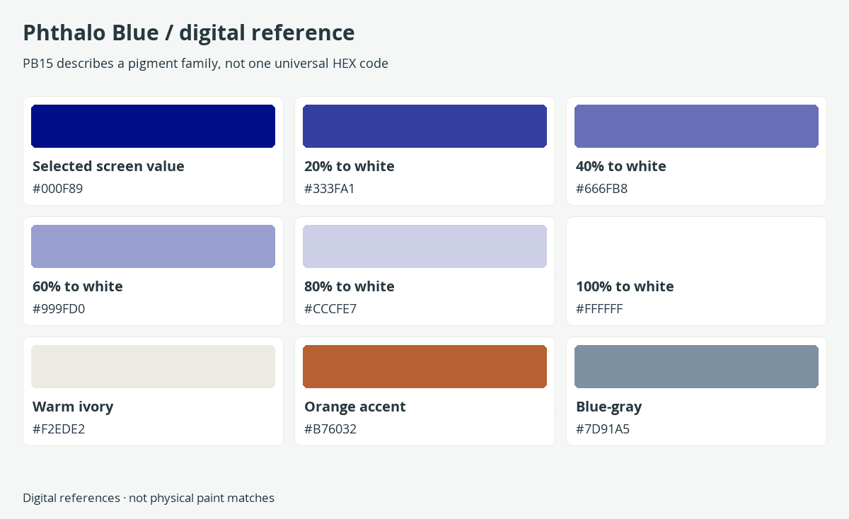
This article uses #000F89, RGB 0, 15, 137, as a selected digital reference for the name Phthalo Blue. It is not a standardized CSS color keyword and it is not a measured value for every PB15 paint. Use the code when reproducing this particular digital design, not when specifying a pigment formulation.
| Reference | Value |
|---|---|
| Selected digital name | Phthalo Blue |
| HEX | #000F89 |
| RGB | 0, 15, 137 |
| HSL | 233.4°, 100%, 26.9% |
| Status | Selected digital reference; not a CSS named color or universal pigment measurement |

The tint strip is calculated by moving the selected RGB channels toward white in equal numerical steps. This is an encoded-sRGB design exercise, not a simulation of mixing titanium white into real paint. It gives you repeatable interface or layout colors while leaving the physical behavior of pigments to actual samples.
For print, convert through the color profile and production conditions required by your printer. A single unqualified CMYK percentage list would suggest a precision the screen reference does not supply. Keep the original digital value in your working notes, then proof the printed result on the intended stock.
Is Phthalo Blue the Same as Navy or Ultramarine?
No: a pigment family and a broad color name do different jobs. Navy describes a dark-blue appearance, while phthalo and ultramarine can identify different pigment families. One dark application may look similar to another on a screen without having the same behavior in a palette.
| Name | HEX | RGB | Color |
|---|---|---|---|
| Selected Phthalo Blue | #000F89 | 0, 15, 137 | |
| CSS Navy | #000080 | 0, 0, 128 | |
| CSS Blue | #0000FF | 0, 0, 255 | |
| CSS Teal | #008080 | 0, 128, 128 |
The exact comparison above uses standardized CSS Navy, Blue, and Teal beside this article’s chosen Phthalo Blue reference. It is deliberately labeled as a screen-color comparison. It does not assign an invented universal swatch to ultramarine paint or claim that a deep navy-colored product contains phthalo.
If a tutorial calls for phthalo blue and you only have a different blue, first test the mixture that matters to the exercise. A successful substitution is about the result you need—such as a clear green or a deep neutral—not merely about whether two unmixed paints look alike.
A Phthalo-Inspired Palette for Design
For a room concept, product composition, or printed cover, an intense blue can act as the main visual anchor. Pair it with a generous warm neutral and use a smaller orange accent. A muted blue-gray can connect the saturated color to the surrounding material palette.

Selected Phthalo Blue #000F89 | |
Warm ivory #F2EDE2 | |
Orange accent #B76032 | |
Blue-gray #7D91A5 |
The ceramic form supplies a large dark silhouette, the fabric creates a softer light area, and the orange shape provides a controlled interruption. Texture does some of the work that another accent color might otherwise do. Try removing an element before adding one: a disciplined four-color arrangement is often easier to adapt than a crowded mood board.
These codes are an editorial palette inspired by the concept, not sampled measurements of the photographed-looking objects. Glaze, fabric, shadow, and reflected light produce many visible colors within one object, so the image should guide the relationship between materials rather than serve as a product-matching chart.
Text Contrast on the Selected Digital Blue
At #000F89, white text has a calculated contrast ratio of 14.69:1, while black text has 1.43:1. White clears the WCAG AA minimum of 4.5:1 for ordinary-size text on this exact solid background; black does not. Check again if you change the blue, use a gradient, or place text over an image.
Keep a Useful Reference, Not a False Recipe
The downloadable sheet separates the pigment-family reminder, this guide’s chosen digital code, its calculated tint strip, and a suggested four-color palette. Use it to keep those categories clear. Add your own labeled physical samples when you need a reference for the paint on your desk.
Download the Phthalo Blue digital reference sheet
Frequently Asked Questions
These answers focus on the differences that matter when moving between artists’ materials, a screen palette, and a practical design.
Does Phthalo Blue Have One Official HEX Code?
No single code describes every phthalo-blue paint. This guide uses #000F89 as a selected digital reference. A pigment’s appearance depends on its formulation, application, surface, and lighting, so record a paint’s brand and pigment code separately.
Does “Red Shade” Mean Red Pigment Has Been Added?
Not necessarily. A red-shade phthalo blue can be a single-pigment paint. The designation describes its hue direction within the family; the ingredient or pigment listing tells you what the product actually contains.
Is Phthalo Blue Easy to Lift in Watercolor?
Do not assume it will lift easily: the DANIEL SMITH chart rates both of its listed phthalo-blue shades as highly staining. Make a small test on your chosen paper before relying on lifting as part of the painting.
Can I Mix a Similar Color From Other Paints?
You can aim for a similar visible result in a particular passage, but that does not create the same pigment or guarantee the same mixing behavior. Match the role you need in the picture, and test the actual combination rather than relying on a universal substitution recipe.

In 2005, Charlene completed her Wellness Diplomas in Therapeutic Aromatherapy and Reflexology from the International School of Reflexology and Meridian Therapy. She worked for a company offering corporate wellness programs for a couple of years, before opening up her own therapy practice. It was in 2015 that a friend, who was a digital marketer, asked her to join her company as a content creator, and this is where she found her excitement for writing.
Since joining the content writing world, she has gained a lot of experience over the years writing on a diverse selection of topics, from beauty, health, wellness, travel, and more. Due to various circumstances, she had to close her therapy practice and is now a full-time freelance writer. Being a creative person, she could not pass up the opportunity to contribute to the Art in Context team, where is was in her element, writing about a variety of art and craft topics. Contributing articles for over three years now, her knowledge in this area has grown, and she has gotten to explore her creativity and improve her research and writing skills.
Charlene Lewis has been working for artincontext.org since the relaunch in 2020. She is an experienced writer and mainly focuses on the topics of color theory, painting and drawing.
Learn more about Charlene Lewis and the Art in Context Team.
Cite this Article
Charlene, Lewis, “Phthalo Blue – Pigment, Color Codes, and Practical Palettes.” Art in Context. September 15, 2026. URL: https://artincontext.org/phthalo-blue/
Lewis, C. (2026, 15 September). Phthalo Blue – Pigment, Color Codes, and Practical Palettes. Art in Context. https://artincontext.org/phthalo-blue/
Lewis, Charlene. “Phthalo Blue – Pigment, Color Codes, and Practical Palettes.” Art in Context, September 15, 2026. https://artincontext.org/phthalo-blue/.