

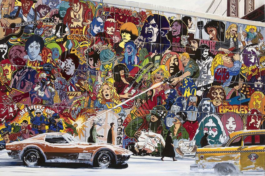
Psychedelic Art – An Exploration of the Psychedelic Aesthetic in Art

Psychedelic Art is a broad field of visual culture associated most closely with the counterculture of the mid-1960s and early 1970s. Its posters, album covers, comics, light shows, and other designs used optical color, distorted lettering, dense patterns, and surreal transformations to suggest altered perception. The term also applies to later art inspired by psychedelic experience, but not every colorful or dreamlike image belongs to the historical psychedelic design movement.
What Is Psychedelic Art?
Psychedelic Art describes visual work related to psychedelic experience and, more narrowly, the graphic language that developed around 1960s counterculture. The historical style appeared most visibly in concert posters, album covers, underground newspapers and comics, murals, animation, and liquid light shows. These formats were connected to music venues, festivals, political activism, experimental communities, and a youth audience that often valued immersion over conventional clarity.
British psychiatrist Humphry Osmond coined the word “psychedelic” in 1956 during his correspondence with author Aldous Huxley. Formed from Greek roots associated with mind or soul and manifestation, the term was intended to mean “mind-manifesting.” The later art label therefore refers to more than a bright palette: it concerns attempts to visualize altered perception or to make viewing itself unstable, absorbing, and participatory.
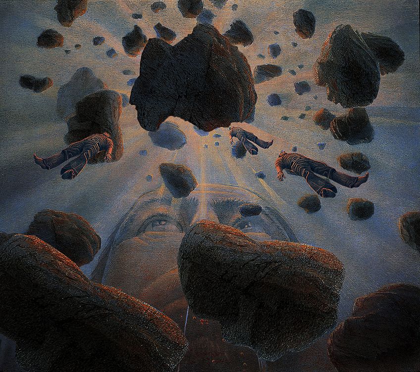
Hanno Karlhuber’s 1982 painting is a later example rather than evidence of the 1960s poster movement. Its spatial distortion and psychological subject show how psychedelic imagery continued beyond the counterculture period. Historical psychedelic design, by contrast, often joined image and text in printed matter whose practical purpose—advertising a concert or identifying an album—was deliberately complicated by intense visual effects.
The category is broad enough to include graphic design, fine art, comics, film, projection, and installation, yet those practices should not be treated as identical. A concert poster communicates an event, a liquid light show unfolds in time with music, and a later visionary painting may focus on spiritual or psychological imagery. What connects strong examples is not one medium but an effort to alter ordinary habits of seeing.
Psychedelic Art is best identified through the interaction of color, typography, pattern, space, and viewing experience—not through bright color alone.
The History of Psychedelic Art
The history of Psychedelic Art cannot be reduced to the discovery of one drug or the invention of one visual device. Albert Hofmann first synthesized LSD in 1938 and identified its psychedelic effects in 1943, while postwar research and writing gradually brought altered states into wider public discussion. By the mid-1960s, artists and designers were combining those ideas with an existing visual vocabulary drawn from Art Nouveau, the Vienna Secession, Surrealism, Op Art, Pop Art, Victorian illustration, comic art, and commercial printing.
San Francisco became a major center because its dance halls joined music, projected light, graphic design, and countercultural social life. Promoters Bill Graham and Chet Helms commissioned posters for the Fillmore Auditorium and Avalon Ballroom. Designers such as Wes Wilson, Victor Moscoso, Rick Griffin, Alton Kelley, Stanley Mouse, and Bonnie MacLean turned event information into dense, collectible images. Their posters frequently sacrificed immediate legibility so that reading became a slower visual experience.
Op Art contributed knowledge of optical instability, afterimages, and color interaction. Art Nouveau and Vienna Secession design offered sinuous contours, flattened figures, ornament, and expressive lettering. Pop Art and commercial graphics supplied mass-media imagery and reproductive methods, while Surrealism provided precedents for transformation and improbable combinations. Psychedelic designers did not merely copy these sources; they recombined them for the spaces, music, printing technologies, and audiences of the 1960s.
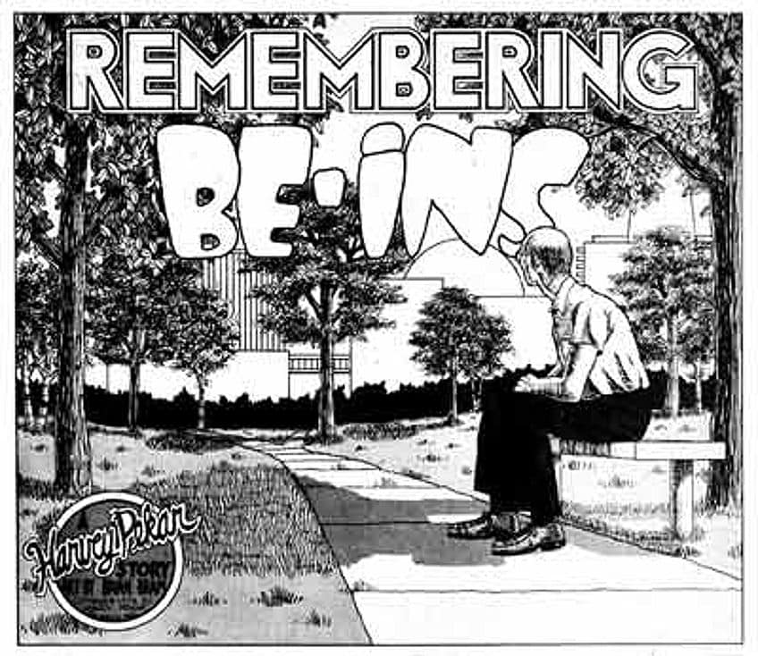
Underground comix expanded this language through satire, taboo subjects, grotesque transformation, and deliberately unruly page design. Artists including Robert Crumb, S. Clay Wilson, Victor Moscoso, and Rick Griffin helped make comics a central countercultural medium. This development influenced comic book artists and album-cover designers while also creating its own publishing networks outside mainstream comics.
Psychedelic visual culture also included liquid light shows, in which colored liquids, slides, and film loops were projected during performances. These time-based environments are important because they show that the style was not simply a collection of printed motifs. Movement, scale, music, duration, and the viewer’s physical presence were part of the experience.
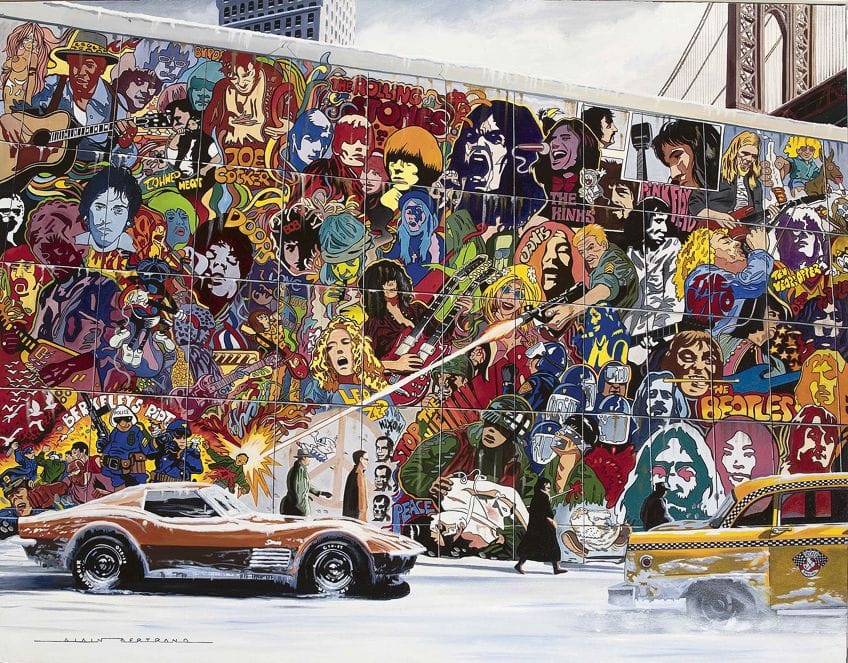
By the early 1970s, psychedelic design had spread beyond the San Francisco scene and into record packaging, advertising, fashion, publishing, and international graphic design. That diffusion made the style more recognizable but also weakened its original connection to particular venues and countercultural communities. Later uses range from historically informed revival to superficial imitation.
Psychedelic Counterculture Art of the 1960s
Psychedelic Art developed within a counterculture shaped by several overlapping forces: opposition to the Vietnam War, struggles over civil rights and social authority, new communal experiments, changing sexual norms, interest in Asian religions and other spiritual traditions, and the growing visibility of psychedelic drugs. No single belief united every artist or audience, and visual resemblance does not prove that a designer shared every political or spiritual position associated with the era.
Concert posters were especially effective community objects. Their difficult lettering and unconventional color often addressed people who already knew the bands, venues, and local scene. Rather than behaving like neutral information design, the posters rewarded sustained looking and helped distinguish insiders from outsiders. At the same time, they still advertised commercial events, which complicates the idea that psychedelic design existed wholly outside the market.
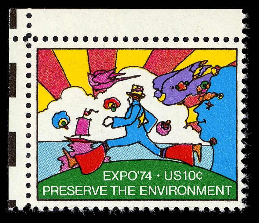
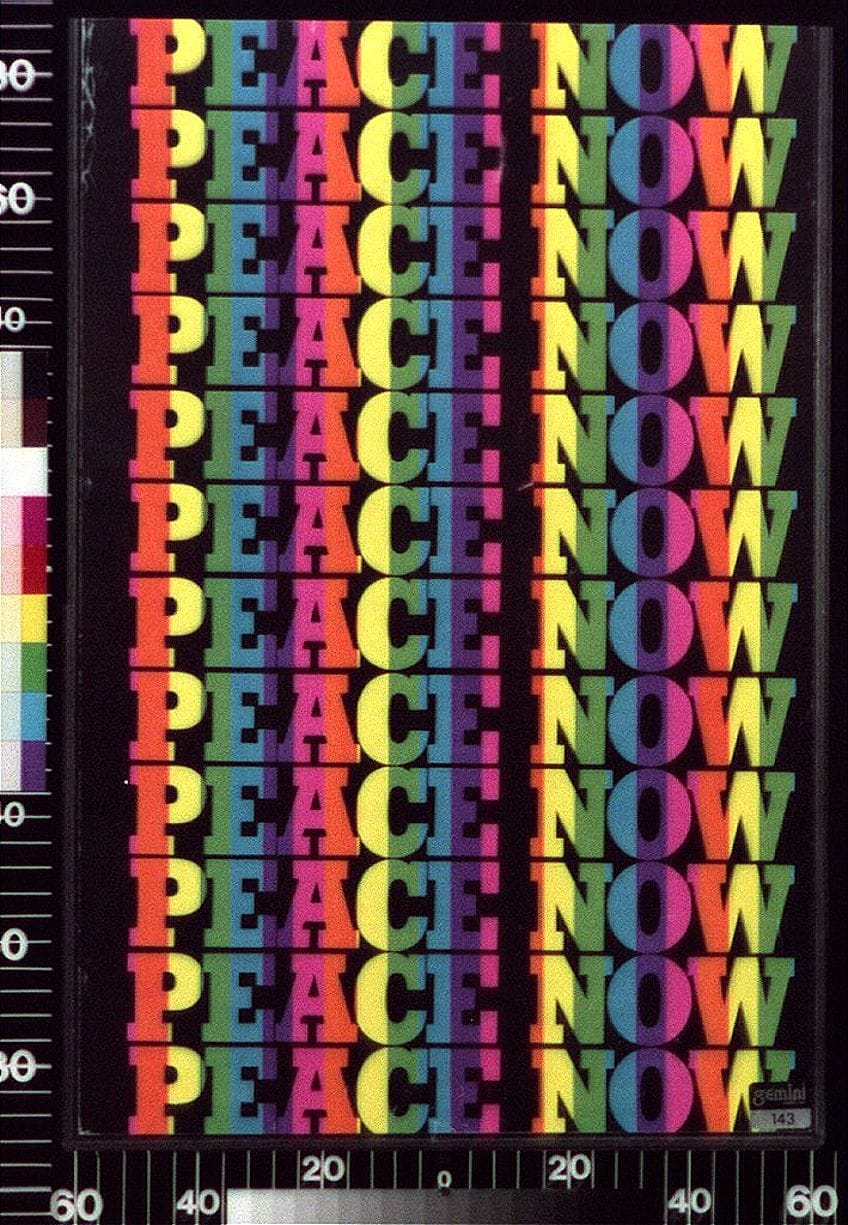
The Expo ’74 stamp is a later example of the period’s broader color and design climate, not a core San Francisco concert poster. This distinction matters: psychedelic influence spread into official and commercial graphics, but influence is not the same as membership in a single organized movement.
The strongest psychedelic designs did more than illustrate counterculture; they changed how information was encountered, slowing down reading and turning promotion into an immersive visual code.
Psychedelic Art in Corporate Advertising
Commercial adoption began while psychedelic counterculture was still active. Advertisers borrowed saturated color, warped lettering, collage, animation, and “trippy” transitions to address younger consumers. Brands could use the look of rebellion without endorsing the political commitments or drug culture associated with it. This made psychedelic style unusually easy to detach from its original social context.
The visual relationship was not entirely one-way. Many psychedelic artists understood printing, promotion, illustration, and commercial design, and concert posters were advertisements themselves. What changed in mass advertising was the scale and purpose of appropriation: a community-specific graphic language became a flexible sign for novelty, youth, freedom, or fashionable difference.
By the early 1970s, psychedelic devices appeared across campaigns for food, fashion, cars, cosmetics, entertainment, and other consumer goods. The semantic shift was substantial. “Psychedelic” could describe almost anything colorful, unusual, or youth-oriented, even when the design no longer attempted to evoke altered perception.
Commercialization did not simply end Psychedelic Art; it separated a portable visual style from the specific communities, events, and oppositional meanings that had helped produce it.
What Are the Characteristics of Psychedelic Art?
Psychedelic Art often uses intense or optically unstable color, but no single palette defines it. Some important posters use restricted colors while still creating disorientation through compressed space, swelling contours, and difficult lettering. Color should therefore be analyzed together with form, typography, density, and the work’s historical function.
Common features include warped or hand-drawn lettering; reversals between positive and negative spaces; compressed, all-over composition; repetition; spirals; concentric forms; collage; visual metamorphosis; and mixtures of ornamental, comic, photographic, and surreal imagery. Innovative hand-lettering can make words behave like shapes, requiring the viewer to decode text rather than scan it instantly.
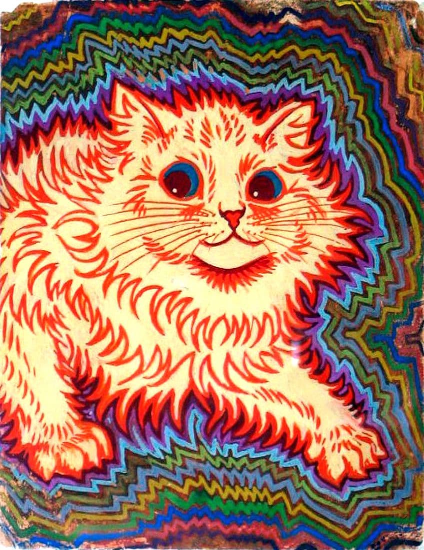
Louis Wain’s cat image predates the historical psychedelic movement and is often labeled “psychedelic” retrospectively because of its pattern and color. It should not be used to prove that a 1960s movement existed in the 19th century. The supplied caption’s title and date also depend on a legacy repository record and require human confirmation before being treated as definitive artwork metadata.
How to Recognize Psychedelic Art Without Reducing It to Bright Color
A reliable identification looks for several interacting signals rather than one decorative feature.
| Signal | What to Look For | Why It Is Not Sufficient Alone |
|---|---|---|
| Optical color | Adjacent saturated hues, vibrating edges, reversals of figure and ground | Op Art and commercial design also use optical color |
| Typography as image | Letters that swell, interlock, curve, or merge into figures and patterns | Decorative lettering appears in many earlier poster traditions |
| Dense transformation | Forms morph into one another; little neutral space remains | Surrealism, Symbolism, and horror vacui can produce similar density |
| Historical context | Connection to 1960s–1970s counterculture, music venues, underground publishing, or light shows | A later work may be psychedelic in theme without belonging to that original scene |
| Viewing effect | The design slows reading, destabilizes depth, or creates an immersive perceptual experience | A merely colorful image may remain visually conventional |
This framework also clarifies the movement’s boundaries. Psychedelic Art overlaps with Art Nouveau, Op Art, Surrealism, Pop Art, and visionary art, but those categories are not interchangeable. Historical evidence, function, and context matter as much as appearance.
Famous Psychedelic Artists and Their Artworks
The best-documented core of 1960s American psychedelic graphic design is the San Francisco rock-poster scene. Later artists such as Peter Max and Alex Grey are relevant to the broader history of psychedelia, but they occupy different geographic, commercial, and chronological positions. The following profiles therefore distinguish core poster designers from adjacent and later figures.
Victor Moscoso (Born 1936)
Spanish artist Victor Moscoso brought unusually extensive formal training to psychedelic poster design. He studied at Cooper Union and Yale, where Josef Albers’s teaching on color interaction became especially important, and later studied lithography at the San Francisco Art Institute. In the mid-1960s, Moscoso reversed conventional advertising priorities by using vibrating color and difficult lettering to demand prolonged attention.
His Neon Rose posters, including the 1967 Chambers Brothers Band design, show how complementary or near-complementary hues can make edges appear to pulse. Moscoso also worked in underground comix, making him an important link between poster design and alternative publishing. He was one of the “Big Five” San Francisco poster artists rather than the first psychedelic artist to create rock posters.
Wes Wilson (1937–2020)
Wes Wilson was a leading designer for concerts promoted by Bill Graham at the Fillmore Auditorium. His lettering drew on Art Nouveau and Vienna Secession sources, then transformed those precedents into compressed, swelling forms that could dominate the entire poster. Cooper Hewitt records that he produced 56 Fillmore posters between 1966 and 1968.
Wilson helped popularize the difficult-to-read lettering now associated with psychedelic rock posters. Describing him as the sole inventor of a “psychedelic font,” however, oversimplifies a collective design culture with several sources and practitioners. His achievement lies in the sustained integration of text, figure, and pattern—not simply in drawing unusual block lettering.
Peter Max (Born 1937)
German American artist Peter Max became a prominent New York image-maker whose “Cosmic ’60s” style combined bright color, simplified figures, astronomy, collage, and mass-media circulation. His work appeared in posters, publications, clothing, products, and advertising, placing him at the commercial and Pop-adjacent edge of psychedelia rather than within the San Francisco “Big Five.”
Max worked across numerous art mediums and used reproduction as part of his public identity. His broad popularity demonstrates how quickly psychedelic imagery could move between counterculture, commercial graphics, and mainstream popular culture.
Bonnie MacLean (1939–2020)
Bonnie MacLean became Bill Graham’s principal poster designer after Wes Wilson’s working relationship with Graham ended. She produced more than 30 Fillmore posters, many in 1967, and developed a distinctive vocabulary of curved lettering, frontal faces, decorative plumes, and imagery drawn from several historical cultures. Her posters for the Yardbirds, the Doors, the Who, Pink Floyd, and other performers are held in major museum collections.
MacLean worked in a field often narrated through the male “Big Five,” yet her role was not peripheral. Her sustained Fillmore output helped define the venue’s visual identity. The supplied birth year of 1939 is supported by museum and obituary records; one major museum database currently lists 1949, a date inconsistent with her documented 1961 university graduation.
Stanley “Mouse” Miller (Born 1940)
Stanley Miller, known as Stanley Mouse, brought experience from Detroit’s custom-car and hot-rod culture to San Francisco. He frequently collaborated with Alton Kelley, and their partnership produced posters and album imagery closely associated with the Grateful Dead. Mouse was also one of the “Big Five” poster artists.
His work demonstrates that psychedelic poster art was often collaborative and commercially functional. Designers, promoters, printers, venues, bands, and audiences all shaped the final object and its circulation. Treating every poster as the isolated expression of one artist misses this production network.
Rick Griffin (1944–1991)
Rick Griffin—not “Rick Griffith”—developed his graphic language through Southern California surf culture before becoming a major San Francisco poster and underground-comix artist. His work for Zap Comix, concert promotion, and the Grateful Dead combined intricate lettering, religious and mortality symbols, grotesque metamorphosis, and highly controlled draftsmanship.
Griffin’s 1968 Jimi Hendrix Experience poster and the imagery adapted for the Grateful Dead’s 1969 album Aoxomoxoa are important examples of his ability to merge text and image. He belonged to the “Big Five” and helped establish Berkeley Bonaparte, a distribution venture that circulated psychedelic posters as collectible objects.
Gary Grimshaw (1946–2014)
Gary Grimshaw was central to Detroit’s psychedelic rock-poster scene, especially through his designs for the Grande Ballroom. His posters connected local counterculture, political activism, and performances by bands including the MC5, the Who, Cream, and the Jimi Hendrix Experience.
Grimshaw’s inclusion broadens a history too often reduced to San Francisco. Detroit had its own venues, musicians, printers, and political conditions, demonstrating that psychedelic graphic design developed through regional scenes rather than one uniform national style.
Alex Grey (Born 1953)
Alex Grey is a later visionary artist, not a core participant in the 1960s San Francisco poster movement. His paintings and installations use detailed anatomical imagery, luminous color, energy systems, and spiritual symbolism to explore the body and consciousness. Grey works across painting, performance, sculpture, and installation art.
Placing Grey within the broader history of psychedelic art shows how the category expanded after the counterculture period. His work belongs to a later visionary and spiritual context, so visual similarities should not erase the difference in time, medium, and cultural setting.
The Legacy of Psychedelic Art
Psychedelic Art’s legacy is clearest in the way it altered relationships among design, music, promotion, and audience experience. Posters once treated as temporary advertisements entered museum collections, while their lettering and color strategies influenced album covers, comics, editorial graphics, fashion, and later event design.
Commercial appropriation reduced some motifs to a marketable period style, but it did not eliminate the historical work or its countercultural meanings. The same poster can be studied as an advertisement, a collectible print, a record of a performance network, and an experiment in perception. That layered function explains why psychedelic design remains more than a nostalgic catalog of swirls and neon colors.
Later revivals also reveal a distinction between quotation and continuation. A designer may quote the 1960s through fonts and palettes, while contemporary artists working with projection, immersive installation, visionary imagery, or digital transformation may pursue the broader psychedelic aim of altering perception through different technologies.
Psychedelic Art in the Digital Age
Digital tools expanded the production and circulation of psychedelic imagery through rave flyers, music visualization, generative graphics, virtual environments, projection mapping, and online animation. The 1990s rave scene combined references to 1960s Psychedelic poster art with graffiti, electronic-music culture, inexpensive desktop publishing, and emerging computer effects.
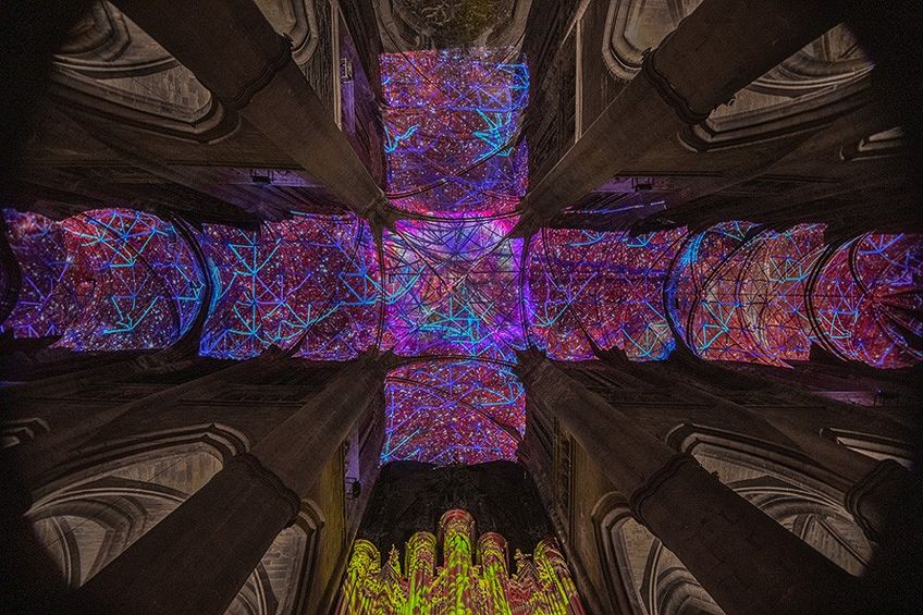
Miguel Chevalier’s Digital Supernova demonstrates how later digital work can transform architecture and surround viewers at a scale unavailable to a printed poster. Its generative projection belongs to a contemporary installation context; calling it psychedelic describes aspects of perception and visual experience rather than membership in the historical 1960s movement.
Digital production also makes historical motifs easy to imitate. A convincing psychedelic work still requires more than filters, fractals, or saturated gradients. It must organize color, movement, scale, typography, spatial instability, or transformation into a coherent viewing experience.
Psychedelic Art remains relevant because it treats perception itself as a design material, whether the medium is a printed poster, a projected light environment, or a generative digital installation.
Take a look at our Trippy Art webstory here!
Frequently Asked Questions About Psychedelic Art
What Is Psychedelic Art?
Psychedelic Art is visual art and design related to psychedelic experience, especially the posters, album covers, comics, and light shows associated with the counterculture of the mid-1960s and early 1970s. The term also covers later work that explores altered perception, but it should not be applied to every bright or surreal image.
What Are the Main Characteristics of Psychedelic Art?
The main characteristics include optically active color, warped hand lettering, dense all-over composition, repetition, collage, fluid contours, and forms that appear to melt or transform. Historical context and viewing effect are as important as surface decoration.
Who Were the “Big Five” Psychedelic Poster Artists?
The “Big Five” were Wes Wilson, Alton Kelley, Stanley Mouse, Victor Moscoso, and Rick Griffin. They were leading designers in the San Francisco rock-poster scene, although other artists—including Bonnie MacLean, Lee Conklin, and David Singer—also made major contributions.
How Is Psychedelic Art Different From Op Art and Surrealism?
Psychedelic Art borrowed optical effects from Op Art and dreamlike transformation from Surrealism, but its historical identity is tied to counterculture, music promotion, altered perception, and immersive media. The categories overlap visually without being interchangeable.

Isabella studied at the University of Cape Town in South Africa and graduated with a Bachelor of Arts majoring in English Literature & Language and Psychology. Throughout her undergraduate years, she took Art History as an additional subject and absolutely loved it. Building on from her art history knowledge that began in high school, art has always been a particular area of fascination for her. From learning about artworks previously unknown to her, or sharpening her existing understanding of specific works, the ability to continue learning within this interesting sphere excites her greatly.
Her focal points of interest in art history encompass profiling specific artists and art movements, as it is these areas where she is able to really dig deep into the rich narrative of the art world. Additionally, she particularly enjoys exploring the different artistic styles of the 20th century, as well as the important impact that female artists have had on the development of art history.
Learn more about Isabella Meyer and the Art in Context Team.
Cite this Article
Isabella, Meyer, “Psychedelic Art – An Exploration of the Psychedelic Aesthetic in Art.” Art in Context. June 2, 2021. URL: https://artincontext.org/psychedelic-art/
Meyer, I. (2021, 2 June). Psychedelic Art – An Exploration of the Psychedelic Aesthetic in Art. Art in Context. https://artincontext.org/psychedelic-art/
Meyer, Isabella. “Psychedelic Art – An Exploration of the Psychedelic Aesthetic in Art.” Art in Context, June 2, 2021. https://artincontext.org/psychedelic-art/.


